YouTube New Interface and Social Interaction Design Santiy Check
YouTube has released a new design for the site and its individual video pages. This gets shared in Google Operating System :: User Inferface Updates at YouTube and TechCrunch :: YouTube Updates Layout, Now with Tabs and Statistics. While the new design looks nice and clean, it has one design bug that is horribly annoying it has mixed interaction design metaphors for its tabs or buttons.
Broken Interaction Design on Buttons or Tabs
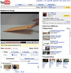 As the image shows the Share, Favorite, Playlists, and Flag buttons or tabs all have similar design treatment, but they do not have the same actions when you click on them. Three of the items (Share, Playlists, and Flag) all act as tabs that open up a larger area below them to provide more options and information. But, the Favorites acts like a button that when clicked it marks the item as a favorite.
This is incredibly poor interaction design as all the items should act in the same manner. If the items do not have the same action properties they really should not look the same and be in the same action space. Favorites should be a check box or a binary interface for on and off. That interaction patter more closely matches the Rate section and seems like it should have been there rather than showing a lack of understanding interaction design basics and confusing people using the site/service.
Social Sites Seem to Share a Lack of Interaction Understanding
This should have been a no brainer observation for a design manager or somebody with a design sanity check. YouTube is far from the the only site/service doing this. Nearly all of the services are not grasping the basics or are broadly applying design patterns to all user scenarios when they really do not fit all scenarios and user types (nearly every service I talk to know exactly the use type a person fits into but never takes this into account in optimization of design patterns that match that use need). Facebook really falls into this hole badly and never seems to grasp they are really making a mess of things the more features and functionality they are bringing into their service without accounting for the design needs in the interface.
My seemingly favorite site to nit pick is LinkedIn which I use a lot and has been a favorite, but their social interaction additions and interactive interfaces really need much better sanity checks and testing before they go into production (even into the beta interface). LinkedIn is really trying to move forward and they are moving in the right direction, but they really need better design thinking with their new features and functionality. Their new design is ready to handle some of the new features, but the features need a lot more refining. The new design shows they have a really good grasp that the interface needs to be a flexible foundation to be used as a framework for including new features, which could benefit from treating them as options for personalization. LinkedIn has pulled back many of the social features and seems to be rethinking them and refining them, but they really need some good sanity checks before rolling them out again.
Social Interaction in Enterprise Tools
The befuddled interaction understanding is not germane to commercial or consumer public social web sites, but it also plagues tools aimed at the enterprise. This is not overly surprising as many of the social enterprise (enterprise 2.0) tools and services are copying the public web tools and services to a large degree. This is a good thing, as it puts the focus on ease of use, which has been horribly missing in business focussed tools for far too long. But, the down side for enterprise focussed tools is they are not for the public web they are for business users, who most often do not have familiarity with the conventions on the public web and they have a large cognitive gap in understanding what the tools do and their value. There is less time for playing and testing in most business people's worklife. This means the tools need to get things right up front with clear understanding of the use needs of the people they are building for in business. This seems to be lacking in many tools as there is much copying of poor design that really needs to be tested thoroughly before launching. Business focussed tools are not hitting the same people as are on the web, which will work through poor design and functionality to see what things do. It is also important to consider that there are a wide variety of types of people using these tools with varying needs and varying interaction understandings (this will be another blog post, actually a series of posts that relate to things I have been including in workshops the last six months and presenting the last couple).
[Comments are available and moderated as usual at: YouTube New Interface and Social Interaction Design Santiy Check :: Personal InfoCloud]