Off the Top: Information Architecture Entries
Showing posts: 1-15 of 311 total posts
Personal Blog Data Analysis - Looking at 25 Years
After adding sparklines to my category lists (Updated Categories with Sparklines and Search is Now in Production) I wanted to have a deeper dive looking at my categories and blog analytics over 25 years.
Category Long Tail
I done a very quick capture of category usage to look at the distribution of use. A question from James about whether my category distribution looked like a long tail distribution and I thought it may, but also looking at the numbers and not having a visualization I wasn’t sure. Charting the use, it really was a very long tail / power law distribution.
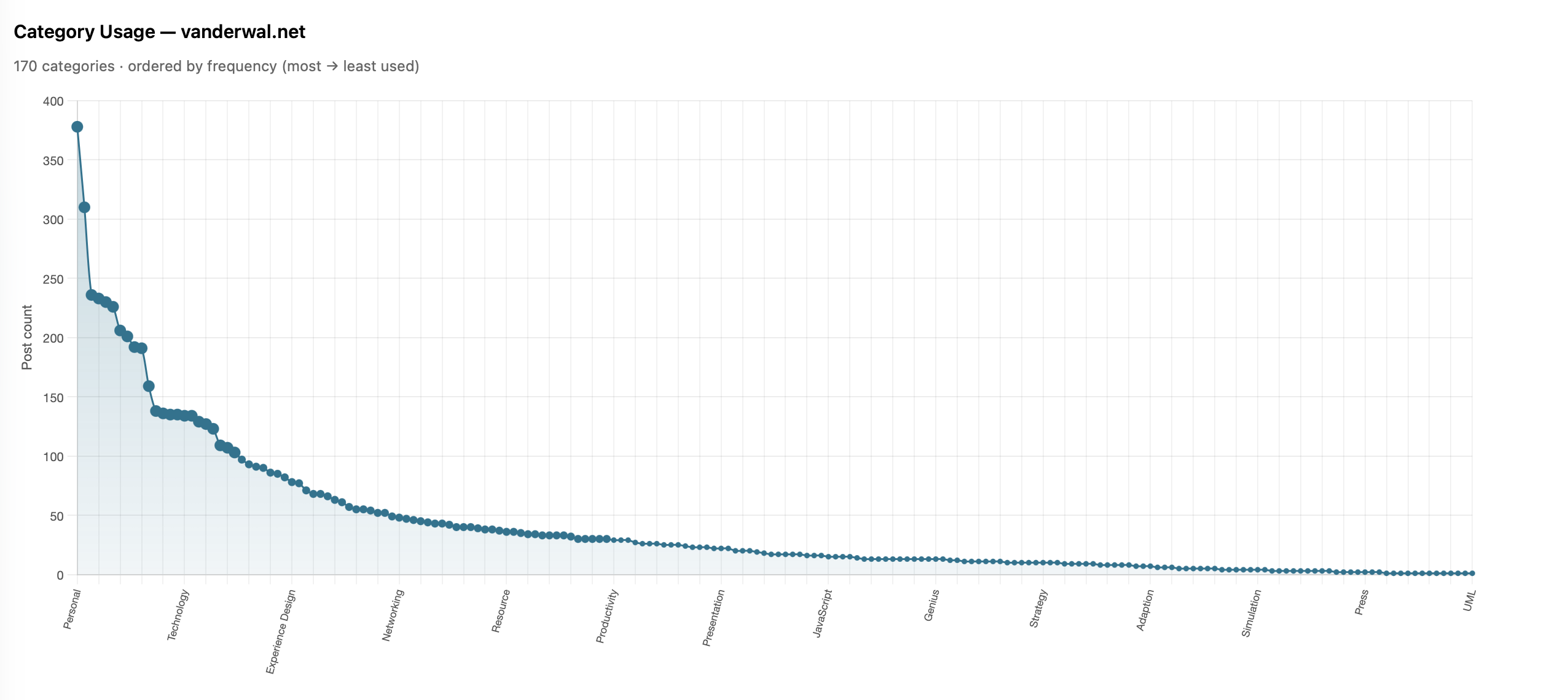
I shared it with James and he also ran his and ended up with much the same (Is there a power law of category use? - James’ Coffee Blog). There have been a few discussions of late around category use and some lean into having just a few categories. I have just over 200 categories now as most of my blog post have more than one subject and I use the categories to have an way to jump to related posts that cover the same subject. When I built my site’s CMS I wanted to have the capability to have multiple categories on each post. I have multiple categories for my own purposes, but also I’m cognizant that readers may have other terms.
With the long tail use of categories I know readers may stumble across a post through web search or a link from else where and having a category term that is familiar can get them to other things I may have posted. I view the web as being able to connect with others and blog posts are sharing things I have interests in or curiosity around and being able to connect with others in a similar mindset is the aim. So a handful of categories, particularly across 25 years and over 2,100 posts, doesn’t help build those connections.
More Analysis on Blog Posts and Categories
This distribution of categories really pushed my interest and curiosity of what the last 25 years of blogging looks like. I joke that Twitter ate my blog, but the sparklines sort of show that. I wanted to see the trends on my blog more closely (I have the archive of my Tweets and I’ll analyze them later and then bring the two analysis together).
To prep for the analysis I pulled my site’s database data local and put it into SQLite (it is already on Mac - Apple and quick) to connect locally with Jupyter Notebooks and use Plotly for interactive data visualizations in the notebook. I had a series of questions, somewhat common data analytics questions I’ve used since grad school looking at analysis over time.
Posts per Month
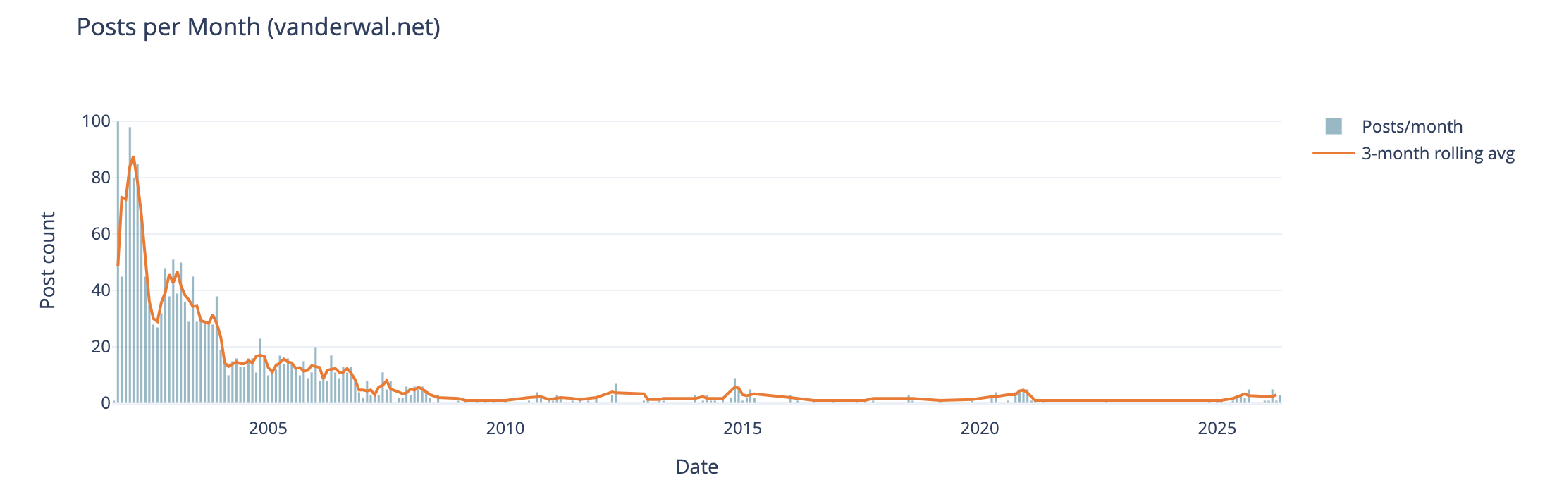
The first analysis is my blog posts by month over 25 years. In my early years I was posting frequently, often in shorter posts (but we will look at that next), and then around 2005 (when started engaging with Twitter) things dropped off. Also at this time I also started blogging more serious subjects at Personal InfoCloud, but those were not all that frequent (I’ll dig into this at some point later too).
My hunch that I posted much more early on and drop off around the time I engaged with Twitter, seem to hold up.
Post Length Over Time
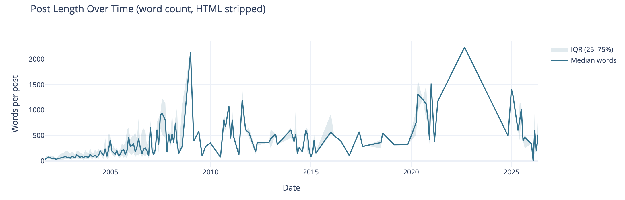
Post length over time also can tell the story of why post volume shifted. I wasn’t posting a lot of short post, but posting longer posts, but less frequently. I’m really curious what I posted in June of 2009 that caused the spike. The spike on the right end in 2020 and beyond are partly attributed to posting weeknotes, which tended to be longer than normal.
I know that my writing muscles went from a few hundred words early on to posts being around 1k and more. I found my comfortable blog post writing length was around 1.2k words. I write to find out and capture what I think, but rarely edit for brevity or other editing benefit, at least on this blog.
Median Categories per Post
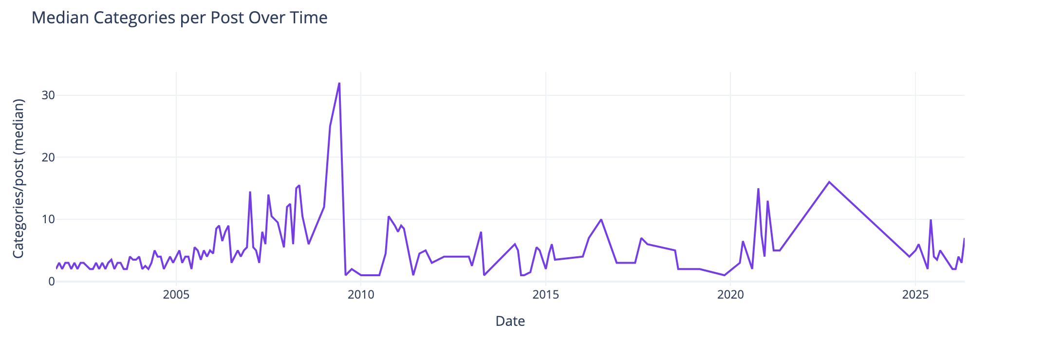
This view of the median number of categories per post over time I found interesting and I didn’t know what my expected outcome was going into this analysis. The numbers pretty much are in line with longer posts have more categories to cover slightly more breadth in a post. Again June 2009, not sure. The spike spike on the right aligns with weeknotes, which cover multiple subjects in one post.
Distribution of Categories per Post
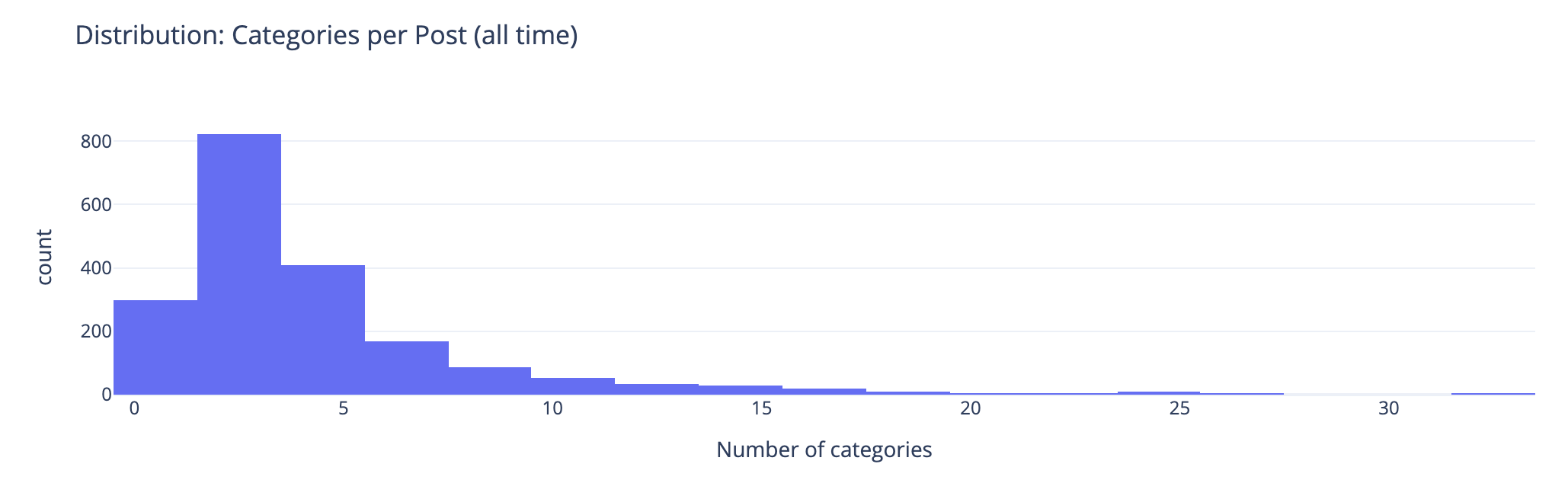
This chart groups number of categories on posts. This shows the second bar has the most number of posts (822 posts) have 2 or 3 categories on the posts. The third bar has 408 posts with 4 or 5 categories on them. This lines up well with the frequency and volume of posts early on which were shorter. Looking at the prior chart most posts had 10 or fewer categories on them.
Combined Timeline for Posts, Length, and median
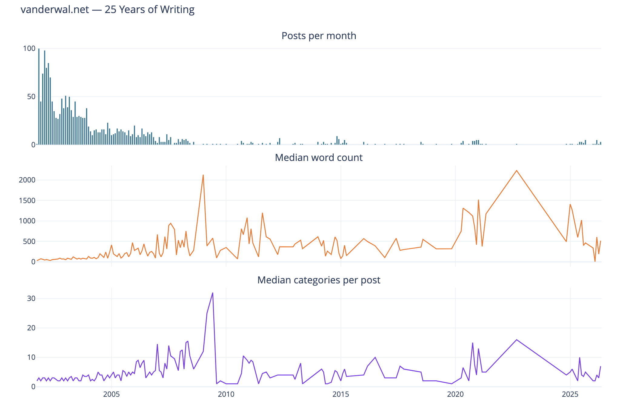
I like this combined chart that reinforces early on with high volume of posts of shorter length and few categories on them. What I find interesting is the correlation of line trends for word count per post and categories per post. This ties closely with the longer posts have more categories.
Seasonal Patterns
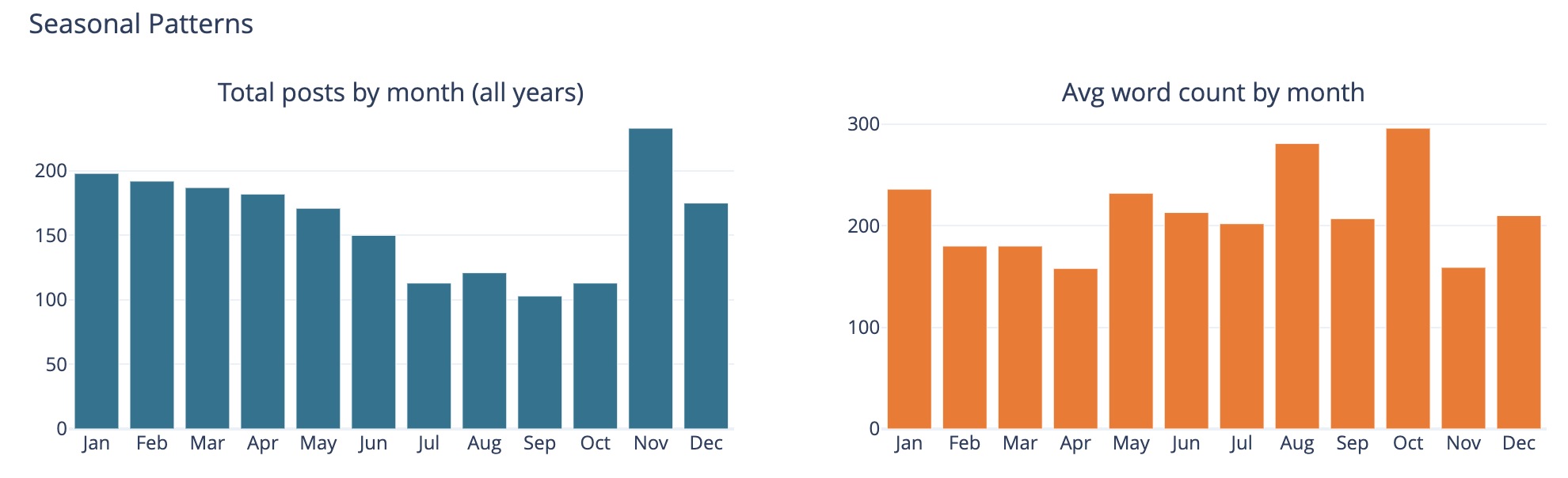
The bar chart on the left is total number of posts by month and on the left it is average word count on posts by month.
This was largely a curiosity to see what was there, but also a common analysis trend analysis to see if there are explanations of other trends looking at seasonal comparisons. The posts by month is not surprising to me as summer and early fall months have often been busy. I am not all that sure what the word count by month tells other than the correlation between more posts and shorter post length correlation showing up.
Top Category Activity Over Time
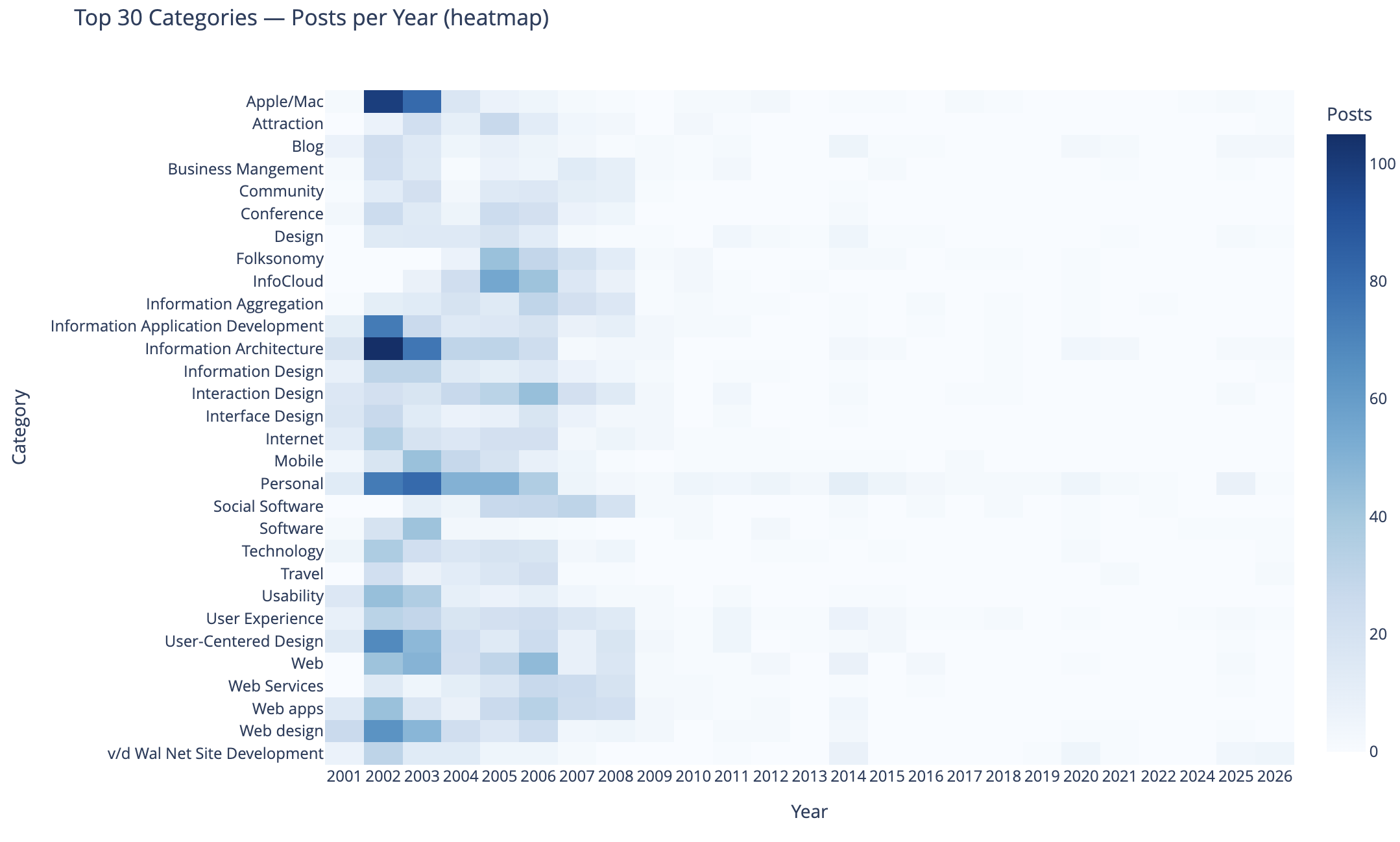
This chart shows the top 30 categories (by use) and their activity over time.
In this heat map Apple categorized posts were sure common, as well as Information Architecture, Information Application Development, Personal, User-Centered Design, and Web Design were also common. Personal and this site’s development.
The heat map being far more dense on the left in early years is skewed by volume of posts and makes activity in the middle and right (more recent years) difficult to see. I need to spend more time on this analysis and chart to separate out the early years and segment things so time outside of the early years can have trends more easily seen. I may want to select a different visualization, but if I can break things out by time that should help. Also running 3 time segements with the same top 30 categories across them and then the top 30 within each time segment could be interesting.
To 40 Co-Occuring Category Pairs
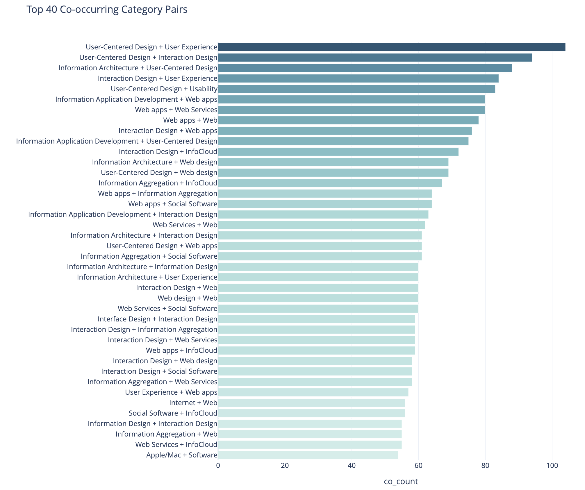
This cart of co-occurring category pairs is in part preparatory work for bringing concurrent tags into the category pages here for understanding and filtering needs for users.
The top 5 pairs are all related to UX, IA, and User-Centered Design and these being the type of concurrence isn’t a surprise to me. The broad UX community had rather divergent use of terms at times and one person’s IA was and other’s UX. For readers who think about these posts in one manner could find other similar content by the term they are familiar with using. Pretty much this whole list is application development, web design and development, web apps, and pan-UX related.
I don’t know how useful this is for broad insights. When I get to adding the concurrent categories on the category pages this will likely be more helpful on a category by category view.
Category Co-occurence Network Graph
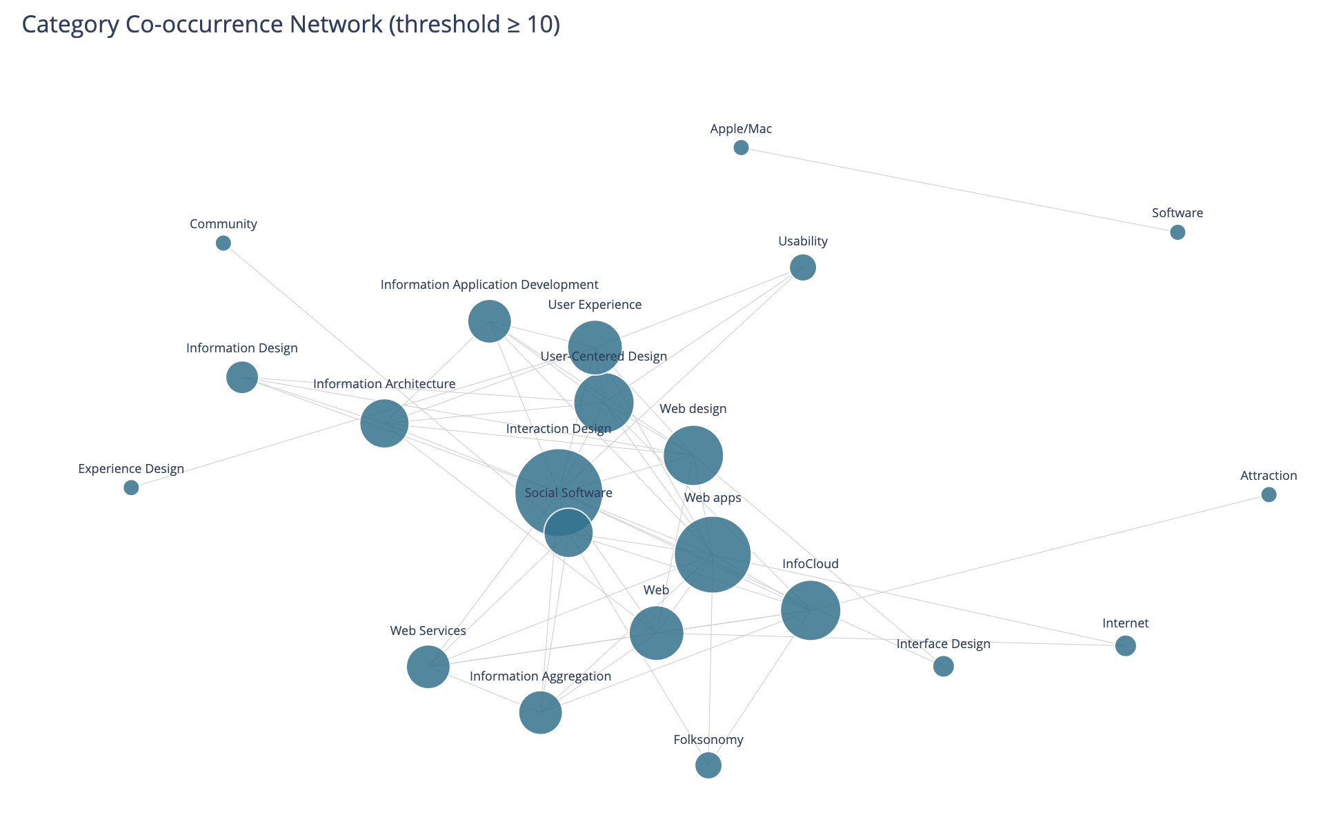
This chart looks at the top thirty categories that have 10 or more co-occurrence of categories.
This I find more interesting than the prior in that this has Social Software and Folksonomy showing up and showing its relationships. The largest category in this view is Interaction Design and its multiple connections. I am entertained by the standalone pairing of Apple and Software, that at the scale limited for the data these only connect to each other.
I need to rerun this with higher acceptance to get more included. But, also this graph isn’t interactive in Jupyter, and every time I went to zoom in it collapsed the graph and I couldn’t move a node out of the way was disappointing.
Helpful as a Good First Pass
This analysis and data visualizations were helpful to see into my 25 years of posts. There are some analysis sets and data visualizations that need more work. Most of these are more helpful with Plotly in Jupyter and the ability to interact with the visualizations.
I am really curious with what this will look like when I look at Twitter usage and notes. Obsidian on top of my notes make note making easier and far more helpful with backlinks / wiki links. I started using it on top of my directory with notes in June 2020 that had around 2k notes in it going back to 2003. Now there are around 6k to 7k and in the past about half of these notes would have been on one of my blogs.
Updated Categories with Sparklines and Search is Now in Production
I made a couple of updates I have long wanted to make to this site. I’ve been wanting to see frequency of categories used on my blog for more than 15 years (or pretty much since I’ve had category list pages). I have also wanted to have blog search and the utter mess that Google Search has become in recent years, where my site isn’t showing at all at times has driven this. These additions will likely iterate and adapt a bit going forward.
Updates to Category Lists with Sparklines
I have basically had two category list pages for years: Category List (which is alphabetical sort) and Category List by Use. I have kept these two and added sparklines to them (Sparkline - Wikipedia). Each line now has a small line chart that covers the 25+ years and what periods had used the category and some sense of the volume of use over time. One category list view I wanted and was missing was one to show a view with the focus of most recently used categories, so there is now a Category Recently Used List that not only groups by most recently used (and in the same entry keeps the alphabetical sort) but also shows the date of the last use in the list. Personally, I have been finding this recently used list view the most helpful and interesting. Skimming through the list I know I have more recent posts that have covered or touched on a subject, but it didn’t include the category, and that becomes a quick task to fix that gap.
Sparklines?
I have been a big fan of sparklines to give quick understanding of data’s distributions at a glance, which I learned about in “recommended reading” of Edward Tufte’s book The Visual Display of Quantitative Information | Edward Tufte in grad school in social / policy quant classes. (There are are many Tufte essays and book annotations on sparklines at Edward Tufte Notebooks & Sketches | Art, Science and Sculpture).
Creating the Sparklines
In creating the sparklines for my category lists I looked initially (and have long looked at them) creating static images from the data and bringing the images in (this would mean updating the images and replacing the old with the new ones, which is relatively straight forward programmatically and something I’ve done in the past, but not optimal) and I also looked at JavaScript but it was a bit slow. I poked at using creating SVGs (which work well when printing or zooming in) and often are much quicker and less strain on a browser than JavaScript. I’ve had a few goes at SVG in the past and I get get my mind around simple shapes, but I would need a little help with sparklines. A couple years back on a sparkline spelunking I found Easy SVG sparklines | Alex Plescan which showed the how. But, I have SVGs somewhat in the same category as regex, which is I do it rarely and I’ll just use Claude Code | Anthropic’s agentic coding system \ Anthropic to assist with the creation.
Chunking the Data for a Sparkline
The other part of sparklines is they are intended to be small glimpses and I have 25+ years of posts and a monthly temporal segmentation would make for a long graphic. I played around with breaking things down to quarters, but in the end I went with two segments per year and roughly 50 data points to map out on a line chart. Running a test with the two data points a year was a reasonable enough glimpse to sort out if the category was used recently or what the variation of use was over time.
One of the interesting discoveries with the first lab run of the categories of sparklines was the rather “U shaped” distribution of the use of categories, which pretty much calls out the lull I had in blogging. This softening of blog post rhythm is something I call, “when Twitter ate my blog” (where the interesting things I would discover and want to share and interact around ended up on Twitter rather than my blog(s)). Other patterns that surfaced were limited use a category in a period when I was rather sure I had posted on the subject, some of this was I was not using the term in that way or I didn’t have the category in my system yet. One of the things that helped sort this out was using my blog search.
Search is Now Out of the Lab
One of the things I have been working on and using my my Lab at vanderwal.net is blog search. But, the modifications I made to the Category pages I found I was leaning on my blog search a fair amount to investigate things. But, the categories and blog search are both in the blog section of this site, so making the change from the lab to the production side made sense. One of the things holding back moving search over, was I had an SVG of a magnifying class in the menu bar with “Blog Search”, but no matter how small I made the image it still was messing with the vertical layout of the menubar. In removing the magnifying glass and just using text things kept to the same layout.
Bringing in Search
The search in the menu in the pages in the blog section with “Off the Top” or “random” in the URL which is where there are currently menubar links to Blog Search. I have the menu bar link to a search page to search from rather than a JavaScript drop down or other menu bar convention (again layout of the menu bar was part of the considerations).
When I was working on search in the Lab section I found I needed to make some modifications to the database to have quicker search and I needed to modify the database engine so I could have search include 3 letter terms as a minimum rather than 4 letter words. In working on search I found many of my early posts didn’t (and still don’t) have titles and I was using the title as the link. I initially thought I would just add titles, but there are around 300 posts that don’t have titles (I’m adding some as I touch the posts for other clean-up issues), but I ended up coding the search results to have the results just fill in “Blog Post #…” as a proxy for a proper title.
The initial 170 or so posts are not in the database and are therefore not in the search.
Bringing Search and Categories In
As I went to move the category list pages out of the lab and into the production side I needed to modify a few other templates and pages to add the updated links. In doing this I realized I could also easily update the menu bar to include “Blog Search”. So, I took a little bit of time and made both changes at the same time.
Not all of the links are in yet. If you see something a little off with category lists or missing blog search links let me know.
Weeknote - 15 March 2026
I thought this week was going to fully turn the corner on a cycle of sinus tears, light infection, better, and then start it over again. It has been messing with sleep and having a clear head. I’m hoping thing are sorted.
Am I back posting weeknotes regularly? I love reading other people’s weeknotes and have a handful of favorites. I also miss getting things of interest shared out somewhat regularly.
Watched
Mission Impossible is Sort of Wachable
The tail end of last week I watched what I thought was the last (latest) installment, Mission: Impossible – Dead Reckoning Part One - Wikipedia. I started watching late and I hadn’t looked at the length before I started. It was decent and enjoyable. I found it to be one of the better of the Mission Impossible series. I really liked the first movie and some along the way I have found to be decent, but some are a slog. I enjoy the travel and some of the film production, but the scripts are think and acting meh (I really am not a fan of Tom Cruise). But this 7th in the series was decent entertainment. As it ended I realized there was the actual “final” installment and given I thought the 7th was enjoyable there may be hope. I was not right, it was a slog with story segments far too long and with that there were logical gaps.
Seven Dials is Rewachable
Later in the week there was a quiet evening and I needed a break and opted for Agatha Christie’s Seven Dials - Wikipedia on Watch Agatha Christie’s Seven Dials | Netflix Official Site. I wasn’t expecting much as one of the Agatha Christie shows that Netflix had done in the last few years was not really watchable. Seven Dials was more than watchable, I found it to be quite good and a good interpretation. The Seven Dials is a Agatha Christie mystery that leans into a serious nod to P. G. Wodehouse, which I found to be well done (as well is something I was in need of). The main characters were really enjoyable.
Work
Search Me
I did a little tweaking around blog search for here, but not fully pulled it into this blog. It is sitting the Search from the Lab for vanderwal.net. I updated the database engine and switched to InnoDB to get search for 3 letter words and larger working.
I then had the issue of old blog entries where I didn’t have a title and the title is what I make linkable from search. I thought I only had a few handfuls of posts that lacked titles, but it was a few hundred. While adding titles is a good background repetitive task, I moved to adding a permalink under the body of the post snippet in the search results, but also added the post ID as a proxy header to give some consistency.
Category Tweaking
Through searching my posts across 25 years I would click to read a post and go to click a category that I believed would take me to other related content, I found I had categories missing. I added in about 5 or 6 categories and went back and searched and added the categories to posts.
Personal InfoCloud Posts
I have a few posts for the Personal InfoCloud site brewing. There are many things I have thought I have posted there over the years that are just written out in my notes and not edited nor posted. I have one I’m reworking a little.
I have also been going back through many Model of Attraction focussed posts and ones around the InfoClouds (Personal, Local, Global, and External) and sorting out what is posted and not. Related is sorting out what posts I have relate to the roughly 100 Complexity Lenses (at the top level - has also used Social Lenses as its main label in the past, but there is so much more in there than social) and the more than 1,500 nodes in all.
I also have a few posts around software development and product development around subjects that people, teams, and organizations seem to be continually missing or tripped up by.
General Posts
I posted the other day about Adding a Museum Category - Off the Top - vanderwal.net in relation to the IndieWeb Carnival - IndieWeb that James is running this month on museum memories - IndieWeb Carnival March 2026: Museum memories | James’ Coffee Blog. When James mentioned this a while back I was thinking I had a couple or small few museum memories I could post, but started a short list. That list turned into more than 30. There may be more than one post for sure. It may be a series or collection (hence added the category). But, I also have some broader theme posts that are growing on the subject.
My blogfodder list is rather long. But, modifications I’ve made to my workflow and blog management process in Obsidian
(I’ve been using it to sit over my nearly 30 years of text and markdown notes for the last 6 years and finding it really valuable) are making it better to get notes moved to blogfodder, and honed enough to post.
Productivity
Going Back to Bartender for Menu Bar Management for a Bit
I’ve been using Ice for my menu bar management on my MacBook Pro M4 since Bartender was sold and became questionable. Ice has not been updated since macOS 26 has been out (I don’t want anything Liquid Glass added) and with many apps getting a bit unstable on macOS 26 (particularly if they convert to Liquid Glass) and I’m trying to get things sorted.
I saw Bartender 6 had some recent updates and listing of changes and are now being more transparent. I also saw a quite reasonable upgrade price so went for a test of it and did the upgrade. It has been good and not all that different from Ice, but it doesn’t have the small bugs Ice had with the hidden menu bar displaying in odd locations under the menu bar.
Grammar Checking
Trying Harper for Grammar Checking
I stumbled onto and have tried Harper: The Private Grammar Checker, a medium capability grammar checker for English. It has an Obsidian plug-in, which I tried. I realized running a grammar checker on my rough notes isn’t a great match for that part of my workflow. It is easy to flip on an off in Obsidian and often notes turn into something more and that is where Harper may provide assistance. Harper is OpenSource and available on GitHub as well, which means I can run it through DeepWiki to get a decent overview of Harper - Automattic/harper - DeepWiki.
Often my writing and planning starts as rough notes in Obsidian. Since everything is in markdown and markdown is great example of Small Apps Loosely Joined where the file can be picked up in various different applications and use the apps to their best. I pick up the note and initial rough pass in iA Writer to flesh things out more. iA Writer has some light grammar checking and in prep sharing the writing out I use Marked 2, which also has some grammar checking. I’ve been looking for something with a little more assistance. I’m going to try Harper in some other of its options.
In grad school I and for long after I used Grammatik as part of WordPerfect and I really liked both and miss both. Grammarly has never fully been a fit for me and with its recent issues it still isn’t going to be part of my consideration. I’m not a fan of AI involved in my writing process.
I Have Webmentions Working
I have had a partial setup for Webmentions for a few years. I have had getting it properly sorted on my to do list for a few years. In the last week ArtLung ~ Joe Crawford was on a call and started asking questions about it and two or three questions and adding one element to my headers completed the cycle. I now have webmentions enabled, but I receive them in my RSS feeds and am not (likely may not) exposing them.
I Have Webmentions Out Going working with Omnibear
A month or two back I joined a call to look at updates and testing for Omnibear, mostly to learn more about it. But, in about an hour i was running Omnibear as an extension in Firefox and I’m authenticating through my Micro.blog account and site as the foundation for sending replies to others through Webmetions. I really like Omnibear as it shows if a site has enabled to receive a webmention and allows comments, bookmarks, and favorites. Having this in the sidebar (well sidebar in my Zen browser where I use it most) is really nice.
2025 Vanderwal.net Backend Modernization is Done
A couple years ago I thought I would update the backend code from PHP 5.6 to PHP 7 and initial progress on it was hindered by time available.
Planning the Modernization Work
A few weeks back I started looking at it again and mapped it out properly like a project. I realized PHP 7 was deprecated and I should really head to PHP 8, so that target was set. I was planning on keeping things relatively simple using a database connection quite similar to what I had used, but digging through PHP 8 books and resources on O’Reilly Learning Platform everything was using a newer more flexible method. After digging further I took the route that would take a bit more work modifying existing code (some going back to 2000 and 2001). But, as I dug into the work I realized I was only needing to modify and modernize about 20% to 30% of code on the pages and templates.
In doing this I also realized my old method of security around the system management backend was no longer working, so it had to be rewritten as well. That meant rebuilding the backend screens. Those updates went live two days ago on the 19th.
With that done it was back to the last third or so of the pages and templates that are public facing. I had already reworked the category output pages and adding pagination to them. No longer will all 121 Folksonomy categorized posts show up on one screen, only 15 at a time will. The “Personal” category has 369 posts (it is a blog so it is about me, you see, but just not all of it).
The RSS feed received a very minor update to RSS 0.92 to keep in line with many of the OG methods that remain.
The Actual Homepage has been Restructured
The homepage for vanderwal.net has been restructured to make it easier to find information that isn’t directly in the blog and I get emails and DMs about somewhat regularly. Moving it to two columns helped this. I do need to modify this to flex or grid CSS model as tweaking the layout was rather tedious.
This Modernization was like Changing the Plumbing and Wiring in a Building
This modernization was like bringing the plumbing and wiring of a building up to new building code. The walls and structure are all pretty much the same. The top layer stays the same for now.
This modernization does allow me to hopefully finish setting up webmentions, which I’ve had partly wired since around 2021 or so. I just need the last piece to that to work. There are also other IndieWeb related updates I’m planning on making and have been waiting to get this code updated before modifying and adding them into place. By the way, if you are running your own site and/or blog, the IndieWeb community has a gem. There are a lot of resources in their wiki and pages helping anybody with their own site.
The pagination for the blog is likely going to change from a date with month focussed pagination to a page model with the oldest selection being page 1. The archive page will get a long over due update so it doesn’t stop at 2003 (looks at calendar, yep it is out of date). I’m hoping to have an archive page that shows activity, but also addresses the different post types (essay, journal, and weblog) that only lasted the first few years, but also around the 2014 code update and site move the entry type template went missing.
The category listings pages will also likely get an update and the category page may likely get some ease of moving through the posts over time, beyond general pagination.
Assistance with the Update
This being 2025 the question pops up if and how I was using generative AI as part of this. I was using Claude.ai from Anthropic with some initial questions, then I’d head to O’Reilly’s resources to validate them and learn what I needed to know (it had been about 10 years since I was knee deep into PHP). When coding and modernizing the pages and templates I’d and hit defects I’d run those past Claude to sort out what the issue may be (sometimes missing “;”, others the new query wrapper and parsing method caused me to miss something, or I had deprecated code I hadn’t converted). Claude would point out my errors and instruct me how to correct it. Sometimes it would offer a few options for approaches (some were not quite right and others were good and I needed to select a path - after verifying and learning about them further). It also would crank out code. I gave Claude instructions not to bother with large chunks of my pages and code, which it left alone.
I use Claude stand alone and used is Project function to keep things focussed. I fed it the outlines and high level task areas I have in GitHub and Obsidian and it was keeping track of what was accomplished and how the work met the goals. The most impressive thing, compared to other generative AI options is it was very strict with identifying things not viable in PHP 8 (and its iterative versions) as nothing else did this well. Claude also had the code of pages and templates I had worked on and would point out I was using a structure and method in other page and ask if I shouldn’t use that practice on the page I just fed it to sort out some defect I was working through. My code has had four or more iterations over the 25 years and my early coding wasn’t so hot and still remained. Claude helped my code get more consistent, not by it fixing it, but pointing out I had something good and modern and I should keep consistent with that. By the last couple of templates I didn’t need to have Claude check them as they worked with my own editing, but I still fed them in as it seems to help improve suggestions and catching lack of consistency of my own doing.
A year ago I tried this with OpenAI and its ChatGPT and it was a hot mess. It couldn’t keep PHP versions correct. I try it with every update and I find it really problematic and what it outputs (code and other attempts) as nothing better than mediocre and often not correct.
IDE Use
In the last 10 to 15 years the IDE I’ve used to code and work on vanderwal.net has been from Panic and either Coda or now Nova, which have worked well. I have kept a good firewall between AI assistance and the IDE. I don’t mind type ahead suggestions. But, finding deprecated code to address was something I was going to need. Some friends suggested I try PhpStorm by JetBrains, which seemed good as I’ve used PyCharm a few times in the past and really enjoyed it. I knew I didn’t want VS Code near this, as I’ve pretty much had it with VS Code (I mostly use it with Python for data analytics) due to plug-in issues and lack of ease keeping projects separated.
I picked-up a trial of PHPStorm and after a day or so I had the hang of a good portion of what I needed to do. My favorite part is the setting the exact version of PHP you are working with. It highlights where there are errors and problems. In the last couple of days as I finally was getting the hang of PHP 8 and the methods I was regularly using PHPStorm was helping with type ahead suggestions (there were a few times where I accidentally triggered them when I didn’t want them and nearly turned of that functionality - control Z is your friend). PHPStorm also can make use of GitHub CoPilot, which I don’t find helpful with OpenAI connected to it, but is better with Claude Sonnet. The downside with CoPilot is it doesn’t have access to the Project space in Claude I’ve been working with and therefore its suggestions are less on target - CoPilot with Claude is light years better for PHP than OpenAI offerings). Essentially I didn’t use the incorporated genAI functionality and I was very happy with that setup.
Posting Ease
One of the things I’m looking forward to are slightly better methods for posting to this site and managing posts. Many of the steps beyond creating and posting are manual steps, like kicking off creation of the RSS feed (I do that after a quick review of the created post as it is live, I kick the RSS feed after that review). The alerting the media, or the alerts beyond basic RSS, is also a manual step done after that review. I may automate the combination of those two kicks after a review.
The 8 Questions Answered in the Blog Questions Challenge
It has been a while since I’ve regularly blogged. I’m still writing a lot, but it is going into notes, and I need to get those back shared out. It used to be things I now put in notes, I just posted online (this sort of gets to the first question). I saw Joe Crawford answer these eight questions on his blog - ArtLung: Blog Questions Challenge ~ 16 Jan 2025. This seems like it would be a great thing to get the writing and workflow to post muscles functioning again.
1. Why did you make the blog in the first place?
I had some odd notes in HTML markup, mostly to myself, that I had posted before I started blogging. They were just HTML files roughly linked in a web directory. On this site I’ve had my links running as an HTML page since 1995, which is a couple years before I had my own domain.
In the web development community in the 1999 and 2000 I was reading sites that had become blogs. It was late 2000 when I was playing around with Blogger, mostly as a means to share links between home and work (this is what my FTP HTML files to my web directory was doing). In very late 2000 I made my first post in Blogger tied to this website. It worked on an FTP model as well at that point, but when I travelled hotels would block FTP from their hotel networks. I wrote a travel note system in PHP that allowed me to capture ideas, links, and notes. When I would get home I would introduce them back into Blogger. The travel notes turned into a CMS at work (I had been regularly rolling CMSes for work life for a few years).
2. Why did you choose to write your own blogging software?
I started with Blogger, but quickly was writing my own CMS for when I travelled. But, what I really wanted was the multiple categories added to blog posts that Grey Matter blogging software (Greymatter (software) - Wikipedia) had that Noah Gray created. I didn’t have an interest in going back to Perl as I had moved to PHP for easier development and having it be more readable code. So, I turned my Travel Notes I wrote in PHP into a more full fledged blogging tool. In Spring or Summer of 2001 I moved fully to my own hand written blogging software and It had stayed there. I still has functionality missing that I’ve long wanted to add.
I’ve updated the underlying code when I move hosts and I need to update the PHP to a newer version (I’m currently in the midst of doing that and hope by May to have that done, if not much sooner).
3. Have you blogged on other platforms before?
My Personal InfoCloud blog started on TypePad in 2005 (I had it on MovableType for a short bit, but Perl was rusty for me and I shifted to TypePad). Around 2012 that moved to SquareSpace and I’m in the midst of moving that to self-hosted WordPress. The PIC blog I just wanted to write and post, where as vanderwal.net I was fine messing with the underpinnings. I’ve setup and run a few WordPress sites. I helped get Home - Boxes and Arrows on MovableType, before MT was publicly available (Jay Allen ended up doing a lot of the heavy lifting as my worklife got very busy). Today I use Micro.blog very lightly and I need to sort out what I’m going to do with that.
4. Do you write your posts directly in the editor or in another software?
When I started blogging on this site I write in Bare Bones Software | BBEdit 15 in text, then would hand code the HTML and copy and paste that into the form, add in the title, location, type of post, and click categories to add. Around 2010 I shifted to Markdown in various Markdown editors. When the app Marked came out I started dragging the Markdown file to Marked and it would convert to clean HTML and I would check it, copy and past in to my system.
The since around 2010 or 2011 I’ve used iA Writer: The Benchmark of Markdown Writing Apps to write my blog content in Markdown. I have used Marked 2 to convert to HTML for this blog since it came out. The remainder of the workflow is to post into the CMS, it returns a blog post link, which I check through. If edits are needed I edit in Markdown, drag to Marked 2, drop in the test again for the post, and submit. If it is good, I go back to the CMS management screen and click to update the RSS feed. Then go to a push the notification something is posted to a ping service (it used to have 20+ options and now it is 2 or 3 I think).
5. When do you feel most inspired to write?
Most days I write thoughts I’ve been mulling as I wake. I capture links of interest I’ve read and write about those through out the day. In the evening I try to clear out open tabs and capture links then.
Sadly, in the last 4.5 years, since I’ve had Obsidian I just write in Markdown in there in a Daily Dump structure note template I have. Those all sit in the same directory as the Markdown for blog posts, as they are all notes.
I really need to get back in the habit of posting, at least a weeknote, if not more regularly. I have a long stack of writing to hone and post into Personal InfoCloud (more than 80 “blogfodder” items in a list for there - my past job didn’t take kindly to blogging, so I’ve held on to a lot of writing that just needs to get out).
6. Do you publish immediately after writing or do you let it simmer a bit as a draft?
Here on vanderwal.net in the Off the Top blog, it is pretty much what it says on the tin. As it is written it is posted. I’ve been trying to edit a bit more to fix missing letters, missing words, and making shorter sentences (that last bit becomes a rabbit hole), but mostly it goes out as I hit the last period. Marked 2 does some grammar checking and other lightweight edit helping, but not much more than that goes in to it.
7. Your favorite post on your blog?
Most posts I forget I’ve written once posted. The act of writing and posting clears them from my head, which is part of why I blog - so to clear my mind for other things. But, I think my favorite isn’t in the actual blog but adjacent to it, Model of Attraction - First Draft :: vanderwal.net, which is a brain dump while on a flight after the inkling of the idea for it was seeded. It was going to go into the Off the Top blog, but I set it apart as a draft. There are many posts I’ve written about attraction since that time -Attraction :: Off the Top :: vanderwal.net. The Model of Attraction is the underlying foundation for a lot of approaches to thinking through and assessing things technical, social (along with grad degree with deep social sciences and analytic / quant).
8. Any future plans for your blog? Maybe a redesign, changing the tag system, etc.?
I am in the midst of updating the PHP on the back end to bring the site’s code current. Once that is done I really need to add pagination to categories, a better previous and next navigation, calendar / chronology focus display of posts, and site search. I’ve also long wanted to have concurrent category views, say “folksonomy” and “data visualization” for better .
The other thing I really am wanting to do is to have a Digital Garden section shared out, like Maggie Appleton lays out here A Brief History & Ethos of the Digital Garden and does on her site, or as Tom Critchlow has been tending to on his site - Tom Critchlow. Move. Think. Create..
Weeknote - 31 January 2021
This seemed like a really quick week. A lot of digging on things on the work side of things.
Read
A Day in the Life of Your Data from Apple is quite well done. The audience for it is more developers than the general public, but it can be a good handbook for them as well. Apple released this to help developers and application owners understand the impact the actions with data have on their users.
–
It was great to read M.G. Siglar writes about location-based service Gowalla coming back to life, which was one of my favorite apps and used for location based service and recommendations. The t-shirt I got for them was adopted about 10 years ago as a night shirt and he still wears it. I’m happy he may get to understand Gowalla is and use it.
Listened
I used one of the Apple Music algo playlists “Pure Chill” to find some calming background music for work stumbled upon Zimmer’s self-named album Zimmer and the song Rey which I really liked, as it starts some with a light rhythm that builds a little bit, but in a way that it feels like a rising wave of deep emotion. It wasn’t work music (the rest of the album works rather well for that, and yet I’m pulling together this weeknote to it on loop just fine), but it was an amazing piece that washes over you. I don’t remember a song doing that before.
–
I really enjoyed 99% Invisible’s Beneath the Skyway episode about the skyways in Minneapolis. Seattle and Spokane had skyways when I was a kid, but not an abundance, and they were deeply fascinating. Visiting Chicago, I found they had even more around Wacker Drive, then there are the underground path systems in Montreal and Toronto which are massive. But, learning about what Minneapolis’ skyway did to street traffic, the downtown use patters, but also who it included and shunned was a really good perspective.
–
I was entertained and sent into a some deep thinking for a day or two from Postlight Podcast - Are Conspiracy Theories Just Bad Theories With Good UX?.
–
Today (I normally don’t include the Sunday I’m pulling together weeknotes in the weeknote, but it was too good to push a week) I was listening to Jorge Arango’s The Informed Life - Kourosh Dini on DEVONthink podcast. I’ve pushed the meat of this down to the Productivity section below.
Food
Sunday steak and eggs is getting to be something of a ritual. Steak isn’t exactly the right term as it could be different cuts of beef, like: tri tip, hangar steak, strip steak, flank steak, etc. They are relatively inexpensive cuts just salted, garlic granules, and pepper, seared in a cast iron pan to medium rare (so 3 to 4 minutes a side) and taken out to rest and slice against the grain. Often some sliced or large diced shitake mushrooms are added to the pan with a little salt to cook down and get a little meaty just before I add the beef. After the beef is out, the pan deglazed with a healthy dose of red wine (Cote du Rhone has been the favorite go to if on hand) and a table spoon or two of Dijon (Trader Joe’s is a fav) mustard are added and the pan scrapped down and tipped to put a corner / side of the pan over the flame to reduce. The sliced beef is plated and thee sauce put over and a eggs quickly scrambled in a non-stick pan for large curd with chopsticks or spatula. Then my son and I just enjoy.
Productivity
I’ve long been a fan / follower of Kourosh Dini’s workflow models, as his OmniFocus tips and tricks changed how I used it for a long time (I’m not using OmniFocus at the moment, which is a longer discussion and nothing really to do with OmniFocus). I’ve started following Kourosh’s work around note taking flows and his are close to what I’ve been doing and tweaking where I use DevonThink (DT) to search and build connections. I’ve used DT for more than 15 years now and scarily all in one database. But, my use of tags with DT is light its search and AI driven search is so good normal use of tags isn’t quite needed, but I tag with project context (writing piece I’m using it in or for, as well as work project collection used in), author, source (if those two are highly relevant and not called out in the pieces well), and tag terms used that are not in the piece. The tagging is more meta as it is about construct of use for refinding in that context. But, I don’t take notes in DT, I point DT to where my notes are and index that location with DT or sometimes feed it in, but always keep the notes in their grouping.
–
This week another IA and long time productivity cohort, Austin Govella dug into note taking and particularly evergreen notes. There are some interesting things in this and some really good links in it. I am still teasing this one apart and may post something mid-week or later.
Weeknote - 10 January 2021
The first week back at work after a 10 day break was going well, other than a continual battle with my work computer that had a battery bulge that started six months ago and slowly turned into throttling, slow cursor and slow recognition of keystrokes at times, and regular crashes. The long replacement / fix cycle is pure Covid impact. After on Friday 5pm my refresh the laptop arrived, it felt like I got half my brain back spending time getting it setup (that process is still underway).
But, the insurrection actions to take over the U.S. Capitol took the focus of the week. Work Thursday and Friday was a welcome distraction, but lack of sleep and a computer doing its best to die made them not overly productive. I never thought I would see the U.S. foundations attacked in such a brutal way. Large mobs fed by outright lies trying to keep Congress from doing what the Constitution requires them to do is years and decades in the making. Chants to execute the Vice President because he said he couldn’t do what there is no legal path for him to do is beyond excuse. Attacking the the monuments to the democracy, but also attacking the Constitution and what it has laid out to protect the U.S. democracy is pure insurrection. This is a true wicked problem that is a tightly wound gordian knot of complexity. Having leader still sitting in office that supported the insurrection and the lies that created its actions is beyond me. They are sitting in seats and elected bodies they don’t believe in and want to destroy and want to run a country with a Constitution they want to destroy.
Read
Friends shared the Rijksmuseum’s now offering high resolution images of their collection, which are stunning.
I restumbled upon SPACE10, which I used to follow but the RSS feed seem to have broken, but some of their long pieces (which is many of them) are not structured well for a long read and they have the scroll bar in the browser turned off to know roughly how far along you are in a long piece, and there are no anchors in the long pieces to link to sections of relevance. It is a really not well conceived site for people thinking about architecture and a structured world.
That said, their piece on The Digital in Architecture: Then, Now and in the Future is rather good, it reminds me of a collection of presentations on information architecture from some of the top information architects from around 2003 to 2015 or so. The piece also has a good bibliography, but nothing is linked (I’m really not sure they understand what they are doing with the web, but they content is interesting and that is likely why I pushed it off my radar in the past).
Team Topologies: Organizing Business and Technology Teams for fast Flow by Matthew Skelton and Manuel Pais finally arrived. This looks much better than what I had thought it was and may dig into it over the weekend. I picked it up to gut around the topic of teams and optimizing them, particularly around adaptive teams. I a lot of experience with building and running teams and team ecosystems in large organization and bringing helping them be modern and breaking out of the command and control as well as chain of command model non-digital companies lean on (which destroy capabilities and efficiencies and mostly died out in the early 2000s except for the dinosaur companies - for more than 20 years I’ve flipped that models and been able to vastly improve every important metric). I haven’t found good books on teams that echo not only the experiences I’ve had and have consulted others on, but ones I see as prevalent in most of the high performing companies that work the same way. I know Team Topologies is more focussed on DevOps / developer / engineering models, but some underlying foundations for improving my framing of things is what I’m looking to get out of it. There are some things I don’t fully agree with and I regularly see as problematic that are listed in headings, but I don’t know their take. What I do know is a lot of the reference materials they point to are ones I’ve long used and have in my foundations as they echo experiences and things I’ve seen in practice that are really good (I love well documented books, particularly ones that use solid references that hold up with time).
Also arrived is a used version of Paul Madonna’s Everything is its own reward, which is a book of his monochrome watercolor and sketches of San Francisco. It is wonderful and takes me back to a San Francisco I deeply miss and loved. Even though it was used, but still had the poster piece tucked into its back cover sleeve. This poster is a wonderful edition.
Watched
News…
Listened
New to me band, Her, fit the mood early in the week and I’ve added them to easy access in some playlists.
Exponent - Episode 191: Facebook, Twitter, and Trump was a good conversation that was a bit out of sync, but good from a thinking and considering the situation piece.
Postlight Podcast - WordPress and Beyond: With Matt Mullenweg was really good, as expected. Some of the side discussion that started Paul Ford thinking, really have me intrigued. I’m needing to go back and track these down.
I had A.J. Croce’s A.J. Croce album on and had forgotten how good it really is. It is so well recorded and produced as on decent headphones or sound system it sounds like you are in the room with them. This was the in the soundtrack of the cross country drive with my dad in 1993. But, even with those wonderful memories I’ve always loved this album as there is so much good music in it and the lyrics are really good with nice turns of phrase.
Productivity
I’ve gone back to a practice of daily notes (the daily dump) in Obsidian / markdown that helps keep track of thoughts. It is similar to the sections I have for the weeknote template, but include: Thoughts, read, talked to, health, watched, listened to, worked on (personal items - I haven’t kept a daily work journal in a long while, but have daily meeting notes I keep in my work environment), learned, ate, bought, added to wishlist. These last two are to keep track of why.
One of the things I’m trying to sort through in my notes, research, and writing process workflow that I’m doing between just the daily notes and weeknotes is a microcosm of my regular workflows for writing (which I’m getting back to). My notes sit in directories in markdown files that are now in Dropbox for mobile device access and Obsidian sits on top of them linking things together and all is searchable in spotlight and DevonThink Indexes it. My writing is now in iA Writer, which works best with iCloud directories, which can be searched by Spotlight, but is outside Obsidian and outside DevonThink.
I sometimes start writing in iA Writer, but they may be: Just a stub, more fleshed out but still a draft, mostly finished but not posted / published, or posted / published. I have many pieces from mid-summer around the Black Lives Matter protests after George Floyd was murdered, which really moved me, but they weren’t finished or posted. Weeknotes ran into multi-week notes, then into just idle and start from scratch. There are things I know I have written I want to point to, but they aren’t shared out (this is a common issue). I finally created a quick template for marking the state at the bottom of a piece in progress. But, this isn’t helping sort through my central repository in Obsidian where searching across that collection and interlinking to pull things closer.
I’ve swapped through a bunch of writing apps and at the moment I have no interest in moving off iA Writer as I really like it. There are some things I need to investigate for some writing coming (footnotes, tables, and possibly integration with Grammarly as I need to get back into good writing patterns and practices). In the past my long or focussed writing was in Scrivener, which I still love, but its treatment of markdown as second class citizen, which made it difficult to have a smooth workflow with for publishing to the web. I used Ulysses for a short while, but its own structures and not freely available markdown files made it not work well at all in my workflows. There is a lot I really like with Ulysses and Scrivener with notes and note management, but easy working across devices isn’t as smooth as iA Writer nor as smooth as the workflow that is easy with freely available markdown files.
Weeknote - 3 January 2021
Happy 309th day of March in the Year of Covid and welcome to the first weeknote of the year here. Having a work break since Christmas Eve has been fantastic. But, it took me about seven days to get into the swing of the break and put behind things that weren’t part of the break. This being the turn of the year many of the news and media outlets, as well as many of my favorite blogs still running were posting their year end wrap-ups and I really enjoy reading those, particularly for books, things to watch, music, and ideas to explore.
This week I stumbled onto a new podcast that is a gem for me, but also in digging through ideas, links, and related exploration to the podcast I stumbled upon one of my own posts from 2006 about technisocial architect, which still hits at an awful lot of my approach and where I’m really happy focussing (that across multiple domains with depth in beyond generalist depth, but aiming toward a polymath depth). The labelling of people with multiple depths and expertise and to this day still bugs me as old style business that haven’t modernized think in one dimensional people and most often have no understanding how to use people with serious depth (they mostly just leave to go to places that know what to do with then and respect them) and really are lost with people with multiple deep dimensions. I’ve been back to pulling others like this together as really missing them and the conversations the freely spin across different domains and open opportunities to explore adjacent ideas.
A wifi hub going south (the end of my Apple AirPorts) meant switching to something different and was concerned with lack of ease of use, but was pleasantly surprised. Having WiFi 6 seems to have improve the odd drops we’ve been having and able to set priority for devices. The odd blind spots for wifi now seem to be gone as well.
Read
I’ve been reading across a bunch of new additions as well as going back through some books and gutting them for some idea spelunking related to the Near Future Lab podcast and newsletters (see below). The Near Future Lab newsletter has been a good find and the breadth of things it is covering with some depth has been triggering some pulling together quite a few things I’ve put in notes and tucked away over the last 15 to 20 years. Relatedly, I’ve had David Epstein’s Range: Why Generalists Triumph in a Specialized World out and gutting it, particularly around polymath, which Epstein has a good framing of, which I find far more helpful than the generalists, which is more of a deep generalist.
Book sales and gift cards have been adding to the stacks near the sofa during break, as well as targeted reading and gutting on subjects to flesh out some things in my notes (Obsidian has been great for showing gaps as I pulled in a couple of the blogfodder tagged notes and blogfodder lists).
One fiction book I picked and read the first chapter has me deeply enthralled is Richard Powers’ The Overstory: A Novel and was amazed with the beauty of it. It was like each word was a gem and each sentence a finely crafted bracelet or necklace. After two or three pages I was wondering if this would keep it up for the chapter, and it pretty much did. It has been a long while since I’ve read something this well crafted with language. I’ve been back reading poetry a little bit, but long for narrative this well crafted is a lot of work and I’m really impressed. But, with Overstory I’m also drawn by the story.
The end of this week I’ve been trying to catch-up with past [Near Future Lab Newsletters] as well as Jorge Arango’s writing and links (from the past few weeks). So much good fodder in these.
The “best of…” books I picked up and started reading a little bit, have not only been a source of good works in them, but I noticed the “other notable…” lists in the back of the books, which have been really good. These additional works mentioned have not only provided good pieces of interest to track down, but publications and sites that I’m now adding to my follow list. The last two or three years I’ve seen a lot of regular sources stop publishing and / or shut, which is problematic. There is a lot of fracturing and splintering of media recently. Most media is only as good as their individual contributors (which is the same as many things including analysts, contracting, consulting, etc.) and the really good individuals now have the capability to run things themselves or group with other strong individuals to build a good strong focused resource.
Watched
Early in the week I found myself watching downhill skiing, which I used to love watching as a kid. Not having Olympics this year has me wanting more skiing to watch and other winter sports (yes, I know it is a Summer Olympics year put on hold, but still).
Listened
One of my favorite sources for inspiration over the last 10+ years has been the Near Future Lab and this week they started a podcast (it is found linked in their 4th edition of their new newsletter Design Fiction newsletter - Design Fiction and the Optimistic Contrarian)and the first one is a pure gem for me. It is a discussion between Julian Bleeker, Fabien Girardin, and Nicholas Nova of the Near Future Lab. The focus is on what Giradin calls ambidexterity, or the switching of tasks and focus between domains and practice area. Julian maps that to what has been his favorite book of 2020, David Epstein’s Range, which is about the success of the generalist. This isn’t quiet your thin thinking generalists, but deeply curious multi-disciplinary generalist that go deep in across many domains and can deeply think (scientifically and exploratorily) as well as do. It is polymath as deep thinker and doer. The type of person who keep pursuing things to where there is boredom or able to hand it off to others. These folks are the ones who can easily have discussions with experts and leave the experts with new thinking and understandings beyond what they new prior.
Realizing Tidal added a ton of new music that is MQA wrapped from their Warner Music Group, I’be been rebuilding some play lists with the “master” version and listening as well. Along these lines I’m finding something is going on in Apple Music as a lot of their catalog is sounding much better running through a DAC on decent headphones (also finding Apple Music stopped scrobbling to Last.fm in December and I can’t get it functioning again, but Tidal still works).
Play
I was thinking I would play and finish Ghosts of Tsushima over break, but a discount on 2K21 made that the gaming focus. I’m a bit surprised with 2k21 as it isn’t as painful to play as it normally is with their “create a character” mode, but the GM mode is still as odd as it was last version. The storyline in the crate a character mode really wasn’t painful and felt more playable than usual and no annoying out of left field diversion thrown in.
Productivity
Obsidian has been getting a workout this week. I still need to sort out linking blocks, but I spent much of my time dumping in notes and connecting things. I need to sort out my workflow for writing, which is currently mostly done in iA Writer and that saves best for remote use in iCloud and my notes for Obsidian are in Dropbox. I need to work out a workflow for how to better handle this. One of the things I did this week was add a snippet for TextExpander for my existing blogfodder notes that were tagged in NValt. The snippet has the state for blogfodder to note if it is a stub, draft, done and not posted, and posted with a link to where it is posted. That would work to copy completed and posted pieces I’ve worked on in iA Writer, but need to sort out how to make that smooth.
Weeknote - 15 November 2020
Happy 260th day of March in the Year of Covid.
The wonders of smell. Not from the lack of smell from Covid–19, but the muted smells from wearing a mask. Losing a sense seems like a great tragedy, be it hearing or sight. But the senses don’t stop there, as we have touch - which seems like it would be detrimental to lose yet that is what happens when someone becomes paralyzed. Taste, I’m realizing is an odd one, as it is so heavily intertwingled with smell that it isn’t fully clear what would be lost.
It is the muted smells and the temporary loss of smells that has me in awe from wearing masks (other than it is God’s way of reminding you that you didn’t brush your teeth). Taking off one’s mask when outside is something magical. The muted sense of smell from wearing a mask, becomes magical when taking it down or taking it off getting a solid direct nose full of the wonderful world around. The background scents that go un-fully noticed on walks of trees, freshly wet pavement, a car engine cooling, all the different flowers and plants, the creek that has filled or when it is drier than usual, fires in fireplaces, and wafts of food being prepared. Taking off one’s mask when nobody is around, or just lowering it is like a firework show finale with all the scents hitting full saturation at once. It is a bit magical. Yet, within a few minutes the smells fade into the background and seem difficult to pull out of the air unless masked again, which does happen. The one scent I don’t find all that magical is vehicle exhaust, which I’m finding is one smell that really lasts. I’ve never noticed it before Covid times, but it is sure present now.
Thanks to Covid–19 and one of its traits of infection can be the loss of scent, one of the first things I do each day after waking is smell things. I smell the back of my hands, fingers, and wrist and then wash my face and hands and smell. Every morning I am relieved that I can smell.
Related, I restumbled upon Monocle’s “The secret to putting on perfume” video that focusses on scent and the use of it as a personal layer of attire, as in scenting for the occasion or work role or environment.
Watched
I finished up Season 3 of The Crown on Netflix so I’m good to start Season 4. I’m utterly impressed with the story telling and film work. The stories don’t seem to fully hew to what I remember reading and hearing retold, but I’m fine with that. I’ve really liked the crafting and developing of characters.
This week I also have been watching some recent and older Monocle Videos, which some seem to be fully Monocle productions and some are Gestalten produced with Monocle. What strikes me is how well they are made as the color grading, edits, cuts, transitions, and tempo are all well done, but they also all are similar going back years to older Monocle videos.
I was good to watch a Netherlands win today over BIH, as they have been a bit lifeless scoring under the new coach. There may be hope.
Listened
I found the 1998 Grace Jones album Private Life: The Compass Point Sessions, which has an 8 minute version of “Slave to the Rhythm”, which is a Hot Blooded Version mix. This song brings back a lot of memories of college, nights out in San Francisco, living in England, and wandering Paris. The odd thing is I didn’t own Island Life the album the original version was on, nor have it on mix tapes. It was ambient life sound track. I have some music that I owned and had on tape and I can tell you the shoes, socks, coat, and places quite vividly when I hear that music. Slave to the Rhythm always seemed to be background soundtrack to some wonderful times and this 8 minute version, which is largely instrumental fills to get to 8 minutes is the perfect background for running errands after the sun has gone down.
Food
This weekend’s grocery errands had a bit of focus on Thanksgiving, as far as sorting out what is stocked and where. With my county back down to Level 1 Covid reopening stores are down to 25% capacity and counting the number of customers in the store and lines starting again.
The weather turned a little bit cooler so made a pot of chili (beef and black bean) that was quite dense, but also really good. My son went through two bowls and it was gone in 3.5 bowls.
Play
A couple days after work I took some time to play through a bit more of Ghosts of Tsushima. I am still amazed withe the scenery and I’m looking forward to being done and just wandering the open map.
Productivity
I’ve been reworking how I’m going to handle blogfodder in Obsidian notes, which start as a link to a piece from someone or some other source. I have been keeping a list in notes, but that was one of the things that I had reworked and been keeping it in an outline, just a tag one note files, and a link on the source in Pinboard. I started a blog fodder note file that links to the source, person, and a note page for what could follow. These may turn into mid-week posts as the notes seems to be turning into 50% to 75% done responses.
Weeknote - 25 October 2020
I’m returning back to something I read a bit ago from Matt Webb about getting back into a habit for blogging again. Matt’s posting about 15 rules for blogging, and my current streak is one that really struck home as I’m trying to get back to a regular writing habit, here and elsewhere. Matt’s idea for one idea per post is the old school way of knocking out quick short notes on one topic for reference for one’s self, but also sharing out for others by default. The weeknote model runs a bit counter to this, but trying to get back to a habit of capturing things and trying to get to a schedule helps get things moving again. Matt’s post is more than worth your time.
The week was heavily focussed on the work front as trying doing work that could really benefit from a good innovation space with large whiteboard and to include teammates to think and work through the flows and integrated systems. I’ve been working through a solutions to a gap that makes some easy solutions not viable due to compliance and needing to craft for a large enterprise and the constraints and diversity of needs. The start to the solution came about about 3 weeks ago and trying to work through a solution for one piece of it that would remove a lot of manual work that has a lot of opportunity for error as it scales and scope increases. Getting he foundations right is key, but I think we will have a good solution. Working through permeations of scenarios and modifications coming from vendors was a good chunk of working with large logic puzzles, but the foundation should be good. Now to work on workflows and interactions for it, or at least the first step and a solid system of record for these. I love this type of work, but it is much more sane with a good sized room, large whiteboard and stickynotes, and a few others to work through permeations and potential missing manhole covers that are created when the goal is seeing them and resolving them.
Early voting starts this week and trying to sort out when I can fit that in. While today (Sunday) was eerily quiet, which could be the cold snap or Covid cases spiking at its worst everywhere around the U.S. and people playing safe, I don’t expect that quiet to last for the week.
Read
A really quiet week on the reading front. I have some things to read this next week for a quick review that I am really looking forward to.
Watched
I sort of stumbled onto starting the Finnish crime drama, Deadwind that is on Netflix. I have only watched one episode, but I think I will stick with it. I thought it was a different series, but it has me interested.
One of the things that had me intrigued is not so much the show, but it is in Finnish. I haven’t listened to a lot of Finnish as an adult and its spoken and linguistic patterns are well outside of any language I have a passing understanding of. I was reading the closed captions and trying to pull out some words that could work as way in, but that was tough. I also realized I really liked the cinematography and focussing on closed captions and thinking about language structure was a bit in the way of what had drawn me in.
Listened
Over the past year I’ve become a fan of Rick Beato’s YouTube channel and I stumbled onto his break down of Peter Gabriel’s In Your Eyes in the episode What Makes This Song Great? Ep.27 Peter Gabriel. There is so much more to this song and with Rick had taken another 30 minutes to dig into that.
Productivity
I’ve been using Obsidian more and a release that should hit those with early access and allowing block addressability really looks good. I’m finding with what Obsidian offers I’m able to really get a lot of crosswalks between ideas, sources, authors / creators, and structures that I just didn’t have access to before. Already it feels a bit like I have a James Burke far transfer method in the works that is part of the structure of his Connections series.
Weeknote - 18 October 2020
Okay, that week was the prior week’s weeknote. Now I’m trying to capture two weeks in one. The prior week was rather busy and the weekend full too.
The morning coffee walk, this week turned a bit wet and chilly. I may need to change from wearing shorts for my this trek to get me out my door and a bit of exercise to start the day. Seasons and other temporal changes of worldly transitions have really flown past this year with little acknowledgement. The trees are just starting to turn in their autumnal color pageant, but it seems like they were just bare and bright green sprouts coming out.
I got a note this week from my webhost, which had been bought quite a while ago by GoDaddy and they finally said they are transitioning and my host is going away. I know a lot of people who work at GoDaddy and the leadership and inhumane leadership problems are gone. But, they are planning on moving from a hosting plan and platform I love that fits what I want to keep going (this site) and some small experimental spaces playing with Python, NodeJS small services, and a little Ruby and moving to a service that really isn’t clear about what it does, nor what it offers, nor pricing, nor service, and it is only based in the UK. With Brexit it is deeply unclear what is going on in the UK with regulation and anything and that is one of the last places I would want to have anything hosted.
So, some of my time will be focussed in the next couple or few weeks transitioning elsewhere. I think I know where, which is a hosting platform from former founders and employees of my current host. They have similar offerings, but I’m needing to sort out what these changes will entail for some of the custom pieces I have and dealing with email.
I was in the midst of starting to plan an upgrade to the underlying code of the site to bring it to a modern version of PHP. This is on hold until I get the site moved.
Read
There wasn’t a lot of reading time this week. But, I sort of parked An Absolutely Remarkable Thing for now as the micro-fame discussions were something that was causing a lot of self reflection around similar. I picked up John Green’s The Fault in Our Stars and just a few pages in I’m happy with the swap as John Green’s writing voice is one I find comfort in.
I’m also reading / skimming back through some Richard Feynman as some friends have stumbled on to it and has lead to interesting discussions. I read Six Easy Pieces around 2003 or so after writing the draft of Model of Attraction and as I fleshed it out and it turned into Complexity / Social Lenses there is a strong underpinning in physics through Feynman’s introduction, followed by discussions with good depth in physics and quantum underpinnings.
Watched
The Pete Souza documentary, The Way I See It about his time as White House photographer for Reagan and Obama. It was completely wonderful and a solid reminder of what a great leader does through understanding things deeply and supporting all others through leading with empathy.
Listened
Tigran Hamasyan is a musician I stumbled upon through a “what is this” explainer on YouTube, which lead to a mini deep dive. The two videos that had been deeply intrigued and really enjoying his music are IMPOSSIBLE Time Signature or 4/4? Tigran Hamasyan Explained and The Rhythms of Tigran Hamasyan on David Bruce’s channel, which I have enjoyed and stumbled on before. The cross over and different mental model using math transformations and mapping patterns through size relevance patterns that are adaptive is really intriguing.
Food
I don’t understand why sole, particularly Dover or Petrale, is so hard to find on the East Coast. I swear they were pretty much a year round fish growing up on the West Coast. This week I stumbled on a decent sale on Dover Sole so made a quick fry in virgin olive oil and brown butter, with a dry coating of corn starch, rice crumbles, sea salt, and black pepper then finishing with lemon and quick fried capers and pickled capers. This was a good Sunday brunch to say the least.
Productivity
In this transition from light too mid-term notes in NValt to Obsidian for better organization and cross-linking and an app that actually works (NValt stopped working spectacularly). One of the things I was peeved about was the tagging I had done in NValt. But, Brett Terpstra knows tagging well and tucked the tags in the user interface of NValt into the tag field in Apple’s file metadata. The one that I’m really wanting to get organized is my blogfodder tag, which is really rough drafts of posts, or collections of notes no a subject.
Rebuilding My Note Taking and Management System and Model
The past many weeks I have been digging into a better note taking and management method, while also embracing what I have and my core underlying principles. A continual genre in YouTube I watch is around productivity, particularly around personal knowledge management methods and tools. A couple years back I ran into Zettelkasten Method, that comes from Niklas Luhmann, which focuses on his prolific reading and his card catalogue and related note taking system. Then a few months back I heard Jorge Arango’s interview with Beck Tench it drew Zettelkasten back into focus. The interview with Beck focussed on Tinderbox, which I love, but I also want mobile access to my notes from phone and tablet.
Early Exploration
I have been using Notion a little bit, but my only use the last few months is as an interstitial capture for YouTube and some other rich media. [I like Notion and it seems like a modern take on Podio and has a similar downfall of not sorting out an adaptive data structure for interoperability and consistency.] But, the communities that are interested in Notion became obsessed with Roam Research, so I looked at Roam. Roam and Notion are two vastly different approaches, which can complement each other but in to way replace each other. But, each has a similar faults, no API, no standard export for structured information, and fully cloud based. That is too many common failure points wrapped into one product (Notion is working on and API, which is really good). Roam bugged me most because it relies on an outline format but has no clue about OPML exporting, but worse has no good export model. The cloud based, which requires being connected and online is a model I really don’t like as, particularly if their isn’t a local sync nor standard data format model. What I really like about Roam is its block focussed format, that is akin to purple numbers model of small chunks that are addressable and reusable.
In this time of looking what a next generation of quick note taking would look like, but long used tool, NValt failed spectacularly, in that it would not find my directory where my 1,200+ notes were stored, nor could I add new notes. Fortunately all of my notes are in plain markdown text files, so all I was missing was my tagging of the files in NValt (Brett Terpstra who created NValt has been working on a new tool that can replace NValt but has been taking forever to show up and my need became immediate). This is one of the common reasons for owning my own notes and having them locally and not using somebody else’s model and framework. But, also using the [small apps loosely joined] model where many tools pointing at well formatted / structured data / information can function to their best ability and can use their strengths without breaking anything with the information / data.
Seriously Looking at Note Taking and Management Tools
I started looking at about five or six different note taking tools. I was building out a rough attribute model of tools to help see what each offered or didn’t. I am needing to write this up, but it started with watching Mike and Matty’s, Notion vs Roam vs Obsidian vs Remnote - How to best fit note taking app for you and using their criteria as a base, then building on it. Obsidian and Remnote were already on my list, but also included Zettelnote, Zettlr, and a couple that extended Tidlywiki for a Zettelkasten type model. I also included OmniOutliner as that has been (and will be) my core outlining tool that interplays well with OPML and I can back and forth with good mind mapping tools that also output and import OPML data standard. I also included DevonThink Pro as it is my long used (since 2005) note and information storage and smart search tool (it already was indexing my notes directories) that there is no chance I’m going to give up, but also knew it didn’t have the core functionality I was seeking, wiki-style back linking.
I did a quick test or Roam and ruled it out as it broke rules I try not to break, and it broke many of them (biggest one is know now you are going to exit before you enter anything and a lack of any structure nor API made it a giant risk I’ve been burned by too many times, but the developers have a lot of arrogance about their approach that far too often leads to disasters - sometimes the kindest, smartest, and solid planning people end up with disasters that I feel very badly about but arrogance and ignorant I don’t).
Zettlr and Remnote were next. But the setup took a bit more of me managing and building things and I know when I lose focus those may not be best choices for myself (my past self 15 years ago or more would have loved it and done well with it, but those days are not now).
Obsidian Ticks the Right Boxes and Adapts to My Existing Model
Obsidian is where I put some time. I pointed its “Vault” to my notes directory (and sub-directory) where I had my 1,200 markdown notes already (some of them were .txt extensions, which I did bulk extension swap on) and it could read everything perfectly. One of my first tests was adding backlinks to some of my social lenses and social scaling notes, which worked really well by making related elements connected. I started capturing my notes about what I was doing in Obsidian and the ease of not only connecting things with backlinks, but having the ability to set empty node wiki links (many notes with the same link to a note / page that doesn’t exist yet, but have the same link to it) and then being able to use backlink following from that non-existent notes link list of things pointing to it was insanely valuable.
I have quite a few book list and book note pages already and I started linking them and linking authors and making author pages. I also found I was wanting note page templates for simple book pages in a Zettelkasten model, a book notes template, author / creator template, and a few others. I created these from existing structured notes I’ve used for years and put the outlines in TextExpander using a simple input line or two to label all of the headers with author name or other name.
I started typing out my notes and highlights from books I’ve read and annotated over the years and after the first three or so books I was deeply hooked.
The Use Where Obsidian Showed I was Hooked
Where I knew I was sold was this last weekend I went back to one of Matt Webb’s blog posts on Small Groups that is dense and has links out to great resources. I captured my initial notes on Matt’s post, and annotated relating to his sections. But, I also quickly dug through the linked materials and created and filled out structured note pages for those as well. The James Mullholland post on Small Groups was fantastic and it spidered out to more related resources, so I followed those and took notes. All of this was cross-linked and back-linked and fleshed out small group notes that I have been building as part of social scaling I’ve been writing on and presenting (talks and workshops) for years. The small group size they focus on is roughly team size, but not a team. Both of these are cooperative social models, which scale from teams, groups (small to large groups with similar social interaction models, but the dynamics shift quite a bit around 75 people and break fully about 300 to 500 people), community (everybody inside a firewall or inside an walled off construct), and network (inside and outside a firewall - so for business it is customers, contractors, consultants, vendors, etc. where there needs to be a safe model for sharing information with shared goals as different roles with their purpose come together for back and forth exchange) - more can be found in my related write-up 5 Core Insights for Community Platforms Today.
This note taking and contextualizing and cross linking to rip through and gut a series of related and interrelated pieces has been something I’ve long looked for and wanted. Many dog years ago in college I took reading notes on note cards with citations and context. When writing a paper / essay I would assemble the note cards in an order that could tell a story. Then I would build an outline in WordStar and type in the quotes. Then I would write the narrative and wrapper. Obsidian is starting to get at that, but ripping through a resource to pull out highlights, quotes, annotations, and notes is utterly fantastic. It gives me a solid resource to easily pull together ideas and supporting information.
Other Obsidian Capabilities
Obsidian can show two note pages at once so to easily copy book citation information from the structured book note file into the book note page. The multiple notes in panels also works well for copying quotes to quote pages and cross linking.
Using Obsidian and Still Working from Mobile and Tablet
The mobile use essential had been broken for a bit after Dropbox stopped supporting softlinks in Mac and requiring that to be native in Dropbox and doing the softlink from the Mac to Dropbox. I moved the directory to Dropbox, which leaves a copy locally usable should something happen to Dropbox and added a softlink for local backups. I pointed DevonThink to this directory to index and I was back running. Now I can use Drafts to take a quick note from my iOS devices and push it to the notes directory (later go back and fix the file name) and I have good inbound notes and can use backlinks (which I test later). This method also works for share sheet to Drafts from Overcast or YouTube and having the link to the media and the notes all pulled in.
Happiness with notes has been missing for a while, perhaps happiness has returned.
Resources
The Writing Ache
It has been a while since I’ve written here, or over at Personal InfoCloud. I have an even larger stack of things in my writing queue and it is getting to the point that I am aching to write.
Shift Happened
I have a few things I really want to and need to get out. One is to take the Shift Happened series I started and made it through 4 of 16 I have outlined and I am finding the shifts myself and others saw and were living and advising through, happened to far more and they are really lost and acting as if these shifts never happened. Still.
Complexity / Social Lenses
The other thing is my Complexity / Social Lenses are now numbering in the 70s and I need to write to frame the core 12 or so I often use as half-day or full-day workshops to help others see through the fog of complexity with social and other complex environments they work and live within. I have been hoping to get these into a book, but the timing either wasn’t right or the environment (publishing company) shifted.
Information Strata
The last of these is around information depth, which I started relabelling Information Strata, that I have been including in client work and as one of the lenses related to social objects / socially mediated objects (depending if it was Jyri Engstrom or Karin Knor Cetina as one’s entry point). Information strata gets back to the core point and realization in the early 2000s that having a discussion with the subject in clear sight drastically improves the depth of the conversation, reduces errors from lack of clarity or misunderstanding, and improve conversational (information sharing) efficiency. Somehow today that basic concept is really lost and people accept the poor communication patterns as a given or don’t think to investigate a better way.
Over the last 10 years or so I started using a point system around the layers inhibiting a person from having a clear view of what is being discussed. This concept of having a clear understanding and isn’t new, it was something I learned as a communication major in many dog years ago as an undergrad. I need to do a decent write-up of this to have something to point to when helping others. I’m also realizing Info Strata leads right back to the “Come to Me Web” and related matters where the importance of bringing things related near has prime importance when building a service and system for someone to live and work with.
Now what I need is time and stability at the same time to get these going. Oh, and to get the ever bumped side project moving forward again.
Good Bye Elizabeth Randolph
This morning’s reading I came across Kevin Hoffman’s piece In Remembrance of Elizabeth Randolph and Elizabeth Randolph Memorial Service Details and Obituary. This caused the day to start with tears as I’ve know Elizabeth since the early 2000s as part of the DC and Baltimore information architecture community. I really enjoyed seeing her at events as she was always friendly and calm with great insights. I’m bummed as I didn’t know she was sick.
I will miss her at events and knowing she would nearly always be there.
Inviewed on Shift Podcast
On Friday I had the pleasure of spending about an hour with two of my favorite people, Euan Semple and Megan Murray on the wonderful podcast, Shift. We covered tagging, taxonomies, meaning, power, and the future that we are all hurtling towards.
I am a big fan of their interviews (as their conversations between them are familiar from past conversations between us) with other. I still have a few to get to.