Off the Top: Contextual Design Entries
Showing posts: 1-15 of 36 total posts
Rebuilding My Note Taking and Management System and Model
The past many weeks I have been digging into a better note taking and management method, while also embracing what I have and my core underlying principles. A continual genre in YouTube I watch is around productivity, particularly around personal knowledge management methods and tools. A couple years back I ran into Zettelkasten Method, that comes from Niklas Luhmann, which focuses on his prolific reading and his card catalogue and related note taking system. Then a few months back I heard Jorge Arango’s interview with Beck Tench it drew Zettelkasten back into focus. The interview with Beck focussed on Tinderbox, which I love, but I also want mobile access to my notes from phone and tablet.
Early Exploration
I have been using Notion a little bit, but my only use the last few months is as an interstitial capture for YouTube and some other rich media. [I like Notion and it seems like a modern take on Podio and has a similar downfall of not sorting out an adaptive data structure for interoperability and consistency.] But, the communities that are interested in Notion became obsessed with Roam Research, so I looked at Roam. Roam and Notion are two vastly different approaches, which can complement each other but in to way replace each other. But, each has a similar faults, no API, no standard export for structured information, and fully cloud based. That is too many common failure points wrapped into one product (Notion is working on and API, which is really good). Roam bugged me most because it relies on an outline format but has no clue about OPML exporting, but worse has no good export model. The cloud based, which requires being connected and online is a model I really don’t like as, particularly if their isn’t a local sync nor standard data format model. What I really like about Roam is its block focussed format, that is akin to purple numbers model of small chunks that are addressable and reusable.
In this time of looking what a next generation of quick note taking would look like, but long used tool, NValt failed spectacularly, in that it would not find my directory where my 1,200+ notes were stored, nor could I add new notes. Fortunately all of my notes are in plain markdown text files, so all I was missing was my tagging of the files in NValt (Brett Terpstra who created NValt has been working on a new tool that can replace NValt but has been taking forever to show up and my need became immediate). This is one of the common reasons for owning my own notes and having them locally and not using somebody else’s model and framework. But, also using the [small apps loosely joined] model where many tools pointing at well formatted / structured data / information can function to their best ability and can use their strengths without breaking anything with the information / data.
Seriously Looking at Note Taking and Management Tools
I started looking at about five or six different note taking tools. I was building out a rough attribute model of tools to help see what each offered or didn’t. I am needing to write this up, but it started with watching Mike and Matty’s, Notion vs Roam vs Obsidian vs Remnote - How to best fit note taking app for you and using their criteria as a base, then building on it. Obsidian and Remnote were already on my list, but also included Zettelnote, Zettlr, and a couple that extended Tidlywiki for a Zettelkasten type model. I also included OmniOutliner as that has been (and will be) my core outlining tool that interplays well with OPML and I can back and forth with good mind mapping tools that also output and import OPML data standard. I also included DevonThink Pro as it is my long used (since 2005) note and information storage and smart search tool (it already was indexing my notes directories) that there is no chance I’m going to give up, but also knew it didn’t have the core functionality I was seeking, wiki-style back linking.
I did a quick test or Roam and ruled it out as it broke rules I try not to break, and it broke many of them (biggest one is know now you are going to exit before you enter anything and a lack of any structure nor API made it a giant risk I’ve been burned by too many times, but the developers have a lot of arrogance about their approach that far too often leads to disasters - sometimes the kindest, smartest, and solid planning people end up with disasters that I feel very badly about but arrogance and ignorant I don’t).
Zettlr and Remnote were next. But the setup took a bit more of me managing and building things and I know when I lose focus those may not be best choices for myself (my past self 15 years ago or more would have loved it and done well with it, but those days are not now).
Obsidian Ticks the Right Boxes and Adapts to My Existing Model
Obsidian is where I put some time. I pointed its “Vault” to my notes directory (and sub-directory) where I had my 1,200 markdown notes already (some of them were .txt extensions, which I did bulk extension swap on) and it could read everything perfectly. One of my first tests was adding backlinks to some of my social lenses and social scaling notes, which worked really well by making related elements connected. I started capturing my notes about what I was doing in Obsidian and the ease of not only connecting things with backlinks, but having the ability to set empty node wiki links (many notes with the same link to a note / page that doesn’t exist yet, but have the same link to it) and then being able to use backlink following from that non-existent notes link list of things pointing to it was insanely valuable.
I have quite a few book list and book note pages already and I started linking them and linking authors and making author pages. I also found I was wanting note page templates for simple book pages in a Zettelkasten model, a book notes template, author / creator template, and a few others. I created these from existing structured notes I’ve used for years and put the outlines in TextExpander using a simple input line or two to label all of the headers with author name or other name.
I started typing out my notes and highlights from books I’ve read and annotated over the years and after the first three or so books I was deeply hooked.
The Use Where Obsidian Showed I was Hooked
Where I knew I was sold was this last weekend I went back to one of Matt Webb’s blog posts on Small Groups that is dense and has links out to great resources. I captured my initial notes on Matt’s post, and annotated relating to his sections. But, I also quickly dug through the linked materials and created and filled out structured note pages for those as well. The James Mullholland post on Small Groups was fantastic and it spidered out to more related resources, so I followed those and took notes. All of this was cross-linked and back-linked and fleshed out small group notes that I have been building as part of social scaling I’ve been writing on and presenting (talks and workshops) for years. The small group size they focus on is roughly team size, but not a team. Both of these are cooperative social models, which scale from teams, groups (small to large groups with similar social interaction models, but the dynamics shift quite a bit around 75 people and break fully about 300 to 500 people), community (everybody inside a firewall or inside an walled off construct), and network (inside and outside a firewall - so for business it is customers, contractors, consultants, vendors, etc. where there needs to be a safe model for sharing information with shared goals as different roles with their purpose come together for back and forth exchange) - more can be found in my related write-up 5 Core Insights for Community Platforms Today.
This note taking and contextualizing and cross linking to rip through and gut a series of related and interrelated pieces has been something I’ve long looked for and wanted. Many dog years ago in college I took reading notes on note cards with citations and context. When writing a paper / essay I would assemble the note cards in an order that could tell a story. Then I would build an outline in WordStar and type in the quotes. Then I would write the narrative and wrapper. Obsidian is starting to get at that, but ripping through a resource to pull out highlights, quotes, annotations, and notes is utterly fantastic. It gives me a solid resource to easily pull together ideas and supporting information.
Other Obsidian Capabilities
Obsidian can show two note pages at once so to easily copy book citation information from the structured book note file into the book note page. The multiple notes in panels also works well for copying quotes to quote pages and cross linking.
Using Obsidian and Still Working from Mobile and Tablet
The mobile use essential had been broken for a bit after Dropbox stopped supporting softlinks in Mac and requiring that to be native in Dropbox and doing the softlink from the Mac to Dropbox. I moved the directory to Dropbox, which leaves a copy locally usable should something happen to Dropbox and added a softlink for local backups. I pointed DevonThink to this directory to index and I was back running. Now I can use Drafts to take a quick note from my iOS devices and push it to the notes directory (later go back and fix the file name) and I have good inbound notes and can use backlinks (which I test later). This method also works for share sheet to Drafts from Overcast or YouTube and having the link to the media and the notes all pulled in.
Happiness with notes has been missing for a while, perhaps happiness has returned.
Resources
The Genius of Design - BBC Series Overview
This past Summer (2010) the BBC (BBC 2) showed a five part documentary series on design, called The Genius of Design (TGoD). This series is similar to Gary Hustwit's Objectified, but TGoD goes much broader and deeper offering a better reflection of the reality of design only seen through that depth. Think of Objectified as a taste sampler of TGoD. There are some people in common between the two whom are interviewed and focussed upon, but life is breathed into architecture, process, visual, industrial, and many more slices of the design world that bring design to life in TGoD. It is a wonderful look at the real nature of design.
The Five Episodes of The Genius of Design
The five episodes are: 1) Ghosts in the Machine; 2) Designs for Living; 3) Blueprints for War; 4) Better Living Through Chemistry; 5) Objects of Desire. The core focus is on the deep consideration and understanding that goes into design. It is this rigor of understanding and working through to final product all based on a core objective. Throughout the five series the focus on a deep understanding the materials deeply, use, impact on the people interacting with what has been designed, and development processes (as well as optimizing them).
Standout Themes
The obsession to understand the materials used and objects being design with depth and breadth is not the only standout theme. Many other themes and take away ideas stood out not only when watching, but also now many months later.
Focus on End Use and People Using Product of Design
One major reoccurring theme throughout is the focus on end use. The the products not only should be pleasing nearly (possibly to the point of being emotive), but they must also be usable, and do what it is intended to do very well. A continual focus on the person using what is designed is one of the central tenets of design and with out this it is something other than design.
Breadth of Design Disciplines and Roles
To the point of design having a focus on the person using what is designed, the breath of roles within design was brought up. Wonderfully, Peter Boersma's T-Model was directly mentioned in when discussing the breadth of expertise with required depth and roles in design that are required to all come together to optimally create a final product that is please and usable for the person who engages with the final product. While watching the whole series the focus on various disciplines and roles is very evident and when listening to the designers talk about their own focus and discipline (all largely falling under the moniker of design) as it relates to final crafting of the final object) it is they all have depth in their own discipline, but understand the materials deeply and the class and required needs for the final product very well.
Every Designer Has A Chair In Them
Another reoccurring thread, that gets depth of focus a few times, is the idea that every designer has a chair in them (this has become a meme in the broad design community from the near instant this was uttered mid-Summer). The chair is emblematic of the need for utility (purpose, comfort, durability, etc.) as well as providing style. A chair that collapses is not well designed. The chair also often has requirements beyond basic sitting, which can include long term comfort, ability to stack and store it, be environmentally friendly, and many more possible variations. This intersection of use, style, material, and production around the chair leads to a lot of the depth of understanding required to get to a final product prototyped, tested, and into production. This depth and breadth that designers put in is often not considered by people outside the design community, but also the depth and rigor involved in design is missed in some disciplines that are tangential to design, but do not consider themselves purely in the design profession.
Process Design and Optimization
Within the Blueprints for War episode the focus of designing the process was often repeated. The episode focussed on Britain in World War II and the need to have mass production of goods needed for the war that worked for their purposes, but there were limitations of materials and time needed to get mass amounts of goods in military personnel�s hands. Streamlining production and simplifying the goods became essential, but as well thinking of solutions seemed like their was expansive production (dummy planes, etc.) and alternate facilities (fake factories) were included in the design mix.
Wishing for More
In all this was a fantastic series for those in and around the design profession, those who intersect with design, and just fans of design.
Enterprise Social Tools: Components for Success
One of the things I continually run across talking with organizations deploying social tools inside their organization is the difficultly getting all the components to mesh. Nearly everybody is having or had a tough time with getting employees and partners to engage with the services, but everybody is finding out it is much more than just the tools that are needed to consider. The tools provide the foundation, but once service types and features are sorted out, it get much tougher. I get frustrated (as do many organizations whom I talk with lately) that social tools and services that make up enterprise 2.0, or whatever people want to call it, are far from the end of the need for getting it right. There is great value in these tools and the cost of the tools is much less than previous generations of enterprise (large organization) offerings.
Social tools require much more than just the tools for their implementation to be successful. Tool selection is tough as no tool is doing everything well and they all are focussing on niche areas. But, as difficult as the tool selection can be, there are three more elements that make up what the a successful deployment of the tools and can be considered part of the tools.
Four Rings of Enterprise Social Tools
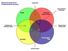 The four elements really have to work together to make for a successful services that people will use and continue to use over time. Yes, I am using a venn diagram for the four rings as it helps point out the overlaps and gaps where the implementations can fall short. The overlaps in the diagram is where the interesting things are happening. A year ago I was running into organizations with self proclaimed success with deployments of social tools (blogs, wikis, social bookmarking, forums, etc.), but as the desire for more than a simple set of blogs (or whichever tool or set of tools was selected) in-house there is a desire for greater use beyond some internal early adopters. This requires paying close attention to the four rings.
Tools
The first ring is rather obvious, it is the tools. The tools come down to functionality and features that are offered, how they are run (OS, rack mount, other software needed, skills needed to keep them running, etc.), how the tools are integrated into the organization (authentication, back-up, etc.), external data services, and the rest of the the usual IT department checklist. The tools get a lot of attention from many analysts and tech evangelists. There is an incredible amount of attention on widgets, feeds, APIs, and elements for user generated contribution. But, the tools do not get you all of the way to a successful implementation. The tools are not a mix and match proposition.
Interface & Ease of Use
One thing that the social software tools from the consumer web have brought is ease of use and simple to understand interfaces. The tools basically get out of the way and bring in more advanced features and functionality as needed. The interface also needs to conform to expectations and understandings inside an organization to handle the flow of interaction. What works for one organization may be difficult for another organization, largely due to the tools and training, and exposure to services outside their organization. Many traditional enterprise tools have been trying to improve the usability and ease of use for their tools over the last 4 to 5 years or so, but those efforts still require massive training and large binders that walk people through the tools. If the people using the tools (not administering the tools need massive amounts of training or large binders for social software the wrong tool has been purchased).
Sociality
Sociality is the area where people manage their sharing of information and their connections to others. Many people make the assumption that social tools focus on everything being shared with everybody, but that is not the reality in organizations. Most organizations have tight boundaries on who can share what with whom, but most of those boundaries get in the way. One of the things I do to help organizations is help them realize what really needs to be private and not shared is often much less than what they regulate. Most people are not really comfortable sharing information with people they do not know, so having comfortable spaces for people to share things is important, but these spaces need to have permeable walls that encourage sharing and opening up when people are sure they are correct with their findings.
Sociality also includes the selective groups people belong to in organizations for project work, research, support, etc. that are normal inside organizations to optimize efficiency. But, where things get really difficult is when groups are working on similar tasks that will benefit from horizontal connections and sharing of information. This horizontal sharing (as well as diagonal sharing) is where the real power of social tools come into play as the vertical channels of traditional organization structures largely serve to make organizations inefficient and lacking intelligence. The real challenge for the tools is the capability to surface the information of relevance from selective groups to other selective groups (or share information more easily out) along the way. Most tools are not to this point yet, largely because customers have not been asking for this (it is a need that comes from use over time) and it can be a difficult problem to solve.
One prime ingredient for social tool use by people is providing a focus on the people using the tools and their needs for managing the information they share and the information from others that flow through the tool. Far too often the tools focus on the value the user generated content has on the system and information, which lacks the focus of why people use the tools over time. People use tools that provide value to them. The personal sociality elements of whom are they following and sharing things with, managing all contributions and activities they personally made in a tool, ease of tracking information they have interest in, and making modifications are all valuable elements for the tools to incorporate. The social tools are not in place just to serve the organization, they must also serve the people using the tools if adoption and long term use important.
Encouraging Use
Encouraging use and engagement with the tools is an area that all organizations find they have a need for at some point and time. Use of these tools and engagement by people in an organization often does not happen easily. Why? Normally, most of the people in the organization do not have a conceptual framework for what the tools do and the value the individuals will derive. The value they people using the tools will derive needs to be brought to the forefront. People also usually need to have it explained that the tools are as simple as they seem. People also need to be reassured that their voice matters and they are encouraged to share what they know (problems, solutions, and observations).
While the egregious actions that happen out on the open web are very rare inside an organization (transparency of who a person is keeps this from happening) there is a need for a community manager and social tool leader. This role highlights how the tools can be used. They are there to help people find value in the tools and provide comfort around understanding how the information is used and how sharing with others is beneficial. Encouraging use takes understanding the tools, interface, sociality, and the organization with its traditions and ways of working.
The Overlaps
The overlaps in the graphic are where things really start to surface with the value and the need for a holistic view. Where two rings over lap the value is easy to see, but where three rings overlap the missing element or element that is deficient is easier to understand its value.
Tools and Interface
Traditional enterprise offerings have focussed on the tools and interface through usability and personalization. But the tools have always been cumbersome and the interfaces are not easy to use. The combination of the tools and interface are the core capabilities that traditionally get considered. The interface is often quite flexible for modification to meet an organizations needs and desires, but the capabilities for the interface need to be there to be flexible. The interface design and interaction needs people who have depth in understanding the broad social and information needs the new tools require, which is going to be different than the consumer web offerings (many of them are not well thought through and do not warrant copying).
Tools and Sociality
Intelligence and business needs are what surface out of the tools capabilities and sociality. Having proper sociality that provides personal tools for managing information flows and sharing with groups as well as everybody as it makes sense to an individual is important. Opening up the sharing as early as possible will help an organization get smarter about itself and within itself. Sociality also include personal use and information management, which far few tools consider. This overlap of tools and sociality is where many tools are needing improvement today.
Interface and Encouraging Use
Good interfaces with easy interaction and general ease of use as well as support for encouraging use are where expanding use of the tools takes place, which in turn improves the return on investment. The ease of use and simple interfaces on combined with guidance that provides conceptual understanding of what these tools do as well as providing understanding that eases fears around using the tools (often people are fearful that what they share will be used against them or their job will go away because they shared what they know, rather than they become more valuable to an organization by sharing as they exhibit expertise). Many people are also unsure of tools that are not overly cumbersome and that get out of the way of putting information in to the tools. This needs explanation and encouragement, which is different than in-depth training sessions.
Sociality and Encouraging Use
The real advantages of social tools come from the combination of getting sociality and encouraging use correct. The sociality component provides the means to interact (or not) as needed. This is provided by the capabilities of the product or products used. This coupled with a person or persons encouraging use that show the value, take away the fears, and provide a common framework for people to think about and use the tools is where social comfort is created. From social comfort people come to rely on the tools and services more as a means to share, connect, and engage with the organization as a whole. The richness of the tools is enabled when these two elements are done well.
The Missing Piece in Overlaps
This section focusses on the graphic and the three-way overlaps (listed by letter: A; B; C; and D). The element missing in the overlap or where that element is deficient is the focus.
Overlap A
This overlap has sociality missing. When the tool, interface, and engagement are solid, but sociality is not done well for an organization there may be strong initial use, but use will often stagnate. This happens because the sharing is not done in a manner that provides comfort or the services are missing a personal management space to hold on to a person's own actions. Tracking one's own actions and the relevant activities of others around the personal actions is essential to engaging socially with the tools, people, and organization. Providing comfortable spaces to work with others is essential. One element of comfort is built from know who the others are whom people are working with, see Elements of Social Software and Selective Sociality and Social Villages (particularly the build order of social software elements) to understand the importance.
Overlap B
This overlap has tools missing, but has sociality, interface, and encouraging use done well. The tools can be deficient as they may not provide needed functionality, features, or may not scale as needed. Often organizations can grow out of a tool as their needs expand or change as people use the tools need more functionality. I have talked with a few organizations that have used tools that provide simple functionality as blogs, wikis, or social bookmarking tools find that as the use of the tools grows the tools do not keep up with the needs. At times the tools have to be heavily modified to provide functionality or additional elements are needed from a different type of tool.
Overlap C
Interface and ease of use is missing, while sociality, tool, and encouraging use are covered well. This is an area where traditional enterprise tools have problems or tools that are built internally often stumble. This scenario often leads to a lot more training or encouraging use. Another downfall is enterprise tools are focussed on having their tools look and interact like consumer social web tools, which often are lacking in solid interaction design and user testing. The use of social tools in-house will often not have broad use of these consumer services so the normal conventions are not understood or are not comfortable. Often the interfaces inside organizations will need to be tested and there many need to be more than one interface and feature set provided for depth of use and match to use perceptions.
Also, what works for one organization, subset of an organization, or reviewer/analyst will not work for others. The understanding of an organization along with user testing and evaluation with a cross section of real people will provide the best understanding of compatibility with interface. Interfaces can also take time to take hold and makes sense. Interfaces that focus on ease of use with more advanced capabilities with in reach, as well as being easily modified for look and interactions that are familiar to an organization can help resolve this.
Overlap D
Encouraging use and providing people to help ease people's engagement is missing in many organizations. This is a task that is often overlooked. The tools, interface, and proper sociality can all be in place, but not having people to help provide a framework to show the value people get from using the tools, easing concerns, giving examples of uses for different roles and needs, and continually showing people success others in an organization have with the social tool offerings is where many organization find they get stuck. The early adopters in an organization may use the tools as will those with some familiarity with the consumer web social services, but that is often a small percentage of an organization.
Summary
All of this is still emergent and early, but these trends and highlights are things I am finding common. The two areas that are toughest to get things right are sociality and encouraging use. Sociality is largely dependent on the tools, finding the limitations in the tools takes a fair amount of testing often to find limitations. Encouraging use is more difficult at the moment as there are relatively few people who understand the tools and the context that organizations bring to the tools, which is quite different from the context of the consumer social web tools. I personally only know of a handful or so of people who really grasp this well enough to be hired. Knowing the "it depends moments" is essential and knowing that use is granular as are the needs of the people in the organization. Often there are more than 10 different use personas if not more that are needed for evaluating tools, interface, sociality, and encouraging use (in some organizations it can be over 20). The tools can be simple, but getting this mix right is not simple, yet.
[Comments are open and moderated at Enterprise Social Tools: Components for Success :: Personal InfoCloud
Explaining the Granular Social Network
This post on Granular Social Networks has been years in the making and is a follow-up to one I previously made in January 2005 on Granular Social Networks as a concept I had been presenting and talking about for quite some time at that point. In the past few years it has floated in and out of my presentations, but is quite often mentioned when the problems of much of the current social networking ideology comes up. Most of the social networking tools and services assume we are broadline friends with people we connect to, even when we are just "contacts" or other less than "friend" labels. The interest we have in others (and others in us) is rarely 100 percent and even rarer is that this 100 percent interest and appreciation is equal in both directions (I have yet to run across this in any pairing of people, but I am open to the option that it exists somewhere).
Social Tools Need to Embrace Granularity
What we have is partial likes in others and their interests and offerings. Our social tools have yet to grasp this and the few that do have only taken small steps to get there (I am rather impressed with Jaiku and their granular listening capability for their feed aggregation, which should be the starting point for all feed aggregators). Part of grasping the problem is a lack of quickly understanding the complexity, which leads to deconstructing and getting to two variables: 1) people (their identities online and their personas on various services) and 2) interests. These two elements and their combinations can (hopefully) be seen in the quick annotated video of one of my slides I have been using in presentations and workshops lately.
Showing Granular Social Network
Granular Social Network from Thomas Vander Wal on Vimeo.
The Granular Social Network begins with one person, lets take the self, and the various interest we have. In the example I am using just five elements of interest (work, music, movies, food, and biking). These are interest we have and share information about that we create or find. This sharing may be on one service or across many services and digital environments. The interests are taken as a whole as they make up our interests (most of us have more interests than five and we have various degrees of interest, but I am leaving that out for the sake of simplicity).
Connections with Others
Our digital social lives contain our interests, but as it is social it contains other people who are our contacts (friends is presumptive and gets in the way of understanding). These contacts have and share some interests in common with us. But, rarely do the share all of the same interest, let alone share the same perspective on these interests.
Mapping Interests with Contacts
But, we see when we map the interests across just six contacts that this lack of fully compatible interests makes things a wee bit more complicated than just a simple broadline friend. Even Facebook and their touted social graph does not come close to grasping this granularity as it is still a clumsy tool for sharing, finding, claiming, and capturing this granularity. If we think about trying a new service that we enjoy around music we can not easily group and capture then try to identify the people we are connected to on that new service from a service like Facebook, but using another service focussed on that interest area it could be a little easier.
When we start mapping our own interest back to the interest that other have quickly see that it is even more complicated. We may not have the same reciprocal interest in the same thing or same perception or context as the people we connect to. I illustrate with the first contact in yellow that we have interest in what they share about work or their interest in work, even though they are not stating or sharing that information publicly or even in selective social means. We may e-mail, chat in IM or talk face to face about work and would like to work with them in some manner. We want to follow what they share and share with them in a closer manner and that is what this visual relationship intends to mean. As we move across the connections we see that the reciprocal relationships are not always consistent. We do not always want to listen to all those who are sharing things, with use or the social collective in a service or even across services.
Focus On One Interest
Taking the complexity and noise out of the visualization the focus is placed on just music. We can easily see that there are four of our six contacts that have interest in music and are sharing their interest out. But, for various reasons we only have interests in what two of the four contacts share out. This relationship is not capturing what interest our contacts have in what we are sharing, it only captures what they share out.
Moving Social Connections Forward
Grasping this as a relatively simple representation of Granular Social Networks allows for us to begin to think about the social tools we are building. They need to start accounting for our granular interests. The Facebook groups as well as listserves and other group lists need to grasp the nature of individuals interests and provide the means to explicitly or implicitly start to understand and use these as filter options over time. When we are discussing portable social networks this understanding has be understood and the move toward embracing this understanding taken forward and enabled in the tools we build. The portable social network as well as social graph begin to have a really good value when the who is tied with what and why of interest. We are not there yet and I have rarely seen or heard these elements mentioned in the discussions.
One area of social tools where I see this value beginning to surface in through tagging for individuals to start to state (personally I see this as a private or closed declaration that only the person tagging see with the option of sharing with the person being tagged, or at least have this capability) the reasons for interest. But, when I look at tools like Last.fm I am not seeing this really taking off and I hear people talking about not fully understanding tagging as as it sometimes narrows the interest too narrowly. It is all an area for exploration and growth in understanding, but digital social tools, for them to have more value for following and filtering the flows in more manageable ways need to more in grasping this more granular understanding of social interaction between people in a digital space.
Social Tools for Mergers and Acquisitions
The announcement yesterday of Delta and Northwest airlines merging triggered a couple thoughts. One of the thoughts was sadness as I love the unusually wonderful customer service I get with Northwest, and loathe the now expected poor and often nasty treatment by Delta staff. Northwest does not have all the perks of in seat entertainment, but I will go with great customer service and bags that once in nearly 50 flights did not arrive with me.
But, there is a second thing. It is something that all mergers and large organization changes trigger...
Social Tools Are Great Aids for Change
Stewart Mader brought this to mind again in his post Onboarding: getting your new employees cleared for takeoff, which focusses on using wikis (he works for Atlassian and has been a strong proponent of wikis for years and has a great book on Wiki Patterns) as a means to share and update the information that is needed for transitions and the joining of two organizations.
I really like his write-up and have been pushing the social tools approach for a few years. The wiki is one means of gathering and sharing information. It is a good match with social bookmarking, which allows organizations that are coming together have their people find and tag things in their own context and perspective. This provides finding common objects that exist, but also sharing and learning what things are called from the different perspectives.
Communication Build Common Ground
Communication is a key cornerstone to any organization working with, merging with, or becoming a part of another. Communication needs common ground and social bookmarking that allows for all context and perspectives to be captured is essential to making this a success.
This is something I have presented on and provided advice in the past and really think and have seen that social tools are essentials in these times of transition. It is really rewarding when I see this working as I have been through organization mergers, going public, and major transitions in the days before these tools existed. I can not imaging thinking of transitioning with out these tools and service today. I have talked to many organizations after the fact that wished they had social bookmarking, blogs, and wikis to find and annotate items, provide the means to get messages out efficiently (e-mail is becoming a poor means of sharing valuable information), and working toward common understanding.
One large pain point in mergers and other transitions is the cultural change that brings new terms, new processes, new workflow, and disruption to patterns of understanding that became natural to the people in the organization. The ability to map what something was called and the way it was done to what it is now called and the new processes and flows is essential to success. This is exactly what the social tools provide. Social bookmarking is great for capturing terms, context, and perspectives and providing the ability to refind these new items using prior understanding with low cognitive costs. Blogs help communicate people's understanding as they are going through the process as well as explain the way forward. Wikis help map these individual elements that have been collectively provided and pull them together in one central understanding (while still pointing out to the various individual contributions to hold on to that context) in a collaborative (working together with one common goal) environment.
Increasing Speed and Lowering Cost of Transition
Another attribute of the social tools is the speed and cost at which the information is shared, identified, and aggregated. In the past the large consulting firms and the slow and expensive models for working were have been the common way forward for these times of change. Seeing social tools along with a few smart and nimble experts on solid deployments and social engagement will see similar results in days and a handful of weeks compared to many weeks and months of expensive change management plodding. The key is the people in the organizations know their concerns and needs, while providing them the tools to map their understanding and finding information and objects empowers the individuals while giving them knowledge and the means to share with others. This also helps the individuals grasp that are essential to the success and speed to the change. Most people resent being pushed and prodded into change and new environments, giving them the tools to understand and guide their own change management is incredibly helpful. This decreases the time for transition (for processes and emotionally) while also keeping the costs lower.
[Comments are open and moderated as always in the post at: Social Tools to Efficiently Build Common Ground :: Personal InfoCloud]
YouTube New Interface and Social Interaction Design Santiy Check
YouTube has released a new design for the site and its individual video pages. This gets shared in Google Operating System :: User Inferface Updates at YouTube and TechCrunch :: YouTube Updates Layout, Now with Tabs and Statistics. While the new design looks nice and clean, it has one design bug that is horribly annoying it has mixed interaction design metaphors for its tabs or buttons.
Broken Interaction Design on Buttons or Tabs
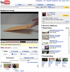 As the image shows the Share, Favorite, Playlists, and Flag buttons or tabs all have similar design treatment, but they do not have the same actions when you click on them. Three of the items (Share, Playlists, and Flag) all act as tabs that open up a larger area below them to provide more options and information. But, the Favorites acts like a button that when clicked it marks the item as a favorite.
This is incredibly poor interaction design as all the items should act in the same manner. If the items do not have the same action properties they really should not look the same and be in the same action space. Favorites should be a check box or a binary interface for on and off. That interaction patter more closely matches the Rate section and seems like it should have been there rather than showing a lack of understanding interaction design basics and confusing people using the site/service.
Social Sites Seem to Share a Lack of Interaction Understanding
This should have been a no brainer observation for a design manager or somebody with a design sanity check. YouTube is far from the the only site/service doing this. Nearly all of the services are not grasping the basics or are broadly applying design patterns to all user scenarios when they really do not fit all scenarios and user types (nearly every service I talk to know exactly the use type a person fits into but never takes this into account in optimization of design patterns that match that use need). Facebook really falls into this hole badly and never seems to grasp they are really making a mess of things the more features and functionality they are bringing into their service without accounting for the design needs in the interface.
My seemingly favorite site to nit pick is LinkedIn which I use a lot and has been a favorite, but their social interaction additions and interactive interfaces really need much better sanity checks and testing before they go into production (even into the beta interface). LinkedIn is really trying to move forward and they are moving in the right direction, but they really need better design thinking with their new features and functionality. Their new design is ready to handle some of the new features, but the features need a lot more refining. The new design shows they have a really good grasp that the interface needs to be a flexible foundation to be used as a framework for including new features, which could benefit from treating them as options for personalization. LinkedIn has pulled back many of the social features and seems to be rethinking them and refining them, but they really need some good sanity checks before rolling them out again.
Social Interaction in Enterprise Tools
The befuddled interaction understanding is not germane to commercial or consumer public social web sites, but it also plagues tools aimed at the enterprise. This is not overly surprising as many of the social enterprise (enterprise 2.0) tools and services are copying the public web tools and services to a large degree. This is a good thing, as it puts the focus on ease of use, which has been horribly missing in business focussed tools for far too long. But, the down side for enterprise focussed tools is they are not for the public web they are for business users, who most often do not have familiarity with the conventions on the public web and they have a large cognitive gap in understanding what the tools do and their value. There is less time for playing and testing in most business people's worklife. This means the tools need to get things right up front with clear understanding of the use needs of the people they are building for in business. This seems to be lacking in many tools as there is much copying of poor design that really needs to be tested thoroughly before launching. Business focussed tools are not hitting the same people as are on the web, which will work through poor design and functionality to see what things do. It is also important to consider that there are a wide variety of types of people using these tools with varying needs and varying interaction understandings (this will be another blog post, actually a series of posts that relate to things I have been including in workshops the last six months and presenting the last couple).
[Comments are available and moderated as usual at: YouTube New Interface and Social Interaction Design Santiy Check :: Personal InfoCloud]
Reading Information and Patterns
The past few weeks and months the subject of reading, analysis, and visualization have been coming up a lot in my talking and chatting with people. These are not new subjects for me as they are long time passions. Part of the discussion the past few weeks have been focussed on what is missing in social bookmarking tools (particularly as one's own bookmarks and tags grows and as the whole service scales) as wells as group discussion monitoring tools, but this discussion is not the focus of this post. The focus is on reading, understanding, and synthesis of information and knowledge.
Not that Reading
I really want to focus on reading. Not exactly reading words, but reading patterns and recognizing patterns and flows to get understanding. After we learn to read a group of letters as a word we start seeing that group of letters as a shape, which is a word. It is this understanding of patterns that interact and are strung together that form the type of reading I have interest in.
Yesterday, Jon Udell posted about analyzing two gymnasts make turns. He was frustrated that the analysis on television lacked good insight (Jon is a former gymnast). Jon, who is fantastic at showing and explaining technologies and interactions to get to the core values and benefits as well as demoing needed directions, applied his great skill and craft on gymnastics. He took two different gymnasts doing the same or similar maneuver frame-by-frame. Jon knew how to read what each gymnast was doing and shared his understanding of how to read the differences.
Similarly a week or so ago an article about the Bloomberg Terminal fantasy redesign along with the high-level explanations and examples of the Bloomberg Terminal brought to mind a similar kind of reading. I have a few friends and acquaintances that live their work life in front of Bloomberg Terminals. The terminals are an incredible flood of information and views all in a very DOS-looking interface. There is a skill and craft in not only understanding the information in the Bloomberg Terminal, but also in learning to read the terminal. One friend I chatted with while he was working (years ago) would glance at the terminal every minute. I had him explain his glancing, which essentially was looking for color shifts in certain parts of the screen and then look for movement of lines and characters in other areas. He just scanned the screen to look for action or alerts. His initial pass was triage to then discern where to focus and possibly dive deeper or pivot for more related information.
The many of the redesign elements of the Bloomberg Terminals understood the reading and ability to understand vast information (in text) or augmented the interface with visualizations that used a treemap (most market analysts are very familiar with the visualization thanks to SmartMoney's useage). But, the Ziba design was sparse. To me it seemed like many of the market knowledge workers used to the Bloomberg Terminal and knew how to read it would wonder where their information had gone.
Simplicity and Reading with Experience
The Ziba solution's simplicity triggers the need in understanding the balance between simplicity just breaking down the complex into smaller easy to understand bits and growing into understanding the bits recollected in a format that is usable through recognition and learned reading skills. The ability to read patterns is learned in many areas of life in sport, craft, and work. Surfers look at the ocean waves and see something very different from those who do not surf in the ebb, flow, breaks, surface currents and under currents. Musicians not only read printed music but also hear music differently from non-musicians, but formally trained musicians read patterns differently from those who have just "picked it up". There has been a push in business toward data dashboards for many years, but most require having the right metrics and good data, as well as good visualizations. The dashboards are an attempt to provide reading information and data with an easier learning curve through visualization and a decreased reliance on deep knowledge.
Getting Somewhere with Reading Patterns
Where this leads it there is a real need in understanding the balance between simplicity and advanced interaction with reading patterns. There is also a need to understand what patterns are already there and how people read them, including when to adhere to these patterns and when to break them. When breaking the patterns there needs to be simple means of learning these new patterns to be read and providing the ability to show improved value from these new patterns. This education process can be short video screen shots, short how-to use the interface or interactions. Building pattern libraries is really helpful.
Next, identify good patterns that are available and understand why they work, particularly why they work for the people that use then and learn how people read them and get different information and understanding through reading the same interface differently. Look at what does not work and where improved tools are needed. Understand what information is really needed for people who are interested in the information and data.
 An example of this is Facebook, which has a really good home page for each Facebook member, it is a great digital lifestream of what my friends are doing. It is so much better at expressing flow and actions the people I have stated I have social interest in on Facebook than any other social web tool that came before Facebook. Relative to the individual level, Facebook fails with its interface of the information streams for its groups. Much of the content that is of interest in Facebook happens in the groups, but all the groups tell you is the number of new members, new messages, new videos, and new wall posts. There is much more valuable information tucked in there, such as who has commented that I normally interact with, state the threads that I have participated in that have been recently updated, etc.
This example illustrates there needs to be information to read that has value and could tell a story. Are the right bits of information available that will aid understanding of the underlying data and stories? It the interface helpful? Is it easy to use and can it provide more advanced understanding? Are there easy to find lessons in how to read the interface to get the most information out of it?
Cuban Clocks and Music Long Tail Discovery
The last two trips to San Francisco I have heard a latin version of Coldplay's Clocks on KFOG and it really intrigued me. This last trip I was in the car for four songs and one of them was Coldplay's Clocks by the Cuban All Stars. I have been trying to track this track down since first hearing, but am not having great luck. This continually happens when I listen to KFOG, which is about the only regular radio station I will listen to (I much prefer XM Radio for is lack of advertising and blathering idiots spouting off while playing overplayed songs that have little merit.
What I like about this version of Clocks by the Cuban All Stars (I have seen the dashboard metadata list it as Ibrahim Ferrer, but it has not been described as such by the DJs on KFOG). This is where my music recommendations break. But, some digging on the KFOG website points me to Rhythms Del Mundo as the source (but their Flash site seems horribly broken in all browsers as none of the links work). I have found the album on iTunes, but only a partial listing and none of the physical music store options have this in stock as it is not mainstream enough (how I miss Tower).
This all seems like far more work that should be needed. But, not if one has even slightly long tail musical interests. I had a wonderful discussion along these lines wish Cory from IODA about this and the lack of really good long tail discovery systems.
I use Last.fm to discover new things from friend#039;s lists, but the Last.fm neighbor recommendations seem to only work on more mainstream interests (Pandora really falls off on the long tail for me). Now if KFOG put their play list in KFOG, it would help greatly and I would add them to my friend list (or I could move back home to the San Francisco Bay Area).
It is Finally IT and Design in Enterprise (and Small Business)
My recent trip to Northern California to speak at the UIE Web App Summit and meetings in the Bay Area triggered some good ideas. One thread of discovery is Enterprise, as well as small and medium sized business, is looking at not only technology for solutions to their needs, but design.
IT Traditions
Traditionally, the CIO or VP IT (and related upper management roles) have focussed on buying technology "solutions" to their information problems. Rarely have the solutions fixed the problems as there is often a "problem with the users" of the systems. We see the technology get blamed, the implementation team get blamed (many do not grasp the solution but only how to install the tools, as that is the type of service that is purchased), and then the "users need more training".
Breaking the Cycle of Blame and Disappointment
This cycle of blame and disappointment in technology is breaking around a few important realizations in the IT world.
Technology is not a Cure All
First, the technology is always over sold in capability and most often needs extensive modification to get working in any environment (the cost of a well implemented system is usually about the same as a built from scratch solution - but who has the resources to do that). Most CIOs and technology managers are not trusting IT sales people or marketing pitches. The common starting point is from the, "your tool can not do what you state" and then discussions can move from there. Occasionally, the tools actually can do what is promised.Many, decision makers now want to test the product with real people in real situations. Solution providers that are good, understand this and will assist with setting up a demonstration. To help truly assess the product the technical staff in the organization is included in the set-up of the product.
People and Information Needs
Second, the problems are finally being identified in terms of people and information needs. This is a great starting place as it focusses on the problems and the wide variety of personal information workflows that are used efficiently by people. We know that technology solutions that mirror and augment existing workflows are easily adopted and often used successfully. This mirroring workflow also allows for lower training costs (occasionally there is no training needed).
Design with People in Mind
Third, design of the interaction and interface must focus on people and their needs. This is the most promising understanding as it revolves around people and their needs. Design is incredibly important in the success of the tools. Design is not just if it looks pretty (that does help), but how a person is walked through the steps easily and how the tools is easy to interact with for successful outcomes. The lack of good design is largely what has crippled most business tools as most have focussed on appealing to the inner geek of the IT manager. Many IT managers have finally realized that their interface and interaction preferences are not remotely representative of 95 percent of the people who need to or should be using the tools.
It is increasingly understood that designing the interaction and interface is very important. The design task must be done with the focus on the needs of real people who will be using the product. Design is not sprinkling some Web 2.0 magic dust of rounded corners, gradients, and fading yellow highlights, but a much deeper understanding that ease of use and breaking processes into easy steps is essential.
Smile to Many Faces
This understanding that buying a technology solutions is more than buying code to solve a problem, but a step in bringing usable tools in to help people work efficiently with information. This last week I talk to many people in Enterprise and smaller businesses that were the technical managers that were trying to get smarter on design and how they should approach digital information problems. I also heard the decision managers stating they needed better interfaces so the people using the tools could, well use the tools. The technology managers were also coming to grips that their preferences for interfaces did not work with most of the people who need the tools to work.
Technology Companies Go Directly to the Users
I have also been seeing the technology tool makers sitting with their actual people using their tools to drastically improve their tools for ease of use. One President of a technology tool maker explained it as, ":I am tired of getting the blame for making poor tools and losing contracts because the technology decision makers are not connected with the real needs of the people they are buying the tools for." This president was talking to three or four users on problems some of his indirect clients were having with a tool they really needed to work well for them. This guy knows the tech managers traditionally have not bought with the people needing to use the tools in mind and is working to create a great product for those people with wants and needs. He also knows how to sell to the technology managers to get their products in the door, but knows designing for the people using the product is how he stays in the company.
Ghosts of Technology Past, Present, and Future
The past two days have brought back many memories that have reminded me of the advances in technology as well as the reliance on technology.
Ghost of Rich Web Past
I watched a walk through of a dynamic prototype yesterday that echoed this I was doing in 1999 and 2000. Well, not exactly doing as the then heavy JavaScript would blow up browsers. The DHTML and web interfaces that helped the person using the site to have a better experience quite often caused the browser to lock-up, close with no warning, or lock-up the machine. This was less than 100kb of JavaScript, but many machines more than two years old at that time and with browsers older than a year or two old did not have the power. The processing power was not there, the RAM was not there, the graphics cards were not powerful, and the browsers in need of optimizing.
The demonstration yesterday showed concepts that were nearly the exact concept from my past, but with a really nice interface (one that was not even possible in 1999 or 2000). I was ecstatic with the interface and the excellent job done on the prototype. I realized once again of the technical advances that make rich web interfaces of "Web 2.0" (for lack of a better term) possible. I have seen little new in the world of Ajax or rich interfaces that was not attempted in 2000 or 2001, but now they are viable as many people's machines can now drive this beauties.
I am also reminded of the past technologies as that is what I am running today. All I have at my beck and call is two 667MHz machines. One is an Apple TiBook (with 1 GB of RAM) and one is a Windows machine (killer graphics card with 256MB video RAM and 500MB memory). Both have problems with Amazon and Twitter with their rich interfaces. The sites are really slow and eat many of the relatively few resources I have at my disposal. My browsers are not blowing up, but it feels like they could.
Ghost of Technology Present
The past year or two I have been using my laptop as my outboard memory. More and more I am learning to trust my devices to remind me and keep track of complex projects across many contexts. Once things are in a system I trust they are mostly out of my head.
This experience came to a big bump two days ago when my hard drive crashed. The iterative back-ups were corrupted or faulty (mostly due to a permission issue that would alter me in the middle of the night). The full back-up was delayed as I do not travel with an external drive to do my regular back-ups. My regularly scheduled back-ups seem to trigger when I am on travel. I am now about 2.5 months out from my last good full back-up. I found an e-mail back-up that functioned from about 3 weeks after that last full backup. Ironically, I was in the midst of cleaning up my e-mail for back-up, which is the first step to my major back-up, when the failure happened.
I have a lot of business work that is sitting in the middle of that pile. I also have a lot of new contacts and tasks in the middle of that period. I have my client work saved out, but agreements and new pitches are in the mire of limbo.
Many people are trying to sync and back-up their lives on a regular basis, but the technology is still faulty. So many people have faulty syncing, no matter what technologies they are using. Most people have more than two devices in their life (work and home computer, smart phone, PDA, mobile phone with syncable address book and calendar, iPod, and other assorted options) and the syncing still works best (often passably) between two devices. Now when we start including web services things get really messy as people try to work on-line and off-line across their devices. The technology has not caught up as most devices are marketed and built to solve a problem between two devices and area of information need. The solutions are short sighted.
Ghost of the Technosocial Future
Last week I attended the University of North Carolina Social Software Symposium (UNC SSS) and while much of the conversation was around social software (including tagging/folksonomy) the discussion of technology use crept in. The topic of digital identity was around the edges. The topic of trust, both in people and technology was in the air. These are very important concepts (technology use, digital identity, and trusted technology and trusted people). There is an intersection of the technosocial where people communicate with their devices and through their devices. The technology layer must be understood as to the impact is has on communication. Communication mediated by any technology requires an understanding of how much of the pure signal of communication is lost and warped (it can be modified in a positive manner too when there are disabilities involved).
Our digital communications are improving when we understand the limitations and the capabilities of the technologies involved (be it a web browser of many varied options or mobile phone, etc.). Learning the capabilities of these trusted devices and understanding that they know us and they hold our lives together for us and protect our stuff from peering eyes of others. These trusted devices communicate and share with other trusted devices as well as our trusted services and the people in our lives we trust.
Seeing OpenID in action and work well gave me hope we are getting close on some of these fronts (more on this in another post). Seeing some of the great brains thinking and talking about social software was quite refreshing as well. The ability to build solid systems that augment our lives and bring those near in thought just one click away is here. It is even better than before with the potential for easier interaction, collaboration, and honing of ideas at our doorstep. The ability to build an interface across data sets (stuff I was working on in 1999 that shortened the 3 months to get data on your desk to minutes, even after running analytics and working with a GIS interface) can be done in hours where getting access to the wide variety of information took weeks and months in the past. Getting access to data in our devices to provide location information with those we trust (those we did not trust have had this info for some time and now we can take that back) enables many new services to work on our behalf while protecting our wishes for whom we would like the information shared with. Having trusted devices working together helps heal the fractures in our data losses, while keeping it safe from those we do not wish to have access. The secure transmission of our data between our trusted devices and securely shared with those we trust is quickly arriving.
I am hoping the next time I have a fatal hard drive crash it is not noticeable and the data loss is self-healed by pulling things back together from resources I have trust (well placed trust that is verifiable - hopefully). This is the Personal InfoCloud and its dealing with a Local InfoCloud all securely built with trusted components.
Technosocial Architect
Those of you that know me well know I am not a fan of being labeled, yes it is rather ironic. A large part of this is a breadth of focus in the lens, from which I view the world. I am deeply interested in how people interact, how people use technology, and the role of information in this equation. My main interest is information and information use, when to people want it and need it, how people acquire it. I am utter fascinated by how technology plays in this mix and how important design is. I look at technology as any mediated form of communication, other than face-to-face communication. The quest began in the technology "quot;paper age" looking at layout and design of text and images on the printed page and the actual and latent messages that were portrayed in this medium. I also dove into television and video as well as computer aided visualizations of data (Tufte was required reading in quantitative methods class (stats) in the early '90s in grad school).
Well, this life long interest only continued when I started digging into the web and online services in the early 90s. But, as my interest turned professional from hobby and grad student my training in quantitative and qualitative (ethnographic) research were used not for public policy, but for understanding what people wanted to do with technology or wished it would work, but more importantly how people wanted to use information in their life.
Basis for Digital Design and Development
As I have waded through web development and design (and its various labels). Most everything I have done is still based on the undergrad training in communication theory and organizational communication. Understanding semantics, rhetoric, layout, design, cogsci, media studies, cultural anthropology, etc. all pay a very important part in how I approach everything. It is a multi-disciplinary approach. In the mid-80s I had figured everybody would be using computers and very adept by the time I finished undergrad, that I thought it was a waste to study computer science as it was going to be like typing and it programming was going to be just like typing, in that everybody was going to be doing (um, a wee bit off on that, but what did I know I was just 18).
People Using Information in Their Life
The one thing that was of deep interest then as it is now, is how people use information in their life and want and need to use information in their life. To many people technology gets in the way of their desired ease of use of information. Those of us who design and build in the digital space spend much of our time looking at how to make our sites and applications easier for people to use.
Do you see the gap?
The gap is huge!
We (as designers and developers) focus on making our technology easy to use and providing a good experience in the domain we control.
People want to use the information when they need it, which is quite often outside the domains we as designers and developers control.
Designing for Information Use and Reuse
Part of what I have been doing in the past few years is looking at the interaction between people and information. With technology we have focussed on findability. Great and good. But, we are failing users on what they do with that information and what they want to do with that information. One question I continually ask people (particularly ones I do not know) is how are you going to use that information. When they are reading or scanning information (paper or digital it does not matter) I ask what is important to them in what is before them. Most often they point to a few things on the page that have different uses (an article referenced in the text, an advertisement for a sale, a quote they really like, etc.). But, the thing that nearly everything that they find important is it has a use beyond what they are reading. They want to read the article that is referenced, they want the date and location for the sale (online address or physical address and date and times), they want to put the quote in a presentation or paper they are writing.
End-to-end is Not the Solution
Many companies try to focus on the end-to-end solution. Think Microsoft or Google and their aim to solve the finding, retaining, using, and reusing of that information all within their products. Currently, the companies are working toward the web as the common interface, but regular people do not live their life on the web, they live it in the physical world. They may have a need for an end-to-end solution, but those have yet to become fully usable. People want to use the tools and technologies that work best for them in various contexts. As designers and developers we can not control that use, but we can make our information more usable and reusable. We have to think of the information as the focal point. We have to think of people actually connecting with other people (that is individuals not crowds) and start to value that person to person interaction and sharing on a massive scale.
Our information and its wrappers must be agnostic, but structured and prepared in a manner that is usable in the forms and applications that people actually use. The information (content to some) is the queen and the people are the king and the marriage of the two of them will continue the reign of informed people. This puts technology and the medium as the serf and workers in that kingdom. Technology and the medium is only the platform for information use and reuse of the information that is in people's lives. That platform, like the foundation of a house or any building must not be noticed and must serve its purpose. It must be simple to get the information and reuse it.
Technology and Design are Secondary
Those of us that live and breathe design and development have to realize what we build is only secondary to what people want. It is the information that is important to regular people. We are only building the system and medium. We are the car and the road that take people to Yosemite where they take pictures, build memories, bond with their travel companions, etc. What is created from this trip to Yosemite will last much longer than the car or road they used to get them to the destination. We only build the conduit. We have to understand that relationship. What we build is transient and will be gone, but what people find and discover in the information they find in what we build must last and live beyond what we control and can build or design. We must focus on what people find and want to use and reuse while they are using what we are designing and building for them.
Information as Building Blocks
All of what is being described is people finding and using information that an other person created and use it in their life. This is communication. It is a social activity. This focus is on building social interactions where information is gathered and used in other contexts. Information use and reuse is part of the human social interaction. This social component with two people or more interacting to communicate must be the focus. We must focus on how that interaction shapes other human interactions or reuses of that information garnered in the communication with an other and ease that interaction. If you are still reading (hello) you probably have something to do with design or development of technology that mediates this communication. We are building social tools in which what is communicated will most likely have a desired use for the people interacting outside of what we have built or designed.
Technosocial Architects
People who understand the social interactions between people and the technologies they use to mediate the interactions need to understand the focus is on the social interactions between people and the relationship that technology plays. It is in a sense being a technosocial architect. I ran across the word technosocial in the writings of Mimi Ito, Howard Rheingold, and Bruce Sterling. It always resonates when I hear technosocial. Social beings communicate and inherent in the term communication is information.
Focus on People, Medium, and Use
Just above you see that I referenced three people (Mimi, Howard, and Bruce) as people who used a term that seems to express how I believe I look at the work I do. It is people, more importantly, it is individuals that I can point to that I trust and listen to and are my social interpreters of the world around me. These people are filters for understanding one facet of the world around me. People have many facets to their life and they have various people (sometimes a collective of people, as in a magazine or newspaper) who are their filters for that facet of their life. There are people we listen to for food recommendations, most likely are different from those that provide entertainment, technology, clothing, auto, child care, house maintenance, finance, etc. We have distinct people we learn to trust over time to provide or reinforce the information we have found or created out of use and reuse of what we have interacted with in our life.
Looking at many of the tools available today there is a focus on the crowd in most social tools on the web. Many regular people I talk to do not find value in that crowd. They want to be able to find individual voices easily that they can learn to trust. Just like I have three people I can point to people in social software environments look at the identity (screen name many times) as their touch point. I really like Ask MetaFilter as a social group "question and answer" tool. Why? Mostly because there are screen names that I have grown to know and trust from years of reading MetaFilter. The medium is an environment that exposes identity (identity is cloaked with a screen name and can be exposed if the person so decides in their profile). People are important to people. In digitally mediated social environments the identity is that point of reference that is a surrogate for name in physical space. In print the name of the writer is important as a means to find or avoid other pieces or works. We do the same in movies, television news, television shows, online videos, podcasts, blogs, etc. the list does not end.
Our social mediums need to keep this identity and surface the identity to build trust. People use identity as gatekeepers in a world of information overload. When I look at Yahoo! Answers and Yahoo! MyWeb (my absolute favorite social bookmarking tool) I get dumped into the ocean of identities that I do not recognize. People are looking for familiarity, particularly familiarity of people (or their surrogate identity). In MyWeb I have a community (unfortunately not one that is faceted) where I trust identities (through a series of past experience) as filters for information in the digital world around us, but I am not placed in this friendly environment, but put in an environment where I find almost nothing I value presented to me. This is the way Yahoo! Answers works as well, but it does not seem like there is the ability to track people who ask or answer questions that a person would find value in.
The tools we use (as well as design and build) must understand the value of person and identity as information filters. The use of information in our lives is one explicit expression of our interest in that subject, the person who created the information, or the source what housed that information. Use and reuse of information is something we need to be able to track to better serve people (this gets in to the area of digital rights management, which usually harms information use more than it enables it, but that is another long essay). The medium needs to understand people and their social interaction people have with the information and the people who create the information and the desired use. This use goes well beyond what we create and develop. Use requires us understanding we need to let go of control of the information so it may be used as people need.
Need for Technosocial Architects
Looking at the digital tools we have around us: websites, social computing services and tools (social networking sites, wikis, blogs, mobile interaction, etc.), portals, intranets, mobile information access, search, recommendation services, personals, shopping, commerce, etc. and each of these is a social communication tool that is based on technology. Each of these has uses for the information beyond the digital walls of their service. Each of these has people who are interacting with other people through digital technology mediation. This goes beyond information architecture, user experience design, interaction design, application development, engineering, etc. It has needs that are more holistic (man I have been trying to avoid that word) and broad as well as deep. It is a need for understanding what is central to human social interactions. It is a need for understanding the technical and digital impact our tools and services have in mediating the social interaction between people. It is a need for understanding how to tie all of this together to best serve people and their need for information that matters to them when they want it and need it.
System One Takes Information Workflow to a New Level
While at Microlearning Conference 2006 Bruno and Tom demonstrated their System One product. This has to be one of the best knowledge/information tools that I have seen in years. They completely understand simplicity and interaction design and have used it to create an information capture and social software tool for the enterprise. Bruno pointed me to a System One overview screen capture (you do not have to login to get started) that features some of the great elements in System One.
One of the brilliant aspects of System One is their marketing of the product. While it has easily usable wiki elements, heavy AJAX, live search, etc. they do not market these buzzwords, they market the ease of use to capture information (which can become knowledge) and the ease of finding information. The simplicity of the interface and interaction make it one of the best knowledge management tools available. Most knowledge management tools fall down on the information entry perspective. Building tools that are part of your workflow, inclusion of information from those that do not feed the KM tool, is essential and System One is the first tools that I have seen that understands this an delivers a product that proves they get it.
The enterprise social software market is one that is waiting to take off, as there is a very large latent need (that has been repressed by poor tools in the past). System One tool is quite smart as they have built e-mail search, file access, Google live file search (you type in the wiki (you do not need to know it is a wiki) and the terms used are searched in Google to deliver a rather nice contextual search. This built in search solves the Google complexity of building solid narrow search queries, but the person using the system just needs to have the capability to enter information into the screen.
Those of us that are geeks find Google queries a breeze, but regular people do not find it easy to tease out the deeply buried gems of information hidden in Google. Surfacing people who are considered experts, or atleast connectors to experts on subjects is part of the System One tool as well and this is an insanely difficult task in an enterprise.
My only wish was that I worked in an organization that would be large enough to use this tool, or there was a personal version I could use to capture and surface my own information when I am working.
You may recognize System One as the developer of retreivr, the Flickr interactive tool that allows you to draw a simple picture and their tool will find related photos in Flickr based on the drawing's pattern and colors. It is a brilliant tool, but not as smart as their main product.
Real Time Flight Tracking Site for Your Mobile
Thanks to Tim Boyd I found a wonderful Mobile Flight Tracking Tool (the flight tracking tool is described by Jon Gales the developer. Tim took a photo of the flight tracking tool running on his Treo.
This is exactly the right tool to do the job that many need. Everybody complains about the lack of mobile interfaces to flight on-time information when they are needing to meet somebody at the airport. The airlines solutions either do not exist, are not detailed enough, or have interfaces that are cluttered (even on a Treo). Airlines suggested arrival times are a joke as they are trying to compensate for their tendencies for late arrivals, which they get penalized on. This has lead to a 45 minute flight from Washington to New York being stated at a flight time of 2 hours or more. On-time flight is not anything close to an efficient guide.
Most of the airline sites only think of the desktop for decent information, but where real-time flight arrival information is important is when you are on the go. Jon Gales's application solves a real life information need in the context of life. A standing ovation for his work is in order. I wish more apps like this were in existence, information solutions for people's real lives (we do not sit at our desktops and most do not carry their laptops where ever they go).
When designing for the mobile (this app horizontally scrolls on my Nokia 3650 and solving that is a relatively easy solution) we need to cut out the clutter. We need to understand the information need and the information that can be provided on that small screen. Paring away what is not essential is a vital task. Getting to what is important is also important. What is important is accurate and useful information for people's given the context that people wanting to use the information on the go face.
The Art of the Pivot
We live life linearly, but there are many tangents and crossing points. Physical life makes surfing those tangents not an easy task, but it is part of the brilliance of digital life to surf serendipitously with purpose. Every now and then, with more increasing regularity I find myself in awe (yet with each occurrence with banality creeping in) of the tangential currents that draw life closer and the world smaller.
Flickr provided this evening's wonderful spark. While peering through the lens of my friends and "contacts" photos I clicked on one that had a familiar scene, it was not that I knew the people in the photo, but it was the table, cups, and feel of the place. It was a photo in the Pork Store on Haight Street. I have had so many wonderful breakfasts there from when I live behind the restaurant on Waller, to trekking over from where I lived on Arguello, to the pilgrimage on nearly every trip I make to San Francisco.
What made this particular photo special was not that I easily recognized the scene, but I double checked in Flickr's tags to see a "porkstore" tag. I clicked the tag to see if that photographer had entered more photos in the Pork Store, but no. I clicked to see "all other public photos tagged with porkstore". In doing this I saw in the thumbnail somebody I thought I recognized. I clicked to the larger photo to ensure it was somebody I had just met yesterday. The world just shrunk.
What was the point of this? It is the ability to pivot or surf in new direction that is related to where we are all thanks to the hyperlink and meta information. As the web has changed my perception of what is right and possible in the world, I increasingly find one of the major differentiators between physical life and digital experiences is the pivot. Including hyperlinks or means to pull information closer to you that is tangential to the current desire or direction. When relevant information is not hyperlinked it is lacking the pivot. Or when there is a lack of ease to find associated information that is relevant to what is in the browser and relevant to the person consuming the information or object on their screen it is frustrating for the user and disappointing as a developer knowing the ease of the solution and the great value it adds.
Oddly, one of the interfaces I love also bothers me for its lack of the pivot. The iPod is great, but it is missing one pivot option that is now driving me nuts. When in Shuffle mode and I hear a song I like by an artist I like often want to pivot and listen to more of that artist or that album. This should be an option on the center button, just like getting to add song rating, scroll through the song, etc. Not only is it in Shuffle mode it is when listening to mixed playlists or soundtracks. It should not be that difficult to implement, one of the screens clicked to from the center button, while listening to a song, should bring up a "listen to more by this artist or album" option. Then life would be so much better.
Amazon and A9 Provide Yellow Pages with Photos
Everybody is talking about Amazon's (A9) Yellow Pages today. Amazon has done a decent job bringing photos into their Yellow Pages for city blocks. This is a nice touch, but it is missing some interaction and interconnections between the photos and the addresses, I hope this will come. I really would like to be able to click on a photo and have the Yellow Pages information show up, everything I tried on Clement Street in San Francisco, California did not work that way.
One of the things that really hit me in playing with the tool today at lunch was how the Yellow Pages still suck. I have had problems with the Yellow Pages for..., well ever. I grew up in cross-cultural environments with British and French influences in my day-time care givers growing up. I moved around a fair amount (up and down the West Coast growing up and Europe and the U.S. East Coast). Culture has their own vocabulary (let alone language) for the same items. What I call things, depends on context, but no matter what, the Yellow Pages do not match what I wish to call what I want (or sometimes need).
Today's search I used one of the Amazon search sample, "Optica", which had some nice references. Knowing how I usually approach using the Yellow Pages I search for glasses (as that is what I need to get or need repaired) or contacts. Doing this in a paper Yellow Pages usually returned nothing or pointers to a couple other places. One would thing online Yellow Pages to be different, well they are, they returned nothing related. Glasses returns restaurant supply and automotive window repairs with not one link to eye glasses, nor a reference to "you may be looking for...".
A9 is a great search tool and Amazon.com has great product tools and incredible predictability algorithms, which will be very helpful down the road for the Personal InfoCloud, but the current implementation is still a little rough. I can see where they are heading with this. And I can dream that I would have this available for a mobile device at some point in the next two or three years.
Once very nice piece that was integrated was reviews and ratings of Yellow Pages entries. This is great for the future, once they get filled out. It will also be great once it is available from mobile device (open API so we can start building a useful tool now?). But, it brings my scenario of the future to light rather quickly, where I am standing in front of a restaurant looking at over 100 restaurant reviews on my mobile device. There is no way that I can get through all of these reviews. Our supporting full complement of context tools will be needed to get pulled into play to get me a couple or four good reviews that will mean something to me.
This is but a small slice of the Personal InfoCloud, which is much broader and focusses on enabling the person to leverage the information they have and find. Pairing these two and enabling easy access to that information when it is needed.