Off the Top: Browsing Structure Entries
Showing posts: 1-11 of 11 total posts
Personal Blog Data Analysis - Looking at 25 Years
After adding sparklines to my category lists (Updated Categories with Sparklines and Search is Now in Production) I wanted to have a deeper dive looking at my categories and blog analytics over 25 years.
Category Long Tail
I done a very quick capture of category usage to look at the distribution of use. A question from James about whether my category distribution looked like a long tail distribution and I thought it may, but also looking at the numbers and not having a visualization I wasn’t sure. Charting the use, it really was a very long tail / power law distribution.
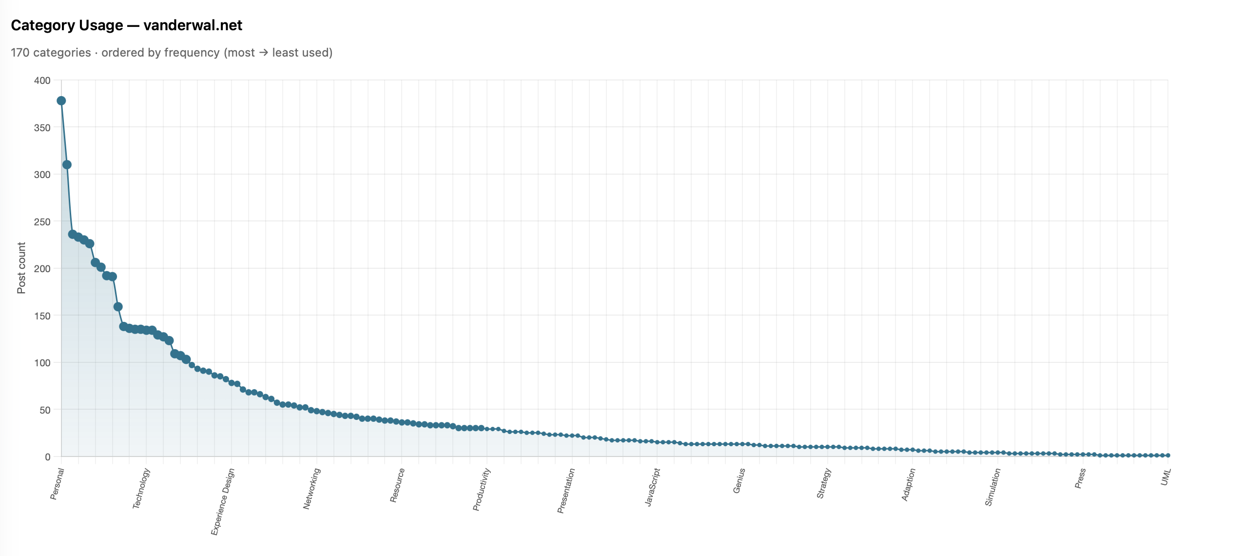
I shared it with James and he also ran his and ended up with much the same (Is there a power law of category use? - James’ Coffee Blog). There have been a few discussions of late around category use and some lean into having just a few categories. I have just over 200 categories now as most of my blog post have more than one subject and I use the categories to have an way to jump to related posts that cover the same subject. When I built my site’s CMS I wanted to have the capability to have multiple categories on each post. I have multiple categories for my own purposes, but also I’m cognizant that readers may have other terms.
With the long tail use of categories I know readers may stumble across a post through web search or a link from else where and having a category term that is familiar can get them to other things I may have posted. I view the web as being able to connect with others and blog posts are sharing things I have interests in or curiosity around and being able to connect with others in a similar mindset is the aim. So a handful of categories, particularly across 25 years and over 2,100 posts, doesn’t help build those connections.
More Analysis on Blog Posts and Categories
This distribution of categories really pushed my interest and curiosity of what the last 25 years of blogging looks like. I joke that Twitter ate my blog, but the sparklines sort of show that. I wanted to see the trends on my blog more closely (I have the archive of my Tweets and I’ll analyze them later and then bring the two analysis together).
To prep for the analysis I pulled my site’s database data local and put it into SQLite (it is already on Mac - Apple and quick) to connect locally with Jupyter Notebooks and use Plotly for interactive data visualizations in the notebook. I had a series of questions, somewhat common data analytics questions I’ve used since grad school looking at analysis over time.
Posts per Month
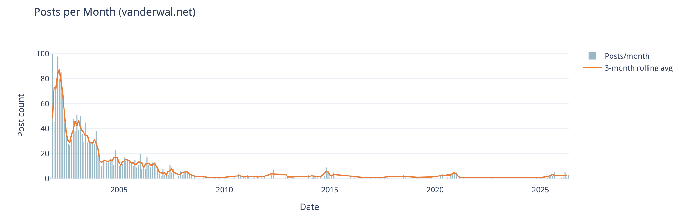
The first analysis is my blog posts by month over 25 years. In my early years I was posting frequently, often in shorter posts (but we will look at that next), and then around 2005 (when started engaging with Twitter) things dropped off. Also at this time I also started blogging more serious subjects at Personal InfoCloud, but those were not all that frequent (I’ll dig into this at some point later too).
My hunch that I posted much more early on and drop off around the time I engaged with Twitter, seem to hold up.
Post Length Over Time
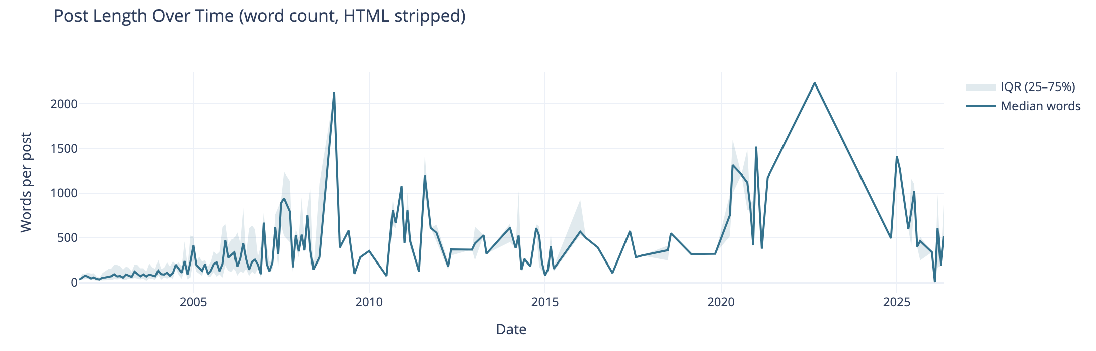
Post length over time also can tell the story of why post volume shifted. I wasn’t posting a lot of short post, but posting longer posts, but less frequently. I’m really curious what I posted in June of 2009 that caused the spike. The spike on the right end in 2020 and beyond are partly attributed to posting weeknotes, which tended to be longer than normal.
I know that my writing muscles went from a few hundred words early on to posts being around 1k and more. I found my comfortable blog post writing length was around 1.2k words. I write to find out and capture what I think, but rarely edit for brevity or other editing benefit, at least on this blog.
Median Categories per Post
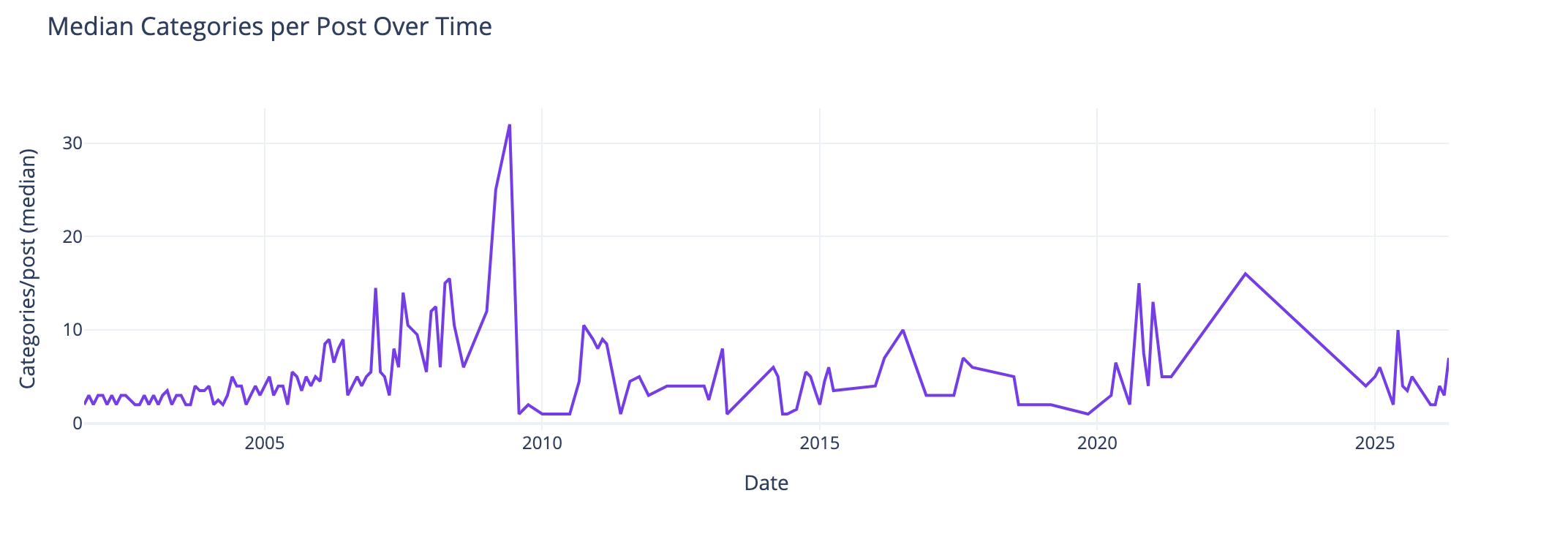
This view of the median number of categories per post over time I found interesting and I didn’t know what my expected outcome was going into this analysis. The numbers pretty much are in line with longer posts have more categories to cover slightly more breadth in a post. Again June 2009, not sure. The spike spike on the right aligns with weeknotes, which cover multiple subjects in one post.
Distribution of Categories per Post
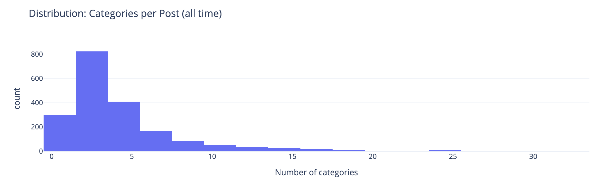
This chart groups number of categories on posts. This shows the second bar has the most number of posts (822 posts) have 2 or 3 categories on the posts. The third bar has 408 posts with 4 or 5 categories on them. This lines up well with the frequency and volume of posts early on which were shorter. Looking at the prior chart most posts had 10 or fewer categories on them.
Combined Timeline for Posts, Length, and median
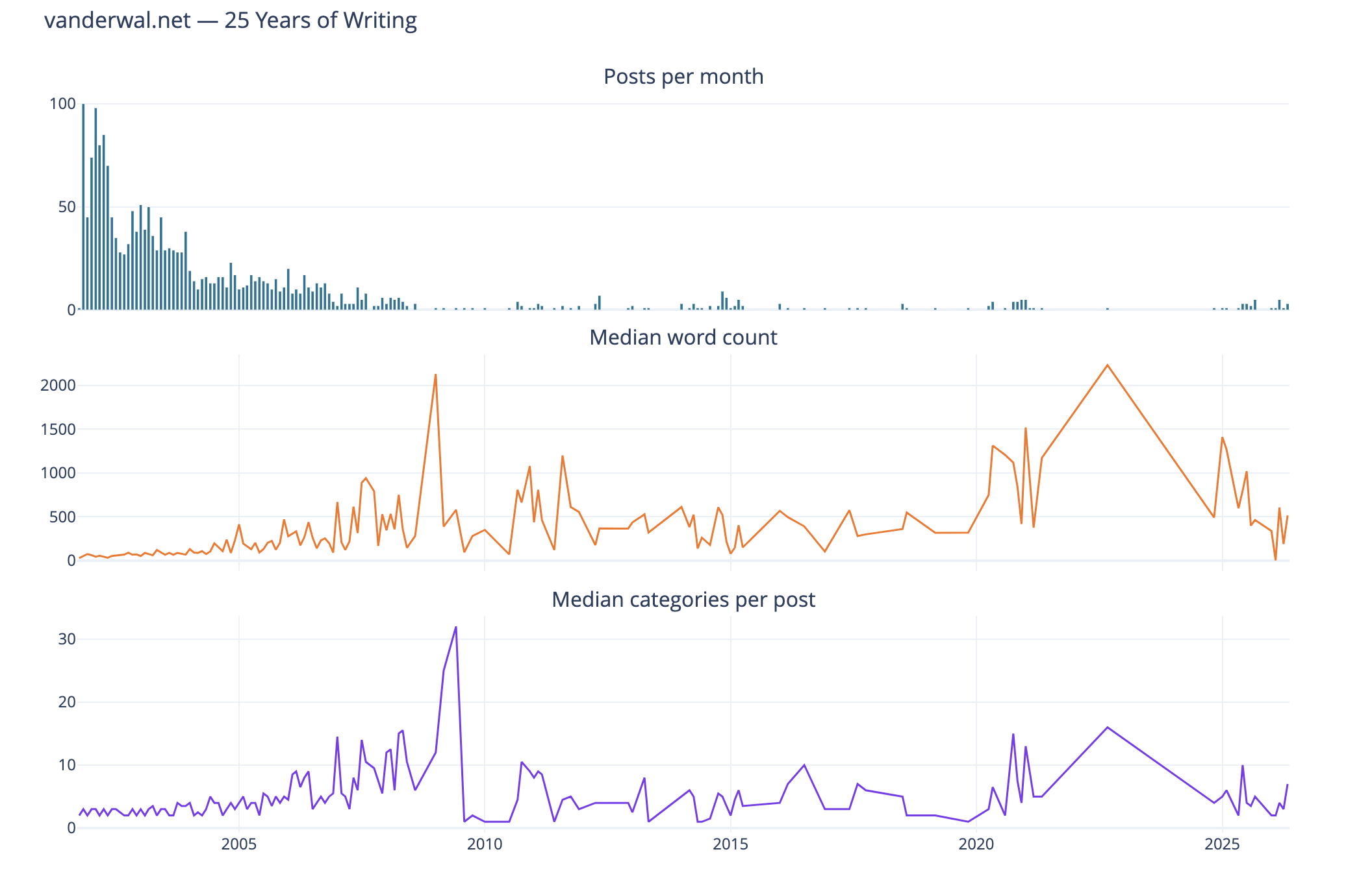
I like this combined chart that reinforces early on with high volume of posts of shorter length and few categories on them. What I find interesting is the correlation of line trends for word count per post and categories per post. This ties closely with the longer posts have more categories.
Seasonal Patterns
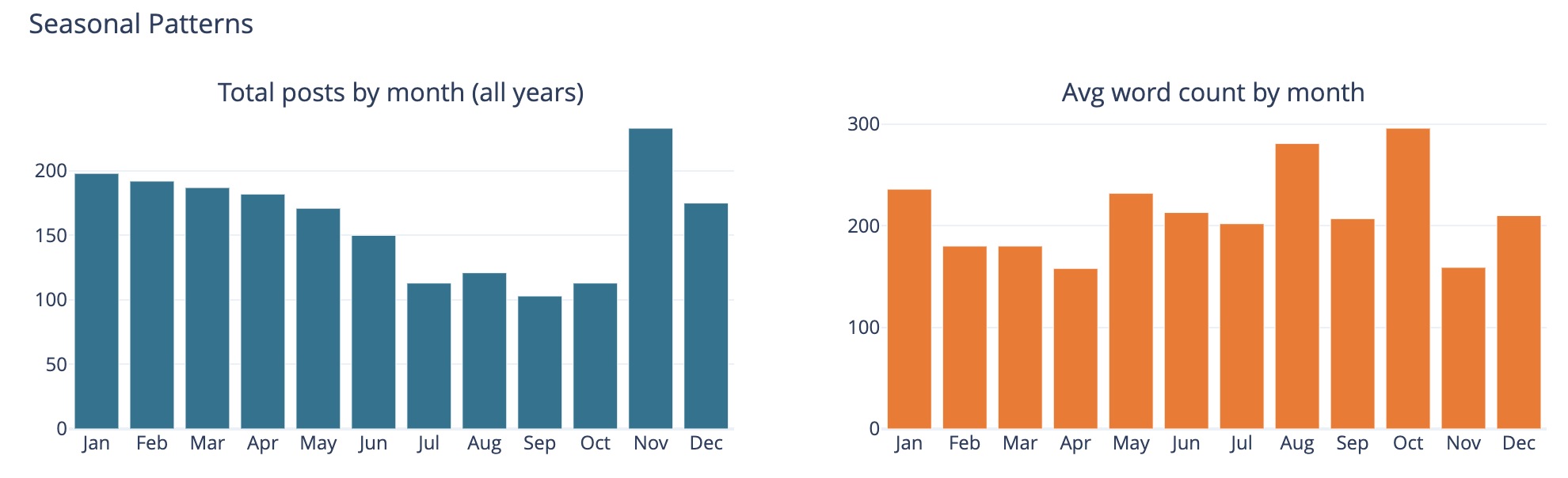
The bar chart on the left is total number of posts by month and on the left it is average word count on posts by month.
This was largely a curiosity to see what was there, but also a common analysis trend analysis to see if there are explanations of other trends looking at seasonal comparisons. The posts by month is not surprising to me as summer and early fall months have often been busy. I am not all that sure what the word count by month tells other than the correlation between more posts and shorter post length correlation showing up.
Top Category Activity Over Time
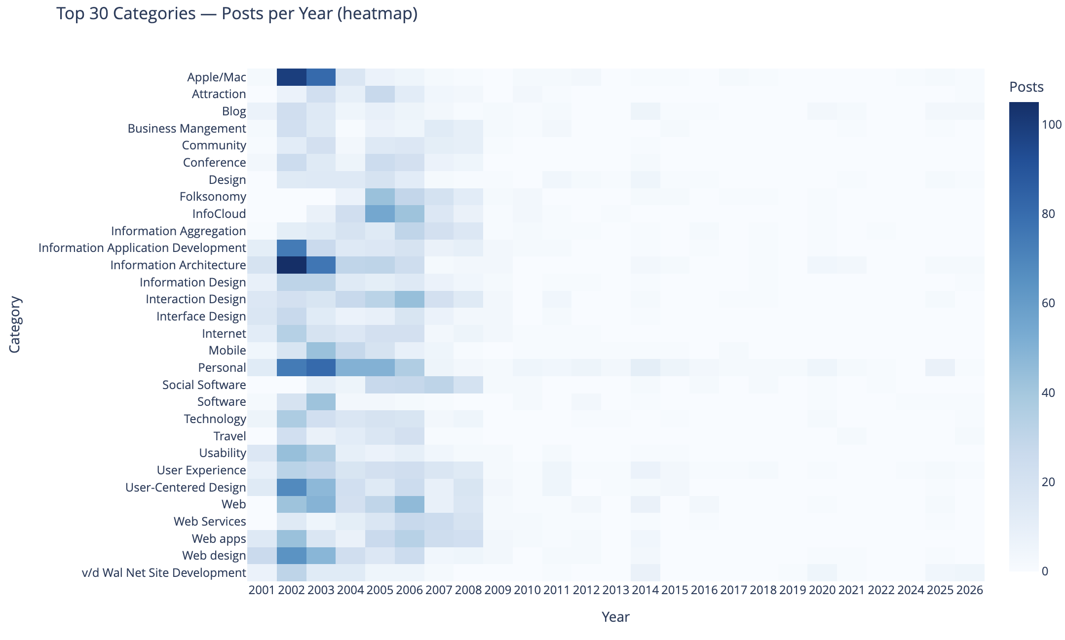
This chart shows the top 30 categories (by use) and their activity over time.
In this heat map Apple categorized posts were sure common, as well as Information Architecture, Information Application Development, Personal, User-Centered Design, and Web Design were also common. Personal and this site’s development.
The heat map being far more dense on the left in early years is skewed by volume of posts and makes activity in the middle and right (more recent years) difficult to see. I need to spend more time on this analysis and chart to separate out the early years and segment things so time outside of the early years can have trends more easily seen. I may want to select a different visualization, but if I can break things out by time that should help. Also running 3 time segements with the same top 30 categories across them and then the top 30 within each time segment could be interesting.
To 40 Co-Occuring Category Pairs
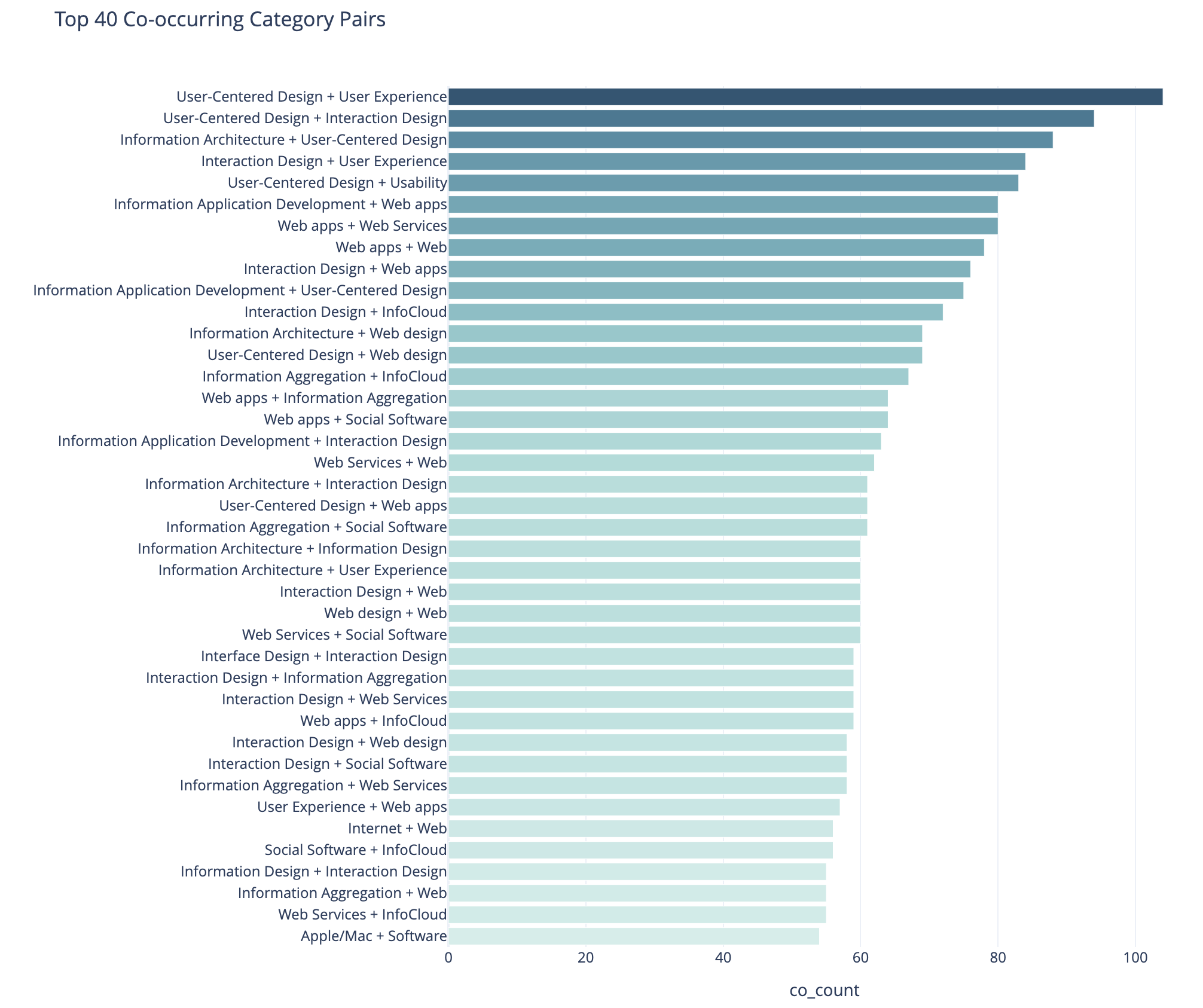
This cart of co-occurring category pairs is in part preparatory work for bringing concurrent tags into the category pages here for understanding and filtering needs for users.
The top 5 pairs are all related to UX, IA, and User-Centered Design and these being the type of concurrence isn’t a surprise to me. The broad UX community had rather divergent use of terms at times and one person’s IA was and other’s UX. For readers who think about these posts in one manner could find other similar content by the term they are familiar with using. Pretty much this whole list is application development, web design and development, web apps, and pan-UX related.
I don’t know how useful this is for broad insights. When I get to adding the concurrent categories on the category pages this will likely be more helpful on a category by category view.
Category Co-occurence Network Graph
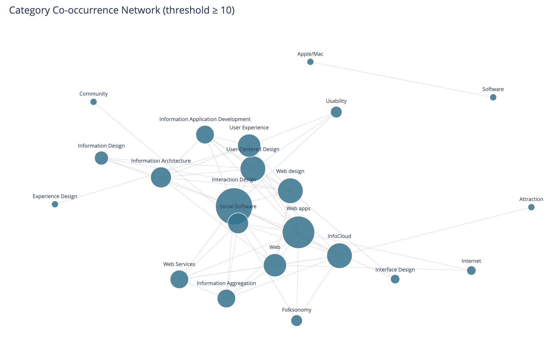
This chart looks at the top thirty categories that have 10 or more co-occurrence of categories.
This I find more interesting than the prior in that this has Social Software and Folksonomy showing up and showing its relationships. The largest category in this view is Interaction Design and its multiple connections. I am entertained by the standalone pairing of Apple and Software, that at the scale limited for the data these only connect to each other.
I need to rerun this with higher acceptance to get more included. But, also this graph isn’t interactive in Jupyter, and every time I went to zoom in it collapsed the graph and I couldn’t move a node out of the way was disappointing.
Helpful as a Good First Pass
This analysis and data visualizations were helpful to see into my 25 years of posts. There are some analysis sets and data visualizations that need more work. Most of these are more helpful with Plotly in Jupyter and the ability to interact with the visualizations.
I am really curious with what this will look like when I look at Twitter usage and notes. Obsidian on top of my notes make note making easier and far more helpful with backlinks / wiki links. I started using it on top of my directory with notes in June 2020 that had around 2k notes in it going back to 2003. Now there are around 6k to 7k and in the past about half of these notes would have been on one of my blogs.
The 8 Questions Answered in the Blog Questions Challenge
It has been a while since I’ve regularly blogged. I’m still writing a lot, but it is going into notes, and I need to get those back shared out. It used to be things I now put in notes, I just posted online (this sort of gets to the first question). I saw Joe Crawford answer these eight questions on his blog - ArtLung: Blog Questions Challenge ~ 16 Jan 2025. This seems like it would be a great thing to get the writing and workflow to post muscles functioning again.
1. Why did you make the blog in the first place?
I had some odd notes in HTML markup, mostly to myself, that I had posted before I started blogging. They were just HTML files roughly linked in a web directory. On this site I’ve had my links running as an HTML page since 1995, which is a couple years before I had my own domain.
In the web development community in the 1999 and 2000 I was reading sites that had become blogs. It was late 2000 when I was playing around with Blogger, mostly as a means to share links between home and work (this is what my FTP HTML files to my web directory was doing). In very late 2000 I made my first post in Blogger tied to this website. It worked on an FTP model as well at that point, but when I travelled hotels would block FTP from their hotel networks. I wrote a travel note system in PHP that allowed me to capture ideas, links, and notes. When I would get home I would introduce them back into Blogger. The travel notes turned into a CMS at work (I had been regularly rolling CMSes for work life for a few years).
2. Why did you choose to write your own blogging software?
I started with Blogger, but quickly was writing my own CMS for when I travelled. But, what I really wanted was the multiple categories added to blog posts that Grey Matter blogging software (Greymatter (software) - Wikipedia) had that Noah Gray created. I didn’t have an interest in going back to Perl as I had moved to PHP for easier development and having it be more readable code. So, I turned my Travel Notes I wrote in PHP into a more full fledged blogging tool. In Spring or Summer of 2001 I moved fully to my own hand written blogging software and It had stayed there. I still has functionality missing that I’ve long wanted to add.
I’ve updated the underlying code when I move hosts and I need to update the PHP to a newer version (I’m currently in the midst of doing that and hope by May to have that done, if not much sooner).
3. Have you blogged on other platforms before?
My Personal InfoCloud blog started on TypePad in 2005 (I had it on MovableType for a short bit, but Perl was rusty for me and I shifted to TypePad). Around 2012 that moved to SquareSpace and I’m in the midst of moving that to self-hosted WordPress. The PIC blog I just wanted to write and post, where as vanderwal.net I was fine messing with the underpinnings. I’ve setup and run a few WordPress sites. I helped get Home - Boxes and Arrows on MovableType, before MT was publicly available (Jay Allen ended up doing a lot of the heavy lifting as my worklife got very busy). Today I use Micro.blog very lightly and I need to sort out what I’m going to do with that.
4. Do you write your posts directly in the editor or in another software?
When I started blogging on this site I write in Bare Bones Software | BBEdit 15 in text, then would hand code the HTML and copy and paste that into the form, add in the title, location, type of post, and click categories to add. Around 2010 I shifted to Markdown in various Markdown editors. When the app Marked came out I started dragging the Markdown file to Marked and it would convert to clean HTML and I would check it, copy and past in to my system.
The since around 2010 or 2011 I’ve used iA Writer: The Benchmark of Markdown Writing Apps to write my blog content in Markdown. I have used Marked 2 to convert to HTML for this blog since it came out. The remainder of the workflow is to post into the CMS, it returns a blog post link, which I check through. If edits are needed I edit in Markdown, drag to Marked 2, drop in the test again for the post, and submit. If it is good, I go back to the CMS management screen and click to update the RSS feed. Then go to a push the notification something is posted to a ping service (it used to have 20+ options and now it is 2 or 3 I think).
5. When do you feel most inspired to write?
Most days I write thoughts I’ve been mulling as I wake. I capture links of interest I’ve read and write about those through out the day. In the evening I try to clear out open tabs and capture links then.
Sadly, in the last 4.5 years, since I’ve had Obsidian I just write in Markdown in there in a Daily Dump structure note template I have. Those all sit in the same directory as the Markdown for blog posts, as they are all notes.
I really need to get back in the habit of posting, at least a weeknote, if not more regularly. I have a long stack of writing to hone and post into Personal InfoCloud (more than 80 “blogfodder” items in a list for there - my past job didn’t take kindly to blogging, so I’ve held on to a lot of writing that just needs to get out).
6. Do you publish immediately after writing or do you let it simmer a bit as a draft?
Here on vanderwal.net in the Off the Top blog, it is pretty much what it says on the tin. As it is written it is posted. I’ve been trying to edit a bit more to fix missing letters, missing words, and making shorter sentences (that last bit becomes a rabbit hole), but mostly it goes out as I hit the last period. Marked 2 does some grammar checking and other lightweight edit helping, but not much more than that goes in to it.
7. Your favorite post on your blog?
Most posts I forget I’ve written once posted. The act of writing and posting clears them from my head, which is part of why I blog - so to clear my mind for other things. But, I think my favorite isn’t in the actual blog but adjacent to it, Model of Attraction - First Draft :: vanderwal.net, which is a brain dump while on a flight after the inkling of the idea for it was seeded. It was going to go into the Off the Top blog, but I set it apart as a draft. There are many posts I’ve written about attraction since that time -Attraction :: Off the Top :: vanderwal.net. The Model of Attraction is the underlying foundation for a lot of approaches to thinking through and assessing things technical, social (along with grad degree with deep social sciences and analytic / quant).
8. Any future plans for your blog? Maybe a redesign, changing the tag system, etc.?
I am in the midst of updating the PHP on the back end to bring the site’s code current. Once that is done I really need to add pagination to categories, a better previous and next navigation, calendar / chronology focus display of posts, and site search. I’ve also long wanted to have concurrent category views, say “folksonomy” and “data visualization” for better .
The other thing I really am wanting to do is to have a Digital Garden section shared out, like Maggie Appleton lays out here A Brief History & Ethos of the Digital Garden and does on her site, or as Tom Critchlow has been tending to on his site - Tom Critchlow. Move. Think. Create..
Khoi Turns Infocards into Wildcard
This past week one of my favorite designers, Khoi Vinh released a product for iOS that is a great play on information card UI called Wildcard. Khoi has a really good write-up of the journey launching Wildcard.
Wildcard is Best When Used
The real joy is in using Wildcard. Khoi created a wonderfully usable and quite intuitive UI and interaction model all based on information cards, which work wonderfully on mobile and other constrained UI devices. Wildcard is a mix of news summary and scrolling service and product finding service.
Information cards are often mis-used and misunderstood. Both Google and Twitter started in with adding infocards to their design and information structuring a few years back. Both did this as a means to surface well chunked and structured content into small chunks for mobile and other UI constrained interfaces, but also for information scanning and lite representation interfaces and interaction models, like Google Now and the Twitter stream. The model does not work as well on fuller information and content sites, as it constrains in ways that are not moving things forwards, but instead setting false arbitrary constraints.
An Interconnected Service
One of the great pleasures in Wildcard is it not only has its own hold onto for later interaction and service, but it has fully integrated sharing with others and into your own services where you track, store, and manage your information nuggets. It does a really good job of integrating into one’s own personal knowledge flows and capture services.
Far too many services (see (unfortunately) Medium as example of current balkanization from other services) have been shifting to make it difficult for the reader and user of their content to work with the content as they wish and need in their information flows. This fracturing means it is more difficult to share and attribute content (and send people to the site) when blogging or other write-ups.
Khoi has long understood the value of information relationships and information flows for use and reuse, which shows brightly here in Wildcard.
Moved Wildcard to the Front Row
After spending about 15 minutes with Wildcard in my first use of it, it moved to the front row of my “News” folder in my iOS devices. It may become one of my first go to apps to see what is happening in the world around me.
A Model Interaction App
One of the things that struck me in my first use was the intuitive interaction model and information model for moving into a collection and around and deeper in the collection and then back out. Wildcard is really well done on this front. It is one of those things where when I am done using it the ease of use (for the most part - there are one or so “wha?” moment, but for a just launched product that is great) really stands out and I start working through how it works and functions. I’m likely going to have a sit down with it not to use it, but to map out what it is doing, because for me its interaction design is really good and fluid.
It is always a joy to find an app or service that not only does its job well and seems to get out of the way, but works to augment your workflows and existing resources for use and reuse. But, when it stands out as a really easy to use service on first use and good for discovery and exploring, it is worth sitting and better understanding the how and why it does that so I can better think through options and paths for things I am working on or advising.
Kudos Khoi!
"Building the social web" Full-day Workshop in Copenhagen on June 30th
Through the wonderful cosponsoring of FatDUX I am going to be putting on a full-day workshop Building the Social Web on June 30th in Copenhagen, Denmark (the event is actually in Osterbro). This is the Monday following Reboot, where I will be presenting.
I am excited about the workshop as it will be including much of my work from the past nine months on setting social foundations for successful services, both on the web and inside organizations on the intranet. The workshop will help those who are considering, planning, or already working on social sites to improve the success of the services by providing frameworks that help evaluating and guiding the social interactions on the services.
Space is limited for this workshop to 15 seats and after its announcement yesterday there are only 10 seats left as of this moment.
Reading Information and Patterns
The past few weeks and months the subject of reading, analysis, and visualization have been coming up a lot in my talking and chatting with people. These are not new subjects for me as they are long time passions. Part of the discussion the past few weeks have been focussed on what is missing in social bookmarking tools (particularly as one's own bookmarks and tags grows and as the whole service scales) as wells as group discussion monitoring tools, but this discussion is not the focus of this post. The focus is on reading, understanding, and synthesis of information and knowledge.
Not that Reading
I really want to focus on reading. Not exactly reading words, but reading patterns and recognizing patterns and flows to get understanding. After we learn to read a group of letters as a word we start seeing that group of letters as a shape, which is a word. It is this understanding of patterns that interact and are strung together that form the type of reading I have interest in.
Yesterday, Jon Udell posted about analyzing two gymnasts make turns. He was frustrated that the analysis on television lacked good insight (Jon is a former gymnast). Jon, who is fantastic at showing and explaining technologies and interactions to get to the core values and benefits as well as demoing needed directions, applied his great skill and craft on gymnastics. He took two different gymnasts doing the same or similar maneuver frame-by-frame. Jon knew how to read what each gymnast was doing and shared his understanding of how to read the differences.
Similarly a week or so ago an article about the Bloomberg Terminal fantasy redesign along with the high-level explanations and examples of the Bloomberg Terminal brought to mind a similar kind of reading. I have a few friends and acquaintances that live their work life in front of Bloomberg Terminals. The terminals are an incredible flood of information and views all in a very DOS-looking interface. There is a skill and craft in not only understanding the information in the Bloomberg Terminal, but also in learning to read the terminal. One friend I chatted with while he was working (years ago) would glance at the terminal every minute. I had him explain his glancing, which essentially was looking for color shifts in certain parts of the screen and then look for movement of lines and characters in other areas. He just scanned the screen to look for action or alerts. His initial pass was triage to then discern where to focus and possibly dive deeper or pivot for more related information.
The many of the redesign elements of the Bloomberg Terminals understood the reading and ability to understand vast information (in text) or augmented the interface with visualizations that used a treemap (most market analysts are very familiar with the visualization thanks to SmartMoney's useage). But, the Ziba design was sparse. To me it seemed like many of the market knowledge workers used to the Bloomberg Terminal and knew how to read it would wonder where their information had gone.
Simplicity and Reading with Experience
The Ziba solution's simplicity triggers the need in understanding the balance between simplicity just breaking down the complex into smaller easy to understand bits and growing into understanding the bits recollected in a format that is usable through recognition and learned reading skills. The ability to read patterns is learned in many areas of life in sport, craft, and work. Surfers look at the ocean waves and see something very different from those who do not surf in the ebb, flow, breaks, surface currents and under currents. Musicians not only read printed music but also hear music differently from non-musicians, but formally trained musicians read patterns differently from those who have just "picked it up". There has been a push in business toward data dashboards for many years, but most require having the right metrics and good data, as well as good visualizations. The dashboards are an attempt to provide reading information and data with an easier learning curve through visualization and a decreased reliance on deep knowledge.
Getting Somewhere with Reading Patterns
Where this leads it there is a real need in understanding the balance between simplicity and advanced interaction with reading patterns. There is also a need to understand what patterns are already there and how people read them, including when to adhere to these patterns and when to break them. When breaking the patterns there needs to be simple means of learning these new patterns to be read and providing the ability to show improved value from these new patterns. This education process can be short video screen shots, short how-to use the interface or interactions. Building pattern libraries is really helpful.
Next, identify good patterns that are available and understand why they work, particularly why they work for the people that use then and learn how people read them and get different information and understanding through reading the same interface differently. Look at what does not work and where improved tools are needed. Understand what information is really needed for people who are interested in the information and data.
 An example of this is Facebook, which has a really good home page for each Facebook member, it is a great digital lifestream of what my friends are doing. It is so much better at expressing flow and actions the people I have stated I have social interest in on Facebook than any other social web tool that came before Facebook. Relative to the individual level, Facebook fails with its interface of the information streams for its groups. Much of the content that is of interest in Facebook happens in the groups, but all the groups tell you is the number of new members, new messages, new videos, and new wall posts. There is much more valuable information tucked in there, such as who has commented that I normally interact with, state the threads that I have participated in that have been recently updated, etc.
This example illustrates there needs to be information to read that has value and could tell a story. Are the right bits of information available that will aid understanding of the underlying data and stories? It the interface helpful? Is it easy to use and can it provide more advanced understanding? Are there easy to find lessons in how to read the interface to get the most information out of it?
Make Nice with Mobile Users Easily
Those interested in making friendly with their mobile users trying to consume their content aimed at the desktop browser market should take a peek at Make Your Site Mobile Friendly by Mike Davidson. This is one method that makes for a little less sweat and keeps some dollars in our budgets for other needs.
Flickr and the Future of the Internet
Peter's post on Flickr Wondering triggers some thoughts that have been gelling for a while, not only about what is good about Flickr, but what is missing on the internet as we try to move forward to mobile use, building for the Personal InfoCloud (allowing the user to better keep information the like attracted to them and find related information), and embracing Ubicomp. What follows is my response to Peter's posting, which I posted here so I could keep better track of it. E-mail feedback is welcome. Enjoy...
You seemed to have hit on the right blend of ideas to bring together. It is Lane's picture component and it is Nadav's integration of play. Flickr is a wonderfully written interactive tool that adds to photo managing and photo sharing in ways that are very easy and seemingly intuitive. The navigations is wonderful (although there are a few tweak that could put it over the top) and the integration of presentational elements (HTML and Flash) is probably the best on the web as they really seem to be the first to understand how to use which tools for what each does best. This leads to an interface that seems quick and responsive and works wonderfully in the hands of many. It does not function perfectly across platforms, yet, but using the open API it is completely possible that it can and will be done in short order. Imagine pulling your favorites or your own gallery onto your mobile device to show to others or just entertain yourself.
Flickr not only has done this phenomenally well, but may have tipped the scales in a couple of areas that are important for the web to move forward. One area is an easy tool to extract a person's vocabulary for what they call things. The other is a social network that makes sense.
First, the easy tool for people to add metadata in their own vocabulary for objects. One of the hinderances of digital environments is the lack of tools to find objects that do not contain words the people seeking them need to make the connection to that object they are desiring. Photos, movies, and audio files have no or limited inherent properties for text searching nor associated metadata. Flickr provides a tool that does this easily, but more importantly shows the importance of the addition of metadata as part of the benefit of the product, which seems to provide incentive to add metadata. Flickr is not the first to go down this path, but it does it in a manner that is light years ahead of nearly all that came before it. The only tools that have come close is HTML and Hyperlinks pointing to these objects, which is not as easy nor intuitive for normal folks as is Flickr. The web moving forward needs to leverage metadata tools that add text addressable means of finding objects.
Second, is the social network. This is a secondary draw to Flickr for many, but it is one that really seems to keep people coming back. It has a high level of attraction for people. Part of this is Flickr actually has a stated reason for being (web-based photo sharing and photo organizing tool), which few of the other social network tools really have (other than Amazon's shared Wish Lists and Linkedin). Flickr has modern life need solved with the ability to store, manage, access, and selectively share ones digital assets (there are many life needs and very few products aim to provide a solution for these life needs or aims to provide such ease of use). The social network component is extremely valuable. I am not sure that Flickr is the best, nor are they the first, but they have made it an easy added value.
Why is social network important? Helping to reduct the coming stench of information that is resultant of the over abundance of information in our digital flow. Sifting through the voluminous seas of bytes needs tools that provide some sorting using predictive methods. Amazon's ratings and that matching to other's similar patterns as well as those we claim as our friends, family, mentors, etc. will be very important in helping tools predict which information gets our initial attention.
As physical space gets annotated with digital layers we will need some means of quickly sorting through the pile of bytes at the location to get a handful that we can skim through. What better tool than one that leverages our social networks. These networks much get much better than they are currently, possibly using broader categories or tags for our personal relationships as well as means of better ranking extended relationships of others as with some people we consider friends we do not have to go far in their group of friends before we run into those who we really do not want to consider relevant in our life structures.
Flickr is showing itself to be a popular tool that has the right elements in place and the right elements done well (or at least well enough) to begin to show the way through the next steps of the web. Flickr is well designed on many levels and hopefully will not only reap the rewards, but also provide inspiration to guide more web-based tools to start getting things right.
Chevy Redesigns with Standards
Chevrolet has redesigned with fully valid (one minor issue in the style sheet) XHTML (strict) and CSS. It is beautiful and wonderfully functional. All the information can be easily copied and pasted to help the discerning car buyer build their own crib sheet. The left navigation (browsing structure) is wonderful and not a silly image, but a definition list that is expandable. The style layer is semantic, which is a great help also (for those IAs who understand). Those of you so inclined, take a look under the hood as there are many good things there.
Keith's Navigation Stress Test
I recently restumbled across Keith Instone's Navigation Stress Test. This will help greatly when trying to sort out browsing structure issues when thinking through how well the user from the whole in the eaves. This is a quick mental jog to ensure the user can find what they are looking for, which will help the site owner's whuffie
The user from the drainpipe
Jeff Lash has posted an on target article at Digital Web, How did you get here? Designing for visitors who don't enter through the home page. This has been issue for to encourage clients to look in their access logs. Most often 40 to 70 percent of a whole site's traffic has their entry point to the site at some other point than the front page. Many clients only think that people enter their site through a home page. The early Web years placed an insane amount of focus on the home page.
I have talked to Jeff about this a while back and he had the same experience with clients and in-house sponsors. Part of the change is eternal search has become much better. Many users head to Google to find what they are seeking rather than going to endpoint.com and clicking from their home page.
This focus shift requires sites to have browsing structures for their users. Test with outside users who are not familiar to the site by starting them in the middle. Check heuristics for each section and page. Does the user know where they are? Can the user find other related information?
Jeff nails this topic, which has more room to grow. Go read.
Indi on site navigation and keeping it under control
Indi Young provides a great guide for building browsing structures in her article Site Navigation: Keeping It Under Control.