Personal Blog Data Analysis - Looking at 25 Years
After adding sparklines to my category lists (Updated Categories with Sparklines and Search is Now in Production) I wanted to have a deeper dive looking at my categories and blog analytics over 25 years.
Category Long Tail
I done a very quick capture of category usage to look at the distribution of use. A question from James about whether my category distribution looked like a long tail distribution and I thought it may, but also looking at the numbers and not having a visualization I wasn’t sure. Charting the use, it really was a very long tail / power law distribution.
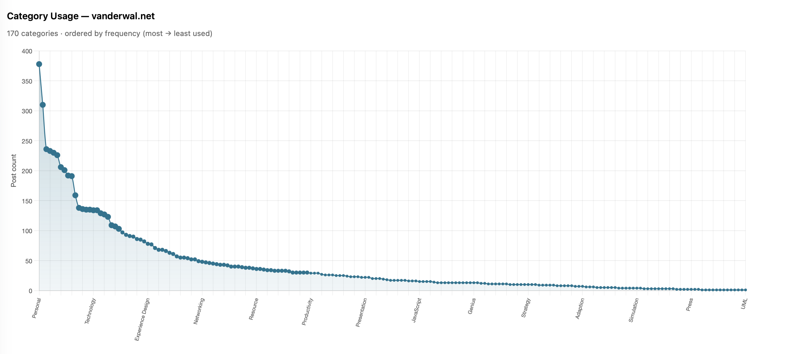
I shared it with James and he also ran his and ended up with much the same (Is there a power law of category use? - James’ Coffee Blog). There have been a few discussions of late around category use and some lean into having just a few categories. I have just over 200 categories now as most of my blog post have more than one subject and I use the categories to have an way to jump to related posts that cover the same subject. When I built my site’s CMS I wanted to have the capability to have multiple categories on each post. I have multiple categories for my own purposes, but also I’m cognizant that readers may have other terms.
With the long tail use of categories I know readers may stumble across a post through web search or a link from else where and having a category term that is familiar can get them to other things I may have posted. I view the web as being able to connect with others and blog posts are sharing things I have interests in or curiosity around and being able to connect with others in a similar mindset is the aim. So a handful of categories, particularly across 25 years and over 2,100 posts, doesn’t help build those connections.
More Analysis on Blog Posts and Categories
This distribution of categories really pushed my interest and curiosity of what the last 25 years of blogging looks like. I joke that Twitter ate my blog, but the sparklines sort of show that. I wanted to see the trends on my blog more closely (I have the archive of my Tweets and I’ll analyze them later and then bring the two analysis together).
To prep for the analysis I pulled my site’s database data local and put it into SQLite (it is already on Mac - Apple and quick) to connect locally with Jupyter Notebooks and use Plotly for interactive data visualizations in the notebook. I had a series of questions, somewhat common data analytics questions I’ve used since grad school looking at analysis over time.
Posts per Month
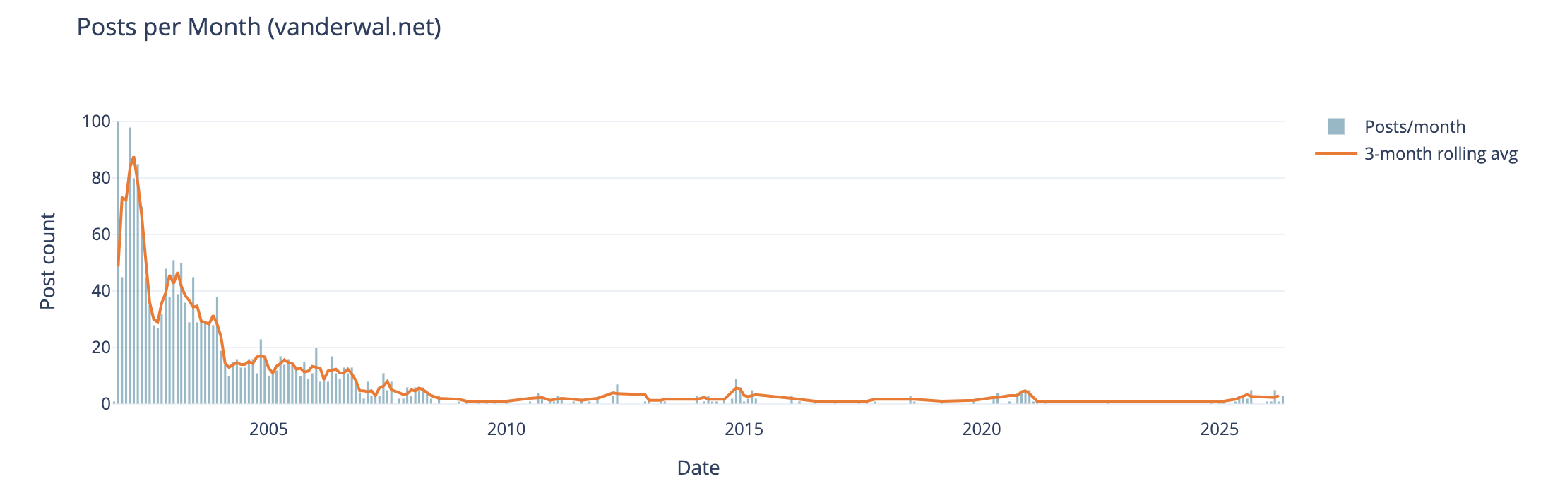
The first analysis is my blog posts by month over 25 years. In my early years I was posting frequently, often in shorter posts (but we will look at that next), and then around 2005 (when started engaging with Twitter) things dropped off. Also at this time I also started blogging more serious subjects at Personal InfoCloud, but those were not all that frequent (I’ll dig into this at some point later too).
My hunch that I posted much more early on and drop off around the time I engaged with Twitter, seem to hold up.
Post Length Over Time
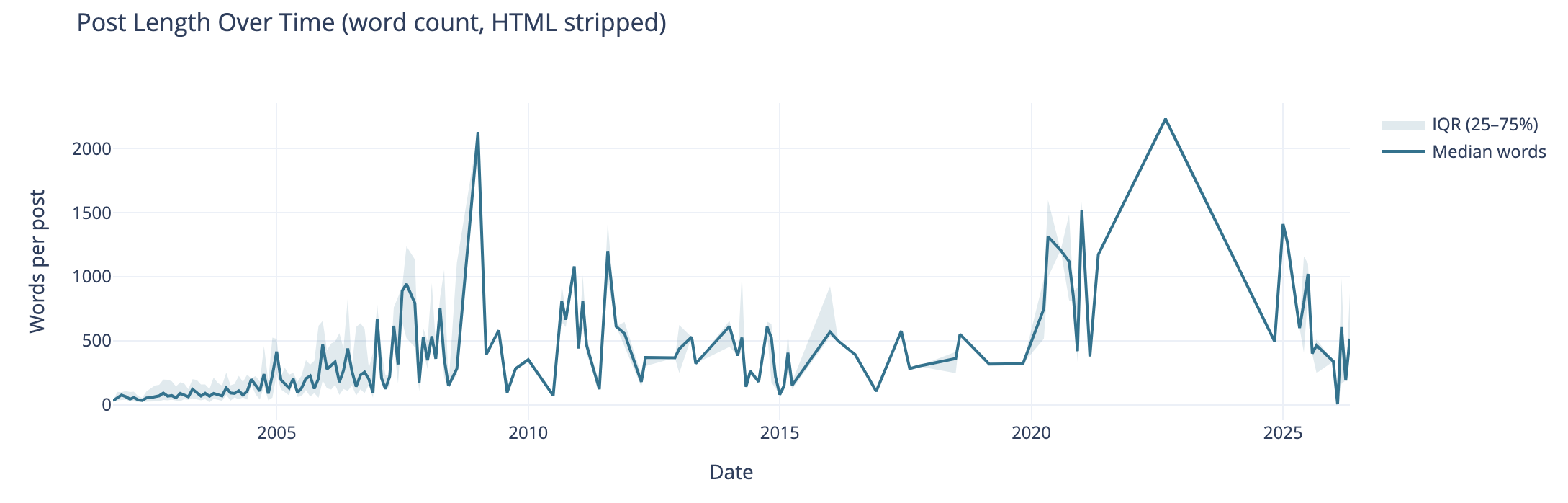
Post length over time also can tell the story of why post volume shifted. I wasn’t posting a lot of short post, but posting longer posts, but less frequently. I’m really curious what I posted in June of 2009 that caused the spike. The spike on the right end in 2020 and beyond are partly attributed to posting weeknotes, which tended to be longer than normal.
I know that my writing muscles went from a few hundred words early on to posts being around 1k and more. I found my comfortable blog post writing length was around 1.2k words. I write to find out and capture what I think, but rarely edit for brevity or other editing benefit, at least on this blog.
Median Categories per Post
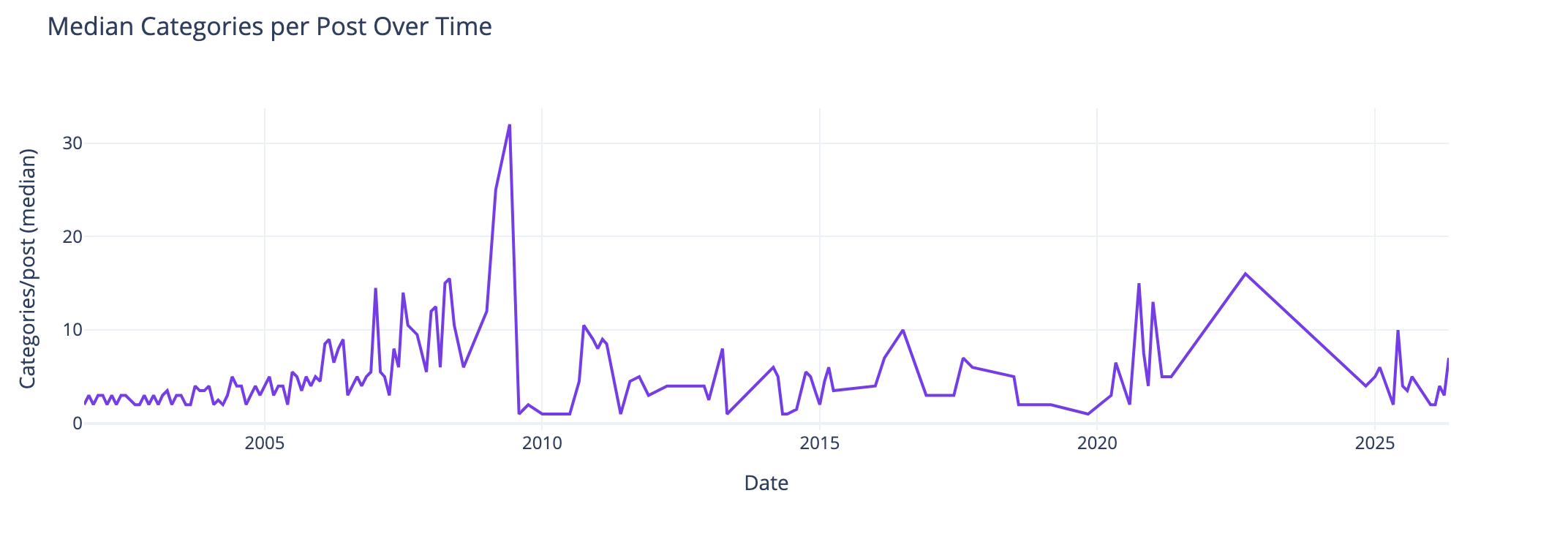
This view of the median number of categories per post over time I found interesting and I didn’t know what my expected outcome was going into this analysis. The numbers pretty much are in line with longer posts have more categories to cover slightly more breadth in a post. Again June 2009, not sure. The spike spike on the right aligns with weeknotes, which cover multiple subjects in one post.
Distribution of Categories per Post
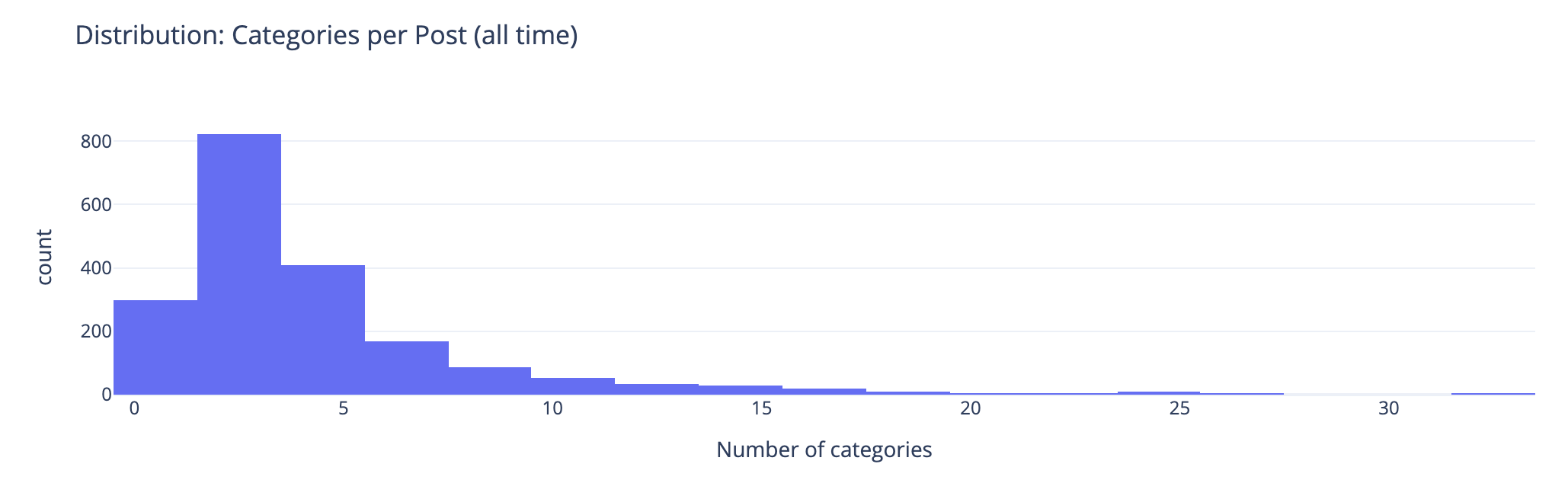
This chart groups number of categories on posts. This shows the second bar has the most number of posts (822 posts) have 2 or 3 categories on the posts. The third bar has 408 posts with 4 or 5 categories on them. This lines up well with the frequency and volume of posts early on which were shorter. Looking at the prior chart most posts had 10 or fewer categories on them.
Combined Timeline for Posts, Length, and median
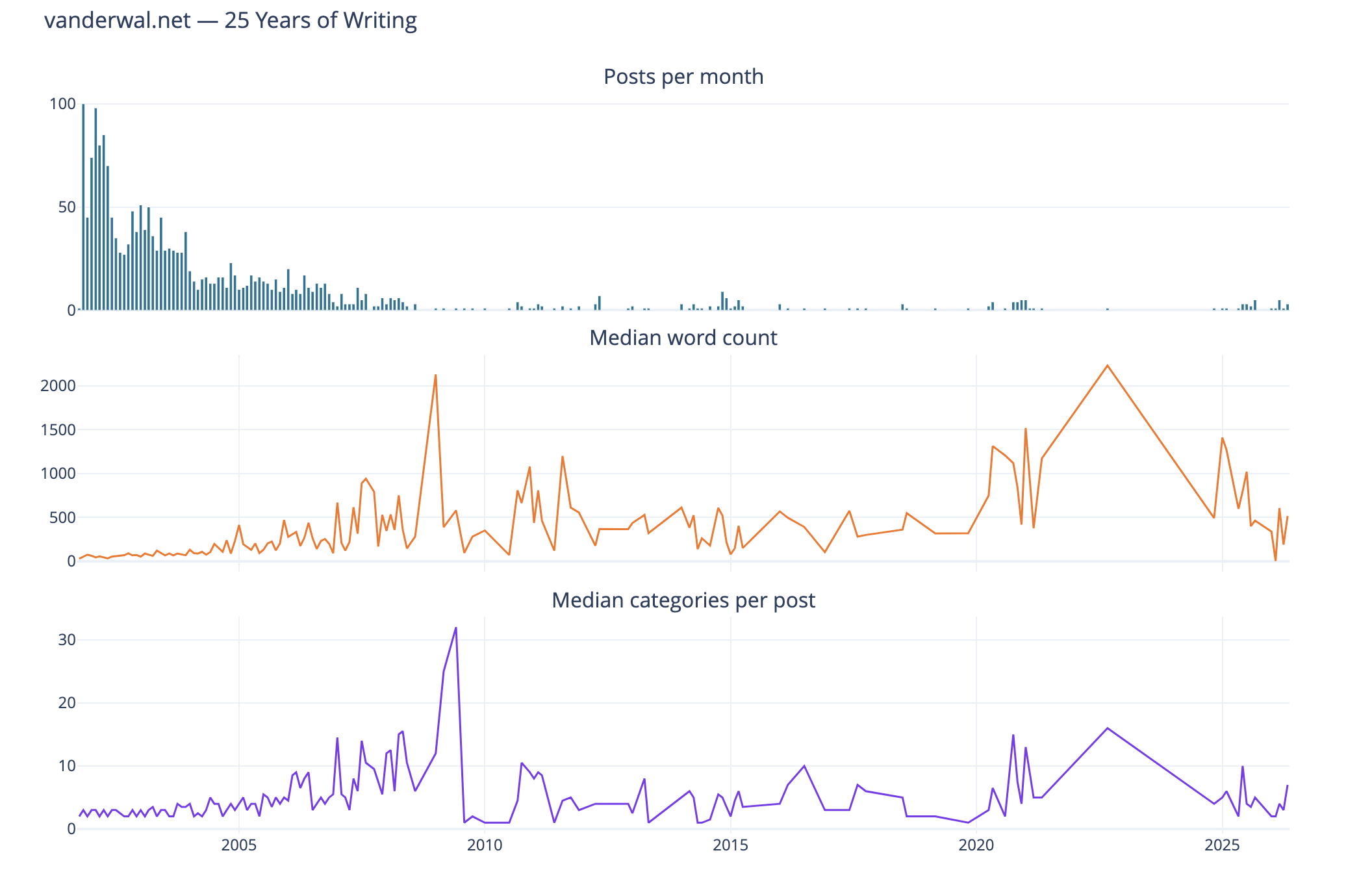
I like this combined chart that reinforces early on with high volume of posts of shorter length and few categories on them. What I find interesting is the correlation of line trends for word count per post and categories per post. This ties closely with the longer posts have more categories.
Seasonal Patterns
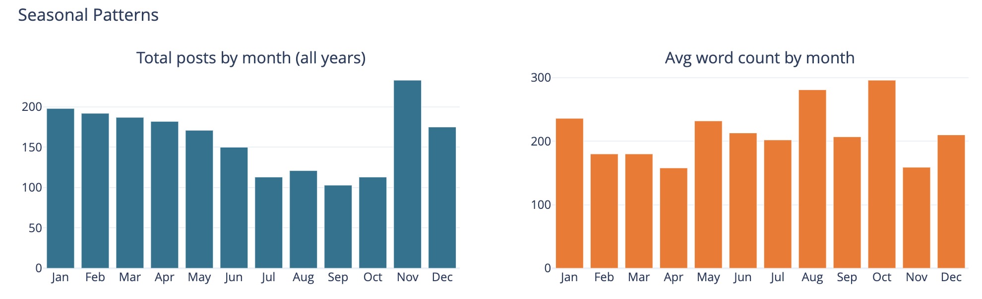
The bar chart on the left is total number of posts by month and on the left it is average word count on posts by month.
This was largely a curiosity to see what was there, but also a common analysis trend analysis to see if there are explanations of other trends looking at seasonal comparisons. The posts by month is not surprising to me as summer and early fall months have often been busy. I am not all that sure what the word count by month tells other than the correlation between more posts and shorter post length correlation showing up.
Top Category Activity Over Time
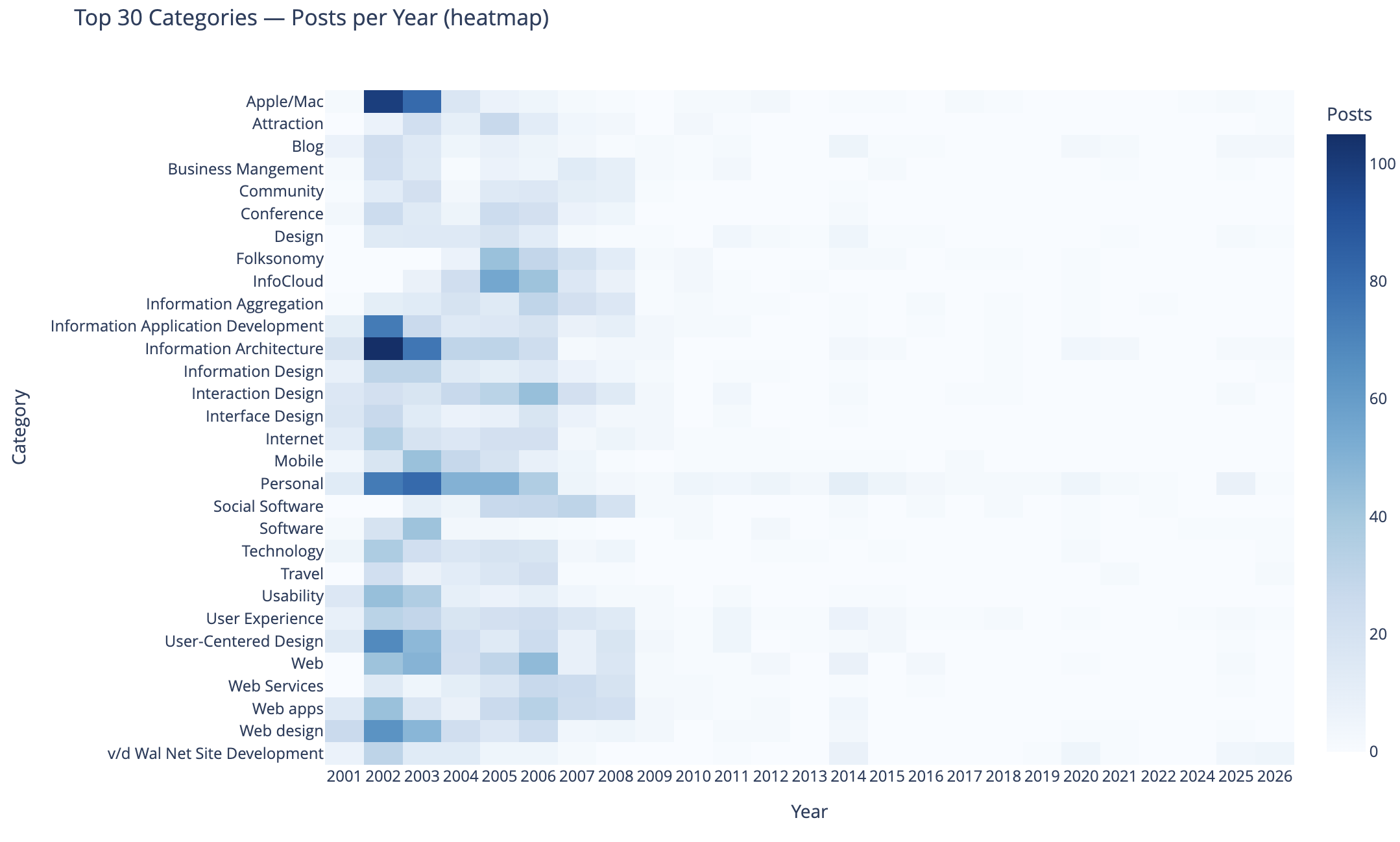
This chart shows the top 30 categories (by use) and their activity over time.
In this heat map Apple categorized posts were sure common, as well as Information Architecture, Information Application Development, Personal, User-Centered Design, and Web Design were also common. Personal and this site’s development.
The heat map being far more dense on the left in early years is skewed by volume of posts and makes activity in the middle and right (more recent years) difficult to see. I need to spend more time on this analysis and chart to separate out the early years and segment things so time outside of the early years can have trends more easily seen. I may want to select a different visualization, but if I can break things out by time that should help. Also running 3 time segements with the same top 30 categories across them and then the top 30 within each time segment could be interesting.
To 40 Co-Occuring Category Pairs
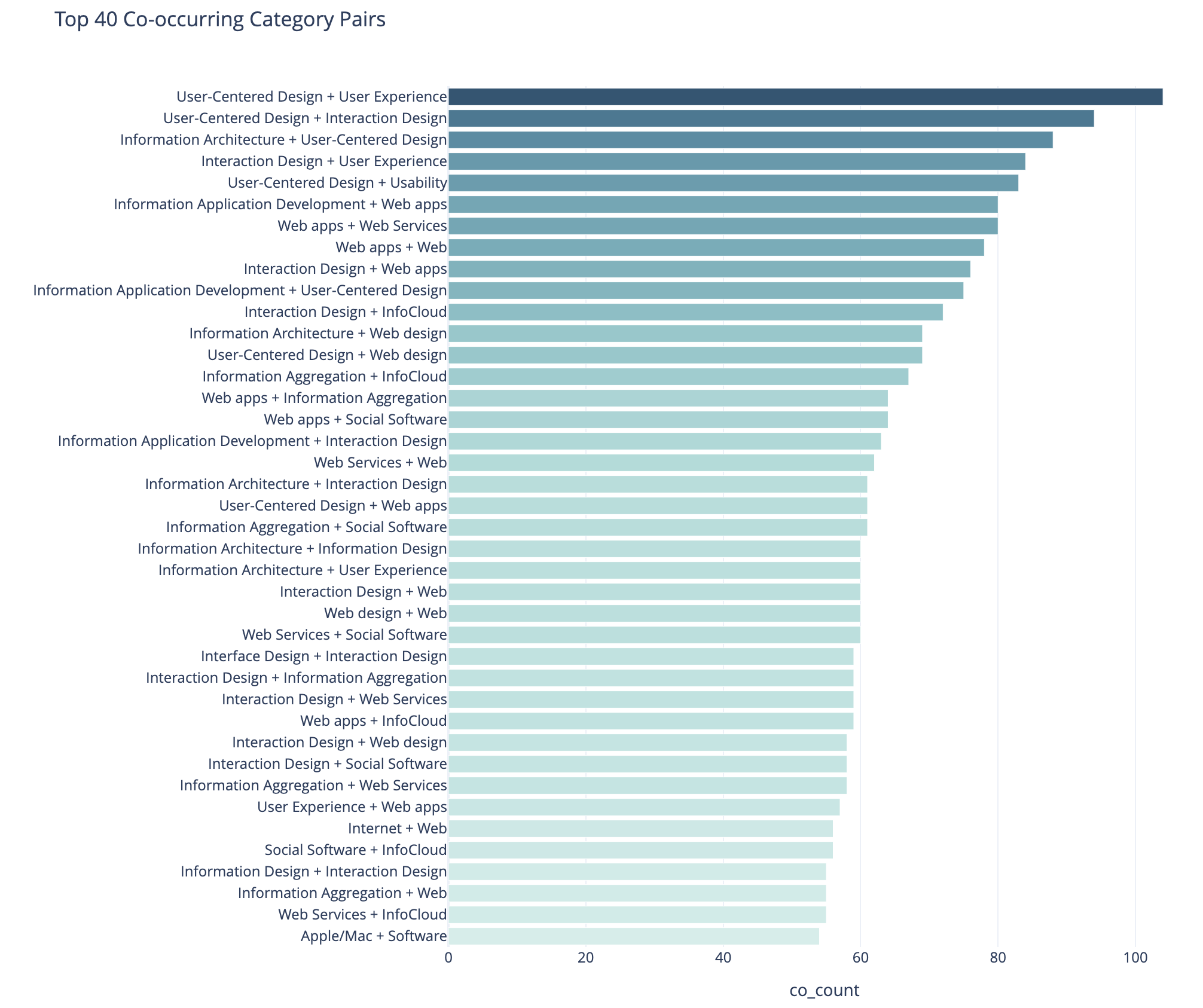
This cart of co-occurring category pairs is in part preparatory work for bringing concurrent tags into the category pages here for understanding and filtering needs for users.
The top 5 pairs are all related to UX, IA, and User-Centered Design and these being the type of concurrence isn’t a surprise to me. The broad UX community had rather divergent use of terms at times and one person’s IA was and other’s UX. For readers who think about these posts in one manner could find other similar content by the term they are familiar with using. Pretty much this whole list is application development, web design and development, web apps, and pan-UX related.
I don’t know how useful this is for broad insights. When I get to adding the concurrent categories on the category pages this will likely be more helpful on a category by category view.
Category Co-occurence Network Graph
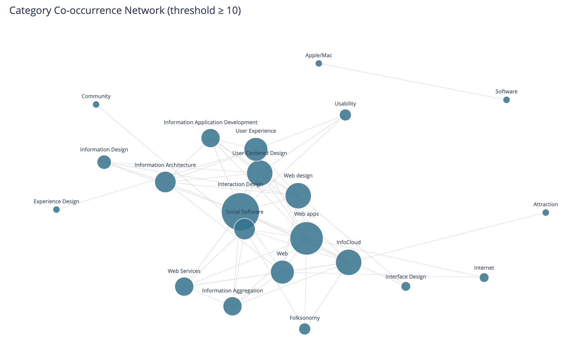
This chart looks at the top thirty categories that have 10 or more co-occurrence of categories.
This I find more interesting than the prior in that this has Social Software and Folksonomy showing up and showing its relationships. The largest category in this view is Interaction Design and its multiple connections. I am entertained by the standalone pairing of Apple and Software, that at the scale limited for the data these only connect to each other.
I need to rerun this with higher acceptance to get more included. But, also this graph isn’t interactive in Jupyter, and every time I went to zoom in it collapsed the graph and I couldn’t move a node out of the way was disappointing.
Helpful as a Good First Pass
This analysis and data visualizations were helpful to see into my 25 years of posts. There are some analysis sets and data visualizations that need more work. Most of these are more helpful with Plotly in Jupyter and the ability to interact with the visualizations.
I am really curious with what this will look like when I look at Twitter usage and notes. Obsidian on top of my notes make note making easier and far more helpful with backlinks / wiki links. I started using it on top of my directory with notes in June 2020 that had around 2k notes in it going back to 2003. Now there are around 6k to 7k and in the past about half of these notes would have been on one of my blogs.