Off the Top: v/d Wal Net Site Development Entries

20052010201520202025

Showing posts: 1-15 of 116 total posts


3 October 2026

Off the Top Search Update and More

I was initially hoping to look at what was going to be needed to update the Off the Top blog search with phrase searching. In going through the options and potential work needed, I started running tests in the Lab. Those tests progressed quickly and with debugging assistance I had something that worked and I was also able to add a boolean exclusion as well.

The past month or so, with posting more, I have been regularly checking with blog search to see if I have posted something related to include in a new post or posted something so close I don’t need to post it. In doing those searches for things along the lines of “model of attraction” (with no quotes around them) I found all sorts of things with model and/or attraction. The results that didn’t have the phrase were wasting time and started being a little annoying. Now, with the update, a “model of attraction” with quotes only pulls results with that phrase. The search is indifferent to capitalization, which I am quite fine with (as of this moment). The exclusion is nice to have as well, as I cannot include results with a term or quoted phrase, so “-mess” does not include results with mess.

I have a hint under the search box on the Search Page :: Off the Top :: vanderwal.net, but It needs better styling. The search results page doesn’t have the search hint in it, but phrase search and exclusions work from there as well, as it is the results that handle all of the parsing.

A WordPress Urgent Update

As I had the blog search update working and dropped in on the production side of the world, I had a note from my host that I urgently needed to update a WordPress installation related to my dad’s memorial site - tom.vanderwal.net. I went through that process, which included sorting out the stored credentials no longer working. Then there was the back-up of the DB and WP files. There was a bit of an update to go through as the PHP was needing an update, the only two plug-ins running needed updating, and removing 7 themes not used as well as updating the one being used.

I let my host know and they came back with a definitive, “nope, not done”. This started feeling like one of those, “the call is coming from inside the house moments”. I looked at where they pointed to and it wasn’t what was serving the sub-domain, the WP wasn’t exposed, WP wasn’t running, and wasn’t connected to a database. I archived it and deleted the directory. Then went through the host controls to deal with mentions of it in the control panels.

So, what was I planning on doing 7 hours ago?


24 September 2026

Webmention Receipt Fixed?

Somewhere in the past month the site’s ability to receive webmentions became a little faulty. I think this may have been resolved. A little more than 10 years ago I started setting up the ability to receive a Webmention - IndieWeb, but it wasn’t completed properly. In the last year I set up Webmention.io and it has been working until about a month ago. Part of the old attempt with the Heroku app approach (which occasionally worked) was still in place. I pulled that out today. I tested with my Micro.blog site and it finally went through, which was a good sign. I had been able to get a webmention through Webmention Rocks!, but that seemed to be the only source able to generate it properly (this site also has a great lest of tests it runs with great output for understanding various).

Over the weekend I also took the step to authenticate things through IndieKey to authenticate many IndieWeb related services. Your site is your identity, through a set of validations.

While my site can receive a webmention (think of them as comments or end points to send a like) they are not displayed on the site. The webmention gets received through RSS that I pull. At some point I may setup the ability to post webmentions on my side, so I’m not using my micro.blog to handle those. But, that day is not today.


22 September 2026

Modernized Page Structure for the Model of Attraction Draft from March 2002

I’ve been looking at filling in the gaps around the Personal InfoCloud and setting the foundation for it in the four InfoClouds in an Overview of the InfoClouds, but pointing back to a quick framing of the Model of Attraction, mostly leans to the original draft (and only a first draft) of the Model of Attraction - First Draft :: vanderwal.net that I wrote on a flight back home from Austin when the idea hit.

Looking at that page, the page was still in a 2002 or 2003 layout and design, which is quite similar to what it is today, but the text was much smaller and the page much narrower.

Update of the Layout Structure

I updated the layout structure of the page and the HTML framework of the page and used the current CSS that does much of the layout work (then and now). I also fixed a few typos and corrected the date at the top, which was a year off as stated elsewhere, as March 2002 is the correct date.

I Haven’t Read Through This In a Long While

As I was resetting the scaffolding of the page I realized it has been a long time since I have read this in full, and I need to set aside time to do that. There are quite a few things I wrote out fully in the rough draft and in the outlined sections at the end, which set the foundations for much that was to follow. But, it goes much farther in a broad sense pulling things in and building bridges to uses of the model within different domains that people work in. The initial piece also calls out the initial rough use of info cloud in my quote:

“Users have a rough cloud of information following them that has a magnetic attraction toward them and their interests.”

I had forgotten about that. It had been captured by someone I was talking with as the idea was gelling and I used it a couple of times and realized it had gravity. This became the hook for InfoCloud.


19 September 2026

Updated Blog Analytics and Added Personal InfoCloud Site

Yesterday I did a little updating of the blog analytics and took my data workflow and applied it to data from my Personal InfoCloud site. There isn’t as much data, as there are only around 130 posts. But, there are 50 categories and not all categories have been applied to older posts as needed. With the the different data shapes the force graph looks different and works differently, Personal InfoCloud, 2003–2026 forced graph for blog posts and categories, and the bar charts for posts over time and word count and line chart for cumulative word counts, Personal InfoCloud, 2003–2026 Words also looks different.

Both of these have been added to the Blog Analytics page in the Lab, Blog Analytics :: Lab :: vanderwal.net. I have normalized the templates for all of the analytics, to some degree. There is more clean-up I’d like to do on the templates. But, I mostly created these for myself to get an understanding of what is there and patterns.

A Note About the Personal InfoCloud Site

On the Personal InfoCloud site side of things I have quite a few posts that have been queued up to publish there. There are also many things I thought I posted, which have gone to point to, but realize they aren’t there. The laying out of the “four InfoClouds”: Personal InfoCloud, Local InfoCloud, Global InfoCloud, and External InfoCloud hasn’t been laid out and posted that I can find. Also the Personal Info Cycle that frames out the workflows in the Personal InfoCloud for individuals. This has been used for some very large products that many people use. This is part of the downside of presenting these publicly for 20 years and well over 100 times (maybe more than 200) I haven’t sorted out what is fully written and posted. This needs to stay in focus as many of the good patterns laid out are starting to break as development and product leads are reverting to earlier broken patterns thanks to vibe coding and AIs not understanding the improved patterns and the broken patterns are out there in abundance.

Also on the Personal InfoCloud site I was doing a Shift Happened series that had four of the 16 posts written and posted. I need to list out what was, or could be coming.


18 September 2026

Prototopia Diner Shared Out

A little over a week ago I hit a creative writing stride and knocked out a small scene in about an hour. I honed it a bit and I shared it with a few people. I had some editing discussions with James and cleaned it up a bit. Even though it is posted it still may be an edit to fix a couple of things, but Prototopia Diner is shared out. Go read it if you wish.

Prototopia Diner is sitting in a new Creative section for my site. I’m not yet adding it to the full site navigation. I’m likely going to move poetry here in some way at some point. I have some other writing I may add in here as well. I wanted a place that I could post creative fictional writing and pull in more poems that I wrote in the mid–90s.

The posts in the Creative section will have a look that is a little different from the rest of the site. On Prototopia Diner I’m using a serif font (Georgia) for easier reading and as a first separation from other portions of the site. I may do something different for each offering, but I’m not fully sure yet.


6 September 2026

The Category Page has Been Updated

Today after some small tweaks I moved the updated category page into the Off the Top blog area. Clicking any category will bring it up. Let’s say you want pages categorized with “folksonomy”, Folksonomy :: Off the Top :: vanderwal.net, and you get the updated category page. It allows you to filter the 128 (as of today for posts categorized as having folksonomy content) blog posts by a five-year range, as well as a co-category. It also shows a distribution chart with marks as 5-year demarcations.


5 September 2026

A Quick Category Page Lab Update

Today I thought I may be able to tackle 2 of the 6 tasks for features and functionality I want to take care of before moving the Category page in the Lab to the production side. Well, one of the tasks (the definitions) I knew is going to be pushed out as it going to take sit down and type words time. The other sort of large task was going to break some ease of use functionality and breaking something I find helpful is a bit of a problem, but also adds odd friction.

What Got Done

I was able to knock out four of the tasks that get the Category page in a much better place than it is at the moment.

The sidebar with the “Year Range” and “Co-category” selection was cleaned up and now with fixing the line wrapping for the long category names, so they no longer go under the radio button when the line wraps.

The inconsistency of the design of the counts for the two areas of selection is fixed and now the count has a subtle light box around them so the counts are noticeable but not drawing too much attention. Working with shades of orange is always tedious, but I like orange enough to deal with it.

There is now a noticeably clear filter selections button for the sidebar and in the main content section at the top. The button at the bottom of the sidebar to submit the filter selections matches the clear the filters buttons. The sidebar radio buttons (if you have JavaScript on) don’t require the submit button, but it is there for those with JavaScript turned off. This wraps up the sidebar.

The unfiltered category page now starts with a distribution chart that is larger than the sparklines on the category listing pages and it has small demarcations every 5 years. This is generated with SVG, like the sparklines.

When you make filter selections the distribution chart goes away (until the selections are cleared) and the filters selected are now laid out properly. This section also has a clear filter selection button as well.

You can try it from the link in the category filtering test section of the Lab notes about this.

This May be Close to Pushing Live

I am going to sleep on it and possibly push it live tomorrow on on the holiday Monday.


4 September 2026

Category Page Filtering Testing

Little by little I’ve been tackling some of the functional needs for this site. As I went through the initial look at the analytics for my blog and site related to content (see Personal Blog Data Analysis - Looking at 25 Years) I see needs from a use perspective from visitor / reader perspectives.

I have many categories (210 as of today) and most posts have at least two categories on them. Categories are a means for a reader to click on them and find more posts that are similar, or contain similar content. Some of the categories have more than 100 posts and there needs to be a means to filter those down somewhat sanely. The two options I’ve leaned into are time ranges and co-categories. I have started framing out the both of these filters in the vanderwal.net Lab and the Lab’s Category Tests :: Lab :: vanderwal.net (go to the Category Testing Page Filtering) to get to the testing of the iterations.

Filtering Options

With 25 years of blog posts and coming up on 2,200 posts breaking down the years as one filtering option is to filter by year ranges. There is a heavy volume and velocity of posts in the first 7 years and then it slowed down. Trying to get consistent year ranges and having most year ranges have posts, which still narrows the number of posts, was one of the main goals. The happy spot seemed to be around a range of 5 years with the aim of the start of the year range being the “0” and “5” year as the start of the range (this theme will resurface more with other restructurings).

The co-categories from a surfacing and selecting perspective is decent, but some categories have long lists of co-categories. Currently selecting a radio button triggers the change if the user’s browser has JavaScript on, but the filter button to select the filter at the bottom of the list works even if JavaScript is off.

I still have tweaks I want to iterate through and those will continue in the Lab. The listing of the active filters is something I need to improve as well as adding a button to clear the filters.

More Modifications for the Page

One thing that will be coming in the near future is the unfiltered category page will have a distribution chart at the top of the page, like a larger sparkline with labelling (hopefully) for years or year ranges. Once this is added and the filtering is in a good spot, the modifications will move to production from the Lab.

Farther down the line a category definition will be added to the page at some point. The database has been set for a while to handle this. The backend management needs to get built and the category pages need to get enabled for to surface the definitions. Then the definitions need to get written as the definitions are not dictionary definitions, but definitions of “the what”, but also how they are applied.


31 August 2026

A Wrap to Blaugust

I’m looking back at August 2026 and Blaugust that started with the post Going in on Blaugust on August 1st, which I didn’t intend to be the first post, but it was in August (sort of, but more in a moment on that). With this overview of Blaugust I’ve had 42 posts in 31 days.

Many years ago I had a much higher number of posts per month, but that slowed and posts got longer. When I went in on Blaugust it was aiming at 31 posts in August. I figured that was an achievable goal. I didn’t intend on blogging every day and within the first couple of weeks I already had a buffer and was ahead of the one post per day rate. There were a few days (maybe 2 or 3) where I didn’t get a post in on the stated date on the blog, but all but one I had a post not long after that date is marked on my blog post.

One oddity I noticed is that my posting date and time are based on UTC not my local time and date. At some point with my current host I had my date and time in sync with my location. It really doesn’t matter that the date and time aren’t in sync. This is how the initial post wasn’t posted when I was in August yet, but was marked as such. I will take the 42 posts in the month as that seems to be a good answer. For years when my site was hosted in Australia the date and time posted was often quite off my location (except for a trip to Australia) and the posting time was fine for those reading in Austrailia.

What Was Learned from Blaugust?

As stated in another post or two this month, getting the workflow smoothed out and just getting the habit anchored was a good outcome. I had hoped to get a few of the longer and more complicated pieces posted that are in my blogfodder list, which would likely post on Personal InfoCloud. Some of those longer posts are much closer to now being finished. One I was working on today I thought would be ready to post today, but that wasn’t going to make it.

I need to sort out the workflow for the Personal InfoCloud as it is on WordPress and the block interface, which adds friction that doesn’t need to be there. But, with a few post for Personal InfoCloud nearly ready I should have a few workflow tests to hone that process as well.

I have a large list of blogfodder with posts that are mostly done needing tweaks and edits and I had hoped to get those through the process and posted, finally. But, the majority of the posts came from something at the front of mind and considered, written, edited, and posted in one flow. About a quarter of the posts were in the blogfodder list, or adjacent to something on the list.

Will the Pace of Posting Continue?

I’m not sure if a daily post pace or higher, will continue, but it may. I have some longer more complicated posts that will slow the pace. But, getting smaller posts out as things come to mind has a flow that works and that will likely keep some of the pace that has been essential to Blaugust.

With the posts to Personal InfoCloud, I’m likely going to write a shorter post pointing to it from here, or may post in both places and point to Personal InfoCloud version from here.

Things I Noticed

With Blaugust posting I had forgotten that my main blog page shows posts for the month, but also has a set minimum number of posts for the blog homepage. With a full month at a time makes for a long scroll when there are many posts. I was really wanting to work through some of the steps to move the structure of the blog to collections, Pagination Chronology Fix :: Lab :: vanderwal.net, but the time wasn’t there to tackle it.

Living in my site had me notice quite a few UI bugs that I fixed. I also found some page structure issues across the site and tackled those as well.

And…

Here’s to September with no theme, but focusing the usual focus things.


19 August 2026

Feeds with More Elements

I had a callout that my RSS / XML feed is lacking links. It has been a long time since I looked at my feed other than to ensure content was in it. I haven’t really touched it much over the last 25 years, other than when I do a PHP update or take security steps.

I looked at my feed reader and the raw XML output file and there were no links. I looked at my create RSS code that I run manually after reviewing what comes out of the CMS. I realized that I was stripping out a lot of HTML elements and links were one.

Now with Links and More

For the same price you have been paying for the feed, you are now getting live links in your feed reader, along with blockquote, lists, code, and more elements.

Ping me in Mastodon or use the contact link above to let me know if the feed or something else needs a little attention.


16 August 2026

Halfway Through Blaugust

At the halfway point of Blaugust following my saying I was in on Blaugust and aiming for 31 post in August, it is time for a check-in. On the 16th of August I have 22 posts (counting this post), which is more than I expected. I had two personal goals for the Blaugust endeavor: 1) Get back in the habit of posting and comfortable with the workflow; 2) Make a dent on my long list of blogfodder.

Back Comfortable with My Workflow

Not only am I comfortable with my workflow, but I’ve made tweaks to it. I have a lot of Daily Dump notes with things written out in the sections that could easily turn into a blog post. Now I have a smoother flow taking those notes and quickly extracting them to their own note, immediately having it transcluded back in, add the blog note framings, as well as blogfodder tracking, which makes it very quick to extract, wrap it for a post, and run through the edit and posting steps.

I am not only more comfortable with my process, but I’m feeling like I’m back living in my site again. I am using my blog search as I prep a note to potentially post to see what I have that may be similar or nice to add to a post as a reference. I also have been finding quite a few small UI gaffs that needed fixing and knocking them out. All pages in the blog area should have “Blog Search” in the navigation. There were layout twitches in layout switching between blog main page and individual post pages, which has been there a long time. This twitch isn’t fully gone, but far less noticeable.

Another thing I did was add some categories to accommodate creative and fiction posts, which I have been trying to sort out what to do with them. I may have another option at some point, but for now I have a decent option.

Making a Dent In Blogfodder List?

Uh… On this front I have knocked out a few items on the blogfodder list, cleaned up the list a little, but the list got a bit longer. Many of the posts for Blaugust have been new ideas and not coming out of the blogfodder list. Many of the items on the list are longer pieces and need more work, but they are likely going to be posted on Personal InfoCloud, but I will note here that I’ve posted there (just like the old days).

Some of those longer pieces will cover: “folksonomy and LLMs” (this question comes up a lot and helping quite a few understand the realities and frame their needs); “My working with AI since 2008”; “My AI policy for my sites (in short nothing read was created or edited by AI)”; “AI and Social Computing (particularly around teams and organizations)”; and other topic. I have quite a few others I swore I have posted over the years, but nope, so I’ve queued those up as well.


12 August 2026

Thinking in Tools has a Category, Sort of

Posting more of what I’ve been only writing as notes for myself, but also things that start as intended posts, I’ve been updating and adding some categories. One category I thought I have had for a long time is Thinking Tools, which is for tools I think in. I have a regular set of tools I write, think, and research in and many have remained the same over many years.

Prior Thinking Tools Posts

Recently I posted about My Browser Family and I definitely think and work in Safari and Zen in different ways, which I outlined. Also in the Podcast Interviews and Presentations the Last Few Years I mention a little bit about my use of OmniGraffle by The Omni Group and OmniOutliner by The Omni Group. I have brought up Obsidian a fair amount since moving to use it as my regular note making app in June 2020, I got to the point of adding a category for it, Obsidian. But, my writing workflow has at least two markdown apps (including Obsidian) as I edit and work on longer writing pieces in iA Writer as it handles all the markdown I regularly use when writing and it is an interface that gets out of the way and lets me focus on words.

Some Tools I Write to Think In

My thinking tools also focus on adaptability so I can bounce between different markdown apps (adding in MarkEdit, Drafts, Marked, and BBEdit), but also can take outlines in OmniOutliner where I’m framing out ideas and export to OPML and import that OPML into a MindMapping app (my favorite is mostly gone (iThoughts), but mostly use MindNode that sort of fits the bill of need, but not as well). With MindMapping I can see the dimensions and gaps more easily and can relatively easily and rearrange the nodes. Sometimes I go back to OmniOutlines with that output, but either way it eventually makes it into markdown as an outline or headings and subheadings (and or export to Keynote as very rough slides).

See It to Think It More Clearly

When I need to see systems and map out flows and interaction points I often turn to OmniGraffle at some point as I know it like the back of my hand I can get it to do many things quickly. With layers and canvases I can turn things off and on to tell stories as needed or get a solid focus of people in a meeting of lawyers and leaders to get actual understanding and focus on decision points to get the best answers to move forward. Early on I’ll use Apple’s Freeform to roughly sketch things and capture rough ideas, as well as use it as a whiteboard or sticky board wall (I really wish there was a better means to bring the pencil and iPad into Vision Pro with Freeform as it is really close with the pencil shadows and bevel tip orientations, but it needs two more essentials). I also use Obsidian Canvas to lay out elements and components of plans and ideas to group them and understand and see flows and interconnections. Obsidian Canvas (Obsidian Canvas) is now its own Open Source offering, JSON Canvas. Canvas is something I’ll often throw on Vision Pro to work through large systems or flows using the Mac Extended monitor mode an ultra wide screen setup and reference materials on the same screen.

I have a couple others I dip into for visual thinking as well. Keynote is always close and often my Master Deck of 600+ slides is open to quickly reference something. I have nearly 600 keynote desks and I’ve been working on getting outlines of them to see what slides I used in which presentation or deck, but also the Master Deck has gaps and doesn’t have the fully fleshed out versions of idea sets. When I had 200 to 300 presentations the Mac search was quite good at finding presentations that would have a phrase in it, but now it finds a lot and I need to map the uses of a slide and the 25 minute version of explaining a concept or the 2 minute version.

More Thinking in Tools Posts to Come

I have many more categories that are regular parts of my thinking tools and framings that let me go broad and deep, as well as pull on my own work from across the years.

I’m thinking I may do deep dive posts on one tool and/or a set of tools / apps. Also layout my app use that map to long standing concepts like the The Elements in the Social Software Stack, which has a build order that helps social tools for use in organizations, but also personal tools that follow the same pattern are vastly more helpful than those that have some things out of order. The “Action” and then “Share” is essential and the Drafts app became a great example of this process order. Action is capturing an idea or writing and framing something out fully. Then figure out what you want to do with what you just created and captured. This allows you to think and capture fully with out thinking about the social context of where it can go. You can push the full content to your working notes and ideas and then create sub-notes from copying paragraphs into new notes and send those as text messages, post to Mastodon (or Twitter), as well as share in Slack and/or a text message and so much more.

Having this category of Thinking Tools gives me a wrapper to post this and some may also cross post to Personal InfoCloud as well.


9 August 2026

Search Pages Brought Up to Our Standards

As I’ve been searching my site a fair amount before starting to blog, the small type (compared to the rest of the page and site) in the search form and search button were bugging me. So thinking of you, well from my perspective, I’ve updated the Search page and Search Results.

I also noticed the navigation for the search related pages the navigation still had “Lab” and it was selected. Fixed that. Now the pages are up to your (well my) standards.


22 June 2026

Does the Internet Make My Type Look Small

Early in the week I was “doing a thing” that is part of future improvement to the back catalog of 25 plus years of posts and I looking at my site a lot, as well as other sites and my type looked small when comparing to most. To me my site was quite readable and keeping comfortable line lengths, but there was a size difference that I really hadn’t noticed as much.

I checked with a few fellow bloggers, whom I swore recently had type around the same rendered size mine has, but they nearly all said they hadn’t touched their type size in years (a couple had adjusted it in recent months). Their type sizes were larger.

Adjusting Type Size

The last visual adjustments I made were in 2020 and it was a bumping up of the default type size and making the page size wider, as screens were larger and could accommodate the size increase of the type (today I found my original draft of the Model of Attraction is still in the older page size - Model of Attraction - First Draft).

I still set the default font size in pixels and call Helvetica Neue to be displayed. I started working with the modifying the CSS in the Lab - vanderwal.net, as there are enough page types in there to test many of the layouts and furniture with the adjustments.

I bumped up the font size two pixels and that needed a lot of adjustments for the header, nav bar, margins, and padding. I was about halfway through the adjustments of sizing for other CSS elements when I realized the line lengths for body text were tight, like a cheap suit that “stretches”. I backed down the font size one pixel and that improved the type size nicely and kept good line lengths and reading more comfortable. One thing I needed to do was add height to the heading to let the “highly creative” heading set more clearly again. This meant adjusting the height of the heading background image (there is plenty of width).

I completed adjusting the margins and padding and the body text was breathing well. I opened a few other pages from other sites I regularly visit for blogs and new and informative sites. The type on vanderwal.net felt like it fit on the web.

Moving the CSS Out of the Lab

On Friday I took the steps to move the CSS over to this side of things.Because there are some things that are a little different on the Lab side I needed to use diff to compare the two CSS files and update this side. I turned to my trusty BBEdit to do the task (I hadn’t used the compare in BBEdit in years) and it reminded me why I like using BBEdit for the, “I wish I had something that could…” type tasks.

After about a half an hour things were sorted and most things looked as I had hoped. There are a handful of alignments that need fussing with. There is a margin and / or padding issue that has been around from the last size tweaking a few years back.

Side Benefit

There are some small benefits that have come from these adjustments. One is related to the links page and improved ease clicking Vision Pro and on iPad. I have kept the line height a bit tight as there are many links and on a laptop or desktop screen it is fine clicking. It has also improved clicking on mobile as the touch target is increase.


6 June 2026

Personal Blog Data Analysis - Looking at 25 Years

After adding sparklines to my category lists (Updated Categories with Sparklines and Search is Now in Production) I wanted to have a deeper dive looking at my categories and blog analytics over 25 years.

Category Long Tail

I done a very quick capture of category usage to look at the distribution of use. A question from James about whether my category distribution looked like a long tail distribution and I thought it may, but also looking at the numbers and not having a visualization I wasn’t sure. Charting the use, it really was a very long tail / power law distribution.
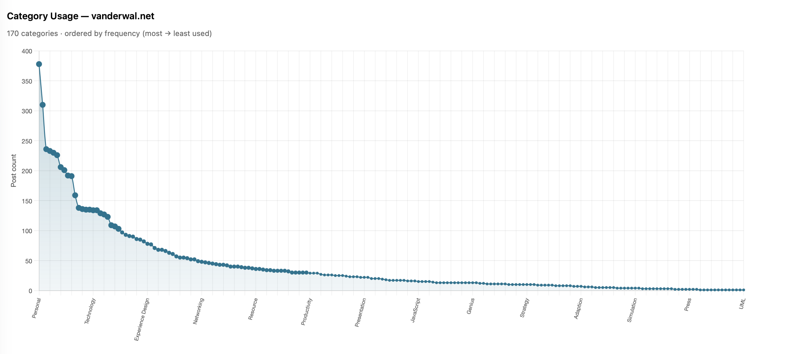
this chart is described in the test that follows

I shared it with James and he also ran his and ended up with much the same (Is there a power law of category use? - James’ Coffee Blog). There have been a few discussions of late around category use and some lean into having just a few categories. I have just over 200 categories now as most of my blog post have more than one subject and I use the categories to have an way to jump to related posts that cover the same subject. When I built my site’s CMS I wanted to have the capability to have multiple categories on each post. I have multiple categories for my own purposes, but also I’m cognizant that readers may have other terms.

With the long tail use of categories I know readers may stumble across a post through web search or a link from else where and having a category term that is familiar can get them to other things I may have posted. I view the web as being able to connect with others and blog posts are sharing things I have interests in or curiosity around and being able to connect with others in a similar mindset is the aim. So a handful of categories, particularly across 25 years and over 2,100 posts, doesn’t help build those connections.

More Analysis on Blog Posts and Categories

This distribution of categories really pushed my interest and curiosity of what the last 25 years of blogging looks like. I joke that Twitter ate my blog, but the sparklines sort of show that. I wanted to see the trends on my blog more closely (I have the archive of my Tweets and I’ll analyze them later and then bring the two analysis together).

To prep for the analysis I pulled my site’s database data local and put it into SQLite (it is already on Mac - Apple and quick) to connect locally with Jupyter Notebooks and use Plotly for interactive data visualizations in the notebook. I had a series of questions, somewhat common data analytics questions I’ve used since grad school looking at analysis over time.

Posts per Month
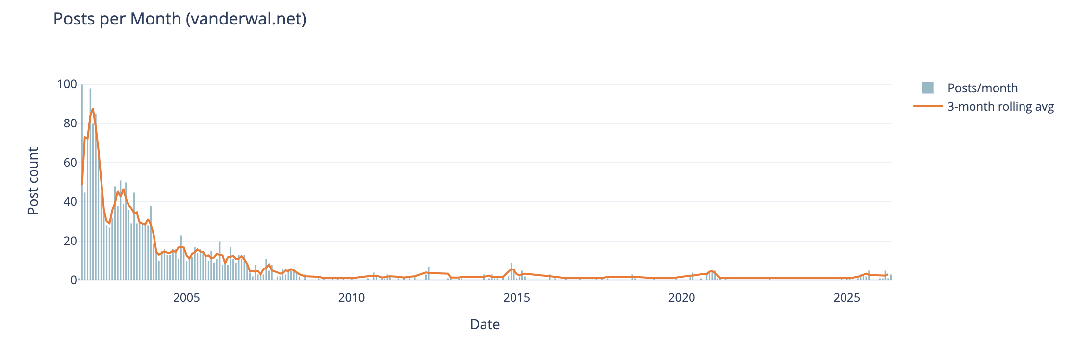
this chart is described in the test that follows

The first analysis is my blog posts by month over 25 years. In my early years I was posting frequently, often in shorter posts (but we will look at that next), and then around 2005 (when started engaging with Twitter) things dropped off. Also at this time I also started blogging more serious subjects at Personal InfoCloud, but those were not all that frequent (I’ll dig into this at some point later too).

My hunch that I posted much more early on and drop off around the time I engaged with Twitter, seem to hold up.

Post Length Over Time
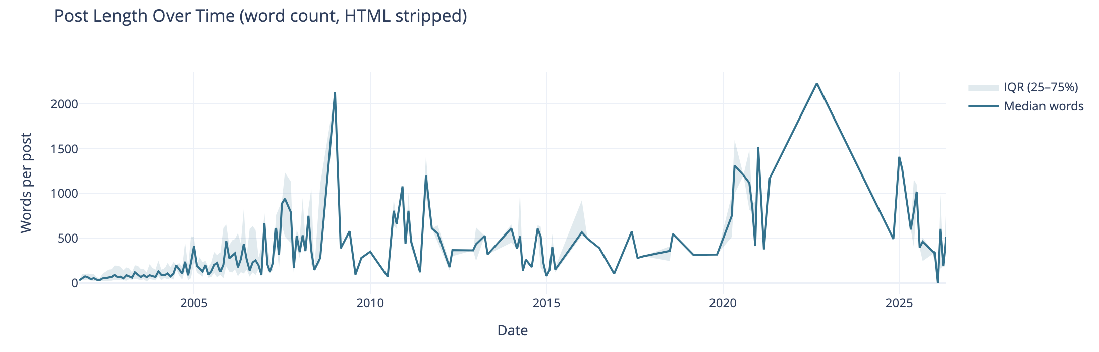
this chart is described in the test that follows

Post length over time also can tell the story of why post volume shifted. I wasn’t posting a lot of short post, but posting longer posts, but less frequently. I’m really curious what I posted in June of 2009 that caused the spike. The spike on the right end in 2020 and beyond are partly attributed to posting weeknotes, which tended to be longer than normal.

I know that my writing muscles went from a few hundred words early on to posts being around 1k and more. I found my comfortable blog post writing length was around 1.2k words. I write to find out and capture what I think, but rarely edit for brevity or other editing benefit, at least on this blog.

Median Categories per Post
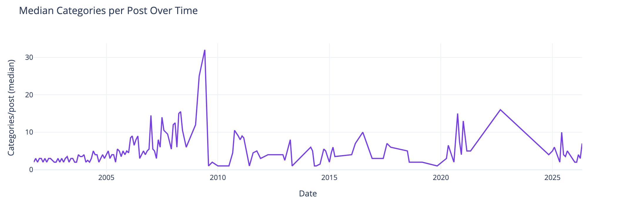
this chart is described in the test that follows

This view of the median number of categories per post over time I found interesting and I didn’t know what my expected outcome was going into this analysis. The numbers pretty much are in line with longer posts have more categories to cover slightly more breadth in a post. Again June 2009, not sure. The spike spike on the right aligns with weeknotes, which cover multiple subjects in one post.

Distribution of Categories per Post
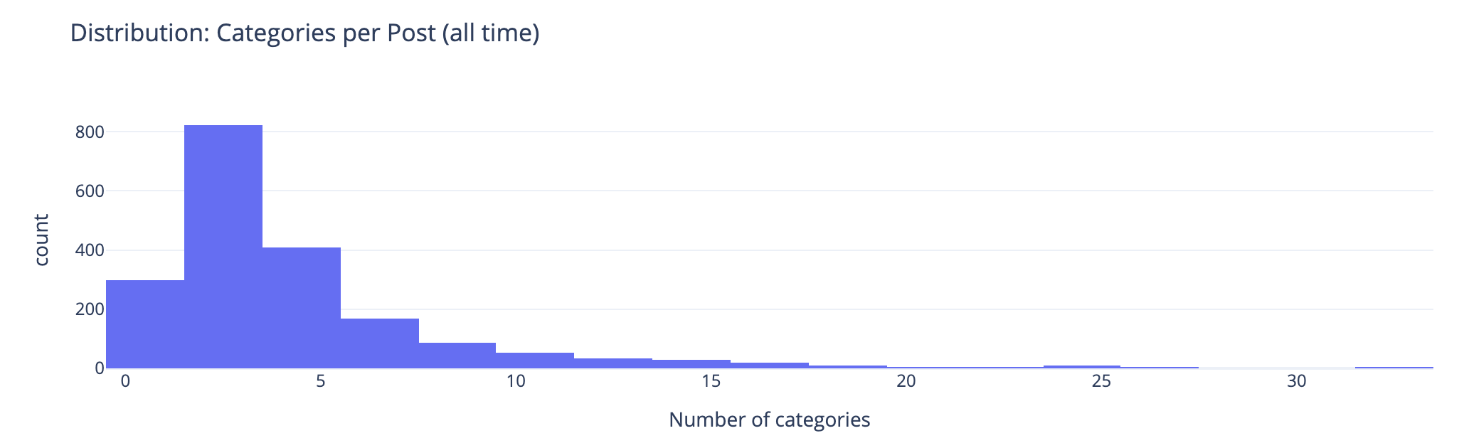
this chart is described in the test that follows

This chart groups number of categories on posts. This shows the second bar has the most number of posts (822 posts) have 2 or 3 categories on the posts. The third bar has 408 posts with 4 or 5 categories on them. This lines up well with the frequency and volume of posts early on which were shorter. Looking at the prior chart most posts had 10 or fewer categories on them.

Combined Timeline for Posts, Length, and median
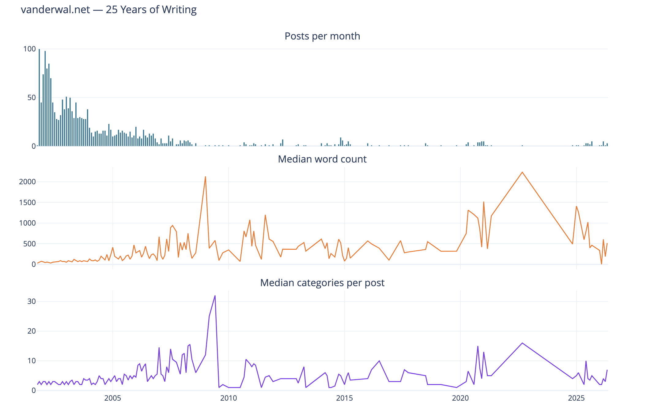
this chart is described in the test that follows

I like this combined chart that reinforces early on with high volume of posts of shorter length and few categories on them. What I find interesting is the correlation of line trends for word count per post and categories per post. This ties closely with the longer posts have more categories.

Seasonal Patterns
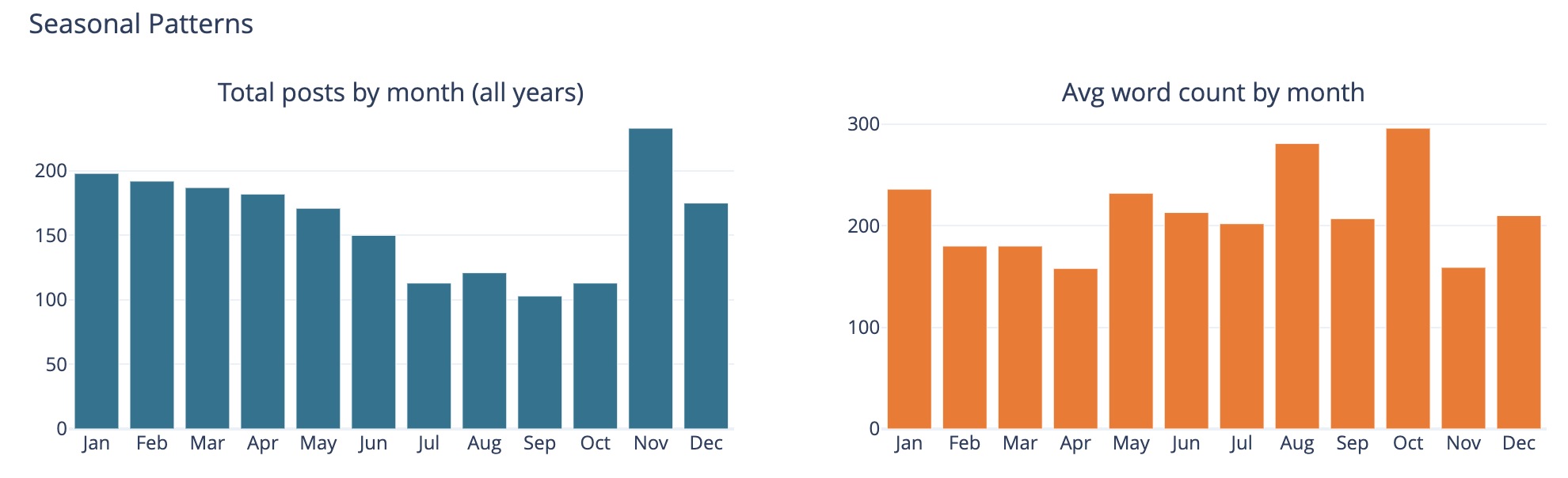
this chart is described in the test that follows

The bar chart on the left is total number of posts by month and on the left it is average word count on posts by month.

This was largely a curiosity to see what was there, but also a common analysis trend analysis to see if there are explanations of other trends looking at seasonal comparisons. The posts by month is not surprising to me as summer and early fall months have often been busy. I am not all that sure what the word count by month tells other than the correlation between more posts and shorter post length correlation showing up.

Top Category Activity Over Time
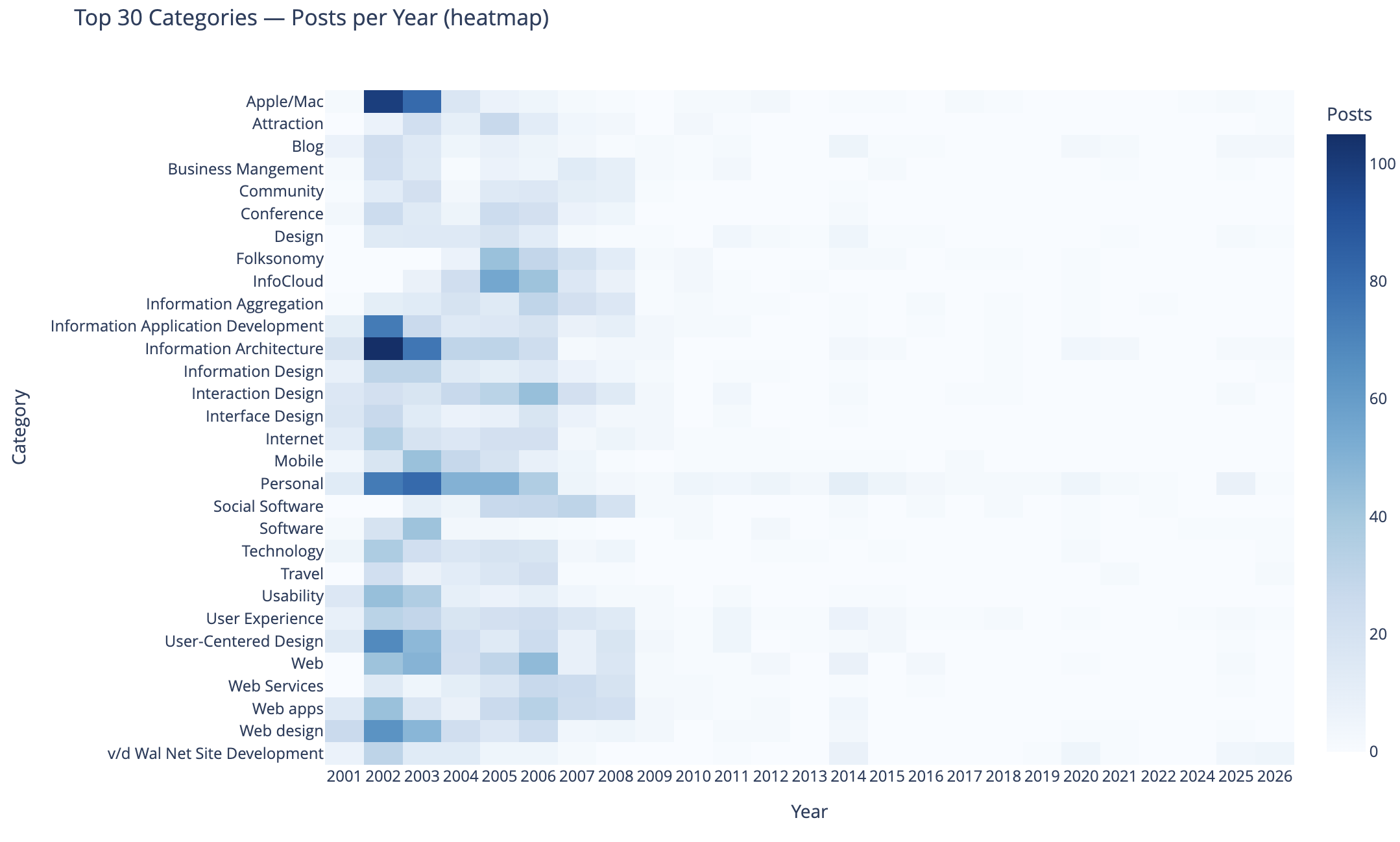
this chart is described in the test that follows

This chart shows the top 30 categories (by use) and their activity over time.

In this heat map Apple categorized posts were sure common, as well as Information Architecture, Information Application Development, Personal, User-Centered Design, and Web Design were also common. Personal and this site’s development.

The heat map being far more dense on the left in early years is skewed by volume of posts and makes activity in the middle and right (more recent years) difficult to see. I need to spend more time on this analysis and chart to separate out the early years and segment things so time outside of the early years can have trends more easily seen. I may want to select a different visualization, but if I can break things out by time that should help. Also running 3 time segements with the same top 30 categories across them and then the top 30 within each time segment could be interesting.

To 40 Co-Occuring Category Pairs
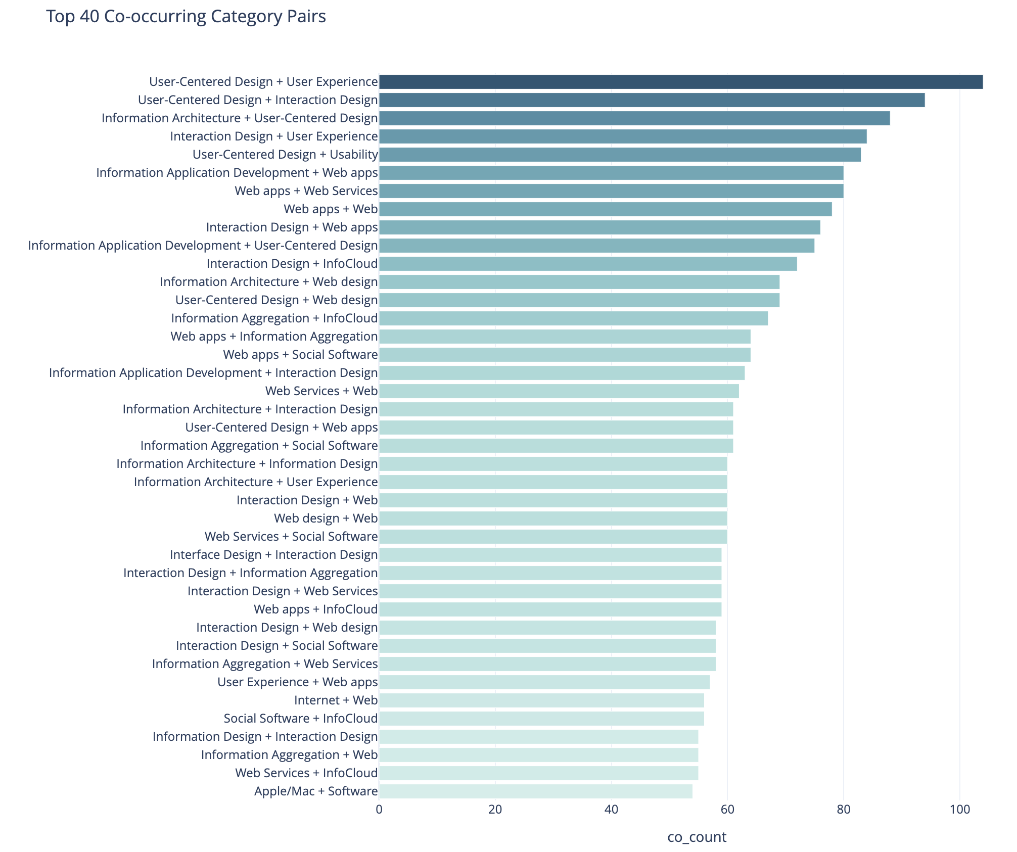
this chart is described in the test that follows

This cart of co-occurring category pairs is in part preparatory work for bringing concurrent tags into the category pages here for understanding and filtering needs for users.

The top 5 pairs are all related to UX, IA, and User-Centered Design and these being the type of concurrence isn’t a surprise to me. The broad UX community had rather divergent use of terms at times and one person’s IA was and other’s UX. For readers who think about these posts in one manner could find other similar content by the term they are familiar with using. Pretty much this whole list is application development, web design and development, web apps, and pan-UX related.

I don’t know how useful this is for broad insights. When I get to adding the concurrent categories on the category pages this will likely be more helpful on a category by category view.

Category Co-occurence Network Graph
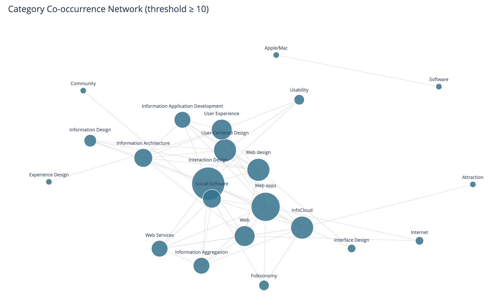
this chart is described in the test that follows

This chart looks at the top thirty categories that have 10 or more co-occurrence of categories.

This I find more interesting than the prior in that this has Social Software and Folksonomy showing up and showing its relationships. The largest category in this view is Interaction Design and its multiple connections. I am entertained by the standalone pairing of Apple and Software, that at the scale limited for the data these only connect to each other.

I need to rerun this with higher acceptance to get more included. But, also this graph isn’t interactive in Jupyter, and every time I went to zoom in it collapsed the graph and I couldn’t move a node out of the way was disappointing.

Helpful as a Good First Pass

This analysis and data visualizations were helpful to see into my 25 years of posts. There are some analysis sets and data visualizations that need more work. Most of these are more helpful with Plotly in Jupyter and the ability to interact with the visualizations.

I am really curious with what this will look like when I look at Twitter usage and notes. Obsidian on top of my notes make note making easier and far more helpful with backlinks / wiki links. I started using it on top of my directory with notes in June 2020 that had around 2k notes in it going back to 2003. Now there are around 6k to 7k and in the past about half of these notes would have been on one of my blogs.


This work is licensed under the Creative Commons Attribution-NonCommercial-ShareAlike License.