Off the Top: Experience Design Entries


July 15, 2016

Breaking Radio Silence Again

It has been a while since I’ve posted here. I’m thinking I may go back to a daily update for a stretch to keep the blogging muscle limber and trained.

Personal InfoCloud Backlog too

Over on other blog, [http://www.personalinfocloud.com](Personal InfoCloud) I have had a few more recent posts, but I have a very long backlog of content for that space as well. I need to rewrite the intro to the latest post there, [http://www.personalinfocloud.com/blog/2016/6/20/team-roles-needed-for-social-software-projects](Team Roles Needed for Social Software Projects).

I also have a series there called [http://www.personalinfocloud.com/?category=Shift+Happened](Shift Happened) that I have at least 12 most posts that need to get written (edited, or more likely rewritten). The next two in the Shift Happened series are related to UX in enterprise software and services and the subject of Adaption. Both of these subjects could likely have more than one post each. The UX in enterprise needs a grounding / framing piece as many still think of UX as visual design and not things being designed for use (nor all the various roles and domains that make up successful UX design). The Adaption pieces need the framing of complexity and complex adaptive systems to get set as a footing, but also needs to frame how adaption works and enables being comfortable in an ever changing environment that we live in today. As well a focus on Adaptive Road Maps is needed as how one plans in an ever shifting and complex environment is needed when today’s road maps for the next 2 to 5 years are shot to pieces after a quarter or two. Having and maintaining a long focus on where a company or product is headed is really helpful, particularly when needing to understand foundation priorities needed for a long haul in a world were agile practices drive the day-to-day, but those agile practices are incredibly nearsighted and often discourage the long view (I’ve had a lot of work related discussions about this in the last 6 months or so as it is a common deep pain point for many).

Health

A common question is about health after the eColi issue in 2014 to early 2015. My health seems to be good. Getting through last winter’s holiday season had me on edge as I was partially expecting to fall ill again. Thankfully, I stayed healthy.


December 3, 2014

24 Ways: A Web Holiday Favorite

Nothing makes me happier than to see the winter holiday begin and 24 Ways start its annual release of web development and design goodness. Drew McLellan and the 24 Ways crew have done another great job and I look forward eagerly for every day’s gem that is released.

To make all of this better, 24 Ways is in its 10th year. Congratulations for all the great content and work, from the very first to the current offering of the day.


November 12, 2014

New Adoption Points

One of those things where, yet again, realize you have a really quick personal adoption threshold when a new device fills in and you start wondering why everything can’t be logged into with a fingerprint. Then there is the, “why are you calling me on my payment device?”

It has been over 30 years of having new devices arrive at semi-regular pace and quickly disrupting things for workflows around devices and interactions, which is followed often by relatively quick adoption and getting used to a new mental model that makes things a little easier. This is really true for software that is buggy and never really fixed and where I (as well as other humans are the human affordance system).

The Software Counter Model to Quick Change Adoption

As much as new physical hardware and software interaction model shifts largely causes little difficulty with changing for more ease of use, the counter to this with software with a lot of human need for grasping mental models. It is particularly difficult when structuring mental models and organization structure before using software is something required.

There have been some good discounts on Tinderbox across podcasts I listen to or websites around Mac productivity I read, so I nabbed a copy. I have had long discussion around Tinderbox for over a decade and it has been on my want list for large writing and research projects. I have had quite a few friends who have been long time users (longer than I have been a DevonThink user), but I don’t seem to have one in my current circle of colleagues (I you are one and would love to chat, please reach out).

I have a few projects that I think would make great sense to put into Tinderbox, but not really grokking the structure and mental model and flows - particularly around what I wish I would know when I have a lot of content in it. It is feeling a lot like trying to read Japanese and not having learned the characters. I also wish I had kept better notes a few years back when I was deeply sold on a need for Tinderbox, but didn’t capture a detailed why and how I thought it would work into workflow.

Some Tools are Nearly There as a Continual State

I have some software and services that I use a fair amount with hope that they will get much much better with a few relatively small things. Evernote is nearly always in this category. Evernote is a good product, but never gets beyond just good. The search always falls apart at scale (it was around 2,000 objects and had about doubled that scaling threshold pain point) and I can’t sort out how to script things easily or remotely drop content into the correct notebook from email or other easy entry model. There are a lot of things I wish Evernote would become with a few minor tweaks to support a scalable solid no (or very few faults tool), but it never quite takes those steps.

Their business tool offering is good for a few use cases, which are basic, but getting some smart and intelligence uses with better search (search always seems to be a pain point and something that DevonThink has nailed for 10 years) would go a really long way. Evernote’s Context is getting closer, but is lacking up front fuzzy, synonym, and narrowing search with options (either the “did you mean” or narrowing / disambiguation hints / helps).

We will get there some day, but I just wish the quick adoption changes with simple hardware interaction design and OS changes would become as normal as quickly with new other knowledge and information tools for personal use (always better than) or business.


October 31, 2014

Deconstructing for Fun

There are two video gems I have fallen into really liking in the last year Every Frame a Painting and Comedians in Cars Getting Coffee.

Every Frame is a Painting

Every Frame is a Painting tickles the film nerd in me. This takes me straight back to a great class in media criticism by Father Mike Russo in undergrad. We not only learned how to watch film, but how to deconstruct it, which turned into how to make film for many in that class.

Tony Zhou who creates Every Frame is a Painting provides great insight into film direction and cinematography, by breaking down scenes and the make-up of a shot to convey a story through film. Film and its genres as well as directorial influences not only help see film with a new eye of appreciation, but the world beyond film. A lot of interaction design in technology heavily references film and the ability to direct attention and create an enjoyable experience.

Comedians in Cars Getting Coffee

I’ve wasn’t a fan of the Jerry Seinfeld show. I saw a decent amount out of inertia (was watching the show on same channel prior) or it was a lead-in to something I wanted to watch. But, while there were some gems, most was listening to people whine, which lead to that same whining tone coming from myself the following day.

But, Seinfeld’s stand-up was something I had appreciation for and enjoyed. But, he has a web video series with the construct of him driving a historic car to pick-up another comedian to go get coffee. Most of the episodes are 15 to 20 minutes of he and his fellow comedian talking craft and sharing stories.

Much like Every Frame… Comedians in Cars… puts the focus on deconstruction of the craft, background of the artist, and breaking things down. There is often quite a bit of humor, which also helps.

In college and the years when I lived in San Francisco I loved going to stand-up shows. There were a lot of really good comedians working through their craft in SF in the mid–80s to mid–90s. The best times were often at open mic nights where comics would try out new material and often spill out into the parking lot or streets for an hour or few of riffing and stories.

Deconstruction is Essential for Understanding

A lot of undergrad for me seemed to be about not only learning (building a corpus of knowledge), but learning to deconstruct and understand the world and craft around me. Comedy and film (media in general got this treatment) were two of many of the disciplines I learned to breakdown to understand at more atomic levels, so to understand how to build more than capably as well as much better.

Learning the craft of deconstruction through something fun like film and comedy is a great place to start. Warning - this will change how you not only watch and consume things and may change the enjoyment and mindless nature that is desired, but it does give enjoyment on many other levels.


April 29, 2013

Broken Decade Precedes It Works Decade

I had long forgotten this Carl Steadman response to Michael Sippy’s “Just One Question - What do you want for Christmas”, but the response from 1997 is fantastic and frames the 1990s as the broken decade. (I’ll wait for you to go read it)

I’m not so sure that Carl’s broken decade got better in the first half of the 2000 decade, but it really started to. We are much farther along now. Our consumer world started to improve quite a bit and slowly business systems and services are slowly improving. The initial part of Carl’s rant focusses on the number of steps to get something going. Once it is working the steps are still clunky.

Carl gets in a great rant about time and how broken it was in the 90s within technology (calendaring and syncing is still a beast and likely to for a bit longer - you understand the problem sets and pain points if you have ever tried to build syncing). With calendaring and its related activities we now have Tempo, which is freakishly close to the next step scenario I used in many of the Come to Me Web presentations and Personal InfoCloud presentations from 2003 through 2007 (I’ve been getting requests to represent them as this is what more and more developers and designers are dealing with today and need to have a better foundation to think through them). There was an internal Yahoo presentation (and follow on day of deep discussions and conversations) with a version of the Personal InfoCloud and Come to me Web flow that is nearly identical to the Tempo app video scenario and ones spelled out in Robert Scoble’s interview with Tempo CEO, which is utterly awesome that it is getting built out some 10 years later (we had the technology and tools to do this in 2004 and beyond).

Carl’s rant gets worn away over time though consumer devices, services, and applications. The refocus on ease of use and particularly the use through mobile, which requires a very different way of thinking and considering things. It thinking through design, the dependancies, and real user needs (all while keeping in mind the attention issues, screen size, networking, and device limitations). The past couple years mobile finally caught on with mainstream users and people doing real work on the mobile and tablets - Box 40% mobile access of files stored there over the last couple years. Many other business vendors have had mobile use rates of their services from mobile over the past two years. When talking to users they opt for mobile solutions over their full enterprise tools as they are much easier to use, which quickly translates into getting more work done. As Bernd Christiansen of Citrix stated in an onstage interview the employee’s most productive part of the day is often the walk from their car to the front door of the office working on their mobile devices.

This world is not fully better and fully easy to use from the days of Carl’s rant, but it is getting better. We still have quite a ways to go.


March 30, 2011

Late to Realizing Ovi Maps Does Exactly What I Wish

I been a big fan of Nokia's mapping solution built into its smart phones, Ovi Maps as it provides the best mobile turn by turn directions I've seen on any mobile device. But, this is largely because Nokia owns Navteq, which has long been the leader for on board mapping and driving solutions.

That FINALLY! Moment Reached

While I have been incredibly impressed with the Ovi mapping on my Nokia E72 device and often use the Ovi resources on the web, I hit that finally, somebody got this right moment with Ovi over the weekend. While, many web mapping solutions allow you to save favorites on the web getting those to sync to your mobile device, with your directions has been left out of most of these solutions (I have been complaining to friends at Google, Yahoo, and elsewhere for many years that this is a no-duh next step). Well, it seems Ovi figured this out quite a while back. (I noticed Google Mobile Maps provided this at the end of 2009, but have never been able to get it to work, even on my supported Symbian device.)

The simplicity and ease with with Nokia's Ovi pulls this off is rather stunning. With this aha moment, I feel like I was the last one to see this and sort it out, but in chats with other mobile maps and navigation users, they have been pained waiting for exactly this functionality, as most people it seems will get a location link and add it to their desktop maps (particularly for travel) but that does them little good as they don't take their desktop or open laptop into the car with them, they take their mobile. Understanding context of use is incredibly valuable.

Now may be a good time to check your device's capability, although iPhone does not seem to have this functionality supported by Google maps (surprised?).


February 22, 2011

The Genius of Design - BBC Series Overview

This past Summer (2010) the BBC (BBC 2) showed a five part documentary series on design, called The Genius of Design (TGoD). This series is similar to Gary Hustwit's Objectified, but TGoD goes much broader and deeper offering a better reflection of the reality of design only seen through that depth. Think of Objectified as a taste sampler of TGoD. There are some people in common between the two whom are interviewed and focussed upon, but life is breathed into architecture, process, visual, industrial, and many more slices of the design world that bring design to life in TGoD. It is a wonderful look at the real nature of design.

The Five Episodes of The Genius of Design

The five episodes are: 1) Ghosts in the Machine; 2) Designs for Living; 3) Blueprints for War; 4) Better Living Through Chemistry; 5) Objects of Desire. The core focus is on the deep consideration and understanding that goes into design. It is this rigor of understanding and working through to final product all based on a core objective. Throughout the five series the focus on a deep understanding the materials deeply, use, impact on the people interacting with what has been designed, and development processes (as well as optimizing them).

Standout Themes

The obsession to understand the materials used and objects being design with depth and breadth is not the only standout theme. Many other themes and take away ideas stood out not only when watching, but also now many months later.

Focus on End Use and People Using Product of Design

One major reoccurring theme throughout is the focus on end use. The the products not only should be pleasing nearly (possibly to the point of being emotive), but they must also be usable, and do what it is intended to do very well. A continual focus on the person using what is designed is one of the central tenets of design and with out this it is something other than design.

Breadth of Design Disciplines and Roles

To the point of design having a focus on the person using what is designed, the breath of roles within design was brought up. Wonderfully, Peter Boersma's T-Model was directly mentioned in when discussing the breadth of expertise with required depth and roles in design that are required to all come together to optimally create a final product that is please and usable for the person who engages with the final product. While watching the whole series the focus on various disciplines and roles is very evident and when listening to the designers talk about their own focus and discipline (all largely falling under the moniker of design) as it relates to final crafting of the final object) it is they all have depth in their own discipline, but understand the materials deeply and the class and required needs for the final product very well.

Every Designer Has A Chair In Them

Another reoccurring thread, that gets depth of focus a few times, is the idea that every designer has a chair in them (this has become a meme in the broad design community from the near instant this was uttered mid-Summer). The chair is emblematic of the need for utility (purpose, comfort, durability, etc.) as well as providing style. A chair that collapses is not well designed. The chair also often has requirements beyond basic sitting, which can include long term comfort, ability to stack and store it, be environmentally friendly, and many more possible variations. This intersection of use, style, material, and production around the chair leads to a lot of the depth of understanding required to get to a final product prototyped, tested, and into production. This depth and breadth that designers put in is often not considered by people outside the design community, but also the depth and rigor involved in design is missed in some disciplines that are tangential to design, but do not consider themselves purely in the design profession.

Process Design and Optimization

Within the Blueprints for War episode the focus of designing the process was often repeated. The episode focussed on Britain in World War II and the need to have mass production of goods needed for the war that worked for their purposes, but there were limitations of materials and time needed to get mass amounts of goods in military personnel’s hands. Streamlining production and simplifying the goods became essential, but as well thinking of solutions seemed like their was expansive production (dummy planes, etc.) and alternate facilities (fake factories) were included in the design mix.

Wishing for More

In all this was a fantastic series for those in and around the design profession, those who intersect with design, and just fans of design.


June 27, 2009

Social Design for the Enterprise Workshop in Washington, DC Area

I am finally bringing workshop to my home base, the Washington, DC area. I am putting on a my “Social Design for the Enterprise” half-day workshop on the afternoon of July 17th at Viget Labs (register from this prior link).

Yes, it is a Friday in the Summer in Washington, DC area. This is the filter to sort out who really wants to improve what they offer and how successful they want their products and solutions to be.

Past Attendees have Said...

“A few hours and a few hundred dollar saved us tens of thousands, if not well into six figures dollars of value through improving our understanding” (Global insurance company intranet director)

From an in-house workshop…
“We are only an hour in, can we stop? We need to get many more people here to hear this as we have been on the wrong path as an organization” (National consumer service provider)

“Can you let us know when you give this again as we need our [big consulting firm] here, they need to hear that this is the path and focus we need” (Fortune 100 company senior manager for collaboration platforms)

“In the last 15 minutes what you walked us through helped us understand a problem we have had for 2 years and a provided manner to think about it in a way we can finally move forward and solve it” (CEO social tool product company)

Is the Workshop Only for Designers?

No, the workshop is aimed at a broad audience. The focus of the workshop gets beyond the tools’ features and functionality to provide understanding of the other elements that make a giant difference in adoption, use, and value derived by people using and the system owners.

The workshop is for user experience designers (information architects, interaction designers, social interaction designers, etc.), developers, product managers, buyers, implementers, and those with social tools running already running.

Not Only for Enterprise

This workshop with address problems for designing social tools for much better adoption in the enterprise (in-house use in business, government, & non-profit), but web facing social tools.

The Workshop will Address…

Designing for social comfort requires understanding how people interact in a non-mediated environment and what realities that we know from that understanding must we include in our design and development for use and adoption of our digital social tools if we want optimal adoption and use.

  • Tools do not need to be constrained by accepting the 1-9-90 myth.
  • Understanding the social build order and how to use that to identify gaps that need design solutions
  • Social comfort as a key component
  • Matrix of Perception to better understanding who the use types are and how deeply the use the tool so to build to their needs and delivering much greater value for them, which leads to improved use and adoption
  • Using the for elements for enterprise social tool success (as well as web facing) to better understand where and how to focus understanding gaps and needs for improvement.
  • Ways user experience design can be implemented to increase adoption, use, and value
  • How social design needs are different from Web 2.0 and what Web 2.0 could improve with this understanding

More info...

For more information and registration to to Viget Lab's Social Design for the Enterprise page.

I look forward to seeing you there.

Reblog this post [with Zemanta]


January 25, 2009

Optimizing Tagging UI for People & Search

Overview/Intro

One of my areas of focus is around social tools in the workplace (enterprise 2.0) is social bookmarking. Sadly, is does not have the reach it should as it and wiki (most enterprise focused wikis have collective voice pages (blogs) included now & enterprise blog tools have collaborative document pages (wikis). I focus a lot of my attention these days on what happens inside the organization’s firewall, as that is where their is incredible untapped potential for these tools to make a huge difference.

One of the things I see on a regular basis is tagging interfaces on a wide variety of social tools, not just in social bookmarking. This is good, but also problematic as it leads to a need for a central tagging repository (more on this in a later piece). It is good as emergent and connective tag terms can be used to link items across tools and services, but that requires consistency and identity (identity is a must for tagging on any platform and it is left out of many tagging instances. This greatly decreases the value of tagging - this is also for another piece). There are differences across tools and services, which leads to problems of use and adoption within tools is tagging user interface (UI).

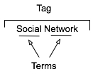
Multi-term Tag Intro

multiterm tag constructionThe multi-term tag is one of the more helpful elements in tagging as it provides the capability to use related terms. These multi-term tags provide depth to understanding when keeping the related tag terms together. But the interfaces for doing this are more complex and confusing than they should be for human, as well as machine consumption.

In the instance illustrated to the tag is comprised or two related terms: social and network. When the tool references the tag, it is looking at both parts as a tag set, which has a distinct meaning. The individual terms can be easily used for searches seeking either of those terms, but knowing the composition of the set, it is relatively easy for the service to offer up "social network" when a person seeks just social or network in a search query.

One common hindrance with social bookmarking adoption is those familiar with it and fans of it for enterprise use point to Delicious, which has a couple huge drawbacks. The compound multi-term tag or disconnected multi-term tags is a deep drawback for most regular potential users (the second is lack of privacy for shared group items). Delicious breaks a basic construct in user focussed design: Tools should embrace human methods of interaction and not humans embracing tech constraints. Delicious is quite popular with those of us malleable in our approach to adopt a technology where we adapt our approach, but that percentage of potential people using the tools is quite thin as a percentage of the population.. Testing this concept takes very little time to prove.

So, what are the options? Glad you asked. But, first a quick additional excursion into why this matters.

Conceptual Models Missing in Social Tool Adoption

One common hinderance for social tool adoption is most people intended to use the tools are missing the conceptual model for what these tools do, the value they offer, and how to personally benefit from these values. There are even change costs involved in moving from a tool that may not work for someone to something that has potential for drastically improved value. The "what it does", "what value it has", and "what situations" are high enough hurdles to cross, but they can be done with some ease by people who have deep knowledge of how to bridge these conceptual model gaps.

What the tools must not do is increase hurdles for adoption by introducing foreign conceptual models into the understanding process. The Delicious model of multi-term tagging adds a very large conceptual barrier for many & it become problematic for even considering adoption. Optimally, Delicious should not be used alone as a means to introduce social bookmarking or tagging.

We must remove the barriers to entry to these powerful offerings as much as we can as designers and developers. We know the value, we know the future, but we need to extend this. It must be done now, as later is too late and these tools will be written off as just as complex and cumbersome as their predecessors.

If you are a buyer of these tools and services, this is you guideline for the minimum of what you should accept. There is much you should not accept. On this front, you need to push back. It is your money you are spending on the products, implementation, and people helping encourage adoption. Not pushing back on what is not acceptable will greatly hinder adoption and increase the costs for more people to ease the change and adoption processes. Both of these costs should not be acceptable to you.

Multi-term Tag UI Options

Compound Terms

I am starting with what we know to be problematic for broad adoption for input. But, compound terms also create problems for search as well as click retrieval. There are two UI interaction patterns that happen with compound multi-term tags. The first is the terms are mashed together as a compound single word, as shown in this example from Delicious.

Tag sample from Delicious

The problem here is the mashing the string of terms "architecture is politics" into one compound term "architectureispolitics". Outside of Germanic languages this is problematic and the compound term makes a quick scan of the terms by a person far more difficult. But it also complicates search as the terms need to be broken down to even have LIKE SQL search options work optimally. The biggest problem is for humans, as this is not natural in most language contexts. A look at misunderstood URLs makes the point easier to understand (Top Ten Worst URLs)

The second is an emergent model for compound multi-term tags is using a term delimiter. These delimiters are often underlines ( _ ), dots ( . ), or hyphens ( - ). A multi-term tag such as "enterprise search" becomes "enterprise.search", "enterprise_search" and "enterprise-search".

While these help visually they are less than optimal for reading. But, algorithmically this initially looks to be a simple solution, but it becomes more problematic. Some tools and services try to normalize the terms to identify similar and relevant items, which requires a little bit of work. The terms can be separated at their delimiters and used as properly separated terms, but since the systems are compound term centric more often than not the terms are compressed and have similar problems to the other approach.

Another reason this is problematic is term delimiters can often have semantic relevance for tribal differentiation. This first surface terms when talking to social computing researchers using Delicious a few years ago. They pointed out that social.network, social_network, and social-network had quite different communities using the tags and often did not agree on underlying foundations for what the term meant. The people in the various communities self identified and stuck to their tribes use of the term differentiated by delimiter.

The discovery that these variations were not fungible was an eye opener and quickly had me looking at other similar situations. I found this was not a one-off situation, but one with a fair amount of occurrence. When removing the delimiters between the terms the technologies removed the capability of understanding human variance and tribes. This method also breaks recommendation systems badly as well as hindering the capability of augmenting serendipity.

So how do these tribes identify without these markers? Often they use additional tags to identity. The social computing researchers add "social computing", marketing types add "marketing", etc. The tools then use their filtering by co-occurrence of tags to surface relevant information (yes, the ability to use co-occurrence is another tool essential). This additional tag addition help improve the service on the whole with disambiguation.

Disconnected Multi-term Tags

The use of distinct and disconnected term tags is often the intent for space delimited sites like Delicious, but the emergent approach of mashing terms together out of need surfaced. Delicious did not intend to create mashed terms or delimited terms, Joshua Schachter created a great tool and the community adapted it to their needs. Tagging services are not new, as they have been around for more than two decades already, but how they are built, used, and platforms are quite different now. The common web interface for tagging has been single terms as tags with many tags applied to an object. What made folksonomy different from previous tagging was the inclusion of identity and a collective (not collaborative) voice that intelligent semantics can be applied to.

The downside of disconnected terms in tagging is certainty of relevance between the terms, which leads to ambiguity. This discussion has been going on for more than a decade and builds upon semantic understanding in natural language processing. Did the tagger intend for a relationship between social & network or not. Tags out of the context of natural language constructs provide difficulties without some other construct for sense making around them. Additionally, the computational power needed to parse and pair potential relevant pairings is somethings that becomes prohibitive at scale.

Quoted Multi-term Tags

One of the methods that surfaced early in tagging interfaces was the quoted multi-term tags. This takes becomes #&039;research "social network" blog' so that the terms social network are bound together in the tool as one tag. The biggest problem is still on the human input side of things as this is yet again not a natural language construct. Systematically the downside is these break along single terms with quotes in many of the systems that have employed this method.

What begins with a simple helpful prompt...:

 SlideShare Tag Input UI

Still often can end up breaking as follows (from SlideShare):

SlideShare quoted multi-term tag parsing

Comma Delimited Tags

Non-space delimiters between tags allows for multi-term tags to exist and with relative ease. Well, that is relative ease for those writing Western European languages that commonly use commas as a string separator. This method allows the system to grasp there are multi-term tags and the humans can input the information in a format that may be natural for them. Using natural language constructs helps provide the ability ease of adoption. It also helps provide a solid base for building a synonym repository in and/or around the tagging tools.

Ma.gnolia comma separated multi-term tag output

While this is not optimal for all people because of variance in language constructs globally, it is a method that works well for a quasi-homogeneous population of people tagging. This also takes out much of the ambiguity computationally for information retrieval, which lowers computational resources needed for discernment.

Text Box Per Tag

Lastly, the option for input is the text box per tag. This allows for multi-term tags in one text box. Using the tab button on the keyboard after entering a tag the person using this interface will jump down to the next empty text box and have the ability to input a term. I first started seeing this a few years ago in tagging interfaces tools developed in Central Europe and Asia. The Yahoo! Bookmarks 2 UI adopted this in a slightly different implementation than I had seen before, but works much the same (it is shown here).

Yahoo! Bookmarks 2 text box per tag

There are many variations of this type of interface surfacing and are having rather good adoption rates with people unfamiliar to tagging. This approach tied to facets has been deployed in Knowledge Plaza by Whatever s/a and works wonderfully.

All of the benefits of comma delimited multi-term tag interfaces apply, but with the added benefit of having this interface work internationally. International usage not only helps build synonym resources but eases language translation as well, which is particularly helpful for capturing international variance on business or emergent terms.

Summary

This content has come from more than four years of research and discussions with people using tools, both inside enterprise and using consumer web tools. As enterprise moves more quickly toward more cost effective tools for capturing and connecting information, they are aware of not only the value of social tools, but tools that get out the way and allow humans to capture, share, and interact in a manner that is as natural as possible with the tools getting smart, not humans having to adopt technology patterns.

This is a syndicated version of the same post at Optimizing Tagging UI for People & Search :: Personal InfoCloud that has moderated comments available.


August 28, 2008

Tale of Two Tunnels: Web 2.0 and Enterprise 2.0

Yesterday I made a few comments in Twitter that prompted a fair amount of questions and requests for more information. The quips I made were about the differences between Web 2.0 (yes, an ambiguous term) and Enterprise 2.0 (equally ambiguous term both for the definition of enterprise and the 2.0 bit). My comments were in response to Bruce Stewart's comment The whole "Enterprise 2.0" schtick is wearing thin, unless you've been monitoring real results. Otherwise you're just pumping technology.. In part I agree, but I am really seeing things still are really early in the emergence cycle and there is still much need for understanding of the social tools and the need for them, as well as how they fit in. There are many that are selling the tools as technologies with great promise. We have seen the magic pill continually pitched and bought through out the history of business tools. (For those new to the game or only been paying attention for the last 15 years, a huge hint, THERE IS NO MAGIC PILL).

Tale of 2 Tunnels

One comment I made yesterday is, "the difference between Web 2.0 and Enterprise 2.0 is like the difference building a tunnel through rock and tunnel under water".

That this is getting at is Web 2.0 takes work to build to get through the earth, but once built it can suffer from imperfections and still work well. The tunnel can crack and crumble a little, but still get used with diminished capacity. We can look at Facebook, which has a rather poor interface and still gets used. Twitter is another example of a Web 2.0 solution that has its structural deficiencies and outages, but it still used as well as still loved (their Fail Whale is on a t-shirt now and a badge of pride worn by loyal users).

The Enterprise 2.0 tunnel is built under water. This takes more engineering understanding, but it also requires more fault testing and assurances. A crack or crumbling of a tool inside an organization is not seen kindly and raises doubts around the viability of the tool. The shear volume of users inside an organization using these tools is orders of magnitude less than in the open consumer web world, but faults are more deadly.

The other important factor is perceived fear of the environment. Fewer people (by pure numbers - as the percentages are likely the same, more on this later) are fearful of tunnels through land, they may not have full faith in them, but they know that they will likely make it safely on all of their journeys. The tunnels under water have greater fears as one little crack can cause flooding and drowning quickly. Fears of use of social tools inside an organization is often quite similar, there may be many that are not fearful, but if you spend time talking to people in organizations not using tools (it is the majority at this point) they are fearful of open sharing as that could lead to trouble. People are not comfortable with the concept as they are foreign to it as they are lacking the conceptual models to let them think through it.

Enterprise 2.0 is not Web 2.0

Another statement yesterday that garnered a lot of feedback was, "Web 2.0 does not work well in enterprise, but the approaches and understandings of Web 2.0 modified for enterprise work really well." The web is not enterprise or smaller organizations for that matter. The open consumer web has different scale and needs than inside organizations and through their firewalls. A small percentage of people using the web can get an account on a tool have have appear to be wildly successful correctly claiming 70 million or 100 million people are or have used their tool. But, even 100 million people is a small percentage of people using the web. Looking at real usage and needs for those tools the numbers are really smaller. Most darlings of the Web 2.0 phase have fewer than 10 million users, which is about 5% of the open consumer web users in the United States. On the web a start-up is seen as successful with 500,000 users after a year or two and is likely to have the capability to be self sufficient at that level too. Granted there are many players in the same market niches on the web and the overall usage for link sharing and recommending for Digg, Mixx, or Reddit is much higher across the sum of these tools than in just one of these tools (obviously).

These percentages of adoption and use inside organizations can make executives nervous that their money is not reaching as many employees as they wish. The percentages that can be similar to the web's percentages of high single digit adoption rates to the teens is seen as something that really needs more thinking and consideration.

Enterprise 2.0 is more than just tools (see my Enterprise Social Tools: Components for Success for better understanding) as it also includes interface/interaction design for ease of use, sociality, and encouragement of use. The two biggest factors that are needed inside an organization that can receive less attention on the web are the sociality and encouragement of use.

Understanding sociality is incredibly important inside an organization as people are used to working in groups (often vertical in their hierarchy) that have been dictated to them for use. When the walls are broken down and people are self-finding others with similar interests and working horizontally and diagonally connecting and sharing with others and consuming the collective flows of information their comfortable walls of understanding are gone. A presentation in Copenhagen at Reboot on Freely Seeping Through the Walls of the Garden focussed just on this issue. This fear inside the enterprise is real. Much of the fear is driven by lacking conceptual models and understanding the value they will derive from using the tools and services. People need to know who the other people are that they are sharing with and what their motivations are (to some degree) before they have comfort in sharing themselves.

Encouraging use is also central to increased adoption inside organizations. Many organizations initial believe that Web 2.0 tools will take off and have great adoption inside an organization. But, this is not a "build it and they will come" scenario, even for the younger workers who are believed to love these tools and services and will not stay in a company that does not have them. The reality is the tools need selling their use, value derived from them, the conceptual models around what they do, and easing fears. Adoption rates grow far beyond the teen percentages in organizations that take time guiding people about the use of the tools and services. Those organizations that take the opportunity to continually sell the value and use for these tools they have in place get much higher adoption and continued engagement with the tools than those who do nothing and see what happens.

Gaps in Enterprise Tools

The last related statement was around the gaps in current and traditional enterprise tools. At the fantastic Jive Enterprise UI Summit in Aspen a few weeks ago there was a lot of discussion about enterprise tools, their UI, and ease of use for employees by the incredible collection of people at the event. One of the things that was shown was a killer path of use through a wide encompassing enterprise toolset that was well designed and presented by SAP's Dan Rosenberg who has done an incredible job of putting user experience and thinking through the needed workflows and uses of enterprise tools at the forefront of enterprise software planning. Given the excellent design and incredible amount of user experience thought that went into the tools behind the SAP toolset in the scenario (one of the best I have seen - functioning or blue sky demoed) there are still gaps. Part of this is identifying of gaps comes from traditional business thinking around formal processes and the tools ensure process adherence. But, the reality is the tools are quite often inflexible (I am not talking about SAP tools, but traditional enterprise tools in general), the cost of time and effort is beyond the gain for individuals to document and annotate all decisions and steps along the way. The hurdles to capture information and share it are often too large for capturing one to 10 quick sentences of information that can be retained for one's own benefit or shared with other where it is relevant.

There is another gap in business around the collective intelligence that is needed, which can lead to collaboration. Most businesses and their tools focus on collaboration and set groups, but at the same time wonder why they do not know what their company knows and knowledge is not all being captured. First there is a difference between collective and collaborative activities and the tools and design around and for those different activities is more than a nuance of semantics it is a huge barrier to capturing, sharing, and learning from information that leads to knowledge if it is not understood well. Enterprise has gone through its phases of knowledge management tools, from forms for capturing information, forums for sharing, and up to enterprise content management systems (ECM) that encompass document management, content management, knowledge management, and information harvesting. But, the gaps still exist.

These existing gaps are around conversations not being captured (the walls of the halls have no memory (well today they do not)) and increasingly the ubiquitous communication channel in organizations, e-mail, is being worked around. Quick decisions are not being documented as it is not enough for a document or worth completing a form. As the iterative processes of development, design, and solution engineering are happening at quicker and smaller increments the intelligence behind the decisions is not being captured or shared. This is largely because of the tools.

As has always been the case large enterprise systems are worked around through the use of smaller and more nimble solutions that augment the existing tools. Even in Dan's incredible demo I saw gaps for these tools. The quick tools that can fill these gaps are blogs, wikis, social bookmarking, tagging, Twitter type sharing, Veodia type video sharing, instant messaging, etc. There are many avenues to quickly capture information and understanding and share it. These tools get out of the way and allow what is in someone's head to get digitized and later structured by the individual themselves or other people whom have had the information shared with them in a community space. This turns into flows through streams that can be put into many contexts and needs as well as reused as needed.

Another point Dan stated at the Enterprise UI Summit that is dead on, is organizations are moving out of the vertical structures and moving to the horizontal. This is having a profound effect on the next generation of business tools and processes. This is also an area for Enterprise 2.0 tools as they easily open up the horizontal and diagonal prospects and tie into it the capability for easily understanding who these newly found people are in an organization through looking at their profiles, which eases their fears around sharing and unfamiliar environments as well as their related tasks.

[Comments are open and moderated at Tale of Two Tunnels: Web 2.0 and Enterprise 2.0 :: Personal InfoCloud]


May 7, 2008

Enterprise Social Tools: Components for Success

One of the things I continually run across talking with organizations deploying social tools inside their organization is the difficultly getting all the components to mesh. Nearly everybody is having or had a tough time with getting employees and partners to engage with the services, but everybody is finding out it is much more than just the tools that are needed to consider. The tools provide the foundation, but once service types and features are sorted out, it get much tougher. I get frustrated (as do many organizations whom I talk with lately) that social tools and services that make up enterprise 2.0, or whatever people want to call it, are far from the end of the need for getting it right. There is great value in these tools and the cost of the tools is much less than previous generations of enterprise (large organization) offerings.

Social tools require much more than just the tools for their implementation to be successful. Tool selection is tough as no tool is doing everything well and they all are focussing on niche areas. But, as difficult as the tool selection can be, there are three more elements that make up what the a successful deployment of the tools and can be considered part of the tools.

Four Rings of Enterprise Social Tools

Enterprise Social Tool: Components for Success 
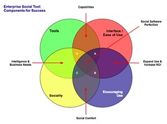
The four elements really have to work together to make for a successful services that people will use and continue to use over time. Yes, I am using a venn diagram for the four rings as it helps point out the overlaps and gaps where the implementations can fall short. The overlaps in the diagram is where the interesting things are happening. A year ago I was running into organizations with self proclaimed success with deployments of social tools (blogs, wikis, social bookmarking, forums, etc.), but as the desire for more than a simple set of blogs (or whichever tool or set of tools was selected) in-house there is a desire for greater use beyond some internal early adopters. This requires paying close attention to the four rings.

Tools

The first ring is rather obvious, it is the tools. The tools come down to functionality and features that are offered, how they are run (OS, rack mount, other software needed, skills needed to keep them running, etc.), how the tools are integrated into the organization (authentication, back-up, etc.), external data services, and the rest of the the usual IT department checklist. The tools get a lot of attention from many analysts and tech evangelists. There is an incredible amount of attention on widgets, feeds, APIs, and elements for user generated contribution. But, the tools do not get you all of the way to a successful implementation. The tools are not a mix and match proposition.

Interface & Ease of Use

One thing that the social software tools from the consumer web have brought is ease of use and simple to understand interfaces. The tools basically get out of the way and bring in more advanced features and functionality as needed. The interface also needs to conform to expectations and understandings inside an organization to handle the flow of interaction. What works for one organization may be difficult for another organization, largely due to the tools and training, and exposure to services outside their organization. Many traditional enterprise tools have been trying to improve the usability and ease of use for their tools over the last 4 to 5 years or so, but those efforts still require massive training and large binders that walk people through the tools. If the people using the tools (not administering the tools need massive amounts of training or large binders for social software the wrong tool has been purchased).

Sociality

Sociality is the area where people manage their sharing of information and their connections to others. Many people make the assumption that social tools focus on everything being shared with everybody, but that is not the reality in organizations. Most organizations have tight boundaries on who can share what with whom, but most of those boundaries get in the way. One of the things I do to help organizations is help them realize what really needs to be private and not shared is often much less than what they regulate. Most people are not really comfortable sharing information with people they do not know, so having comfortable spaces for people to share things is important, but these spaces need to have permeable walls that encourage sharing and opening up when people are sure they are correct with their findings.

Sociality also includes the selective groups people belong to in organizations for project work, research, support, etc. that are normal inside organizations to optimize efficiency. But, where things get really difficult is when groups are working on similar tasks that will benefit from horizontal connections and sharing of information. This horizontal sharing (as well as diagonal sharing) is where the real power of social tools come into play as the vertical channels of traditional organization structures largely serve to make organizations inefficient and lacking intelligence. The real challenge for the tools is the capability to surface the information of relevance from selective groups to other selective groups (or share information more easily out) along the way. Most tools are not to this point yet, largely because customers have not been asking for this (it is a need that comes from use over time) and it can be a difficult problem to solve.

One prime ingredient for social tool use by people is providing a focus on the people using the tools and their needs for managing the information they share and the information from others that flow through the tool. Far too often the tools focus on the value the user generated content has on the system and information, which lacks the focus of why people use the tools over time. People use tools that provide value to them. The personal sociality elements of whom are they following and sharing things with, managing all contributions and activities they personally made in a tool, ease of tracking information they have interest in, and making modifications are all valuable elements for the tools to incorporate. The social tools are not in place just to serve the organization, they must also serve the people using the tools if adoption and long term use important.

Encouraging Use

Encouraging use and engagement with the tools is an area that all organizations find they have a need for at some point and time. Use of these tools and engagement by people in an organization often does not happen easily. Why? Normally, most of the people in the organization do not have a conceptual framework for what the tools do and the value the individuals will derive. The value they people using the tools will derive needs to be brought to the forefront. People also usually need to have it explained that the tools are as simple as they seem. People also need to be reassured that their voice matters and they are encouraged to share what they know (problems, solutions, and observations).

While the egregious actions that happen out on the open web are very rare inside an organization (transparency of who a person is keeps this from happening) there is a need for a community manager and social tool leader. This role highlights how the tools can be used. They are there to help people find value in the tools and provide comfort around understanding how the information is used and how sharing with others is beneficial. Encouraging use takes understanding the tools, interface, sociality, and the organization with its traditions and ways of working.

The Overlaps

The overlaps in the graphic are where things really start to surface with the value and the need for a holistic view. Where two rings over lap the value is easy to see, but where three rings overlap the missing element or element that is deficient is easier to understand its value.

Tools and Interface

Traditional enterprise offerings have focussed on the tools and interface through usability and personalization. But the tools have always been cumbersome and the interfaces are not easy to use. The combination of the tools and interface are the core capabilities that traditionally get considered. The interface is often quite flexible for modification to meet an organizations needs and desires, but the capabilities for the interface need to be there to be flexible. The interface design and interaction needs people who have depth in understanding the broad social and information needs the new tools require, which is going to be different than the consumer web offerings (many of them are not well thought through and do not warrant copying).

Tools and Sociality

Intelligence and business needs are what surface out of the tools capabilities and sociality. Having proper sociality that provides personal tools for managing information flows and sharing with groups as well as everybody as it makes sense to an individual is important. Opening up the sharing as early as possible will help an organization get smarter about itself and within itself. Sociality also include personal use and information management, which far few tools consider. This overlap of tools and sociality is where many tools are needing improvement today.

Interface and Encouraging Use

Good interfaces with easy interaction and general ease of use as well as support for encouraging use are where expanding use of the tools takes place, which in turn improves the return on investment. The ease of use and simple interfaces on combined with guidance that provides conceptual understanding of what these tools do as well as providing understanding that eases fears around using the tools (often people are fearful that what they share will be used against them or their job will go away because they shared what they know, rather than they become more valuable to an organization by sharing as they exhibit expertise). Many people are also unsure of tools that are not overly cumbersome and that get out of the way of putting information in to the tools. This needs explanation and encouragement, which is different than in-depth training sessions.

Sociality and Encouraging Use

The real advantages of social tools come from the combination of getting sociality and encouraging use correct. The sociality component provides the means to interact (or not) as needed. This is provided by the capabilities of the product or products used. This coupled with a person or persons encouraging use that show the value, take away the fears, and provide a common framework for people to think about and use the tools is where social comfort is created. From social comfort people come to rely on the tools and services more as a means to share, connect, and engage with the organization as a whole. The richness of the tools is enabled when these two elements are done well.

The Missing Piece in Overlaps

This section focusses on the graphic and the three-way overlaps (listed by letter: A; B; C; and D). The element missing in the overlap or where that element is deficient is the focus.

Overlap A

This overlap has sociality missing. When the tool, interface, and engagement are solid, but sociality is not done well for an organization there may be strong initial use, but use will often stagnate. This happens because the sharing is not done in a manner that provides comfort or the services are missing a personal management space to hold on to a person's own actions. Tracking one's own actions and the relevant activities of others around the personal actions is essential to engaging socially with the tools, people, and organization. Providing comfortable spaces to work with others is essential. One element of comfort is built from know who the others are whom people are working with, see Elements of Social Software and Selective Sociality and Social Villages (particularly the build order of social software elements) to understand the importance.

Overlap B

This overlap has tools missing, but has sociality, interface, and encouraging use done well. The tools can be deficient as they may not provide needed functionality, features, or may not scale as needed. Often organizations can grow out of a tool as their needs expand or change as people use the tools need more functionality. I have talked with a few organizations that have used tools that provide simple functionality as blogs, wikis, or social bookmarking tools find that as the use of the tools grows the tools do not keep up with the needs. At times the tools have to be heavily modified to provide functionality or additional elements are needed from a different type of tool.

Overlap C

Interface and ease of use is missing, while sociality, tool, and encouraging use are covered well. This is an area where traditional enterprise tools have problems or tools that are built internally often stumble. This scenario often leads to a lot more training or encouraging use. Another downfall is enterprise tools are focussed on having their tools look and interact like consumer social web tools, which often are lacking in solid interaction design and user testing. The use of social tools in-house will often not have broad use of these consumer services so the normal conventions are not understood or are not comfortable. Often the interfaces inside organizations will need to be tested and there many need to be more than one interface and feature set provided for depth of use and match to use perceptions.

Also, what works for one organization, subset of an organization, or reviewer/analyst will not work for others. The understanding of an organization along with user testing and evaluation with a cross section of real people will provide the best understanding of compatibility with interface. Interfaces can also take time to take hold and makes sense. Interfaces that focus on ease of use with more advanced capabilities with in reach, as well as being easily modified for look and interactions that are familiar to an organization can help resolve this.

Overlap D

Encouraging use and providing people to help ease people's engagement is missing in many organizations. This is a task that is often overlooked. The tools, interface, and proper sociality can all be in place, but not having people to help provide a framework to show the value people get from using the tools, easing concerns, giving examples of uses for different roles and needs, and continually showing people success others in an organization have with the social tool offerings is where many organization find they get stuck. The early adopters in an organization may use the tools as will those with some familiarity with the consumer web social services, but that is often a small percentage of an organization.

Summary

All of this is still emergent and early, but these trends and highlights are things I am finding common. The two areas that are toughest to get things right are sociality and encouraging use. Sociality is largely dependent on the tools, finding the limitations in the tools takes a fair amount of testing often to find limitations. Encouraging use is more difficult at the moment as there are relatively few people who understand the tools and the context that organizations bring to the tools, which is quite different from the context of the consumer social web tools. I personally only know of a handful or so of people who really grasp this well enough to be hired. Knowing the "it depends moments" is essential and knowing that use is granular as are the needs of the people in the organization. Often there are more than 10 different use personas if not more that are needed for evaluating tools, interface, sociality, and encouraging use (in some organizations it can be over 20). The tools can be simple, but getting this mix right is not simple, yet.

[Comments are open and moderated at Enterprise Social Tools: Components for Success :: Personal InfoCloud


February 22, 2008

Remote Presentation and Perception Matrix for Social Tools

This post is also found at: Remote Presentation and Perceptions Matrix for Social Tools :: Personal InfoCloud with moderated comments turned on.]

Today I did something I had never done before (actually a few things) I sat in my office in my home and gave a live web video presentation to a conference elsewhere on the globe. I presented my nearly all new presentation, Keeping Up With Social Tagging to the Expert Workshop in: Social Tagging and Knowledge Organization - Perspectives and Potential that was put on by the Knowledge Media Research Center in Tübingen, Germany.

Remote Presentation Feelings

While the remote video presentation is normal for many people inside their large organizations and I have presented at meetings and conferences where my presentation was provided to other location on live video feed (my recent Ann Arbor trip to present at STIET was HD broadcast to Wayne State in Detroit), this home office to conference presentation was new to me. The presentation and video link used Adobe Connect, which allowed me to see whom I was talking to, manage my slides, text chat, and see myself. This worked quite well, much better than I expected. I did have my full slide presentation in lightroom view set up in Keynote on my external monitor on the side and used Awaken on the side monitor as well to help with timing.

The ability to get feedback and watch the attendees body language and non-verbal responses was insanely helpful. I have given webinars and done phone presentations where I had not visual cues to the audience responses, which I find to be a horrible way to present (I often will expand on subjects or shorten explanations based on non-verbal feedback from the audience). Adobe Connect allowed this non-verbal feedback to be streamed back to me, which completely allows me to adjust the presentation as I normally do.

One thing that was a wee bit difficult was having to change focus (I suppose that comes with use and experience), but I would watch audience feedback while presenting, peek to the side to see where I was with time and slides (to work in the transitions), but would then try to look at the camera to "connect". Watching myself on the video feedback the moments I would try to connect through the camera I would open my eyes wide as if trying to see through my iSight and boy does that come across looking strange on a close range camera. I also (unknown to myself until recently watching a video of another presentation I had done) use a similar facial expression to add emphasis, I am realizing with a camera as close as it is for web presentation also really looks odd. I am sort of used to listening to myself (normally to write out new analogies I use or responses to questions), but watching myself in playback from that close of a range is really uncomfortable.

One thing I really missed in doing this web video presentation was extended interaction with the attendees. I rather enjoy conferences, particularly ones with this focussed a gathering as it makes for great socializing with people passionate about the same subjects I am passionate about. I like comparing note, perceptions, and widely differing views. It helps me grow my knowledge and understandings as well as helps change my perceptions. Live face-to-face conversation and sharing of interests is an incredibly value part of learning, experiencing, and shaping views and it is something I greatly enjoy attending conferences in person. I am not a fan of arriving at a conference just prior to a presentation, giving the presentation, and then leaving. The personal social interaction is valuable. The video presentation does not provide that and I really missed it, particularly with the people who are so closely tied to my deep interest areas as this workshop was focused.

New Content in Presentation

This presentation included a lot of new content, ideas, and concepts that I have not really presented or written about in as open of a forum. I have received really strong positive feedback from the Faces of Perception, Depth of Perception, and Perception Matrix when I have talked about it with people and companies. I have included this content in the book on social bookmarking and folksonomy I am writing for O&Reilly and pieces have been in public and private workshops I have given, but it was long past time to let the ideas out into the open.

The components of perception came about through reading formal analysis and research from others as well as not having a good models myself to lean on to explain a lot of what I find from social computing service providers (web tools in the Web 2.0 genre as well as inside the firewall Enterprise 2.0 tools) as tool makers or service owners. The understandings that are brought to the table on a lot of research and analysis is far too thin and far too often badly confuses the roles and faces of the tool that are being reviewed or analyzed. In my working with tool makers and organizations implementing social tools the analysis and research is less than helpful and often makes building products that meet the user needs and desires really difficult. I am not saying that this conceptual model fixes it, but from those who have considered what it shows almost all have had realizations they have had a less than perfect grasp and have lacked the granularity they have needed to build, analyze, or research these social tools.

I am hoping to write these perspectives up in more depth at some point in the not too distant future, but the video and slides start getting the ideas out there. As I have been walking people through how to use the tools I have been realizing the content needed to best us the model and matrix may take more than a day of a workshop of even a few days to get the most complete value from it. These tools have helped me drastically increase my value in consulting and training in the very short time I have used them. Some are finding that their copying of features and functionality in other social services has not helped them really understand what is best for their user needs and are less than optimal for the type of service they are offering or believe they are offering.


February 11, 2008

Challenges as Opportunities for Social Networks and Services

Jeremiah Owyang posts "The Many Challenges of Social Network Sites" that lays out many of the complaints that have risen around social networking sites (and other social computing services). He has a good list of complaints, which all sounded incredibly familiar from the glory days of 1990 to 1992 for IT in the enterprise (tongue firmly planted in cheek). We have been through these similar cycles before, but things are much more connected now, but things also have changed very little (other than many of the faces). His question really needs addressing when dealing with Enterprise 2.0 efforts as these are the things I hear initially when talking with organizations too. Jeremiah asked for responses and the following is what I posted...

Response to Challenges of Social Network/Services

The past year or two, largely with Facebook growing the social networks and social computing tools have grown into the edges of mainstream. Nearly every argument made against these tools and services was laid down against e-mail, rich UI desktops (people spent hours changing the colors and arranging the interfaces), and IM years ago.

Where these tools are "seemingly" not working is mostly attributed to a severe lack of defining the value derived from using the tools. These news tools and services, even more so those of us working around them, need to communicate how to use the tools effectively and efficiently (efficiently is difficult as the many of the tools are difficult to use or the task flows are not as simple as they should be). The conceptual models & frameworks for those of us analyzing the tools have been really poor and missing giant perspectives and frameworks.

One of the biggest problems with many of these tools and services is they have yet to move out of early product mode. The tools and services are working on maturity getting features in the tools that people need and want, working on scaling, and iterating based on early adopters (the first two or three waves of people), which is not necessarily how those who follow will use the tools or need the tools to work.

Simplicity and limited options on top of tools that work easily and provide good derived value for the worklife and . As the tools that were disrupters to work culture in the past learned the focus needs to be on what is getting done and let people do it. Friending people, adding applications, tweaking the interface, etc. are not things that lead to easy monetization. Tools that help people really be social, interact, and get more value in their life (fun, entertainment, connecting with people near in thought, filtering information from the massive flow, and using the information and social connections in context where people need it) from the tools is there things must head. We are building the platforms for this, but we need to also focus on how to improve use of these platforms and have strong vision of what this is and how to get there.

[This is also posted at Challenges as Oppotunities for Social Networks and Services :: Personal InfoCloud with moderated comments turned on.]


October 18, 2007

The State of Enterprise Social Software - Pointer

I have written and posted The State of Enterprise Social Software on my Peronal InfoCloud blog as it has comments on and it also is where I am trying to keep my more professional pieces.

This blog post is a reaction to Richard McManus excellent post Big Vendors Scrap for Enterprise 2.0 Supremacy. The post seemed less about supremacy than scapping to be relevant. Many of the tools I am quite or somewhat familiar with and rather unimpressed. But, go read the other post to find my assessments of the tools, but also the tools that are doing much better jobs than the traditional enterprise vendors.


August 25, 2007

Reading Information and Patterns

The past few weeks and months the subject of reading, analysis, and visualization have been coming up a lot in my talking and chatting with people. These are not new subjects for me as they are long time passions. Part of the discussion the past few weeks have been focussed on what is missing in social bookmarking tools (particularly as one's own bookmarks and tags grows and as the whole service scales) as wells as group discussion monitoring tools, but this discussion is not the focus of this post. The focus is on reading, understanding, and synthesis of information and knowledge.

Not that Reading

I really want to focus on reading. Not exactly reading words, but reading patterns and recognizing patterns and flows to get understanding. After we learn to read a group of letters as a word we start seeing that group of letters as a shape, which is a word. It is this understanding of patterns that interact and are strung together that form the type of reading I have interest in.

Yesterday, Jon Udell posted about analyzing two gymnasts make turns. He was frustrated that the analysis on television lacked good insight (Jon is a former gymnast). Jon, who is fantastic at showing and explaining technologies and interactions to get to the core values and benefits as well as demoing needed directions, applied his great skill and craft on gymnastics. He took two different gymnasts doing the same or similar maneuver frame-by-frame. Jon knew how to read what each gymnast was doing and shared his understanding of how to read the differences.

Similarly a week or so ago an article about the Bloomberg Terminal fantasy redesign along with the high-level explanations and examples of the Bloomberg Terminal brought to mind a similar kind of reading. I have a few friends and acquaintances that live their work life in front of Bloomberg Terminals. The terminals are an incredible flood of information and views all in a very DOS-looking interface. There is a skill and craft in not only understanding the information in the Bloomberg Terminal, but also in learning to read the terminal. One friend I chatted with while he was working (years ago) would glance at the terminal every minute. I had him explain his glancing, which essentially was looking for color shifts in certain parts of the screen and then look for movement of lines and characters in other areas. He just scanned the screen to look for action or alerts. His initial pass was triage to then discern where to focus and possibly dive deeper or pivot for more related information.

The many of the redesign elements of the Bloomberg Terminals understood the reading and ability to understand vast information (in text) or augmented the interface with visualizations that used a treemap (most market analysts are very familiar with the visualization thanks to SmartMoney's useage). But, the Ziba design was sparse. To me it seemed like many of the market knowledge workers used to the Bloomberg Terminal and knew how to read it would wonder where their information had gone.

Simplicity and Reading with Experience

The Ziba solution's simplicity triggers the need in understanding the balance between simplicity just breaking down the complex into smaller easy to understand bits and growing into understanding the bits recollected in a format that is usable through recognition and learned reading skills. The ability to read patterns is learned in many areas of life in sport, craft, and work. Surfers look at the ocean waves and see something very different from those who do not surf in the ebb, flow, breaks, surface currents and under currents. Musicians not only read printed music but also hear music differently from non-musicians, but formally trained musicians read patterns differently from those who have just "picked it up". There has been a push in business toward data dashboards for many years, but most require having the right metrics and good data, as well as good visualizations. The dashboards are an attempt to provide reading information and data with an easier learning curve through visualization and a decreased reliance on deep knowledge.

Getting Somewhere with Reading Patterns

Where this leads it there is a real need in understanding the balance between simplicity and advanced interaction with reading patterns. There is also a need to understand what patterns are already there and how people read them, including when to adhere to these patterns and when to break them. When breaking the patterns there needs to be simple means of learning these new patterns to be read and providing the ability to show improved value from these new patterns. This education process can be short video screen shots, short how-to use the interface or interactions. Building pattern libraries is really helpful.

Next, identify good patterns that are available and understand why they work, particularly why they work for the people that use then and learn how people read them and get different information and understanding through reading the same interface differently. Look at what does not work and where improved tools are needed. Understand what information is really needed for people who are interested in the information and data.

Facebook | GroupsAn example of this is Facebook, which has a really good home page for each Facebook member, it is a great digital lifestream of what my friends are doing. It is so much better at expressing flow and actions the people I have stated I have social interest in on Facebook than any other social web tool that came before Facebook. Relative to the individual level, Facebook fails with its interface of the information streams for its groups. Much of the content that is of interest in Facebook happens in the groups, but all the groups tell you is the number of new members, new messages, new videos, and new wall posts. There is much more valuable information tucked in there, such as who has commented that I normally interact with, state the threads that I have participated in that have been recently updated, etc.

This example illustrates there needs to be information to read that has value and could tell a story. Are the right bits of information available that will aid understanding of the underlying data and stories? It the interface helpful? Is it easy to use and can it provide more advanced understanding? Are there easy to find lessons in how to read the interface to get the most information out of it?


August 23, 2007

Making a Mobile SmartPhone Selection

Many of you know I have a relationship of hate with my Palm Treo as it (well it has been four of them) a really poor phone and device.

The Needs

I have been trying for some time to weigh my options for a new phone. I really have wanted a phone that works globally. I needs to be a great phone. I needs to have e-mail and web capability. It must sync with my Mac and be capable of handling my full address book (1300 entries - stop your nattering) and my calendar. It must be a stable phone (not crash multiple times each day) and be responsive. It needs to have a camera of decent quality of 2 megapixels or greater.

The Should Haves

I really want an unlocked phone. This has a few advantages that include being able to change carriers if one is not meeting my needs, drop in a SIM when I travel to get lower telecom rates, and the phone is not crippled. I not only have a crippled Treo (thanks to Sprint) that keeps me from transferring files to and from it via bluetooth, but my old Nokia 3650 was crippled by the old AT&T from similar file transfers and using it as a dial-up modem. My old Nokia was moved to T-Mobile and the transfer did not fix the phone being crippled. I would really like the phone to have 3G data capability, partly for Skype and part for downloading documents. I would like the phone to have quad band, which means it will work in most countries around the globe with out changing phones.

I really would like to have WiFi capability built into the phone. It should have the ability to add Skype. I should have the ability to add applications to the phone. It should have the capability of acting as a dial-up modem via bluetooth for my laptop or one of my other devices. It should be easy to use. It should be very responsive - I touch it and it immediately does what I ask and not sit for 3 to 10 seconds before responding. It should have GPS or the capability to use external bluetooth enabled GPS devices to use with phone based applications. It should have a full QWERTY keyboard (2 character toggles could work too). I also like the Treo screen size, which works well for web browsing and reading documents. I would also like a touch interface on the screen (it is an ease of use thing I have grown accustom to with my 8 years or more on Palm devices).

The Should Not Haves

It should not be locked to one carrier (this is not a deal breaker, but for the international travel it is important). It should not be more than $600 (USD), which is about the going rate for unlocked smartphones. It should not be huge (to quantify the Treo is bulky, so it should not be thicker or wider and/or longer than the Treo). It should not crash multiple times each day. It should not require wires to transfer data between my main computer (laptop) and the phone, as well it should not route this trough the internet.

Things That Do Not Matter

I really do not care if my smartphone can play music or play videos. Having this capability would be nice, but the occasions when I want this functionality I have my iPod with in easy reach and it serves me well.

The Options

Yes, I have been looking at the Apple iPhone. I have been looking at the Nokia E61i for quite some time. I have been looking at the Blackberry devices. Lastly, I have been looking at various Sony Ericsson devices.

iPhone

This is an utterly amazing phone. I have spent a lot of time in Apple retail stores testing every inch of the iPhone. It is the most stunningly easy to use and responsive phones I have ever run across. It meets all of my must have requirements and does not match any must not have requirements. The lack of not being able to add applications (particularly GPS and Skype) means I need an data connection to get applications and functionality. This is really not good as international data rates are horrible and WiFi is not always within reach in many countries, so this is a huge problem (cheaper or unlimited international data would solve this issue, but it is not an option as of today). The lack of 3G and true GPS is also less than optimal for me. The ease of switching from mobile carrier to WiFi is fantastic and the preference for WiFi use is a great plus.

Then there is the AT&T issue, which is a provider of last resort for me. The downsides of the iPhone are not huge and can be worked through, many likely getting resolved with software updates over time (3G requires different hardware and is the only non-upgradable detractor), but AT&T/Cingular has notorious high rates for data and horrible customer service. The rates I figure could get resolved, but getting AT&T to let existing customer change with out charges or other painful experiences (read hours on the phone arguing and debating). When I compare AT&T to T-Mobile there is comparison for customer service, T-Mobile is utterly fantastic, has a great site that lets you add and remove features with out penalty and their customer service is kind and will often bend over backward to do what ever it takes to keep you (their customer) happy.

Then we have the AT&T censorship and customer monitoring issues, which are not new. In recent news AT&T admits it has censored many bands (after getting caught censoring Pearl Jam) and the censoring is nearly always political in nature. AT&T has also been overly willing to offer up customer data to the government. With all of the name changes AT&T has gone through it seems that it has also confused its own country of the USA for the USSR.

The iPhone being tied to AT&T makes it really a difficult choice for me. Moving to AT&T will be done as a last resort.

Nokia E61i

I had a lot of interest in the Nokia E61, which did not have a camera and a camera is a must for me. The Nokia has all of the must haves and none of the must not haves. It is nearly perfect in every way, but does not have a touch interface on the screen. It also can be a little quirky in Nokia kinds or ways, which means interactions are not always as easy or seamless as the could be. I have read bits with getting the E61i to work with WiFi properly problems. The E61i is not as beautiful as the iPhone, but it does cover many of the bases that I need it to, including SIM card swapping and being fully unlocked (or the ability to buy it that way). One slight downside has been finding a place to find the Nokia line up in the US to try and buy. I have resorted to trying international friends phones and looking at Mobile Planet to purchase (Dell is now selling the E61i, but it takes 2 to 3 weeks to ship).

Blackberry

I continually have looked at the Blackberry as an option. The bulk of most of the devices (other than the Pearl) has been a turn off, as the device will likely live in my pocket. While I like the functionality of the Pearl (it has a camera and meets the must haves) and I really like the size compared to other Blackberries, the lack of a full keyboard and the smaller screen are drawbacks.

Sony Ericsson

The Sony Ericsson phones have a similar problem to Nokia phone, in that they are rather difficult to find in the US unless you go to Mobile Planet. I have mostly resorted to trying international friend's phones. The lack of a full QWERTY keyboard has been a downside and some of the models have seemed a little bulky. The P1i, which is new to the market has been really interesting and could fit the bill, but I have not seen one. The P1i does not have a full QWERTY keyboard, but has a similar keyboard to the Blackberry Pearl, and it has a touch screen. It is missing WiFi too, which is not a killer. The biggest downside is it is over $600 price limit (making it more expensive than the iPhone).

Conclusion

After much debating options I am going to try the E61i as I can return it in 15 days if it does not work well for me. The little quirks and WiFi access will be the biggest potential frustrations. How much it frustrates me will be the key. It seems like it will be a large improvement over the Treo, which would be difficult to not beat. The ability to try the phone is really important for me. One thing I need to sort out is how to move my number from Sprint to the T-Mobile account easily (I will like move my T-Mobile number to Sprint or Verizon for a second phone option - as I have come to learn there are CDMA and GSM cities in the US and having at least a cheap phone on each is a good plan).

Should my trial with the Nokia E61i prove too frustrating the international carriers for the iPhone will likely be selected in the next couple weeks and I will see if that changes options for the iPhone being completely locked. The next question will be iPhone or the Sony Ericsson P1i, which will depend on the pain of AT&T.


August 20, 2007

Why Ma.gnolia is One of My Favorite Social Bookmarking Tools

After starting the Portable Social Network Group in Ma.gnolia yesterday I received a few e-mails and IMs regarding my choice. Most of the questions were why not just use tags and del.icio.us. After I posted my Ma.Del Tagging Bookmarklet post I have had a lot of questions about Ma.gnolia and my preference as well as people thought I was not a fan of it. I have been thinking I would blog about my usage, but given my work advising on social bookmarking and social web, I shy away talking about what I use as what I like is likely not what is going to be a good fit for others. But, my work is one of the reasons I want to talk about what I like using as nearly every customer of mine and many presentation attendees look at del.icio.us first (it kicked the door wide open with a tool that was light years ahead of all others), but it is not for everybody and there are many other options. Much of my work is with enterprise and organizations of various size, which del.icio.us is not right for them for privacy reasons. I still add to del.icio.us along with my favorite as there are many people that have subscribed to the at feed as they derive value from that subscription so I take the extra step to keep that feed as current.

Ma.gnolia Offers Great Features for Sociality

I have two favorite tools for my own personal social bookmarking reasons Ma.gnolia and Clipmarks (I don't think I have anything publicly shared in Clipmarks). First the later, I use Clipmarks primarily when I only want to bookmark a sub-page element out on the web, which are paragraphs, sentences, quotes, images, etc.

I moved to try Ma.gnolia again last Fall when something changed in del.icio.us search and the results were not returning things that were in del.icio.us. My trying Ma.gnolia, by importing all of my 2200 plus bookmarks not only allowed me to search and find things I wanted, but I quickly became a fan of their many social features. In the past year or less they have become more social in insanely helpful and kind ways. Not only does Ma.gnolia have groups that you can share bookmarks with but there is the ability to have discussions around the subject in those groups. Sharing with a group is insanely easy. Groups can be private if the manager wishes, which makes it a good test ground for businesses or other organizations to test the social bookmarking waters. I was not a huge fan of rating bookmarks as if I bookmarked something I am wanting to refind it, but in a more social context is has value for others to see the strength of my interest (normall 3 to 5 stars). One of my favorite social features is giving "thanks", which is not a trigger for social gaming like Digg, but is an interpersonal expression of appreciation that really makes Ma.gnolia a friendly and positive social environment.

Started with Beauty, but Now with Ease

Ma.gnolia started as a beautiful del.icio.us (it was not the first) and the beauty got in the way of usability for many. But, Ma.gnolia has kept the beautiful strains and added simple ease of use in a very Apple delightful moments sort of way. The thanks are a nice treat, but the latest interactions that provide non-disruptive ease of use to accomplish a task, without completely taking you away from your previous flow (freaking brilliant in my viewpoint - anything that preserves flow to accomplish a short task is a great step). Another killer feature is Ma.gnolia Roots, which is a bookmarklet that when clicked hovers a semi-transparent layer over the webpage to show information from Ma.gnolia about that page (who has linked to it, tags, annotations, etc.) and makes it really easy to bookmark that page from that screen. The API (including a replica of the del.icio.us API that nearly all services use as the standard), add-ons, Creative Commons license for your bookmarks, many bookmarklet options, and feed options. But, there are also the little things that are not usually seen or noticed, such as great URLs that can be easily parsed, all pages are properly marked up semantically, and Microformats are broadly and properly used throughout the site (nearly at every pivot).

Intelligently Designed

For me Ma.gnolia is not only a great site to look at, a great social bookmarking site that is really social (as well as polite and respectful of my wishes), but a great example for semantic web mark-up (including microformats). There is so much attention to detail in the page markup that for those of us that care it is amazingly beautiful. The visual layer can be optimized for more white space and detail or for much easier scrolling. The interactions, ease of use, and delightful moments that assist you rather than taking you out of your flow (workflow, taskflow, etc.) and make you ask why all applications and social sites are not this wonderful.

Ma.gnolia is not perfect as it needs some tools to better manage and bulk edit your own bookmarks. It could use a sort on search items (as well as narrow by date range). Search could use some RedBull at times. It could improve with filtering by using co-occurance of tag terms as well as for disambiguation.

Overall for me personally, Ma.gnolia is a tool I absolutely love. It took the basic social bookmarking idea in del.icio.us and really made it social. It has added features and functionality that are very helpful and well executed. It is an utter pleasure to use. I can not only share things easily and get the wonderful effects of social interaction, but I can refind things in my now 2,500 plus bookmarks rather easily.


March 22, 2007

Las Vegas is First Life's Attempt at Second Life

I arrived in Las Vegas last night feeling slightly out of sync with the world around me. I realized that Las Vegas is the First Life's version of Second Life. When I mentioned this to a friend in a chat they stated, "but the people are real". This was after I had just come through the Las Vegas Airport, which was filled with people who looked as if they just stepped out of Second Life.

Las Vegas seems to have taken the User Experience and turned it up to eleven. Everything is synthetic, which is horribly disconcerting. When manufacturing user experience we must have a foundation on the real to build upon and shape things from. Las Vegas has no foundation in the real as it uses manufactured experiences as its foundation for building upon, there is no firm ground to use as context as it is all manufactured.

When I go to New York, London, or Amsterdam there is a flood of real experiences to use a frameworks for building a user experience. These places have a firm ground to build augmented or shaped experiences on top of, but Las Vegas has only a foundation in the plastic and manufactured. In Second Life there is the option to close that world and rejoin the grounded experience, but Las Vegas that button is a car, plane, or bus out.

This morning I went in search of the 24 hour breakfast in the massive hotel, only to find it served at a restaurant that did not open until 6am (0600). In this purely synthesized world their is no irony in this as it only a play on reality, which uses the unreal as a foundation. The only options for breakfast at 5:30am were Technicolor gelato and alcohol.

I was sure Las Vegas was based on Second Life (or the converse) when a dear friend stated he was trying to get a tour of Hoover Dam and other local sights by helicopter. He seeming had found the fly button in Las Vegas.


January 31, 2007

It is Finally IT and Design in Enterprise (and Small Business)

My recent trip to Northern California to speak at the UIE Web App Summit and meetings in the Bay Area triggered some good ideas. One thread of discovery is Enterprise, as well as small and medium sized business, is looking at not only technology for solutions to their needs, but design.

IT Traditions

Traditionally, the CIO or VP IT (and related upper management roles) have focussed on buying technology "solutions" to their information problems. Rarely have the solutions fixed the problems as there is often a "problem with the users" of the systems. We see the technology get blamed, the implementation team get blamed (many do not grasp the solution but only how to install the tools, as that is the type of service that is purchased), and then the "users need more training".

Breaking the Cycle of Blame and Disappointment

This cycle of blame and disappointment in technology is breaking around a few important realizations in the IT world.

Technology is not a Cure All

First, the technology is always over sold in capability and most often needs extensive modification to get working in any environment (the cost of a well implemented system is usually about the same as a built from scratch solution - but who has the resources to do that). Most CIOs and technology managers are not trusting IT sales people or marketing pitches. The common starting point is from the, "your tool can not do what you state" and then discussions can move from there. Occasionally, the tools actually can do what is promised.

Many, decision makers now want to test the product with real people in real situations. Solution providers that are good, understand this and will assist with setting up a demonstration. To help truly assess the product the technical staff in the organization is included in the set-up of the product.

People and Information Needs

Second, the problems are finally being identified in terms of people and information needs. This is a great starting place as it focusses on the problems and the wide variety of personal information workflows that are used efficiently by people. We know that technology solutions that mirror and augment existing workflows are easily adopted and often used successfully. This mirroring workflow also allows for lower training costs (occasionally there is no training needed).

Design with People in Mind

Third, design of the interaction and interface must focus on people and their needs. This is the most promising understanding as it revolves around people and their needs. Design is incredibly important in the success of the tools. Design is not just if it looks pretty (that does help), but how a person is walked through the steps easily and how the tools is easy to interact with for successful outcomes. The lack of good design is largely what has crippled most business tools as most have focussed on appealing to the inner geek of the IT manager. Many IT managers have finally realized that their interface and interaction preferences are not remotely representative of 95 percent of the people who need to or should be using the tools.

It is increasingly understood that designing the interaction and interface is very important. The design task must be done with the focus on the needs of real people who will be using the product. Design is not sprinkling some Web 2.0 magic dust of rounded corners, gradients, and fading yellow highlights, but a much deeper understanding that ease of use and breaking processes into easy steps is essential.

Smile to Many Faces

This understanding that buying a technology solutions is more than buying code to solve a problem, but a step in bringing usable tools in to help people work efficiently with information. This last week I talk to many people in Enterprise and smaller businesses that were the technical managers that were trying to get smarter on design and how they should approach digital information problems. I also heard the decision managers stating they needed better interfaces so the people using the tools could, well use the tools. The technology managers were also coming to grips that their preferences for interfaces did not work with most of the people who need the tools to work.

Technology Companies Go Directly to the Users

I have also been seeing the technology tool makers sitting with their actual people using their tools to drastically improve their tools for ease of use. One President of a technology tool maker explained it as, ":I am tired of getting the blame for making poor tools and losing contracts because the technology decision makers are not connected with the real needs of the people they are buying the tools for." This president was talking to three or four users on problems some of his indirect clients were having with a tool they really needed to work well for them. This guy knows the tech managers traditionally have not bought with the people needing to use the tools in mind and is working to create a great product for those people with wants and needs. He also knows how to sell to the technology managers to get their products in the door, but knows designing for the people using the product is how he stays in the company.


September 26, 2006

Personal Disconnectedness of Travel and Gerneric Architecture

Um, what does one do at 2am in the morning (after sleeping four hours and waking at 1am)? Blog.

Unfocussed Curor Bliking

I am finding that this long distance traveling has been really increasing my personal disconnectedness time this year, where the mind, body, and soul are not joined. Some call it jetlag, but it seems deeper. There were times yesterday where my motor skills just were shot (as they normally are with long travel on the first day). Other times my mind would just freeze mid-thought or sentence. It is not a bad thing, but more of a just "is" thing. It feels like the unfocussed blinking cursor syndrome, where a window on the desktop has a blinking cursor and you believe that if you type your text will show up there (the password box on a web form), but in reality it is some completely different window (like chat session) that has focus and displays the text as you hit enter to submit.

The SimCity Model for Urban Redevelopment

At a meal yesterday (brunch at Darling Harbor or dinner at Bondi Beach) I began to think that many cities are just replications of SimCity with similar architecture, where the cities are rather modern and/or developed in the mid-1800s. You can plop down a new structure that is similar to one from another city. Much like the new buildings in Darling Harbor look strikingly like the new Baltimore, Maryland Inner Harbor. Much of Sydney yesterday felt like something on the North America West Coast, as they were built and grew up about the same times in the mid-1800s and had similar cycles of growth over time. On Pitt street in Sydney, where it is a pedestrian mall, it really felt like there were some Commonwealth flourishes, like shopping arcades, put in San Francisco's Financial District.

Architecture as Cultural and Location Grounding

This quasi-generic western culture Pacific Rim architecture washing tended to compound the personal disconnectedness I was experiencing. Not only was my being disconnected, but the physical markers of my surroundings were off kilter as well. I somewhat experienced that in Berlin last Fall with the new modern architecture around Potsdam Platz. I felt far more grounded and connected in Friedrichshain as it was not modern and had native architectural elements that were not pan-global.

When I travel to Europe I like doing my time correction to resolve the personal disconnectedness is Amsterdam as it is distinctly Amsterdam. I know internally that I am in a different city, different country, and different culture. But, in Amsterdam they speak English very well and are technically adept (often leading to better understanding of mobile usage and other technosocial interactions that are missing in America as it lags Europe with technical adoption on many many fronts.

Similarly, I found Innsbruck to be similar to Amsterdam in its distinctive architectural elements, but even its modern architecture was very germanic. Growing-up I was a model railroad fan, but many of the buildings were not similar to the architecture I knew growing up on the West Coast of the United States as the larger makers of pre-built buildings and models for model railroads was from Germany, the Netherlands, or Belgium (I really do not remember the name of the company), but when taking a train from Schiphol to Amsterdam many of the post-war-modern (World War II) buildings looked straight out of the scene set catalogs for modern railroads. But, there were many buildings in Innsbruck that had the same architecture mixed in to the Tyrolean architecture.


June 30, 2006

Technosocial Architect

Those of you that know me well know I am not a fan of being labeled, yes it is rather ironic. A large part of this is a breadth of focus in the lens, from which I view the world. I am deeply interested in how people interact, how people use technology, and the role of information in this equation. My main interest is information and information use, when to people want it and need it, how people acquire it. I am utter fascinated by how technology plays in this mix and how important design is. I look at technology as any mediated form of communication, other than face-to-face communication. The quest began in the technology "quot;paper age" looking at layout and design of text and images on the printed page and the actual and latent messages that were portrayed in this medium. I also dove into television and video as well as computer aided visualizations of data (Tufte was required reading in quantitative methods class (stats) in the early '90s in grad school).

Well, this life long interest only continued when I started digging into the web and online services in the early 90s. But, as my interest turned professional from hobby and grad student my training in quantitative and qualitative (ethnographic) research were used not for public policy, but for understanding what people wanted to do with technology or wished it would work, but more importantly how people wanted to use information in their life.

Basis for Digital Design and Development

As I have waded through web development and design (and its various labels). Most everything I have done is still based on the undergrad training in communication theory and organizational communication. Understanding semantics, rhetoric, layout, design, cogsci, media studies, cultural anthropology, etc. all pay a very important part in how I approach everything. It is a multi-disciplinary approach. In the mid-80s I had figured everybody would be using computers and very adept by the time I finished undergrad, that I thought it was a waste to study computer science as it was going to be like typing and it programming was going to be just like typing, in that everybody was going to be doing (um, a wee bit off on that, but what did I know I was just 18).

People Using Information in Their Life

The one thing that was of deep interest then as it is now, is how people use information in their life and want and need to use information in their life. To many people technology gets in the way of their desired ease of use of information. Those of us who design and build in the digital space spend much of our time looking at how to make our sites and applications easier for people to use.

Do you see the gap?

The gap is huge!

We (as designers and developers) focus on making our technology easy to use and providing a good experience in the domain we control.

People want to use the information when they need it, which is quite often outside the domains we as designers and developers control.

Designing for Information Use and Reuse

Part of what I have been doing in the past few years is looking at the interaction between people and information. With technology we have focussed on findability. Great and good. But, we are failing users on what they do with that information and what they want to do with that information. One question I continually ask people (particularly ones I do not know) is how are you going to use that information. When they are reading or scanning information (paper or digital it does not matter) I ask what is important to them in what is before them. Most often they point to a few things on the page that have different uses (an article referenced in the text, an advertisement for a sale, a quote they really like, etc.). But, the thing that nearly everything that they find important is it has a use beyond what they are reading. They want to read the article that is referenced, they want the date and location for the sale (online address or physical address and date and times), they want to put the quote in a presentation or paper they are writing.

End-to-end is Not the Solution

Many companies try to focus on the end-to-end solution. Think Microsoft or Google and their aim to solve the finding, retaining, using, and reusing of that information all within their products. Currently, the companies are working toward the web as the common interface, but regular people do not live their life on the web, they live it in the physical world. They may have a need for an end-to-end solution, but those have yet to become fully usable. People want to use the tools and technologies that work best for them in various contexts. As designers and developers we can not control that use, but we can make our information more usable and reusable. We have to think of the information as the focal point. We have to think of people actually connecting with other people (that is individuals not crowds) and start to value that person to person interaction and sharing on a massive scale.

Our information and its wrappers must be agnostic, but structured and prepared in a manner that is usable in the forms and applications that people actually use. The information (content to some) is the queen and the people are the king and the marriage of the two of them will continue the reign of informed people. This puts technology and the medium as the serf and workers in that kingdom. Technology and the medium is only the platform for information use and reuse of the information that is in people's lives. That platform, like the foundation of a house or any building must not be noticed and must serve its purpose. It must be simple to get the information and reuse it.

Technology and Design are Secondary

Those of us that live and breathe design and development have to realize what we build is only secondary to what people want. It is the information that is important to regular people. We are only building the system and medium. We are the car and the road that take people to Yosemite where they take pictures, build memories, bond with their travel companions, etc. What is created from this trip to Yosemite will last much longer than the car or road they used to get them to the destination. We only build the conduit. We have to understand that relationship. What we build is transient and will be gone, but what people find and discover in the information they find in what we build must last and live beyond what we control and can build or design. We must focus on what people find and want to use and reuse while they are using what we are designing and building for them.

Information as Building Blocks

All of what is being described is people finding and using information that an other person created and use it in their life. This is communication. It is a social activity. This focus is on building social interactions where information is gathered and used in other contexts. Information use and reuse is part of the human social interaction. This social component with two people or more interacting to communicate must be the focus. We must focus on how that interaction shapes other human interactions or reuses of that information garnered in the communication with an other and ease that interaction. If you are still reading (hello) you probably have something to do with design or development of technology that mediates this communication. We are building social tools in which what is communicated will most likely have a desired use for the people interacting outside of what we have built or designed.

Technosocial Architects

People who understand the social interactions between people and the technologies they use to mediate the interactions need to understand the focus is on the social interactions between people and the relationship that technology plays. It is in a sense being a technosocial architect. I ran across the word technosocial in the writings of Mimi Ito, Howard Rheingold, and Bruce Sterling. It always resonates when I hear technosocial. Social beings communicate and inherent in the term communication is information.

Focus on People, Medium, and Use

Just above you see that I referenced three people (Mimi, Howard, and Bruce) as people who used a term that seems to express how I believe I look at the work I do. It is people, more importantly, it is individuals that I can point to that I trust and listen to and are my social interpreters of the world around me. These people are filters for understanding one facet of the world around me. People have many facets to their life and they have various people (sometimes a collective of people, as in a magazine or newspaper) who are their filters for that facet of their life. There are people we listen to for food recommendations, most likely are different from those that provide entertainment, technology, clothing, auto, child care, house maintenance, finance, etc. We have distinct people we learn to trust over time to provide or reinforce the information we have found or created out of use and reuse of what we have interacted with in our life.

Looking at many of the tools available today there is a focus on the crowd in most social tools on the web. Many regular people I talk to do not find value in that crowd. They want to be able to find individual voices easily that they can learn to trust. Just like I have three people I can point to people in social software environments look at the identity (screen name many times) as their touch point. I really like Ask MetaFilter as a social group "question and answer" tool. Why? Mostly because there are screen names that I have grown to know and trust from years of reading MetaFilter. The medium is an environment that exposes identity (identity is cloaked with a screen name and can be exposed if the person so decides in their profile). People are important to people. In digitally mediated social environments the identity is that point of reference that is a surrogate for name in physical space. In print the name of the writer is important as a means to find or avoid other pieces or works. We do the same in movies, television news, television shows, online videos, podcasts, blogs, etc. the list does not end.

Our social mediums need to keep this identity and surface the identity to build trust. People use identity as gatekeepers in a world of information overload. When I look at Yahoo! Answers and Yahoo! MyWeb (my absolute favorite social bookmarking tool) I get dumped into the ocean of identities that I do not recognize. People are looking for familiarity, particularly familiarity of people (or their surrogate identity). In MyWeb I have a community (unfortunately not one that is faceted) where I trust identities (through a series of past experience) as filters for information in the digital world around us, but I am not placed in this friendly environment, but put in an environment where I find almost nothing I value presented to me. This is the way Yahoo! Answers works as well, but it does not seem like there is the ability to track people who ask or answer questions that a person would find value in.

The tools we use (as well as design and build) must understand the value of person and identity as information filters. The use of information in our lives is one explicit expression of our interest in that subject, the person who created the information, or the source what housed that information. Use and reuse of information is something we need to be able to track to better serve people (this gets in to the area of digital rights management, which usually harms information use more than it enables it, but that is another long essay). The medium needs to understand people and their social interaction people have with the information and the people who create the information and the desired use. This use goes well beyond what we create and develop. Use requires us understanding we need to let go of control of the information so it may be used as people need.

Need for Technosocial Architects

Looking at the digital tools we have around us: websites, social computing services and tools (social networking sites, wikis, blogs, mobile interaction, etc.), portals, intranets, mobile information access, search, recommendation services, personals, shopping, commerce, etc. and each of these is a social communication tool that is based on technology. Each of these has uses for the information beyond the digital walls of their service. Each of these has people who are interacting with other people through digital technology mediation. This goes beyond information architecture, user experience design, interaction design, application development, engineering, etc. It has needs that are more holistic (man I have been trying to avoid that word) and broad as well as deep. It is a need for understanding what is central to human social interactions. It is a need for understanding the technical and digital impact our tools and services have in mediating the social interaction between people. It is a need for understanding how to tie all of this together to best serve people and their need for information that matters to them when they want it and need it.


May 25, 2006

Developing the Web for Whom?

Google Web Developer Toolkit for the Closed Web

Andrew in his post "Reading user interface libraries" brings in elements of yesterday's discussion on The Battle to Build the Personal InfoCloud. Andrew brings up something in his post regarding Google and their Google Web Developer Toolkit (GWT. He points out it is in Java and most of the personal web (or new web) is built in PHP, Ruby [(including Ruby on Rails), Python, and even Perl].

When GWT was launched I was at XTech in Amsterdam and much of the response was confusion as to why it was in Java and not something more widely used. It seems that by choosing Java for developing GWT it is aiming at those behind the firewall. There is still much development on the Intranet done in Java (as well as .Net). This environment needs help integrating rich interaction into their applications. The odd part is many Intranets are also user-experience challenged as well, which is not one of Google's public fortés.

Two Tribes: Inter and Intra

This whole process made me come back to the two differing worlds of Internet and Intranet. On the Internet the web is built largely with Open Source tools for many of the big services (Yahoo, Google, EBay, etc.) and nearly all of the smaller services are Open Source (the cost for hosting is much much lower). The Open Source community is also iterating their solutions insanely fast to build frameworks (Ruby on Rails, etc.) to meet ease of development needs. These sites also build for all operating systems and aim to work in all modern browsers.

On the Intranet the solutions are many times more likely to be Java or .Net as their is "corporate" support for these tools and training is easy to find and there is a phone number to get help from. The development is often for a narrower set of operating systems and browsers, which can be relatively easy to define in a closed environment. The Google solution seems to work well for this environment, but it seems that early reaction to its release in the personal web it fell very flat.

13 Reasons

A posting about Top 13 reasons to CONSIDER the Microsoft platform for Web 2.0 development and its response, "Top 13 reasons NOT to consider the Microsoft platform for Web 2.0 development" [which is on a .Net created site] had me thinking about these institutional solutions (Java and .Net) in an openly developed personal web. The institutional solutions seem like they MUST embrace the open solutions or work seamlessly with them. Take any one of the technical solutions brought up in the Microsoft list (not including Ray Ozzie or Robert Scoble as technical solutions) and think about how it would fit into personal site development or a Web 2.0 developed site. I am not so sure that in the current state of the MS tools they could easily drop in with out converting to the whole suite. Would the Visual .Net include a Python, PHP, Ruby, Ruby On Rails, or Perl plug-in?The Atlas solution is one option in now hundreds of Ajax frameworks. To get use the tools must had more value (not more cost or effort) and embrace what is known (frogs are happy in warm water, but will not enter hot water). Does Atlas work on all browsers? Do I or any Internet facing website developer want to fail for some part of their audience that are using modern browsers?

The Web is Open

The web is about being browser agnostic and OS agnostic. The web makes the OS on the machine irrelevant. The web is about information, media, data, content, and digital objects. The tools that allow us to do things with these elements are increasingly open and web-based and/or personal machine-based.

Build Upon Open Data and Open Access

The web is moving to making the content elements (including the microconent elements) open for use beyond the site. Look at the Amazon Web Services (AWS) and the open APIs in the Yahoo Developer Network. Both of these companies openly ease community access and use of their content and services. This draws people into Amazon and Yahoo media and properties. What programming and scripting languages are required to use these services? Any that the developer wants.. That is right, unlike Google pushing Java to use their solution, Amazon and Yahoo get it, it is up to the developer to use what is best for them. What browsers do the Amazon and Yahoo solutions work in? All browsers.

I have been watching Microsoft Live since I went to Search Champs as they were making sounds that they got it too. The Live Clipboard [TechCrunch review] that Ray Ozzie gave at O'Reilly ETech is being developed in an open community (including Microsoft) for the whole of the web to use. This is being done for use in all browsers, on all operating systems, for all applications, etc. It is open. This seems to show some understanding of the web that Microsoft has not exhibited before. For Microsoft to become relevant, get in the open web game, and stay in the game they must embrace this approach. I am never sure that Google gets this and there are times where I am not sure Yahoo fully gets it either (a "media company" that does not support Mac, which the Mac is comprised of a heavily media-centric community and use and consume media at a much higher rate than the supported community and the Mac community is where many of the trend setters are in the blogging community - just take a look around at SXSW Interactive or most any other web conference these days (even XTech had one third of the users on Mac).

Still an Open Playing Field

There is an open playing field for the company that truly gets it and focusses on the person and their needs. This playing field is behind firewalls on Intranet and out in the open Internet. It is increasingly all one space and it continues to be increasingly open.


May 16, 2006

Nick Finck on XHTML Wireframes

Nick does a killer job in a post on XHML wireframing and use and reuse of deliverables. This is something I had been doing for years and found it really made the conception to inception process really quick. It also gives the means to keep your documentation up to date. The time savings with XHTML wireframes has been about a quarter to a third of the development time saved.

Those who don't like giving clients clickable wireframes, the pages can be printed/saved out in PDF and annotated.

The other knock is IAs not knowing XHTML or CSS. Somebody working in the practice of web development and web design that does not have an understanding of the handful of elements in XHTML needs to learn it quickly. Go look at CSS Zen Garden to get an idea of what design can be done on top of properly structured XHTML. Lift the hood and look at the mark-up. It is not that difficult.

In short go read Nick's wonderful piece and give XHTML wireframes a shot.


January 11, 2006

Real Time Flight Tracking Site for Your Mobile

Thanks to Tim Boyd I found a wonderful Mobile Flight Tracking Tool (the flight tracking tool is described by Jon Gales the developer. Tim took a photo of the flight tracking tool running on his Treo.

This is exactly the right tool to do the job that many need. Everybody complains about the lack of mobile interfaces to flight on-time information when they are needing to meet somebody at the airport. The airlines solutions either do not exist, are not detailed enough, or have interfaces that are cluttered (even on a Treo). Airlines suggested arrival times are a joke as they are trying to compensate for their tendencies for late arrivals, which they get penalized on. This has lead to a 45 minute flight from Washington to New York being stated at a flight time of 2 hours or more. On-time flight is not anything close to an efficient guide.

Most of the airline sites only think of the desktop for decent information, but where real-time flight arrival information is important is when you are on the go. Jon Gales's application solves a real life information need in the context of life. A standing ovation for his work is in order. I wish more apps like this were in existence, information solutions for people's real lives (we do not sit at our desktops and most do not carry their laptops where ever they go).

When designing for the mobile (this app horizontally scrolls on my Nokia 3650 and solving that is a relatively easy solution) we need to cut out the clutter. We need to understand the information need and the information that can be provided on that small screen. Paring away what is not essential is a vital task. Getting to what is important is also important. What is important is accurate and useful information for people's given the context that people wanting to use the information on the go face.


September 16, 2005

Tomo and Ivan on Ebay to raise funds for the Red Cross

Our friends, Kevin and Tom, have put up an OK/Cancel pencil sketch on Ebay to raise money for the Red Cross Hurricane Katrina Relief Fund. It is Ebay and Tomo & Ivan for good a good cause, you know what to do.


August 17, 2005

User Experience Design in the Come to Me Web?

A question came up with Rashmi in the week prior to the BayCHI Web 2.0 event that I thought would definitely come up at the panel in the Q&A session, but most of the questions related to the application and technology side of things.

As content can be repurposed in and pulled into various tools with drastically different presentations than the sites they sit within. There seems to be a logical question as to the value of the user experience of the initial site. We are spending a lot of time, effort, and resources building optimal user experience, but with more and more of the content being consumed in interfaces that do not use the user experience should we spend less time and resources on perfecting it?

One answer is no, things are fine the way they are as the people that still consume the information in the traditional web manner (is it too early to call it traditional web manner?) are a narrower audience than the whole of the people consuming the information. The design of the site would have to add value, or provide additional service to continue enticing people back. I have been talking about the Perceptual Receptor in the Model of Attraction for a few years and the sensory components of design, look, and appeal should be targeted to the expected users so it fits their expectations and they are attracted to the content they are seeking in a manner that is appealing to them.

The converse to this is we are spending too much time on the ephemeral in relation to the benefit. With increasing consumption of the information done though RSS/ATOM feed readers and aggregators on the desktop, mobile, or web (as in Bloglines or My Yahoo) interfaces, which nearly all strip the presentational layers and just deliver the straight content with the option for the person to click and get to the site we developed. Information is also pulled together in other aggregators as summaries on various websites and versions e-mailed around. The control of the user experience has drifted away from the initial designer and is in the hands of the tools aggregating (some provide presentational layers from the content owners to show through on the aggregators), or the people consuming the information that choose their own presentation layer or just strip it for other uses.

With content presentations in the hands of the people consuming and not the crafting designer how does branding come through? How does the richer integrated interface we spent months designing, testing, and carefully tweaking? Branding with logos may be easier than the consistent interface we desire as the person consuming the content has a different idea of consistent interface, which is the interface they are consuming all of the information in. People have visual patterns they follow in an application and that interface helps them scan quickly for the information they desire.

Where the content creator puts their content out for aggregation in XML related feeds, they have made a decision at some level that having their content in the hands of more people who want it is more important than a unified user experience. Consumption of the media has a greater impact than fewer people consuming a preferred experience. All of the resources we put into the refined user experience is largely for the user's benefit, or at least that is what we say, but it is also for the business benefit for consistent branding and imprinting. The newer consumption models focus on the person and their getting the information and media they want in the easiest and their preferred manner for that person.

Is there an answer? One single answer, most likely not. But, I personally don't think we and crafting designer have a great say at this point. As tools people use mature, we may get more control, but optimally the person consuming is the one in control as they want to be and should in the "come to me web".


May 29, 2005

Response to Usability of Feeds

Jeffrey Veen has a wonderful post about the usability of RSS/Atom/feeds on his site. I posted a response that I really want to keep track of here, so it follows...

I think Tom's pointer to the BBC is a fairly good transition to where we are heading. It will take the desktop OS or browser to make it easier. Neither of these are very innovative or quickly adaptive on the Windows side of the world.

Firefox was the first browser (at least that I know of) to handle RSS outside the browser window, but it was still done handled in a side-window of the browser. Safari has taken this to the next step, which is to use a mime-type to connect the RSS feed to the desktop device of preference. But, we are still not where we should be, which is to click on the RSS button on a web page and dump that link into ones preferred reader, which may be an application on the desktop or a web/internet based solution such as Bloglines.

All of this depends on who we test as users. Many times as developers we test in the communities that surround us, which is a skewed sample of the population. If one is in the Bay Area it may be best to go out to Stockton, Modesto, Fresno, or up to the foothills to get a sample of the population that is representative of those less technically adept, who will have very different usage patterns from those we normally test.

When we test with these lesser adept populations it is the one-click solutions that make the most sense. Reading a pop-up takes them beyond their comfort zone or capability. Many have really borked things on their devices/machines by trying to follow directions (be they well or poorly written). Most only trust easy solutions. Many do not update their OS as it is beyond their trust or understanding.

When trends start happening out in the suburbs, exurbs, and beyond the centers of technical adeptness (often major cities) that is when they have tipped. Most often they tip because the solutions are easy and integrated to their technical environment. Take the Apple iPod, it tipped because it is so easy to set up and use. Granted the lack of reading is, at least, an American problem (Japanese are known to sit down with their manuals and read them cover to cover before using their device).

We will get to the point of ease of use for RSS and other feeds in America, but it will take more than just a text pop-up to get us there.


April 27, 2005

Opening Old Zips and Finding Missing Passion

Tonight I finally got my old USB Zip drive to work with my laptop (I have not tried in a couple years) and it worked like a charm. I decided to pull most of the contents of my old Zips into my hard drive, as it is backed-up.

I started opening old documents from a project from four and five years ago and the documentation is so much better and detailed that what I have these days. The difference? Focus and resources. On that project I was researching, defining, iterating, and testing one project full-time. I was working with some fantastic developers that were building their parts and a designer that could pulled everything together visually. We each had our areas of expertise and were allowed to do what we enjoyed and excelled at to the fullest. Our passions could just flow. The project was torn apart by budgets and politics with the real meat of it never going live. A small piece of it went live, but nothing like we had up and running. But, this is the story of so many killer projects and such is life.

What is different between now and then? Today there is no focus and no resources to develop and design. I am in an environment overseeing 2,000 projects a year across 15 funding areas (most of the work done centrally is done on 5 funding areas), it is project traffic management, not design, not research design, not iterating, just balancing high priority projects (mostly it is 9 of us cleaning up others poor work). The team I work with is fantastic, but we have few resources (mostly time is missing) to do incredible work.

The looking back at the volumes of documents I wrote laying out steps, outlines of design elements, content assessments, schematics, data flows, wireframes, and Flash animations demonstrating how the finished tools would function I realize I miss that, deeply. I miss the passion and drive to make something great. I miss being permitted to dream big and solve problems that were untouchable, and best of all, go execute on those dreams. When I see members that made up that old team we reminisce, much like guys do about high school sports champion teams they were on. We had a great team with each of us doing what we loved and changing our part of the world, the digital world.

It was in that project that the seeds were planted for everything I love working on now. Looking at old diagrams I see hints of the Model of Attraction. I was using scenarios around people using and reusing information, which became the Personal InfoCloud. These elements were used to let others in on our dreams for that project and it was not until my time on the project was winding down (or there was no desire to move more of the whole product live and therefore no need for my skills) that I could pull out what worked well on project that made it special. Now others are getting to understand the Personal InfoCloud and other frameworks and models I have been sharing.


April 22, 2005

Annotated New York Times

The Annotated New York Times is the best interface for blog coverage out there. Feedster and Technorati are leagues behind in their presentation compared to this. I had not been to BlogRunner in a while, but it has grow-up too. The interface, interaction, and presentation are dead-on for an intuitive tool. Bravo.

I do wish it were easier to find book review annotations more easily, such as by author or book title.


February 23, 2005

Simple Genius for ProCare

With the arrival of my new Powerbook I was in the middle of preparing for four upcoming talks with illustrations and presentations for them in process I needed to get my works in progress off my TiBook as well as my applications moved over. I went with the ProCare at my local Apple Store, which turned out to be awesome. For just under 100 bucks they moved everything over and kept all the new goodness in place all in 12 hours. It was the longest I have been off my computer (actually more like 20 hours off the machine) in quite some time (things have been a little busy of late). I panicked when I dropped my computer off as the Apple floor person told me they no longer moved applications over, but he was just a little off.

I could not recommend ProCare more for just that service by itself. Somebody in recent weeks called ProCare the frequent flier club for Apple. You can also reserve an Apple Genius up to seven days in advance at any Apple Store. Not only that, but you can reserve a specific Genius. Unfortunately your favorite Genius will not follow you around the globe, but it is still sweet.


February 20, 2005

The Future of Newspapers

A state of the newspaper industry article in today's Washington Post tries to define what people want from newspapers and what people are doing to get information.

Me? I find that newspapers provide decent to great content. Newspapers are losing readers of their print versions, but most people I know are new reading more than one paper, but online. The solutions I see from my vantage are as follows.

Ads

The articles rarely have ads that relate to the stories, foolishly missing ad revenues. The ads that are available are distracting and make for an extremely poor experience for the reader. News sites should ban the improperly targeted inducements that rely on distracting from reading the article, which is the reason the person is on that web page. The person has an interest in the topic. There are monetary opportunities to be had if the news outlets were smart and advertisers were smart.

How? If I am reading an article on the San Francisco Giants I would follow and may pay a little something for an ad targeted to this interest of mine. I like to buying Giants tickets, paraphernalia, a downloadable video of the week's highlights, etc. If I am reading about an airline strike a link to train tickets would be a smart option. A news article about problems in the Middle East could have links to books by the journalist on the subject, other background books or papers, links to charitable organizations that provide support in the region. The reader has shown an interest, why not offer something that will also be of interest?

We know that advertisers want placement in what they consider prime territory, the highly trafficked areas of the site. Often this is when the non-targeted ads appear. This is an opportunity to have non-targeted ads pay a premium, say five to 20 times that of targeted ads. The non-targeted ads have to follow the same non-disruptive guidelines that targeted ads follow. This is about keeping the readers around, without readers selling ads does not make any sense.

Archives

One area the news site are driving me crazy is access to the archives. The news sites that require payment to view articles in the archives are shooting themselves in the foot with this payment method and amount required to cough up to see an article that may or may not be what the person interested is seeking. The archives have the same opportunity to sell related ads, which in my non-professional view, would seem like they would have more value as the person consuming the information has even more of an interest as they are more than a casual reader. Any payment by the person consuming the information should never be more than the price for the whole print version. The articles cost next to nothing to store and the lower the price the more people will be coming across the associated advertising.

Blogging and personal sites often point to news articles. Many of us choose whom we are going to point to based on our reader's access to that information at any point in the future. We may choose a less well written article, but knowing it will be around with out having to pay extortionist rates to see it is what many of us choose. Yes, we are that smart and we are not as dumb as your advertisers are telling you. We, the personal site writers are driving potential ad revenues to you for free, if you open your articles for consumption.

Loyalty

Loyalty to one paper is dead, particularly when there are many options to choose to get our news from. We can choose any news source anywhere in the world. Why would we choose yours? Easy access, good writing, point of view, segment coverage (special interests - local, niche industries, etc), etc. are what drive our decisions.

I often choose to make my news selections to include sources from outside my region and even outside my country. Why? I like the educated writing style that British sources offer. I like other viewpoints that are not too close to the source to be tainted. I like well researched articles. I like non-pandering viewpoints. This is why I shell out the bucks for the Economist, as it is far better writing than any other news weekly in the U.S. and it pays attention to what is happening around the world, which eventually will have an impact to me personally at some point in the future. I don't have patience for mediocrity in journalism and the standards for many news sources have really slipped over the past few years.

News sources should offer diversity of writing style and opinion of one source will attract attention. The dumbing down of writing in the news has actually driven away many of those that are willing to pay to read the print versions. Under educated readers are not going to pay to read, even if it is dumbed down. Yes, the USA Today succeeded in that, but did you really want those readers at the loss of your loyal revenue streams?

Loyalty also requires making the content available easily across devices. Time and information consumption has changed. We may start reading an article in the print edition (even over somebody's shoulder and want to follow-up with it. We should be able to easily find that article online at our desk or from our mobile device. Integration of access across devices is a need not a nicety and it is not that difficult to provide, if some preparation is done with the systems. Many of us will pull RSS feeds from our favorite news sources and flag things for later consumption, but the news sites have not caught on how to best enable that. We may pull feeds at one location, but may have the time and focus to read them at another location, but we may not have the feeds there. Help those of us that are loyal consume your information in a pan-medium and pan-device world that we live in.


February 16, 2005

All the Blog that is Fit To...

From the blog realm. Elise Bauer provides an excellent overview of available blog tools. This is a very good article on the business of weblog tool development and what the tools offer.

The fine folks at Six Apart launched their redesign today. Not only is there a new look, but the navigation is improved and is now consistent. All of the Six Apart properties are now united, which is also very helpful. Their site is looking less like a blog and more like a professional software company, but the secret it is their sites are run by their blogging tools. Great job 6A and Mule who did much of the work!


December 26, 2004

Flickr and the Future of the Internet

Peter's post on Flickr Wondering triggers some thoughts that have been gelling for a while, not only about what is good about Flickr, but what is missing on the internet as we try to move forward to mobile use, building for the Personal InfoCloud (allowing the user to better keep information the like attracted to them and find related information), and embracing Ubicomp. What follows is my response to Peter's posting, which I posted here so I could keep better track of it. E-mail feedback is welcome. Enjoy...

You seemed to have hit on the right blend of ideas to bring together. It is Lane's picture component and it is Nadav's integration of play. Flickr is a wonderfully written interactive tool that adds to photo managing and photo sharing in ways that are very easy and seemingly intuitive. The navigations is wonderful (although there are a few tweak that could put it over the top) and the integration of presentational elements (HTML and Flash) is probably the best on the web as they really seem to be the first to understand how to use which tools for what each does best. This leads to an interface that seems quick and responsive and works wonderfully in the hands of many. It does not function perfectly across platforms, yet, but using the open API it is completely possible that it can and will be done in short order. Imagine pulling your favorites or your own gallery onto your mobile device to show to others or just entertain yourself.

Flickr not only has done this phenomenally well, but may have tipped the scales in a couple of areas that are important for the web to move forward. One area is an easy tool to extract a person's vocabulary for what they call things. The other is a social network that makes sense.

First, the easy tool for people to add metadata in their own vocabulary for objects. One of the hinderances of digital environments is the lack of tools to find objects that do not contain words the people seeking them need to make the connection to that object they are desiring. Photos, movies, and audio files have no or limited inherent properties for text searching nor associated metadata. Flickr provides a tool that does this easily, but more importantly shows the importance of the addition of metadata as part of the benefit of the product, which seems to provide incentive to add metadata. Flickr is not the first to go down this path, but it does it in a manner that is light years ahead of nearly all that came before it. The only tools that have come close is HTML and Hyperlinks pointing to these objects, which is not as easy nor intuitive for normal folks as is Flickr. The web moving forward needs to leverage metadata tools that add text addressable means of finding objects.

Second, is the social network. This is a secondary draw to Flickr for many, but it is one that really seems to keep people coming back. It has a high level of attraction for people. Part of this is Flickr actually has a stated reason for being (web-based photo sharing and photo organizing tool), which few of the other social network tools really have (other than Amazon's shared Wish Lists and Linkedin). Flickr has modern life need solved with the ability to store, manage, access, and selectively share ones digital assets (there are many life needs and very few products aim to provide a solution for these life needs or aims to provide such ease of use). The social network component is extremely valuable. I am not sure that Flickr is the best, nor are they the first, but they have made it an easy added value.

Why is social network important? Helping to reduct the coming stench of information that is resultant of the over abundance of information in our digital flow. Sifting through the voluminous seas of bytes needs tools that provide some sorting using predictive methods. Amazon's ratings and that matching to other's similar patterns as well as those we claim as our friends, family, mentors, etc. will be very important in helping tools predict which information gets our initial attention.

As physical space gets annotated with digital layers we will need some means of quickly sorting through the pile of bytes at the location to get a handful that we can skim through. What better tool than one that leverages our social networks. These networks much get much better than they are currently, possibly using broader categories or tags for our personal relationships as well as means of better ranking extended relationships of others as with some people we consider friends we do not have to go far in their group of friends before we run into those who we really do not want to consider relevant in our life structures.

Flickr is showing itself to be a popular tool that has the right elements in place and the right elements done well (or at least well enough) to begin to show the way through the next steps of the web. Flickr is well designed on many levels and hopefully will not only reap the rewards, but also provide inspiration to guide more web-based tools to start getting things right.


December 23, 2004

Mobile in Suburbia

Last weekend I stopped in one of our local malls to do a little shopping before Christmas. The mall, White Flint, is a decent small suburban shopping mall. The mall has just gone through a minor renovation. One of the things that was added were small sitting areas in the center areas of the mall. They are nice little conversation areas to stop and rest your feet, etc.

One of the things in nearly every hand in the lounge areas was a mobile device. The age range was 30s to 60s and nearly every person had a device in their hands. There where some mobile phones, but most of what I saw were BlackBerry's and Treos. I don't know what tasks these people were doing, whether it was e-mail, games, checking shopping lists, price comparing on the web, text messaging, or what.

It dawned on me. Suburbia is onto mobile. Coming back from Europe in November I was down about how far behind the U.S. is with mobile (and personal technology use in general). One of the things that gets a lot of attention is urban use of mobile devices, but much of the U.S. is not urban it is out in the 'burbs. Molly presented a view of suburbia at Design Engaged and it has had me thinking about how people deal with information and how they use personal technology in suburbia. The mobile devices at the mall was an eye opener (granted I do not live in test market America as a mall with valet parking may not count as representative of the rest of anywhere). The mobile uses in Japan are reported as largely during commutes and walking time. In Europe I witnessed similar trends. In the U.S. we are married to the car (for better or worse), but we do go to the mall and leisure activities for families in suburbia revolves around kids sporting events, extra curricular activities, shopping, and waiting in lines. There is a lot of down time and it seems mobile has an opportunity to be the snack entertainment and information consumption time.

The trick is how to integrate mobile into the rhythms of the suburban life. How to use mobile to check and reset Tivo settings, get store and price information for items on the mobile user's or their family's Amazon wishlist. There are uses for pointers about cheapest gas when your car is getting low or a nearby car wash just after it rains. The mobile device can make easy work of this and it does not require much computing power, only some location and predictive web services.

There is so much more that could be done, but the carriers are completely clueless in the U.S. about services. It seems like it is prime target area for a Yahoo, Google, or Amazon that can integrate related information and provide quick responses to the users of their service. It much be effortless and painless. It must be a benefit but unobtrusive. It must respect the person and their desires for sharing information about them, but still provide predictive input for the person's uses.

I think we just expanded the Personal InfoCloud one more rich layer.


November 29, 2004

Removing the Stench from Mobile Information

Standing in Amsterdam in front of the Dam, I was taking in the remnants of a memorial to Theodore van Gogh (including poetry to Theo). While absorbing what was in front of me, I had a couple people ask me what the flowers and sayings were about. I roughly explained the street murder of Theo van Gogh.

While I was at the Design Engaged conference listening to presentations about mobile information and location-based information I thought a lot about the moment at the Dam. I thought about adding information to the Dam in an electronic means. If one were standing at the Dam you could get a history of the Dam placed by the City of Amsterdam or a historical society. You could get a timeline of memorials and major events at the Dam. You could also get every human annotation.

Would we want every annotation? That question kept running reoccurring and still does. How would one dig through all the digital markings? The scent of information could become the "stench of information" very quickly. Would all messages even be friendly, would they contain viruses? Locations would need their own Google search to find the relevant pieces of information. This would all be done on a mobile phone, those lovely creatures with their still developing processors.

As we move to a world where we can access information by location and in some cases access the information by short range radio signals or touching our devices there needs to be an easy to accept these messages. The messaging needs some predictive understanding on our mobiles or some preparsing of content and messaging done remotely (more on remote access farther down).

If was are going to have some patterning tools built in our mobiles what information would they need to base predictions? It seems the pieces that could make it work are based on trust, value, context, where, time, action, and message pattern. Some of this predictive nature will need some processing power on the mobile or a connection to a service that can provide the muscle to predict based on the following metadata assets of the message.

Trust is based on who left the message and whether you know this person or not. If the person is known do you trust them? This could need an ensured name identification, which could be mobile number, their tagging name crossed with some sort of key that proves the identity, or some combination of known and secure metadata items. It would also be good to have a means to identify the contributor as the (or an) official maintainer of the location (a museum curator annotating galleries in a large museum is one instance). Some trusted social tool could do some predicting of the person's worthiness to us also. The social tools would have to be better than most of today's variants of social networking tools as they do not have the capability for us to have a close friend, but not really like or trust their circle(s) of friends. It would be a good first pass to go through our own list of trusted people and accept a message left by any one of these people. Based on our liking or disliking of the message a rating would be associated with this person to be used over time.

Value is a measure of the worthiness of the information, normally based on the source of the message. Should the person who left the message have a high ranking of content value it could be predicted that the message before us is of high value. If these are message that have been reviews of restaurants and we have liked RacerX previous reviews we found in five other cities and they just gave the restaurant we are in front of a solid review that meets our interests. Does RacerX have all the same interests?

Context is a difficult predictive pattern as there are many contextual elements such as mood, weather, what the information relates to (restaurant reviews, movie reviews, tour recommendations, etc.). Can we set our mood and the weather when predicting our interest in a message. Is our mood always the same in certain locations?

Where we are is more important than location. Yes, do we know where we are? Are we lost? Are we comfortable where we are? These are important questions that may help be a predictor that are somewhat based on our location. Or location is the physical space we occupy, but how we feel about that spot or what is around us at that spot may trigger our desire to not accept a location-based message. Some of us feel very comfortable and grounded in any Chinatown anywhere around the globe and we seek them out in any new city. Knowing that we are in or bordering on a red-light district may trigger a predictive nature that would turn off all location-based messages. Again these are all personal to us and our preferences. Do our preferences stay constant over time?

Time has two variables on two planes. The first plane is our own time variables while the other relates to the time of the messages. One variable is the current moment and the other is historical time series. The current moment may be important to us if it is early morning and we enjoy exploring in the early morning and want to receive information that will augment our explorative nature. Current messages may be more important than historical messages to us. The other variable of historical time and how we treat the past. Some of us want all of our information to be of equal value, while others will want the most current decisions to have a stronger weight so that new events can keep information flowing that is most attune to our current interests and desires. We may have received a virus from one of our recent messages and want to change our patterns of acceptance to reflect our new cautionary nature. We may want to limit how far back we want to read messages.

Action is a very important variable to follow when the possibility of malicious code can damage our mobile or the information we have stored in the mobile or associated with that mobile. Is the item we are about to receive trigger some action on our device or is is a static docile message. Do we want to load active messages into a sandbox on our mobile so the could not infect anything else? Or, do we want to accept the active messages if they meet certain other criteria.

Lastly, message pattern involved the actual content of the message and would predict if we would want to read the information if it is identical or similar to other messages, think attention.xml. If the Dam has 350 messages similar to "I am standing at the Dam" I think we may want to limit that to ones that meet some other criteria or to just one, if we had the option. Do we have predictors that are based on the language patterns in messages? Does our circle of trusted message writers always have the same spellings for certain wordz?

All of these variables could lead to a tight predictive pattern that eases the information that we access. The big question is how is all of this built into a predictive system that works for us the moment we get our mobile device and start using the predictive services? Do we have a questionnaire we fill out that creates our initial settings? Will new phones have ranking buttons for messages and calls (nice to rank calls we received so that our mobile would put certain calls directly into voice mail) so it is an easier interface to set our preferences and patterns.

Getting back to remote access to location-based information seems, for me, to provide some excellent benefits. There are two benefits I see related to setting our predictive patterns. The first is remote access to information could be done through a more interactive device than our mobile. Reading and ranking information from a desktop on a network or a laptop on WiFi could allow us to get through more information more quickly. The second benefit is helping us plan and learn from the location-based information prior to our going to that location so we could absorb the surroundings, like a museum or important architecture, with minimal local interaction with the information. Just think if we could have had our predictive service parse through 350 messages that are located at the Dam and we previews the messages remotely and flagged four that could have interest to us while we are standing at the Dam. That could be the sweet smell of information.


November 6, 2004

Model-T is User Experience Defined

Peter Boersma lays out Model T: Big IA is UX. I completely agree with this assessment and view. The field of Information Architecture is very muddled in the eyes of clients and managers as those pitching the services mean different things. Personally I think Richard Saul Wurman's incredible book on information design labeled "Information Architecture" caused a whole lot of the problem. The little IA was evident in the Wurman book and there are many concepts that were delivered to the IA profession from that book, but it was largely about information design.

Getting back to Peter Boersma's wonderful piece, the Model-T hits the correlated professions and roles dead on. This is essentially how things are organized. There are some of us that go deep in more than one area and others that are shallow in most, but also tend to provide great value.


September 1, 2004

Gordon Rugg and the Verifier Method

In the current Wired Magazine an article on Gordon Rugg - Scientific Method Man (yes, it is the same Gordon Rugg of card sorting notoriety). The article focuses on his solving the Voynich manuscript, actually deciphering it as a hoax. How he goes about solving the manuscript is what really has me intrigued.

Rugg uses a method he has been developing, called the verifier approach, which develops a means critical examination using:

The verifier method boils down to seven steps: 1) amass knowledge of a discipline through interviews and reading; 2) determine whether critical expertise has yet to be applied in the field; 3) look for bias and mistakenly held assumptions in the research; 4) analyze jargon to uncover differing definitions of key terms; 5) check for classic mistakes using human-error tools; 6) follow the errors as they ripple through underlying assumptions; 7) suggest new avenues for research that emerge from steps one through six.

One area that Rugg has used this has been solving cross-discipline terminology problems leading to communication difficulties. He also found that pattern-matching is often used to solve problems or diagnose illness, but a more thorough inquiry may have found a more exact cause, which leads to a better solution and better cure.

Can the verifier method be applied to web development? Information Architecture? Maybe, but the depth of knowledge and experience is still rather shallow, but getting better every day. Much of the confounding issues in getting to optimal solutions is the cross discipline backgrounds as well as the splintered communities that "focus" on claimed distinct areas that have no definite boundaries and even have extensive cross over. Where does HCI end and Usability Engineering begin? Information Architecture, Information Design, Interaction Design, etc. begin and end. There is a lot of "big umbrella" talk from all the groups as well as those that desire smaller distinct roles for their niche. There is a lot of cross-pollination across these roles and fields as they all are needed in part to get to a good solution for the products they work on.

One thing seems sure, I want to know much more about the verifier method. It seems like understanding the criteria better for the verifier method will help frame a language of criticism and cross-boundary peer review for development and design.


August 3, 2004

UXnet Aims to Unite the Splinters

Having trouble figuring what group will help you in your carreer as as a web designer that keeps information architecture, usability, interaction design, experience design, etc. in your toolbelt?

It seems there is a group that has come togther to help be the glue and bring all of these splintered groups together. UXnet aims to be the glue that draws the groups together. Many designers and UX/IA/ExD/Etc folks are lost in finding one good home and one or two good conferences. There are many resources, too many is what much of these designers and researchers say. Many of us wear many hats and need a good cross pollination to get better.

I have hope that UXnet will help close the chasm that keeps everybody apart. There are representatives from many groups as a part of the team pulling things together.


June 16, 2004

Airport Bliss

On my recent trip through the Minneapolis airport I heard a lot of Prince over the airport loudspeakers as well as from the stores. That was a great welcome to Minneapolis. I have been through that airport four times in the past couple months and the airport and the view flying in has me very intrigued with the city, or at least wanting to get out of the airport for a few days.

The impact of the airport made me think about other airports and I can think of none that I have been drawn step out and explore. This could be because the airports I do enjoy I also enjoy the city. Portland has a nice airport with good amenities and it seems to echo the nature of the city. I have not been impressed with the Atlanta airport and have not been outside of the airport. I liked Heathrow terminal 4 and I have enjoyed London and its surroundings. I have spent a fair amount of time in the Paris Charles DeGaul airport and always find things to explore and enjoy, much like Paris. All I remember from Schiphol in the Netherlands is the signage, which seemed very good and nothing else stood out and that is not representative of what I know of the Netherlands and particularly not Amsterdam.

The Minneapolis airport is built in a box layout with parallel outcropping for the waiting areas. There is one main mall area that includes a Lands' End store, which is something I have never seen. The voices on the loudspeakers oozed Mid-West nasal, "Would the person who lost a Hi-Un-Day car key come to the main kiosk."


December 16, 2003

Taking Site Headers to the Next level

Dunstan (a fellow WaSP) has done a great job with his new site header at 1976design, his personal site. Dunstan explains that the header is made up of 90 image and uses scripts to drive the weather and time relative header image. The sheep in the header move depending on the weather conditions at Dunstan's farm as well as change based on the time of day (they have to sleep sometime).


November 17, 2003

Urban Tapestries and Next Wave Interface Seminar

Uban Tapestries blog is a wonderful resource for things digital, mobile, and ubiquitous. The blog has pointed to Next Wave Interface Annual Seminar, which has supplied a great set of presentations. These two resources get to the understanding of enhanced user experience in any environment.


October 19, 2003

RSS on PDAs and information reuse

Three times the past week I have run across folks mentioning Hand/RSS for Palm. This seems to fill the hole that AvantGo does not completely fill. Many of the information resources I find to be helpful/insightful have RSS feeds, but do not have a "mobile" version (more importantly the content is not made with standard (X)HTML validating markup with a malleable page layout that will work for desktop/laptop web browsers and smaller mobile screens).

I currently pull to scan then read content from 125 RSS feeds. Having these some of these feeds pulled and stored in my PDA would be a great help.

Another idea I have been playing with is to pull and convert RSS feeds for mobile browser access and use. This can be readily done with PHP. It seems that MobileRSS already does something like this.

Content, make that information in general, stored and presented in a format that is only usable in one device type or application is very short sighted. Information should be reusable to be more useful. Users copy and paste information into documents, todo lists, calendars, PDAs, e-mail, weblogs, text searchable data stores (databases, XML respositories, etc.), etc. Digital information from the early creation was about reusing the information. Putting text only in a graphic is foolish (AIGA websites need to learn this lesson) as is locking the information in a proprietary application or proprietary format.

The whole of the Personal Information Cloud, the rough cloud of information that the user has chosen to follow them so that it is available when they need that information is only usable if information is in an open format.


October 2, 2003

Compassion and the crafting of user experience

Adam provides a good form versus function essay in his Compassion and the crafting of user experience post. Make the time to read. Once again design without function is an unusable product, but function with good design is very enjoyable. Top designers understand the balance of form and function and make decisions on how the design will impact use. Those that are not to this point yet, do not have command of their craft, which should be a goal.


September 9, 2003

Jess offers Searching for the Center of Design

Jess provides an excellent take on Searching for the center of design in Boxes and Arrows this month. Whether you develop "top-down" or "bottom-up" this is a great read and show great understanding. He really hits the nail on the head in that there is usually one person who chooses which direction to go, this is usually not a user group but a powerful stakeholder.

The best we can do is be well educated and bring a lot of experience and educate the stakeholder, if that is permitted. Add to your education by taking in Jess article.


August 4, 2003

Real Underground gets Flash right

Yes, I get crank when I experience Flash in places it fails (like the Macromedia site for ordering and their Forums for the tip of a very large iceberg), but there are some things that Flash just kicks ass. Experience the The Real Underground an interactive display of Beck's original London Underground map, the current map, and the actual geography. This Flash experience shows what would be very difficult to do otherwise.

Another good use of Flash is Gabe Kean's portfolio site, which scripts the pointer hand to only show over what is clickable, the site is meant to display past projects (and does it very well), and provides a good interface. One thing that does bug me is Gabe's address and other info one may want to grab for easy use in a PIM has to be retyped by the user, which greatly increases the ability to transpose info. Yes, I know this info can be lifted for unscrupulous means, but...


August 3, 2003

Sports venues go high tech for added experience

There are two recent articles about how technology is changing the experience at sporting events. Chris Monicatti adds flavor and details to St. Paul Hockey and Safeco Field swimming with data and replays at will. These technological advances are now in the luxury boxes, but the ability to add to the experience for the fan the the nosebleeds, should not be that far behind. Although the venue modifications in St. Paul can enhance any event, including concerts by changing the content of the images on the walls and the content available in the devices, which is a little bit more of a challenge for those in the cheap seats.

Currently, for the rest of us, the best it gets is box scores and news on handhelds while we are at games. Sports are data and information treasure troves for those of us that love delving into the info. Digging in the box scores and stats are how many learned to love math and statistics. Having updated info at the tips of your fingers at games would be incredible. The SF Giants had (and may still have) in 2001 a beaming portal to beam updated game day info to those with Palm OS devices so to keep score and keep up on the stats of each player. It was a nice treat. What is being touted is so much more.

Take me out to the ballgame.


July 24, 2003

Typeface indicates nice weather

The New York TImes Circuits section covers weather sensitive typefaces. The Dutch designers Erik van Blokland and Just van Rossum of LettError developed a malleable typeface that changes the form based on weather conditions. This would enable a person to perceive changes in the weather as they were reading their news or other information, all this done to changes in the typeface, which is being read for other content.

Samples of this work can be seen at the University of Minnesota Design School where a twin typeface demo is available as well as the temperature sensitive typeface.

These tools are not innately learned but would take time and instruction to get the user to the sensing ability. This type of secondary communication (the primary channel of information expression is the information being communicated in the content that the typeface is spelling out. Those of us that use and are attuned to our computer's audible cues do not have to think there is an error in the system, but it is conveyed in an audible tone that we recognize and associate with some state of being or in condition. Changing typefaces would be another cue to the world around us.


July 20, 2003

Jeffrey Veen on the State of the Web

Digital Web interviews Jeffrey Veen who discusses the current state of Web development. This is must read to understand, to not only understand where we are today, but also how Web teams are comprised today.

Remember when Web sites used to have huge home pages constructed entirely out of images so that designers could have control over typefaces? Thankfully, thatís mostly a thing of the past now. We all understand that speed is crucial in usability and, therefore, success. The designers who are left nowóthe ones who have succeededóare the ones with an aesthetic that is based on what the Web is capable of, and not some antiquated notion of graphic art applied as decoration to some obscure technical requirements.
Also, specialization is creeping into our industry and thatís a great thing. Weíre seeing Web design split into disciplines like interaction design, information architecture, usability, visual design, front-end coders, and more. Even information architecture is subdividing into content strategists, taxonomists, and others. I think we can safely say that there is no such thing as a ìWebmasterî anymore.

There are many more gems in this interview, including the state of Web standards and poor job Microsoft is doing to allow the Web move forward. (Jeffrey Veen's observations can regularly be found at Jeffrey Veen's online home.


April 26, 2003

Jeff Veen on urban design

Also in Jeffrey Veen's recent postings are insights on Urban Design. I was reminded of the experience urban design can have on the users of the city on my trip to Portland, Oregon. Portland is extremely walkable and has much character downtown, even on weekends. The downtown space of Portland is created to enhance public transportation and on a weekend day it does not have the vacant echoing canyon feeling of other cities' downtown areas.


February 11, 2003

Build your ideal creative team and other articles

Boxes and Arrows serves up three great articles right now. George Olsen shares his R&D (Relevant & Desirable article discussing the need for vision driven design in user-centered design. Scott McDaniel offers up What's Your Idea of a Mental Model?. My favorite of this current bunch is Erin Malone's Modeling the Creative Organization in which Erin walks through how to put together her idea of an ideal creative team. Her discussion is provides insight into a great approach.


January 14, 2003

Peel exposes layered storytelling

Design Interact examines the Seattle design firm Peel and their layered storytelling approach to information structures. Layered storytelling is explained:

Layered storytelling means that a site opens much like a film, with a splash of music, photography and animation, but not a lot of information. If you stay on the top level of the site, your experience is similar to watching a documentary on television. But if you click on any topic, you dive down into a more book-like experience, with long texts and additional background information. The idea is that a visitor skims along the surface until he or she finds something interesting and then digs in to read more.

This appoach provides the ability to have a one way interaction with the site as it entertains and informs, but when the user is attracted to a topic, idea, or visual cue they can interact and find out more. I have enjoyed the layered storytelling approach when I have encountered it. It does seem like it would have the same repeat user problems that other multi-media interfaces encounter, in that having to wait for load times before interacting or navigating is usually problematic. Providing an option to use the layered storytelling or providing it the first time by default (but if a user is like me and works with three or four browsers open or working from many computers, setting a cookie to track repeat use will not solve the issue).

This too is worth coming back to as it provides intamacy with the user and a topic. This can help break down some of the dry appearance of some dull topics that are difficult to unwrap, like sciences, urban planning, the history of duct tape, etc.


December 29, 2002

Up the kilt of the BBC redesign

Matt has posted a PDF of the detailed BBC redesign process, which is well worth the download time (7.3 MB plus). This is how the process should be done and is done often in places that care to do it right. This process takes time, which equates to money, but the reward is happy satisfied users.

At first I found it a slight bit odd that the Beeb would target their voice map (page 16) to the fun and highbrow side of the map. I understand highbrow, but fun over functional seemed odd at first (possibly since I work with clients that should be focussing on the functional and not so fun side of the map (some think of the fun at the detriment of functional). But, having the Beeb America channel help understand the fun side of the site. There is a lot of information that the Beeb produces and much of it is instructional/educational, which benefits from having the fun element. I have tended to think of the BBC as a resource for my news, and growingly so my information (gardening, etc) and entertainment.


December 2, 2002

Adam and Nathan Part II

Adam and Nathan discuss experience design, part two. This second part gets a little deeper than the first and aims more at defining than tearing apart.


December 1, 2002

UPA Calendar of Events

N2S (note to self): UPA calendar of conferences covers more than just UPA events. This could prove a good resource for coming attractions.


November 21, 2002


November 17, 2002

Conferenece envy

Matt has been chronicling his experience at Doors of Perception held in Amsterdam. Matt offers his notes from: day 1, day 2 morning, day 2 afternoon, day 3, and day 3 final notes. This and ASIS&T were two conferences I really wanted to attend this Fall, but the move and house have eaten my money. I am saving myself for the Spring for SXSW, ASIS&T IA Summit, and possiblly DUX along with the possibility of Good Experience Live.

I did pop up to Philly to meet-up with some AIfIA Board members, other leadership counsel folks, and members. It was a great treat. I really wished I was staying for the ASIS&T conference (next year) and spending more time with these folks.

The train up was good as I got a lot of writing done (remember to take headphones if you are not on a "quiet" car, which do not run on weekends). The seat I was in on the way up did not have a functioning electrical socket, so I was pulling on batteries (not to worry I have a TiBook with 4 to 5 hours of battery). I was able to edit, read, write, and work on some graphics last evening and on the train back today. What a wonderful way to travel, particularly to Philly.


November 10, 2002

Tablet Hotels gets Experience Design and IA right

The November 2002 edition of ID Magazine reviews Tablet Hotels. For those that are not familiar, Tablet Hotels is a Web site that focusses on well designed hotels that are not from the cookie cutter molds of the large chains. These boutique hotels presented are from around the world. The site allows users the ability to select by location, amenities, and the traveler's agenda.

The response to "What was the biggest design challenge in creating the site?" points to the success:

The booking path was the greatest design challenge. We built our own proprietary real-time reservation engine, and when we began, we really wanted to create something outstanding and above and beyond the sterile process that's out there now. However, as we got into it, we found ourselves handcuffed by the antiquated systems that the engine had to connect to (GDS and hotel inventory systems). Throw in the fact that our site caters to an international audience and that the language terms and general policies of hotels vary greatly throughout the world, and we had our work cut out for us in our information architecture.

The small site of Tablet Hotels had not only their own information architecture (micro IA) to work through be the semantic variations of an industry so to digitally interact with various players (macro IA). The pairing of these two extremes seems to be wonderfully executed. The visual design of the site attracts the international customers searching for design and customer focussed hotels. Each hotel has a well written snippet and are photographed from design friendly perspectives. The reviews also offer a "citysense", which is a, self described, sensory guide to region covering: look, listen, taste, touch, and smell. The interactive components are also executed very well with allowing the user a the ability to select the elements/facets that are important to them when making the selection for their hotel.

The Tablet Hotel site is very well thought through and has spent much time and consideration walking through the whole array of Experience Design/User-Centered Design roles, including information architecture, to make a site that raises the bar for other hotel sites.


October 23, 2002

Wahoo, Books

What a wonderful week in books. I just received Christina Wodtke's Information Architecture: Blueprints for the Web today and it looks fantastic. I have only leafed through it briefly, but it seems to cover the basis wonderfully and provide excellent guidence on how to get through IA successfully.

Saturday I picked up Jesse James Garrett's The Elements of User Experience: User-Centered Design for the Web and have read it in little snippets and have made it through a very good chunk in no time. Much of what I have learned over time, from experience, or from great thinkers like Jesse, which leads to successful Web sites or information applications is in this book. Knowing the steps and phases of approaching development will help you greatly. Jesse has it down for all to read and it is wonderfully written.

I am very glad to not only know these to folks, but that they are sharing what they have learn for others to gain from their experiences. This sharing is what the Web was build upon and will keep the Web improving into its next generations and incarnations. Congratulations guys!


July 2, 2002

Inner Navigation and Information Cascade

A couple of weeks ago I picked up Inner Navigation: Why we Get Lost in the World and How we Find Our Way by Erik Jonsson. I was interested in the title and a quick read of the cover and forward brought me to buy it. The book offers very short snippets about how folks lose their way in environments. The use of visual cues or the ignoring the visual cues and how they prompt us to make decisions or mis-decisions has had me interested. I have been reading one of the short stories most nights and pondering.

One of the other interesting elements is the disconnect between known right and wrong. There is a story or two about folks thinking they were heading one direction so to reach a destination, but were actually travelling in the opposite, or nearly opposite direction. The folks knew the destination was a block or two away, but yet kept travelling for many more blocks beyond what they figured was even possible. The brain gets filled with doubt and at the same time conviction that it has made the correct decision.

This has dovetailed with some readings from the past few months on Information Cascade, which Lisa Anderson and Charles Holt coined to explain individual choice that follows the trends of others, even though they know the trend is not in their best interest or will provide them a positive outcome. This echoes of the late '90s stock market, but also those following "guru's" statements because others have but value in them. Some of this can explain reliance on poor information vehicles, like the mis-use or improper use of PDF's to store and present information. PDF's provide a wonderful information vehicle to store information that is intended for exact visual representation of the information. PDF's now have poor methods of information extraction and searching (when compared to other information storage like a database that would output perfectly validating HTML as its presentation layer), but this all depends on the use and purpose of the end user for that information. PDF's gained prominence because others were using them to distribute information, even though there were issues with the intended purpose meshing with the information vehicle, the use by others developed a "herding" decision based on use by others.

There are many possible illustrations for these issues and the Inner Navigation book offers some great triggers to better personal examination to the world around us. These are some of my favorite books, the one that cause me to have introspection and outward observations in a new light and can tie other readings and knowledge together in new ways. Grow ye synaptic connections.


June 8, 2002

The story of food in a few scentances from Trader Joes

I know I am slow to catch things, but I just noticed the great stories that describe poducts in the Trader Joe's Fearless Flyer are quite similar J Peterman approach. The product descriptions form small stories that add character to the product. The J Peterman catalog was wonderful in their approach to selling their counterfeit mailbag, Key West hat, and other products. The Key West hat is a long billed baseball hat that through the story this odd hat gained an aura of Hemmingway and a mystique. Trader Joes does a similar thing with their food and health products. It is a wonderful touch to quality foods they offer.


April 19, 2002

Intelligent gripes about AOL

WSJ's Kara Swisher, in her last Boom Town Exchange, posts readers comments about AOL. Many of the comments are critical, but it is a good look at how users interact with services. Many of these folks writing in have been AOL users for years. Services is important and keeping a broad user group happy is really tough, as you will see if you read.


March 15, 2002

Based on descussions begun with Stewart, Peter, Lane, and others in, beginning in discussions about navigation as a poor metaphor for the interaction of humans and information on the Web (which really breaks down further when looking at other types of Internet information interaction), I am working on another metaphor that struck me while in Austin. Lane asked in another conversation for alternatives to the navigation metaphor. I will be posting a series on this site that will open the idea for discussion and help finding holes or coming to the conclusion the idea sucks. The postings will most likely begin next week sometime. I am going to put the idea past a few friends at the IA Summit and see how hard they laugh or like it. For me the concept is working so far and seems to have a decent reach into Web and non-Web Internet interactions with information. No I am not going to state it now, but I will soon.


March 13, 2002

Boxes and Arrows is finally live.


February 27, 2002

Decisionmaking about design is critical and demonstrated. This walk through of how design influences impressions of a product. Communicating a message is important in the words and visual design. Each of these samples builds an experience and expectation for the product.


February 26, 2002

This evening I went to a jam packed AIGA DC event, Good Design is Smart Business 6, which included a panel discussing design and experience design as it relates to building a businnes' brand. The panel included Hillman Curtis, Neal Boulton, and Brian Jacobs of Pentagram. Hillman discussed the redesign of Adobe and pointed to the Web environment offering a double barrel of visual and functional design. Hillman had one of the best quotes that a "Web designer has to think of every pixel and the role it plays in brand". Brian Jacobs was another favorite of mine on this panel discussing his role in redesigning the Muzak brand. The brand now encompasses the organization, which was amazing. If you have the opportunity to see Hillman or Brian speak it is well worth the effort to see them.


February 8, 2002

Nathan is offering The Future of Branding. This document provides good methods to approach branding and good context for us to think about brands and what we and our organizations do.


February 7, 2002

CommArts features the Herman Miller Red site design, which includes User Experience and Information Architecture work of Nathan Shedroff (on of the Vivid Studio founders). I went to a session at last year's SXSW where Nathan presented an over view that is essentially the same as this, I am glad this is now on line as I can share it. This article provides a solid insight into decision making, workflow, and the purpose of wireframes.


January 27, 2002

I keep rereading Nathan's Rant from July 2001 concerning experience design, its state of being and his first book on the subject. Visual presentation and creating an experience for the user is quite helpful when presenting dry or complex information. Today visual presentation must be accompanied by versions of the same information for the visually impaired, well at least many of us live in that world. This adds new twists and challenges to create compelling information sources for an array of user types. For me, Nathan's works have always been an inspiration and a trigger for solid thinking and problem solving.


Also stumbled across... Walking Info, a site for pedestrian's and cyclists. There is good information related to safety and trends. (I found this in a Google search for France, crosswalk, signs, which I still have not found what I am looking for, a man's figure with briefcase and 40's type felt hat crosswalk signal sign found in Lyon in the late 80s).


December 19, 2001

The Way We Webbed

Builder.com to focus more on technology than Web. This article, delivered to my e-mail a couple weeks ago, has been ringing in my head. The Web is not dead, but how it is build has changed greatly. All of have learned a lot over the past few years and we all have grown greatly. Many of us have been implementing content management systems or rolling our own solutions to ease the management of these sites. We have build community tools and become readers and commentors on other's sites.

The Web is no longer just static pages. It has not been for some time. Dynamic pages have there limits too and we all have found wonderful balances to build a better Web that is a better tool and information source for the users. The Web has also burst its seams and spread back out over the broad Internet. The Internet has become mobile and Web content has been repurposed and is now showing up on handheld devices and developers are creating versions of their information to ease this adoption (this will be an addition to this site in the next month or two, so to accommodate those that read this site on wireless AvantGo readers). Information is also syndicated using XML (RSS) so others can pull the information and use it in a manner that best suits them.

There will be a need for Web pages for quite some time. The great skill of Web design (from folks like Jeffery) will continue to be a needed profession as the design and visual presentation of information is essential to better understanding of the information and eases the adoption/internalization of information. I look forward to the new content from Builder.com, but I also will miss some of their focus too.


Data Needs Context and Molding to Mean Anything

Matt has found one of the many gems on data and providing meaning to it from the ever popular (in my book) Nathan Shedroff. The quote...
"Data is fairly worthless to most of us; it is the product of research or creation
(such as writing), but it is not an adequate product for communicating. To have 
informational value, it must be organized, transformed, and presented in a way
that gives it meaning."
is from Nathan's A Unified Field Theory of Design.


December 2, 2001

Joe Gillespie's Interface Design Primer offers a wonderful background of the computer interface. There are wonderful nuggets that we designers and devleopers need to keep in mind. Knowing how, why, history, and reasoning behind elements of interface understanding are some of the best tools we carry in our tool belts. We also need to keep testing what we know to ensure there are not new shades that will help get all of us around a corner to a much better method of providing the user an intuitive interactive interface. [hat tip Jeffery]


November 28, 2001

In digging through the v/d wal net access logs I found a pull quote at Cognitive Architects from my brain dumps on Information Architecture. This is an interesting way to parse information and ideas from one's own head.

I promise I will not make a habit of pointing to others quoting me. Although I may point to outside sources where I am posting my braindumps, as this site is my method of culling information of interest and tracking my own thoughts along with a resource to track other ideas of interest to myself.


November 27, 2001

Zeldman and his folks at Happy Cog and NotLimitedNYC have launched Charlotte Gray for Warner Brothers. At first I thought it was nothing great, but there is a simple elegance that radiates the period and the feeling of the film. The site does not have an over the top Flash interface, but a nicely crafted interface. All the links state exactly what will happen if you click on the link. It is very Zeldman-esque in that it is very well designed and gives the user a wonderful experience.


November 16, 2001

Is Information Architect the Term for the Work of Setting Plans for Information Applications

There has been quite a bit of discussion about the moniker Information Architect on the sigia-L listserve lately. I tried to post a response, but it never made it to the list serve. I am not too concerned about the name or the label attached to the skills and practice of these skills, but to me IA is rather apropos for what I find to be a core part of information application development. The following is my input and a description of what I do as a foundation for developing information applications.

I am finding a lot of common ground in the descriptions of IA, User-based terms, and Experience Design. I tend to lump the whole, to a large extent, into Information Architecture. My work focuses on building information applications from static Web pages to Content Management Systems (CMS) driven sites that extend access to the information to wireless/mobile devices and work between systems. There are two key elements of this development: the information and the user.

Information architects put structure to the information to better understand it by looking at it through the eyes of the user. How does the user think about this information? How does the user structure the information in their mind? How will the information be used and in what context? Where do users look for this information? These questions are essential to building an information application that can and hopefully will be used. I can not have a successful project or product result unless these questions are asked, answered, and put in to a logical structure. This is the basis for navigation systems, metadata gathering, synomic databases for searches, the foundation to build a wireframe, and extends to the framework to create an information facade in the Richard Saul Wuhrman/Nathan Shedroff understanding of IA.

Louis Rosenfeld sees IA as an intersection of three areas: users, content, and context. Which are the base elements that most of us come to the table to understand. These elements are the core elements that need to be understood for an information application.

Christina Wodtke's big tent includes three elements to an IA: content architecture, interaction design, and information design. These elements are the action elements to Lou's component level approach.

The Experience Design folks (of the Richard Saul Wurman and Nathan Shedroff fold) have the same elements in their tool kit and approach the questions much the same manner, but have an experiential end goal the are trying to achieve.

Much of my understanding of these elements came initially from Communication Theory, advertising, public relations, and direct marketing. The user/audience is the focal point of communication and to target a message one needs to answer the same user centric questions and understand the information at hand. I added this background to my then hobby of playing with computers and trying to make applications function in a way that helped me do my job and try to extend that passion to helping others use technology to aid them. The core focus is the user, the task, and the information.

I really like Marc Rittig's hub-and-spoke approach to find a core set of understanding, which there is plenty there to build upon. The joining of disciplines where there is common ground is important as we have a lot to learn and a lot of experiences to share.

I did not know what to call the foundation skills that I found needed to be employed in a project to lead to success. At SXSW last year information architecture kept popping up as a viable choice. After six to seven years of working off a modified process, based on the one I read on vivid studio's site and married it to my process background learned in communication theory, I had a name. I worked for six years with out a name for what I did and found helpful. I know that much of what I do is based on examining how an information space will be used to provide a structured understanding to the user for accessing and using that information. Understanding the user and the information allows a map/schematic/blueprint to be drawn, upon which an information application can be built.


November 5, 2001

I continually turned down my free offers to receive the Darwin magazine, but this article on failure to communicate, about computers communicating to replace our rote tasks. This article focuses on Defense Advanced Research Projects Agency (DARPA), which was the sponsor for the advent of the Internet; MIT's Project Oxygen; and the University of Washington's Portolano Project.


November 1, 2001

Wireless Week discusses location based services, which are seeming to be making in roads. One of the nice items in this article is the inclusion of voice in the new Kivera release. Having the ability to talk to your dashboard and return directions or nearest gas station or ATM would be a seriously great tool.

Previous Month

This work is licensed under the Creative Commons Attribution-NonCommercial-ShareAlike License.