Off the Top: Usability Entries


March 17, 2015

Mobile Apps and Enabling Content Use and Reuse

This morning I read Dave Winer’s “When will the 140-char wall come down” that aside from the focus of the piece is the secondary focus on mobile. The part that caught my attention is the section that mentions Facebook’s discussions with content publishers.

David Carr ran an article in the NY Times last October that previewed the pitch we'll likely hear. They want publishers to post full content to Facebook. In return they are willing to share ad revenue with the publishers.

The reason this is so important? In a mobile environment, clicking on a link to read a story is a very big price. We all know that mobile is where Facebook’s growth is coming from. News reading on mobile can become much more fluid. That's what Facebook wants to do.

This pulling content into large commercial social platform’s mobile apps is also problematic. While I really understand the value of not having the users click out of the service and keeping ad revenues pegged to a higher level, it is this lock-in that creates problems. For those of us who value content and being able to refind content and easily quote it and pull it together in links (as is done in this post) these walled gardens of social platforms have rather overbearing walls that make ease of personal information management a giant chore. Many of the social platforms offer some connection to bookmark, send to a full browser, and / or to other apps on the mobile device. Each service is different, most offer some means of getting the content out to functional tools or providing them within their app, but some (like LinkedIn offer nothing, which is really painful and horribly thought through).

The Value to Publishers of Connecting Content

Why should publishers care about their content in a commercial social platform like Facebook? As Dave Winer points out it is about mobile access and what apps and services to people spend time in. A common adage and mindset is to place your content were people are and can see your content. This makes sense to be in the commercial social platforms. Also people share in these social platforms things they find of interest. But, the downside is the lack of ease for people to share out into other social platforms and hold on to content for greater value add outside one platform.

The ability and ease of getting content out of the social platform’s mobile app and into a browser has value, as the browser often have user’s bookmarklets to tuck things into services to read things later (like Instapaper), bookmark it in services (like Pinboard) or a work service (like KnowledgePlaza), or grab an interesting snippet for later (in something like Evernote). All of these not only add personal value to the reader using these services, but most often this content is easily shared to others who follow the link and go read the publisher’s content. If the content is not linked to the publisher’s site and to the social platform, that often hinders people from going.

As publishers consider going this route they need to understand the referral value from power readers and how social platforms currently add friction to that model of value generation.


November 13, 2014

Finding Voice and Freeing my Mind

The effort to return to a habit of regular blogging has been really helpful. But, it has also not solved some inner conflict I thought was going to be a breeze to push past. In my initial push the Refinement can be a Hinderance post really is a tough speed bump to clear. I have a long list of blogfodder queued up for my more formal and work focussed blog, Personal InfoCloud, but now I’m noticing a queue here on this blog as well.

Part of this effort on this blog is to just get things out of my head and shared. I’m realizing time is a hurdle (more correctly lack of time), but getting things framed well and not making a fool (there is a huge part of my inner self that loves to play the jester) of myself. In blogging I’m trying to work writing as an easy sprint again. I am trying to not pay attention to voice, nor what sorts of things I am finding of interest to share. I have been hoping it would evolve, has it did in the very beginning and again with a few other reboots. In this I am finding I am noting things of interest, but not fleshing them out quickly and marking them as to do later, which was my counter intent. Part of this shifting ideas to blogfodder lists rather than knocking it out is there are other things that get my attention as I sit to write.

I am ending up with a few new category terms to add to my pick list. I am also wanting to use this blog to frame and shape ideas and maps forward for the Personal InfoCloud blog. I’m likely going to list out all of the 14 or 15 Shift Happened posts that are brewing as a post here in the near future. I’m also thinking of listing all the social lenses as an outline - downside to this is I want to point to all the existing posts over the years that have become part of the social lenses.

Potentially Adding Linkblogging Back Again

I am also thinking of doing quick link blog posts, which fall into a longer Pinboard or Delicious social bookmark and add more narrative. I keep thinking I want a slightly different input form for those (I had one for Quick Links years back before Delicious started, but it doesn’t quite fit the bill these days). I also have a love / hate for blogger’s link blogging as the header link goes way from their blog and not to a permalink page with a little more info. The user interface is not differentiated in any way, or done incredibly poorly on most sites. But, I am trying not to let the short comings of other’s sites deter my own use of link blogging, but I would keep the header link consistent and link it locally to a node page and have a proper link out to the site or object in the text.

No More Meta - Maybe

With each of these meta posts about this blog as post in this blog, I swear it is my last one.

I also realized my new hosting server (sat in New York I believe) is not using local time, but GMT instead. This is better than the time stamping of blog posts on my old server / host in Sydney (yes, I know I can fix this with a simple conversion, but that requires writing the conversion). One day I may fix that. One day.


March 30, 2011

Late to Realizing Ovi Maps Does Exactly What I Wish

I been a big fan of Nokia's mapping solution built into its smart phones, Ovi Maps as it provides the best mobile turn by turn directions I've seen on any mobile device. But, this is largely because Nokia owns Navteq, which has long been the leader for on board mapping and driving solutions.

That FINALLY! Moment Reached

While I have been incredibly impressed with the Ovi mapping on my Nokia E72 device and often use the Ovi resources on the web, I hit that finally, somebody got this right moment with Ovi over the weekend. While, many web mapping solutions allow you to save favorites on the web getting those to sync to your mobile device, with your directions has been left out of most of these solutions (I have been complaining to friends at Google, Yahoo, and elsewhere for many years that this is a no-duh next step). Well, it seems Ovi figured this out quite a while back. (I noticed Google Mobile Maps provided this at the end of 2009, but have never been able to get it to work, even on my supported Symbian device.)

The simplicity and ease with with Nokia's Ovi pulls this off is rather stunning. With this aha moment, I feel like I was the last one to see this and sort it out, but in chats with other mobile maps and navigation users, they have been pained waiting for exactly this functionality, as most people it seems will get a location link and add it to their desktop maps (particularly for travel) but that does them little good as they don't take their desktop or open laptop into the car with them, they take their mobile. Understanding context of use is incredibly valuable.

Now may be a good time to check your device's capability, although iPhone does not seem to have this functionality supported by Google maps (surprised?).


February 22, 2011

The Genius of Design - BBC Series Overview

This past Summer (2010) the BBC (BBC 2) showed a five part documentary series on design, called The Genius of Design (TGoD). This series is similar to Gary Hustwit's Objectified, but TGoD goes much broader and deeper offering a better reflection of the reality of design only seen through that depth. Think of Objectified as a taste sampler of TGoD. There are some people in common between the two whom are interviewed and focussed upon, but life is breathed into architecture, process, visual, industrial, and many more slices of the design world that bring design to life in TGoD. It is a wonderful look at the real nature of design.

The Five Episodes of The Genius of Design

The five episodes are: 1) Ghosts in the Machine; 2) Designs for Living; 3) Blueprints for War; 4) Better Living Through Chemistry; 5) Objects of Desire. The core focus is on the deep consideration and understanding that goes into design. It is this rigor of understanding and working through to final product all based on a core objective. Throughout the five series the focus on a deep understanding the materials deeply, use, impact on the people interacting with what has been designed, and development processes (as well as optimizing them).

Standout Themes

The obsession to understand the materials used and objects being design with depth and breadth is not the only standout theme. Many other themes and take away ideas stood out not only when watching, but also now many months later.

Focus on End Use and People Using Product of Design

One major reoccurring theme throughout is the focus on end use. The the products not only should be pleasing nearly (possibly to the point of being emotive), but they must also be usable, and do what it is intended to do very well. A continual focus on the person using what is designed is one of the central tenets of design and with out this it is something other than design.

Breadth of Design Disciplines and Roles

To the point of design having a focus on the person using what is designed, the breath of roles within design was brought up. Wonderfully, Peter Boersma's T-Model was directly mentioned in when discussing the breadth of expertise with required depth and roles in design that are required to all come together to optimally create a final product that is please and usable for the person who engages with the final product. While watching the whole series the focus on various disciplines and roles is very evident and when listening to the designers talk about their own focus and discipline (all largely falling under the moniker of design) as it relates to final crafting of the final object) it is they all have depth in their own discipline, but understand the materials deeply and the class and required needs for the final product very well.

Every Designer Has A Chair In Them

Another reoccurring thread, that gets depth of focus a few times, is the idea that every designer has a chair in them (this has become a meme in the broad design community from the near instant this was uttered mid-Summer). The chair is emblematic of the need for utility (purpose, comfort, durability, etc.) as well as providing style. A chair that collapses is not well designed. The chair also often has requirements beyond basic sitting, which can include long term comfort, ability to stack and store it, be environmentally friendly, and many more possible variations. This intersection of use, style, material, and production around the chair leads to a lot of the depth of understanding required to get to a final product prototyped, tested, and into production. This depth and breadth that designers put in is often not considered by people outside the design community, but also the depth and rigor involved in design is missed in some disciplines that are tangential to design, but do not consider themselves purely in the design profession.

Process Design and Optimization

Within the Blueprints for War episode the focus of designing the process was often repeated. The episode focussed on Britain in World War II and the need to have mass production of goods needed for the war that worked for their purposes, but there were limitations of materials and time needed to get mass amounts of goods in military personnel’s hands. Streamlining production and simplifying the goods became essential, but as well thinking of solutions seemed like their was expansive production (dummy planes, etc.) and alternate facilities (fake factories) were included in the design mix.

Wishing for More

In all this was a fantastic series for those in and around the design profession, those who intersect with design, and just fans of design.


June 27, 2009

Social Design for the Enterprise Workshop in Washington, DC Area

I am finally bringing workshop to my home base, the Washington, DC area. I am putting on a my “Social Design for the Enterprise” half-day workshop on the afternoon of July 17th at Viget Labs (register from this prior link).

Yes, it is a Friday in the Summer in Washington, DC area. This is the filter to sort out who really wants to improve what they offer and how successful they want their products and solutions to be.

Past Attendees have Said...

“A few hours and a few hundred dollar saved us tens of thousands, if not well into six figures dollars of value through improving our understanding” (Global insurance company intranet director)

From an in-house workshop…
“We are only an hour in, can we stop? We need to get many more people here to hear this as we have been on the wrong path as an organization” (National consumer service provider)

“Can you let us know when you give this again as we need our [big consulting firm] here, they need to hear that this is the path and focus we need” (Fortune 100 company senior manager for collaboration platforms)

“In the last 15 minutes what you walked us through helped us understand a problem we have had for 2 years and a provided manner to think about it in a way we can finally move forward and solve it” (CEO social tool product company)

Is the Workshop Only for Designers?

No, the workshop is aimed at a broad audience. The focus of the workshop gets beyond the tools’ features and functionality to provide understanding of the other elements that make a giant difference in adoption, use, and value derived by people using and the system owners.

The workshop is for user experience designers (information architects, interaction designers, social interaction designers, etc.), developers, product managers, buyers, implementers, and those with social tools running already running.

Not Only for Enterprise

This workshop with address problems for designing social tools for much better adoption in the enterprise (in-house use in business, government, & non-profit), but web facing social tools.

The Workshop will Address…

Designing for social comfort requires understanding how people interact in a non-mediated environment and what realities that we know from that understanding must we include in our design and development for use and adoption of our digital social tools if we want optimal adoption and use.

  • Tools do not need to be constrained by accepting the 1-9-90 myth.
  • Understanding the social build order and how to use that to identify gaps that need design solutions
  • Social comfort as a key component
  • Matrix of Perception to better understanding who the use types are and how deeply the use the tool so to build to their needs and delivering much greater value for them, which leads to improved use and adoption
  • Using the for elements for enterprise social tool success (as well as web facing) to better understand where and how to focus understanding gaps and needs for improvement.
  • Ways user experience design can be implemented to increase adoption, use, and value
  • How social design needs are different from Web 2.0 and what Web 2.0 could improve with this understanding

More info...

For more information and registration to to Viget Lab's Social Design for the Enterprise page.

I look forward to seeing you there.

Reblog this post [with Zemanta]


March 12, 2009

Catching Up On Personal InfoCloud Blog Posts

Things here are a little quiet as I have been in writing mode as well as pitching new work. I have been blogging work related items over at Personal InfoCloud, but I am likely only going to be posting summaries of those pieces here from now on, rather than the full posts. I am doing this to concentrate work related posts, particularly on a platform that has commenting available. I am still running my own blogging tool here at vanderwal.net I wrote in 2001 and turned off the comments in 2006 after growing tired of dealing comment spam.

The following are recently posted over at Personal InfoCloud

SharePoint 2007: Gateway Drug to Enterprise Social Tools

SharePoint 2007: Gateway Drug to Enterprise Social Tools focusses on the myriad of discussions I have had with clients of mine, potential clients, and others from organizations sharing their views and frustrations with Microsoft SharePoint as a means to bring solid social software into the workplace. This post has been brewing for about two years and is now finally posted.

Optimizing Tagging UI for People & Search

Optimizing Tagging UI for People and Search focuses on the lessons learned and usability research myself and others have done on the various input interfaces for tagging, particularly tagging with using multi-term tags (tags with more than one word). The popular tools have inhibited adoption of tagging with poor tagging interaction design and poor patterns for humans entering tags that make sense to themselves as humans.

LinkedIn: Social Interaction Design Lessons Learned (not to follow)

I have a two part post on LinkedIn's social interaction design. LinkedIn: Social Interaction Design Lessons Learned (not to follow) - 1 of 2 looks at what LinkedIn has done well in the past and had built on top. Many people have expressed the new social interactions on LinkedIn have decreased the value of the service for them.

The second part, LinkedIn: Social Interaction Design Lessons Learned (not to follow) - 2 of 2 looks at the social interaction that has been added to LinkedIn in the last 18 months or so and what lessons have we as users of the service who pay attention to social interaction design have learned. This piece also list ways forward from what is in place currently.


May 7, 2008

Enterprise Social Tools: Components for Success

One of the things I continually run across talking with organizations deploying social tools inside their organization is the difficultly getting all the components to mesh. Nearly everybody is having or had a tough time with getting employees and partners to engage with the services, but everybody is finding out it is much more than just the tools that are needed to consider. The tools provide the foundation, but once service types and features are sorted out, it get much tougher. I get frustrated (as do many organizations whom I talk with lately) that social tools and services that make up enterprise 2.0, or whatever people want to call it, are far from the end of the need for getting it right. There is great value in these tools and the cost of the tools is much less than previous generations of enterprise (large organization) offerings.

Social tools require much more than just the tools for their implementation to be successful. Tool selection is tough as no tool is doing everything well and they all are focussing on niche areas. But, as difficult as the tool selection can be, there are three more elements that make up what the a successful deployment of the tools and can be considered part of the tools.

Four Rings of Enterprise Social Tools

Enterprise Social Tool: Components for Success 
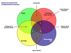
The four elements really have to work together to make for a successful services that people will use and continue to use over time. Yes, I am using a venn diagram for the four rings as it helps point out the overlaps and gaps where the implementations can fall short. The overlaps in the diagram is where the interesting things are happening. A year ago I was running into organizations with self proclaimed success with deployments of social tools (blogs, wikis, social bookmarking, forums, etc.), but as the desire for more than a simple set of blogs (or whichever tool or set of tools was selected) in-house there is a desire for greater use beyond some internal early adopters. This requires paying close attention to the four rings.

Tools

The first ring is rather obvious, it is the tools. The tools come down to functionality and features that are offered, how they are run (OS, rack mount, other software needed, skills needed to keep them running, etc.), how the tools are integrated into the organization (authentication, back-up, etc.), external data services, and the rest of the the usual IT department checklist. The tools get a lot of attention from many analysts and tech evangelists. There is an incredible amount of attention on widgets, feeds, APIs, and elements for user generated contribution. But, the tools do not get you all of the way to a successful implementation. The tools are not a mix and match proposition.

Interface & Ease of Use

One thing that the social software tools from the consumer web have brought is ease of use and simple to understand interfaces. The tools basically get out of the way and bring in more advanced features and functionality as needed. The interface also needs to conform to expectations and understandings inside an organization to handle the flow of interaction. What works for one organization may be difficult for another organization, largely due to the tools and training, and exposure to services outside their organization. Many traditional enterprise tools have been trying to improve the usability and ease of use for their tools over the last 4 to 5 years or so, but those efforts still require massive training and large binders that walk people through the tools. If the people using the tools (not administering the tools need massive amounts of training or large binders for social software the wrong tool has been purchased).

Sociality

Sociality is the area where people manage their sharing of information and their connections to others. Many people make the assumption that social tools focus on everything being shared with everybody, but that is not the reality in organizations. Most organizations have tight boundaries on who can share what with whom, but most of those boundaries get in the way. One of the things I do to help organizations is help them realize what really needs to be private and not shared is often much less than what they regulate. Most people are not really comfortable sharing information with people they do not know, so having comfortable spaces for people to share things is important, but these spaces need to have permeable walls that encourage sharing and opening up when people are sure they are correct with their findings.

Sociality also includes the selective groups people belong to in organizations for project work, research, support, etc. that are normal inside organizations to optimize efficiency. But, where things get really difficult is when groups are working on similar tasks that will benefit from horizontal connections and sharing of information. This horizontal sharing (as well as diagonal sharing) is where the real power of social tools come into play as the vertical channels of traditional organization structures largely serve to make organizations inefficient and lacking intelligence. The real challenge for the tools is the capability to surface the information of relevance from selective groups to other selective groups (or share information more easily out) along the way. Most tools are not to this point yet, largely because customers have not been asking for this (it is a need that comes from use over time) and it can be a difficult problem to solve.

One prime ingredient for social tool use by people is providing a focus on the people using the tools and their needs for managing the information they share and the information from others that flow through the tool. Far too often the tools focus on the value the user generated content has on the system and information, which lacks the focus of why people use the tools over time. People use tools that provide value to them. The personal sociality elements of whom are they following and sharing things with, managing all contributions and activities they personally made in a tool, ease of tracking information they have interest in, and making modifications are all valuable elements for the tools to incorporate. The social tools are not in place just to serve the organization, they must also serve the people using the tools if adoption and long term use important.

Encouraging Use

Encouraging use and engagement with the tools is an area that all organizations find they have a need for at some point and time. Use of these tools and engagement by people in an organization often does not happen easily. Why? Normally, most of the people in the organization do not have a conceptual framework for what the tools do and the value the individuals will derive. The value they people using the tools will derive needs to be brought to the forefront. People also usually need to have it explained that the tools are as simple as they seem. People also need to be reassured that their voice matters and they are encouraged to share what they know (problems, solutions, and observations).

While the egregious actions that happen out on the open web are very rare inside an organization (transparency of who a person is keeps this from happening) there is a need for a community manager and social tool leader. This role highlights how the tools can be used. They are there to help people find value in the tools and provide comfort around understanding how the information is used and how sharing with others is beneficial. Encouraging use takes understanding the tools, interface, sociality, and the organization with its traditions and ways of working.

The Overlaps

The overlaps in the graphic are where things really start to surface with the value and the need for a holistic view. Where two rings over lap the value is easy to see, but where three rings overlap the missing element or element that is deficient is easier to understand its value.

Tools and Interface

Traditional enterprise offerings have focussed on the tools and interface through usability and personalization. But the tools have always been cumbersome and the interfaces are not easy to use. The combination of the tools and interface are the core capabilities that traditionally get considered. The interface is often quite flexible for modification to meet an organizations needs and desires, but the capabilities for the interface need to be there to be flexible. The interface design and interaction needs people who have depth in understanding the broad social and information needs the new tools require, which is going to be different than the consumer web offerings (many of them are not well thought through and do not warrant copying).

Tools and Sociality

Intelligence and business needs are what surface out of the tools capabilities and sociality. Having proper sociality that provides personal tools for managing information flows and sharing with groups as well as everybody as it makes sense to an individual is important. Opening up the sharing as early as possible will help an organization get smarter about itself and within itself. Sociality also include personal use and information management, which far few tools consider. This overlap of tools and sociality is where many tools are needing improvement today.

Interface and Encouraging Use

Good interfaces with easy interaction and general ease of use as well as support for encouraging use are where expanding use of the tools takes place, which in turn improves the return on investment. The ease of use and simple interfaces on combined with guidance that provides conceptual understanding of what these tools do as well as providing understanding that eases fears around using the tools (often people are fearful that what they share will be used against them or their job will go away because they shared what they know, rather than they become more valuable to an organization by sharing as they exhibit expertise). Many people are also unsure of tools that are not overly cumbersome and that get out of the way of putting information in to the tools. This needs explanation and encouragement, which is different than in-depth training sessions.

Sociality and Encouraging Use

The real advantages of social tools come from the combination of getting sociality and encouraging use correct. The sociality component provides the means to interact (or not) as needed. This is provided by the capabilities of the product or products used. This coupled with a person or persons encouraging use that show the value, take away the fears, and provide a common framework for people to think about and use the tools is where social comfort is created. From social comfort people come to rely on the tools and services more as a means to share, connect, and engage with the organization as a whole. The richness of the tools is enabled when these two elements are done well.

The Missing Piece in Overlaps

This section focusses on the graphic and the three-way overlaps (listed by letter: A; B; C; and D). The element missing in the overlap or where that element is deficient is the focus.

Overlap A

This overlap has sociality missing. When the tool, interface, and engagement are solid, but sociality is not done well for an organization there may be strong initial use, but use will often stagnate. This happens because the sharing is not done in a manner that provides comfort or the services are missing a personal management space to hold on to a person's own actions. Tracking one's own actions and the relevant activities of others around the personal actions is essential to engaging socially with the tools, people, and organization. Providing comfortable spaces to work with others is essential. One element of comfort is built from know who the others are whom people are working with, see Elements of Social Software and Selective Sociality and Social Villages (particularly the build order of social software elements) to understand the importance.

Overlap B

This overlap has tools missing, but has sociality, interface, and encouraging use done well. The tools can be deficient as they may not provide needed functionality, features, or may not scale as needed. Often organizations can grow out of a tool as their needs expand or change as people use the tools need more functionality. I have talked with a few organizations that have used tools that provide simple functionality as blogs, wikis, or social bookmarking tools find that as the use of the tools grows the tools do not keep up with the needs. At times the tools have to be heavily modified to provide functionality or additional elements are needed from a different type of tool.

Overlap C

Interface and ease of use is missing, while sociality, tool, and encouraging use are covered well. This is an area where traditional enterprise tools have problems or tools that are built internally often stumble. This scenario often leads to a lot more training or encouraging use. Another downfall is enterprise tools are focussed on having their tools look and interact like consumer social web tools, which often are lacking in solid interaction design and user testing. The use of social tools in-house will often not have broad use of these consumer services so the normal conventions are not understood or are not comfortable. Often the interfaces inside organizations will need to be tested and there many need to be more than one interface and feature set provided for depth of use and match to use perceptions.

Also, what works for one organization, subset of an organization, or reviewer/analyst will not work for others. The understanding of an organization along with user testing and evaluation with a cross section of real people will provide the best understanding of compatibility with interface. Interfaces can also take time to take hold and makes sense. Interfaces that focus on ease of use with more advanced capabilities with in reach, as well as being easily modified for look and interactions that are familiar to an organization can help resolve this.

Overlap D

Encouraging use and providing people to help ease people's engagement is missing in many organizations. This is a task that is often overlooked. The tools, interface, and proper sociality can all be in place, but not having people to help provide a framework to show the value people get from using the tools, easing concerns, giving examples of uses for different roles and needs, and continually showing people success others in an organization have with the social tool offerings is where many organization find they get stuck. The early adopters in an organization may use the tools as will those with some familiarity with the consumer web social services, but that is often a small percentage of an organization.

Summary

All of this is still emergent and early, but these trends and highlights are things I am finding common. The two areas that are toughest to get things right are sociality and encouraging use. Sociality is largely dependent on the tools, finding the limitations in the tools takes a fair amount of testing often to find limitations. Encouraging use is more difficult at the moment as there are relatively few people who understand the tools and the context that organizations bring to the tools, which is quite different from the context of the consumer social web tools. I personally only know of a handful or so of people who really grasp this well enough to be hired. Knowing the "it depends moments" is essential and knowing that use is granular as are the needs of the people in the organization. Often there are more than 10 different use personas if not more that are needed for evaluating tools, interface, sociality, and encouraging use (in some organizations it can be over 20). The tools can be simple, but getting this mix right is not simple, yet.

[Comments are open and moderated at Enterprise Social Tools: Components for Success :: Personal InfoCloud


February 22, 2008

Remote Presentation and Perception Matrix for Social Tools

This post is also found at: Remote Presentation and Perceptions Matrix for Social Tools :: Personal InfoCloud with moderated comments turned on.]

Today I did something I had never done before (actually a few things) I sat in my office in my home and gave a live web video presentation to a conference elsewhere on the globe. I presented my nearly all new presentation, Keeping Up With Social Tagging to the Expert Workshop in: Social Tagging and Knowledge Organization - Perspectives and Potential that was put on by the Knowledge Media Research Center in Tübingen, Germany.

Remote Presentation Feelings

While the remote video presentation is normal for many people inside their large organizations and I have presented at meetings and conferences where my presentation was provided to other location on live video feed (my recent Ann Arbor trip to present at STIET was HD broadcast to Wayne State in Detroit), this home office to conference presentation was new to me. The presentation and video link used Adobe Connect, which allowed me to see whom I was talking to, manage my slides, text chat, and see myself. This worked quite well, much better than I expected. I did have my full slide presentation in lightroom view set up in Keynote on my external monitor on the side and used Awaken on the side monitor as well to help with timing.

The ability to get feedback and watch the attendees body language and non-verbal responses was insanely helpful. I have given webinars and done phone presentations where I had not visual cues to the audience responses, which I find to be a horrible way to present (I often will expand on subjects or shorten explanations based on non-verbal feedback from the audience). Adobe Connect allowed this non-verbal feedback to be streamed back to me, which completely allows me to adjust the presentation as I normally do.

One thing that was a wee bit difficult was having to change focus (I suppose that comes with use and experience), but I would watch audience feedback while presenting, peek to the side to see where I was with time and slides (to work in the transitions), but would then try to look at the camera to "connect". Watching myself on the video feedback the moments I would try to connect through the camera I would open my eyes wide as if trying to see through my iSight and boy does that come across looking strange on a close range camera. I also (unknown to myself until recently watching a video of another presentation I had done) use a similar facial expression to add emphasis, I am realizing with a camera as close as it is for web presentation also really looks odd. I am sort of used to listening to myself (normally to write out new analogies I use or responses to questions), but watching myself in playback from that close of a range is really uncomfortable.

One thing I really missed in doing this web video presentation was extended interaction with the attendees. I rather enjoy conferences, particularly ones with this focussed a gathering as it makes for great socializing with people passionate about the same subjects I am passionate about. I like comparing note, perceptions, and widely differing views. It helps me grow my knowledge and understandings as well as helps change my perceptions. Live face-to-face conversation and sharing of interests is an incredibly value part of learning, experiencing, and shaping views and it is something I greatly enjoy attending conferences in person. I am not a fan of arriving at a conference just prior to a presentation, giving the presentation, and then leaving. The personal social interaction is valuable. The video presentation does not provide that and I really missed it, particularly with the people who are so closely tied to my deep interest areas as this workshop was focused.

New Content in Presentation

This presentation included a lot of new content, ideas, and concepts that I have not really presented or written about in as open of a forum. I have received really strong positive feedback from the Faces of Perception, Depth of Perception, and Perception Matrix when I have talked about it with people and companies. I have included this content in the book on social bookmarking and folksonomy I am writing for O&Reilly and pieces have been in public and private workshops I have given, but it was long past time to let the ideas out into the open.

The components of perception came about through reading formal analysis and research from others as well as not having a good models myself to lean on to explain a lot of what I find from social computing service providers (web tools in the Web 2.0 genre as well as inside the firewall Enterprise 2.0 tools) as tool makers or service owners. The understandings that are brought to the table on a lot of research and analysis is far too thin and far too often badly confuses the roles and faces of the tool that are being reviewed or analyzed. In my working with tool makers and organizations implementing social tools the analysis and research is less than helpful and often makes building products that meet the user needs and desires really difficult. I am not saying that this conceptual model fixes it, but from those who have considered what it shows almost all have had realizations they have had a less than perfect grasp and have lacked the granularity they have needed to build, analyze, or research these social tools.

I am hoping to write these perspectives up in more depth at some point in the not too distant future, but the video and slides start getting the ideas out there. As I have been walking people through how to use the tools I have been realizing the content needed to best us the model and matrix may take more than a day of a workshop of even a few days to get the most complete value from it. These tools have helped me drastically increase my value in consulting and training in the very short time I have used them. Some are finding that their copying of features and functionality in other social services has not helped them really understand what is best for their user needs and are less than optimal for the type of service they are offering or believe they are offering.


October 18, 2007

The State of Enterprise Social Software - Pointer

I have written and posted The State of Enterprise Social Software on my Peronal InfoCloud blog as it has comments on and it also is where I am trying to keep my more professional pieces.

This blog post is a reaction to Richard McManus excellent post Big Vendors Scrap for Enterprise 2.0 Supremacy. The post seemed less about supremacy than scapping to be relevant. Many of the tools I am quite or somewhat familiar with and rather unimpressed. But, go read the other post to find my assessments of the tools, but also the tools that are doing much better jobs than the traditional enterprise vendors.


June 17, 2007

Stitching Conversation Threads Fractured Across Channels

Communicating is simple. Well it is simple at its core of one person talking with another person face-to-face. When we communicate and add technology into the mix (phone, video-chat, text message, etc.) it becomes more difficult. Technology becomes noise in the pure flow of communication.

Now With More Complexity

But, what we have today is even more complex and difficult as we are often holding conversation across many of these technologies. The communication streams (the back and forth communication between two or more people) are now often not contained in on communication channel (channel is the flavor or medium used to communicate, such as AIM, SMS, Twitter, e-mail, mobile phone, etc.).

We are seeing our communications move across channels, which can be good as this is fluid and keeping with our digital presence. More often than not we are seeing our communication streams fracture across channels. This fracturing becomes really apparent when we are trying to reconstruct our communication stream. I am finding this fracturing and attempting to stitch the stream back together becoming more and more common as for those who are moving into and across many applications and devices with their own messaging systems.

The communication streams fracture as we pick-up an idea or need from Twitter, then direct respond in Twitter that moves it to SMS, the SMS text message is responded back to in regular SMS outside of Twitter, a few volleys back and forth in SMS text, then one person leaves a voicemail, it is responded to in an e-mail, there are two responses back and forth in e-mail, an hour later both people are on Skype and chat there, in Skype chat they decide to meet in person.

Why Do We Want to Stitch the Communication Stream Together?

When they meet there is a little confusion over there being no written overview and guide. Both parties are sure they talked about it, but have different understandings of what was agreed upon. Having the communication fractured across channels makes reconstruction of the conversation problematic today. The conversation needs to be stitched back together using time stamps to reconstruct everything [the misunderstanding revolved around recommendations as one person understands that to mean a written document and the other it does not mean that].

Increasingly the reality of our personal and professional lives is this cross channel communication stream. Some want to limit the problem by keeping to just one channel through the process. While this is well intentioned it does not meet reality of today. Increasingly, the informal networking leads to meaningful conversations, but the conversations drifts across channels and mediums. Pushing a natural flow, as it currently stands, does not seem to be the best solution in the long run.

Why Does Conversation Drift Across Channels?

There are a few reasons conversations drift across channels and mediums. One reason is presence as when two people notice proximity on a channel they will use that channel to communicate. When a person is seen as present, by availability or recently posting a message in the service, it can be a prompt to communicate. Many times when the conversation starts in a presence channel it will move to another channel or medium. This shift can be driven by personal preference or putting the conversation in a medium or channel that is more conducive for the conversation style between people involved. Some people have a preferred medium for all their conversations, such as text messaging (SMS), e-mail, voice on phone, video chat, IM, etc.. While other people have a preferred medium for certain types of conversation, like quick and short questions on SMS, long single responses in e-mail, and extended conversations in IM. Some people prefer to keep their short messages in the channel where they begin, such as conversations that start in Facebook may stay there. While other people do not pay attention to message or conversation length and prefer conversations in one channel over others.

Solving the Fractured Communication Across Channels

Since there are more than a few reasons for the fractured communications to occur it is something that needs resolution. One solution is making all conversations open and use public APIs for the tools to pull the conversations together. This may be the quickest means to get to capturing and stitching the conversation thread back together today. While viable there are many conversations in our lives that we do not want public for one reason or many.

Another solution is to try to keep your conversations in channels that we can capture for our own use (optimally this should be easily sharable with the person we had the conversation with, while still remaining private). This may be where we should be heading in the near future. Tools like Twitter have become a bridge between web and SMS, which allows us to capture SMS conversations in an interface that can be easily pointed to and stitched back together with other parts of a conversation. E-mail is relatively easy to thread, if done in a web interface and/or with some tagging to pull pieces in from across different e-mail addresses. Skype chat also allows for SMS interactions and allows for them to be captured, searched, and pulled back together. IM conversations can easily be saved out and often each item is time stamped for easy stitching. VoIP conversations are often easily recorded (we are asking permission first, right?) and can be transcribed by hand accurately or be transcribed relatively accurately via speech-to-text tools. Voice-mail can now be captured and threaded using speech-to-text services or even is pushed as an attachment into e-mail in services as (and similar to) JConnect.

Who Will Make This Effortless?

There are three types of service that are or should be building this stitching together the fractured communications across channels into one threaded stream. I see tools that are already stitching out public (or partially public) lifestreams into one flow as one player in this pre-emergent market (Facebook, Jaiku, etc.). The other public player would be telecoms (or network provider) companies providing this as a service as they currently are providing some of these services, but as their markets get lost to VoIP, e-mail, on-line community messaging, Second Life, etc., they need to provide a service that keeps them viable (regulation is not a viable solution in the long run). Lastly, for those that do not trust or want their conversation streams in others hands the personally controlled application will become a solutions, it seems that Skype could be on its way to providing this.

Is There Demand Yet?

I am regularly fielding questions along these lines from enterprise as they are trying to deal with these issues for employees who have lost or can not put their hands on vital customer conversations or essential bits of information that can make the difference in delivering what their customers expect from them. Many have been using Cisco networking solutions that have some of these capabilities, but still not providing a catch all. I am getting queries from various telecom companies as they see reflections of where they would like to be providing tools in a Come to Me Web or facilitating bits of the Personal InfoCloud. I am getting requests from many professionals that want this type of solution for their lives. I am also getting queries from many who are considering building these tools, or pieces of them.

Some of us need these solutions now. Nearly all of us will need these solutions in the very near future.


May 31, 2007

Folksonomy Book In Progress

Let me start with an announcement. I have not had any answer for continual question after I present on tagging and folksonomy (I also get the question after the Come to Me Web and Personal InfoCloud presentations), which is "where is your book?" Well I finally have an answer, I have signed with O'Reilly to write a book, initially titled Understanding Folksonomy (this may change) and it may also be a wee bit different from your normal O'Reilly book (we will see how it goes).

I am insanely excited to be writing for O'Reilly as I have a large collection of their books from over the years - from the programming PHP, Perl, Python, and Ruby to developer guides on JavaScript, XHTML, XML, & CSS to the Polar Bear book on information architecture, Information Dashboard Design, and Designing Interfaces: Patterns for Effective Interaction Design along with so many more.

Narrowing the Subject

One of the things that took a little more time than I realized it would take is narrowing the book down. I have been keeping a running outline of tagging and folksonomy related subjects that have been in my presentations and workshop as well as questions and answers from these sessions. The outline includes the deep knowledge that has some from client work on the subject (every single client has a different twist and set of constraints. Many of the questions have answers and for some the answers are still being worked out, but the parameters and guidelines are known to get to viable solutions.

Well, when I submitted the outline I was faced with the knowledge that I had submitted a framework for a 800 to 1,000 page book. Huh? I started doing the math based on page size, word counts, bullets in the outline, and projects words per bullet and those with knowledge were right. So, I have narrowed it down to an outline that should be about 300 pages (maybe 250 and maybe a few more than 300).

What Is In This Smaller Book?

I am using my tagging and folksonomy presentations as my base, as those have been iterated and well tested (now presented some version of it well over 50 times). While I have over 300 design patterns captured from tagging service sites (including related elements) only a few will likely be used and walked through. I am including the understanding from a cognitive perspective and the lessening of technology pain that tagging services can provide to people who use them. There will also be a focus on business uses for intranet and web.

When Will This Be Done

Given that I have a rather busy Fall with client work, workshops, and presentations I set a goal to finish the writing by the end of Summer. It sounds nuts and it really feels like grad school all over again, but that is my reality. I have most of the words in my head and have been speaking them. Now I need to write them (in a less dense form than I blog).

Your Questions and Feedback

If you have questions and things you would like covered please e-mail me (contact in the header nav above). I will likely be setting up a blog to share and post questions (this will happen in a couple weeks). I am also looking for sites, organizations, and people that would like to be included in the case studies and interviews (not all will end up in the book, but those that are done will end up tied to the book in some manner). Please submit suggestions for this section if you have any.


January 31, 2007

It is Finally IT and Design in Enterprise (and Small Business)

My recent trip to Northern California to speak at the UIE Web App Summit and meetings in the Bay Area triggered some good ideas. One thread of discovery is Enterprise, as well as small and medium sized business, is looking at not only technology for solutions to their needs, but design.

IT Traditions

Traditionally, the CIO or VP IT (and related upper management roles) have focussed on buying technology "solutions" to their information problems. Rarely have the solutions fixed the problems as there is often a "problem with the users" of the systems. We see the technology get blamed, the implementation team get blamed (many do not grasp the solution but only how to install the tools, as that is the type of service that is purchased), and then the "users need more training".

Breaking the Cycle of Blame and Disappointment

This cycle of blame and disappointment in technology is breaking around a few important realizations in the IT world.

Technology is not a Cure All

First, the technology is always over sold in capability and most often needs extensive modification to get working in any environment (the cost of a well implemented system is usually about the same as a built from scratch solution - but who has the resources to do that). Most CIOs and technology managers are not trusting IT sales people or marketing pitches. The common starting point is from the, "your tool can not do what you state" and then discussions can move from there. Occasionally, the tools actually can do what is promised.

Many, decision makers now want to test the product with real people in real situations. Solution providers that are good, understand this and will assist with setting up a demonstration. To help truly assess the product the technical staff in the organization is included in the set-up of the product.

People and Information Needs

Second, the problems are finally being identified in terms of people and information needs. This is a great starting place as it focusses on the problems and the wide variety of personal information workflows that are used efficiently by people. We know that technology solutions that mirror and augment existing workflows are easily adopted and often used successfully. This mirroring workflow also allows for lower training costs (occasionally there is no training needed).

Design with People in Mind

Third, design of the interaction and interface must focus on people and their needs. This is the most promising understanding as it revolves around people and their needs. Design is incredibly important in the success of the tools. Design is not just if it looks pretty (that does help), but how a person is walked through the steps easily and how the tools is easy to interact with for successful outcomes. The lack of good design is largely what has crippled most business tools as most have focussed on appealing to the inner geek of the IT manager. Many IT managers have finally realized that their interface and interaction preferences are not remotely representative of 95 percent of the people who need to or should be using the tools.

It is increasingly understood that designing the interaction and interface is very important. The design task must be done with the focus on the needs of real people who will be using the product. Design is not sprinkling some Web 2.0 magic dust of rounded corners, gradients, and fading yellow highlights, but a much deeper understanding that ease of use and breaking processes into easy steps is essential.

Smile to Many Faces

This understanding that buying a technology solutions is more than buying code to solve a problem, but a step in bringing usable tools in to help people work efficiently with information. This last week I talk to many people in Enterprise and smaller businesses that were the technical managers that were trying to get smarter on design and how they should approach digital information problems. I also heard the decision managers stating they needed better interfaces so the people using the tools could, well use the tools. The technology managers were also coming to grips that their preferences for interfaces did not work with most of the people who need the tools to work.

Technology Companies Go Directly to the Users

I have also been seeing the technology tool makers sitting with their actual people using their tools to drastically improve their tools for ease of use. One President of a technology tool maker explained it as, ":I am tired of getting the blame for making poor tools and losing contracts because the technology decision makers are not connected with the real needs of the people they are buying the tools for." This president was talking to three or four users on problems some of his indirect clients were having with a tool they really needed to work well for them. This guy knows the tech managers traditionally have not bought with the people needing to use the tools in mind and is working to create a great product for those people with wants and needs. He also knows how to sell to the technology managers to get their products in the door, but knows designing for the people using the product is how he stays in the company.


November 1, 2006

No Personal or Work E-Mail to My Gmail Address

If you want to send an e-mail that gets my attention, please use an address other than my Gmail address. I mostly use that address for listserves. The ability to search, parse, and scan e-mail in Gmail just does not work for me and things I really want to follow-up with only get addressed if I forward them to myself at an other address. [Granted the amount of e-mail I am getting and daily communication is more then I can normally keep-up with at the moment. I deeply apologize if I owe you a response. I need to better embrace the DTD model as my GTOMG model leave too many things left unaddressed.]

Filters, Labels, and Tags

The Gmail interface does not work well for me personally to highlight, track, and respond to the mail. I had a lot of hope for Gmail and its ability to tag (or in Google terms, "label"), but its interface is really poor for doing this with anything more than 10 or 15 labels. When I want to manually applying more than one label the interface is really poor (at best).

GTDGmail

I have looked at the GTDGMail mail as a solution, as its interface is much much better than what Google has churned out. While the GTDGmail is a vast improvement the remainder of Gmail for personal or work mail does not scale to meet my needs on that front. If you are unpleased with the Gmail labelling, as most I know are, you owe it to yourself to look at GTDGmail.


October 19, 2006

The Excellence of Accessibilty Presentations

One of the people I have met this past year and come to know better through traveling to and from Web Directions 2006 and hanging with at d.construct is Derek Featherstone. His presentations on the subject of accessibility are the best I have ever seen. The past year I have not had the opportunity to think, talk about, or develop around the subject of web accessibility (I had thought of this as a good thing, but I will explain that shortly) other than as an extension of semantically well structured information, which most conference I have been speaking at are related to in one form or another.

Derek is one of the first presenters that digs deep into accessibility beyond a set of rules, but also looks at usability for those with accessibility needs as the baseline for building great sites that work for all. He frames his presentations not as accessibility is for "them", but as it is for all of us. This focus is astoundingly refreshing and rare.

Derek digs into how JavaScript and Ajax, if done well (did you read that caveat, "done well"?), can actually improve accessibility. In his presentation Derek walks through how to think about interfaces, both rich and static, and improve upon them for everybody. Much of this is basic usability that is missed by many, but the rich interface elements are something I have not heard before from somebody talking about accessibility.

Lastly, Derek's presentation style is light and easy, which bring many people who are put off my accessibility into listening and learning. It is a great thing to watch people gain interest as he presents about a subject they did not care about. But even better is when they start talking about they now have a good framework to think about and approach accessibility does the power of Derek's presentation style and deep knowledge make a the subject come to life.

Granted I have not been reading much around accessibility for the past year, although I have had some great discussions about it with Matt May and Christian Heilmann at various points this year along the lines of rich interfaces and caring about those with accessibility needs. My lack of interest is not because I do not care about accessibility, but I have been burned out from dealing with the politics of accessibility in the U.S. Federal Government. I enjoyed working with the webmasters on the government side, but outside of that it was really painful. Most people would go out of their way to make unusable, poorly structured, semantically incorrect, let alone unaccessible sites just because they were told to make a site accessible. The long battles, even with those charged with caring and ensuring accessibility, made me very happy not to have to deal with accessibility for quite a while. Since you can get about 90 percent of the way to accessibility with just semantically well structured XHTML mark-up, which is the mark of any decent web developer, I have not considered the subject much beyond that in over a year.

Derek's presentations and our long discussions regarding semantically well structured information as the basis for everything that has improved the web in the past few years, brought me back to enjoying the subject of accessibility. In saying this I am more sure now that those who wrote the U.S. Section 508 regulations and those on the Access Board have failed those who needed real accessibility so they could partake in this freedom of information we embrace.


September 1, 2006

Domain of Digital Design Includes Strings

Many of us around the digital design profession consider visual pixels our domain, information as content and its structure is our in our domain, and the ease of use as part of our domain (all of this depending on what label or design community we align with). Strings do not fall into the design camp. By strings I mean data strings, which include date stamps, URLs, identity strings, etc. These often fall through the cracks.

In the last year or so these have become quite important to me as I look at the URLs on this site (vanderwal.net) and they are not as friendly, readable, or guessable as they should be. There is no understanding what http://www.vanderwal.net/random/entrysel.php?blog62 will lead to. Do people actually care about this?

Attention to Strings

I find not everybody cares about data strings, but some people do and many devices and services do too. We know many people do not pay attention to their address bar when surfing the web, but when they copy a link to send to a friend or IM a friend, they often look at the URL as a double-check. This is where confusion comes in, they have no idea that blog62 is the post they are wanting to share and it takes them out of a simple flow if they want to make sure it is the right thing.

Not only do people care by devices and services care about what is in strings. When a site is scraped by a search engine one of the important components in weighing the validity is the words in the string. If "blog62" were some thing that I wanted to ensure had optimal opportunity to surface in any of the major search engines I would want to ensure some key terms were in the URL that was being scraped and used. To the search engines 1862 means very little.

Human Readable

The goal is to have these data strings human readable, which leads to text that machines can read and used in algorithmic and automated filters and optimization tools. Not only do URLs need help, but so do date strings. Date strings should be easily understood and they should be labeled with relevant time zone if time is displayed as well.

Ground Control to Major Thomas - Where Are You

Again I turn to my own blog and its less than optimal state of being for my fodder. Since Fall of last year my vanderwal.net site has been hosted in Australia (a wonderful hosting company Segment Publishing (SegPub)). Part of this means that my time stamp for posting my blog entries grabs the local date and time. Since last Fall I have been blogging from the future, or so readers have been thinking. In a couple weeks I may actually be blogging from a the local timezone for my blog, but it is something I need to change.

One complication I have is I post content from various timezones. I could make all dates local to where I post, or choose the Greenwich Mean Time (GMT) as a default and label it properly as such. One of the things that the date and time stamp for posts does get mostly right is it is understandable. Many times we see sites with the tech generic "2006-7-23T2:44:03Z" rather than a more easily human readable "7 July 2006 2:44:03AM GMT".

Data Strings Design Worthy Too

I hope these examples from my own site (a self-built blogging tool that I have not touched much since 2001 or 2002, which I use but not fix or move away from) help illustrate the confusion unattended to date strings play. If we care about the experience for people coming to our sites we build and design we need to care about the little things, the details, like URLs and date strings.

[Yes, I will fix my site eventually. I have been waiting for that magical downtime to sort through porting all my posts and related metadata into a real blogging tool, as I really do not see me finding the time or desire to start tackling all that I want and need to fix in my own dear little tool.]


August 16, 2006

Quick and Intense Usability Interations

Last evening I was chatting with Nate Bolt who mentioned he had done some usability studies with a large client who brought their developers with them to watch the studies live. He mentioned that the developers would go back every evening an code the site/tools they were testing and then test the new site the next day. Others that were chatting thought this was nuts, which a year or two ago I would have thought the same.

A couple years ago I started talking to people doing development and usability sprints that start-ups, open source projects, and small development teams had been trying.

Usabilty Test Built into Sprints and Hack Days

In the past year I have talked with at least three teams working on projects that are doing one-day to four-day sprints or hack days to gather information from usability tests regarding how people use or are unable to use their products as well as collect wish-lists of desired product improvements. In the multi-day sessions some of the identified front-end tweaks and quick development tasks are knocked out, tested with people who use the product, and iterated a few times. The instant feedback on tweaks is very helpful and allows for rapid product development.

Quick Fixes and Long Term Tasks

The time between the intense sessions are used to build the deeper and more wide spread changes. These release cycles are now quicker and more on target. One project also has done usability sessions in addition to the intense sessions to catch some of the more subtle issues (with people new to the sites/tools as well as those with long term use).

Listening and Fixing Before Their Eyes

I definitely see the strong advantages of the intense sessions mixed with the usual longer term development. Finally it seems a broad section of the development world is finally learning that the best way to build out stuff is to sit with the people that use it, see their pain and frustration. But, even better is fixing that pain overnight. These intense iterations build positive feedback for the developers and designers on the projects, the business owners seeing quick improvements, and the people who want and need to use the products. The people using the tools will most likely go away and become evangelists for the products as the developers and designers not only listened to their needs, but fixed it so it worked better for them right before their eyes.

What It Takes

This approach not only takes solid developers and designers, but smart project managers that can assess (more accurately triage) the needed fixes, prioritize the short term and long term solutions, assign and manage these quick solutions. Smart and passionate people is the key to these solutions as well as nimble teams.

Small Projects Get It, Will Enterprise?

I am wondering if the quick intense iterations will be where we are going. I definitely see it for the small and nimble. But, can enterprise iterate this quickly? Or will the hands that need to bless the iterations have to stay involved with meeting cycles that will slow down the progress?

I have been impressed with the discussions around Yahoo! Hack Days and Yahoo is a large enterprise with many meetings, but they "get it" (or are in the process of internalizing "getting it"). I think Yahoo is showing enterprise can get there. But getting there will take faith that the enterprise has hired well and have the right people working for (and with) them and the right managers in place that trust their developers and designers, but most importantly trust their customers and people that use, as well as want to use, what they produce.


July 30, 2006

Are We There Yet? - The Need to Easily Shift Medium

People & Medium Preferences

Talking to people about the peeves about the flood of information they deal with in their lives there is a trend that seems completely unaddressed. This is the understanding that people have preferences for voice, text, and/or media. If you leave a text person an voicemail they do not process it well. IMing a voice person will frustrate them.

Medium Is the Attractor

I am ever more sure Marshall McLuhan is as valid as ever with his maxim, "The Medium is the Message". But, more importantly the medium is the attractor (or detractor). The voice people love other voice people and tend to ignore text people and their text attempts to interact with them and visa versa. Text people tend not to get into podcasts. When using news sites text people get frustrated with no text version of a video and media people like video over text.

Closing the Gap?

What needs to be done to fix this? I have not seen easy voice to text and text to voice solutions pop-up that will solve the message leaving problems to match information consumption preferences. There are tools out there, but they are not filling into the mainstream and not easily integrated into the tools people regularly use.

The solution for content creators is to provide more than one medium. I keep hearing complaints from friends and others in airports (my favorite place to interact with regular people) about CNN only having text or video versions of their stories and not both side-by-side. It seems like CNN is making a lot of changes lately, so hopefully this will get resolved (as well as their videos not playing on Mac easily, or PCs for that matter if the airport population of regular people is any indicator).


June 30, 2006

Technosocial Architect

Those of you that know me well know I am not a fan of being labeled, yes it is rather ironic. A large part of this is a breadth of focus in the lens, from which I view the world. I am deeply interested in how people interact, how people use technology, and the role of information in this equation. My main interest is information and information use, when to people want it and need it, how people acquire it. I am utter fascinated by how technology plays in this mix and how important design is. I look at technology as any mediated form of communication, other than face-to-face communication. The quest began in the technology "quot;paper age" looking at layout and design of text and images on the printed page and the actual and latent messages that were portrayed in this medium. I also dove into television and video as well as computer aided visualizations of data (Tufte was required reading in quantitative methods class (stats) in the early '90s in grad school).

Well, this life long interest only continued when I started digging into the web and online services in the early 90s. But, as my interest turned professional from hobby and grad student my training in quantitative and qualitative (ethnographic) research were used not for public policy, but for understanding what people wanted to do with technology or wished it would work, but more importantly how people wanted to use information in their life.

Basis for Digital Design and Development

As I have waded through web development and design (and its various labels). Most everything I have done is still based on the undergrad training in communication theory and organizational communication. Understanding semantics, rhetoric, layout, design, cogsci, media studies, cultural anthropology, etc. all pay a very important part in how I approach everything. It is a multi-disciplinary approach. In the mid-80s I had figured everybody would be using computers and very adept by the time I finished undergrad, that I thought it was a waste to study computer science as it was going to be like typing and it programming was going to be just like typing, in that everybody was going to be doing (um, a wee bit off on that, but what did I know I was just 18).

People Using Information in Their Life

The one thing that was of deep interest then as it is now, is how people use information in their life and want and need to use information in their life. To many people technology gets in the way of their desired ease of use of information. Those of us who design and build in the digital space spend much of our time looking at how to make our sites and applications easier for people to use.

Do you see the gap?

The gap is huge!

We (as designers and developers) focus on making our technology easy to use and providing a good experience in the domain we control.

People want to use the information when they need it, which is quite often outside the domains we as designers and developers control.

Designing for Information Use and Reuse

Part of what I have been doing in the past few years is looking at the interaction between people and information. With technology we have focussed on findability. Great and good. But, we are failing users on what they do with that information and what they want to do with that information. One question I continually ask people (particularly ones I do not know) is how are you going to use that information. When they are reading or scanning information (paper or digital it does not matter) I ask what is important to them in what is before them. Most often they point to a few things on the page that have different uses (an article referenced in the text, an advertisement for a sale, a quote they really like, etc.). But, the thing that nearly everything that they find important is it has a use beyond what they are reading. They want to read the article that is referenced, they want the date and location for the sale (online address or physical address and date and times), they want to put the quote in a presentation or paper they are writing.

End-to-end is Not the Solution

Many companies try to focus on the end-to-end solution. Think Microsoft or Google and their aim to solve the finding, retaining, using, and reusing of that information all within their products. Currently, the companies are working toward the web as the common interface, but regular people do not live their life on the web, they live it in the physical world. They may have a need for an end-to-end solution, but those have yet to become fully usable. People want to use the tools and technologies that work best for them in various contexts. As designers and developers we can not control that use, but we can make our information more usable and reusable. We have to think of the information as the focal point. We have to think of people actually connecting with other people (that is individuals not crowds) and start to value that person to person interaction and sharing on a massive scale.

Our information and its wrappers must be agnostic, but structured and prepared in a manner that is usable in the forms and applications that people actually use. The information (content to some) is the queen and the people are the king and the marriage of the two of them will continue the reign of informed people. This puts technology and the medium as the serf and workers in that kingdom. Technology and the medium is only the platform for information use and reuse of the information that is in people's lives. That platform, like the foundation of a house or any building must not be noticed and must serve its purpose. It must be simple to get the information and reuse it.

Technology and Design are Secondary

Those of us that live and breathe design and development have to realize what we build is only secondary to what people want. It is the information that is important to regular people. We are only building the system and medium. We are the car and the road that take people to Yosemite where they take pictures, build memories, bond with their travel companions, etc. What is created from this trip to Yosemite will last much longer than the car or road they used to get them to the destination. We only build the conduit. We have to understand that relationship. What we build is transient and will be gone, but what people find and discover in the information they find in what we build must last and live beyond what we control and can build or design. We must focus on what people find and want to use and reuse while they are using what we are designing and building for them.

Information as Building Blocks

All of what is being described is people finding and using information that an other person created and use it in their life. This is communication. It is a social activity. This focus is on building social interactions where information is gathered and used in other contexts. Information use and reuse is part of the human social interaction. This social component with two people or more interacting to communicate must be the focus. We must focus on how that interaction shapes other human interactions or reuses of that information garnered in the communication with an other and ease that interaction. If you are still reading (hello) you probably have something to do with design or development of technology that mediates this communication. We are building social tools in which what is communicated will most likely have a desired use for the people interacting outside of what we have built or designed.

Technosocial Architects

People who understand the social interactions between people and the technologies they use to mediate the interactions need to understand the focus is on the social interactions between people and the relationship that technology plays. It is in a sense being a technosocial architect. I ran across the word technosocial in the writings of Mimi Ito, Howard Rheingold, and Bruce Sterling. It always resonates when I hear technosocial. Social beings communicate and inherent in the term communication is information.

Focus on People, Medium, and Use

Just above you see that I referenced three people (Mimi, Howard, and Bruce) as people who used a term that seems to express how I believe I look at the work I do. It is people, more importantly, it is individuals that I can point to that I trust and listen to and are my social interpreters of the world around me. These people are filters for understanding one facet of the world around me. People have many facets to their life and they have various people (sometimes a collective of people, as in a magazine or newspaper) who are their filters for that facet of their life. There are people we listen to for food recommendations, most likely are different from those that provide entertainment, technology, clothing, auto, child care, house maintenance, finance, etc. We have distinct people we learn to trust over time to provide or reinforce the information we have found or created out of use and reuse of what we have interacted with in our life.

Looking at many of the tools available today there is a focus on the crowd in most social tools on the web. Many regular people I talk to do not find value in that crowd. They want to be able to find individual voices easily that they can learn to trust. Just like I have three people I can point to people in social software environments look at the identity (screen name many times) as their touch point. I really like Ask MetaFilter as a social group "question and answer" tool. Why? Mostly because there are screen names that I have grown to know and trust from years of reading MetaFilter. The medium is an environment that exposes identity (identity is cloaked with a screen name and can be exposed if the person so decides in their profile). People are important to people. In digitally mediated social environments the identity is that point of reference that is a surrogate for name in physical space. In print the name of the writer is important as a means to find or avoid other pieces or works. We do the same in movies, television news, television shows, online videos, podcasts, blogs, etc. the list does not end.

Our social mediums need to keep this identity and surface the identity to build trust. People use identity as gatekeepers in a world of information overload. When I look at Yahoo! Answers and Yahoo! MyWeb (my absolute favorite social bookmarking tool) I get dumped into the ocean of identities that I do not recognize. People are looking for familiarity, particularly familiarity of people (or their surrogate identity). In MyWeb I have a community (unfortunately not one that is faceted) where I trust identities (through a series of past experience) as filters for information in the digital world around us, but I am not placed in this friendly environment, but put in an environment where I find almost nothing I value presented to me. This is the way Yahoo! Answers works as well, but it does not seem like there is the ability to track people who ask or answer questions that a person would find value in.

The tools we use (as well as design and build) must understand the value of person and identity as information filters. The use of information in our lives is one explicit expression of our interest in that subject, the person who created the information, or the source what housed that information. Use and reuse of information is something we need to be able to track to better serve people (this gets in to the area of digital rights management, which usually harms information use more than it enables it, but that is another long essay). The medium needs to understand people and their social interaction people have with the information and the people who create the information and the desired use. This use goes well beyond what we create and develop. Use requires us understanding we need to let go of control of the information so it may be used as people need.

Need for Technosocial Architects

Looking at the digital tools we have around us: websites, social computing services and tools (social networking sites, wikis, blogs, mobile interaction, etc.), portals, intranets, mobile information access, search, recommendation services, personals, shopping, commerce, etc. and each of these is a social communication tool that is based on technology. Each of these has uses for the information beyond the digital walls of their service. Each of these has people who are interacting with other people through digital technology mediation. This goes beyond information architecture, user experience design, interaction design, application development, engineering, etc. It has needs that are more holistic (man I have been trying to avoid that word) and broad as well as deep. It is a need for understanding what is central to human social interactions. It is a need for understanding the technical and digital impact our tools and services have in mediating the social interaction between people. It is a need for understanding how to tie all of this together to best serve people and their need for information that matters to them when they want it and need it.


June 21, 2006

Still Thowing Out the User

There is much buzz about getting rid of the term user these days. Don Norman talks about using the term person, PeterMe picks up on this, and others are not happy with the term "user generated content", like Jon Udell who would like to use "reader-created content", Robert Scoble who believes it is screwing the Long Tail, and Jeff Veen who talks about people writing the web. I have to agree, well I did more than agree.

Throwing Out the User

More than a year ago I got fed up with the user and wrote about saying Good Bye to the User. In years prior I have watched people having painful moments in usability testing. These people felt sorry that they could not easily use what we built and designed. They had empathy for us, but we just lumped them in the category "user". User is not a good word, it is a dirty four letter word. Far too many times designers and developers blame the "user". We tried to solve the user's problems. It was not the problem of the user, it is a real person's pain.

As designers and developers we know deep inside that technology is complex and difficult to use, but we often forget it. The term user has stood in the way. But using person or people, we can see the pain and feel the pain. Many of us consider ourselves users and we do not have these problems, but we are über users, who at one point had the same pain and struggles.

People are different, we have learned this early in life. We can take some characteristics and lump groups of people together, but there are so many important facets that that make us who we are it is difficult to lump people across facets. The only way to lump people separating ourselves as designers and developers out of the equation and putting the focus on regular people. If you are reading this, you are most likely not a regular person who has problems using technology as they wish or need to. It is real people with pain. It is real people who worry about privacy, identity issues, easy access to needed info for themselves and some easy access for some people they know but impossible access for most everybody else, etc. But, the problem with this is these real people do not know this is what they want or need until they do not have it an it becomes painfully aware to them.

Generating Content

I like approach of Jeff Veen and Jon Udell who focus on person-created content. In a hip world of popularity engines like Digg where the masses or crowd bubble up information we forget that most people listen and trust individual voices. We have done this with mass media for years. We trusted certain news anchors and certain reporters on television. We read and trusted certain journalist, columnists, reviewers, and opinion writers. This trust was not always to the wrapper of the communication, like a paper or the whole network news offerings. It comes down to people trusting people. Individuals trusting individuals.

Those of us who have been blogging for nearly a dog year or more understand it is about the individual. We are individual people creating content. We are individual voices. We may be part of a collective at times, but people trust us the person and over time may come to trust people we trust, whom our readers do not know and do not trust yet.

Bringing People Together with People

So what do we need in these social computing environments? We need to see the person. We need to have the ability to find the person similar to us. We want to find those whom are near in thought to us. This may not be the most prolific person on a subject or the most linked to, but their interests match our interests and or vocabularies are similar (often a very good sign of commonality). In the popularity engines we should be able to find those who have "liked" or "dug" things similar to that which we have the same feelings and/or interests.

Doing Without the User

The past year I have been asked many times how easy it is not to use the term user. Well, at first it was hard to transition because it was a term I just used with out thinking. It was also hard because many of my clients and customers I worked with liked using the term user (they also have had many of the problems that come with the term user). But, over time I have a few clients using people and the empathy for the pain that the people who use their products feel is felt and it is reflected in their work products.

One benefit that came from focussing on the person and not the user has been being able to easily see that people have different desired uses and reuses for the data, information, media, etc. that the products I am working on or my clients are developing. I can see complexity more easily focussing on people than I could the user. Patterns are also easier to see looking at the individual people as the patterns resemble flows and not steps. When we focus on the user we try to fit what we built to pre-determined patterns, which we have broken into steps. We can determine steps that are roughly common points of task changing in the flows (changing from seeking to recognizing in a search task it part of an iterative flow, which we can determine is a separate step, but whether that leads to the next step or iterates a few more times is part of a person's information workflow.

Steps are Broken

One of the steps that is getting broken by real people is that around process. People use tools in different ways. For years we have been looking at a publish and subscribe model. But, that is missing a step or two when we look at the flows. People create content and publish it, right? Well, not quite. We are seeing people skipping the publish and pushing it straight to syndication. There is no single point where it is published and has a definable address. The old publish and subscribe model assumed publishing would syndicate the information (RSS, ATOM, RDF, etc.). But, we all know that syndication has been a really slow adoption for traditional media. It was many years after those of us blogging and syndicating information saw traditional media pick-up on the trend. But, traditional media has always understood going straight to syndication with columnists, radio, and television shows. It was the blogging community and personal content creators that were late to understanding we could just syndicate the information and skip the publishing step in the flow.

Getting to Watching People and Flows

How do we not miss things? We watch people and we need to pay attention to their flows. Each individual, each of their desires, each of their different personal information workflows, across each of their current devices, and how they wish they could have what we build inflict less pain on their person.

The person should not feel empathy for those of us building and designing tools and systems, we must feel the person's and peoples pain and feel empathy for them. Where have we stood in their way of their desired flow? Now we must get out of the way, get rid of the user, and focus on people to build and design more effectively.


May 24, 2006

The Battle to Build the Personal InfoCloud

Over at Personal InfoCloud I posted The Future is Now for Information Access, which was triggered by an interview with Steve Ballmer (Microsoft) about the future of technology and information. I do not see his future 10 years out, but today. I see the technology in the pockets of people today. People are frustrated with the information not being easily accessed and use and reuse not being as simple as it should. Much of this is happening because of the structure of the information.

Personal InfoCloud is the Focus

One thing that struck me from the article, which I did not write about, was the focus on Google. Personally I find it odd as Yahoo is sitting on the content and the structure for more than 90 percent of what is needed to pull off the Personal InfoCloud. Yahoo is beginning to execute and open access to their data in proper structures. Ballmer lays out a nearly exact scenario for aggregating one's own information and putting it in our lives to the one I have been presenting the last few years. Yahoo has the components in place today to build on top of and make it happen. Google is not only lacking the structure, but they are not executing well on their products they produce. Google does the technically cool beta, but does not iterate and fix the beta nor are they connecting the dots. Yahoo on the other hand is iterating and connecting (they need to focus on this with more interest, passion, and coordinated direction).

The Real Battle

I really do not see the battle as being between Google and the others. The real battle is between Yahoo and Microsoft. Why? Both focus on the person and that person's use and need for information in their life and with their context. Information needs to be aggregated (My Yahoo is a great start, but it goes deeper and broader) and filtered based on interest and need. We are living in a flood of information that has crossed into information pollution territory. We need to remove the wretched stench of information to get back the sweet smell of information. We need to pull together our own creations across all of the places we create content. We need to attract information from others whom have similar interests, frameworks, and values (intellectual, social, political, technological, etc.). The only foundation piece Yahoo is missing is deep storage for each person's own information, files, and media.

Microsoft Live Gets It

Microsoft has the same focus on the person. I have become intrigued with the Microsoft Live properties (although still have a large disconnect with their operating systems and much of their software). Live is aiming where Yahoo is sitting and beyond. Microsoft has the cash and the interest to assemble the pieces and people to get there. Live could get there quickly. Looking at the Live products I saw in January at Search Champs with some in relatively early states and what was launched a few months later, the are iterating quickly and solidly based on what real people want and need in their lives (not the alpha geeks, which Google seems to target). Live products are not done and the teams are intact and the features and connections between the components are growing. They are leaving Google in the dust.

Can Yahoo Stay Ahead of Microsoft?

The question for Yahoo is can they keep up and keep ahead of Microsoft? Google has the focus in search as of today (not for me as the combination of Yahoo! MyWeb 2.0 and Yahoo! Search combined blow away anything that Google has done or seemingly can do. Yahoo! does need to greatly improve the simplicity, ease of use, and payoff (it takes a while for the insanely great value of MyWeb 2.0 to kick in and that needs to come much earlier in the use phase for regular people).

I am seeing Microsoft assembling teams of smart passionate people who want to build a killer web for regular people. It seems Ray Ozzie was the turn around for this and is part of the draw for many heading to work on Live products. The competition for minds of people who get it puts Live in competition with Google, Yahoo, EBay, Amazon, and even Apple. I am seeing Live getting the people in that they need. Recently (last week) Microsoft even started changing their benefits and employee review practices to better compete and keep people. It seems that they are quite serious and want to make it happen now.

Yahoo Under Valued

Recent comments about Yahoo being under valued in the long term are dead on in my view. A recent Economist article about Google pointed out how poorly they execute on everything but their core service (search). This waking up starts to bring a proper focus on what those of us who look at regular people and their needs from information and media in their lives have been seeing, Yahoo gets it and is sitting on a gold mine. Yahoo has to realize that Microsoft sees the same thing and is pushing hard with a proper focus and passion to get there as well.

Google Overvalued

What does this mean for Google? I am not sure. Google is a technology company that is focussed on some hard problems, but it has to focus on solutions that people can use. Google aims for simple interfaces, but does not provide simple solutions or leaves out part of the solutions to keep it simple. They need a person-centered approach to their products. The addition of Jeff Veen and his Measure Map team should help, if they listen. Google has some excellent designers who are focussed on usable design for the people, but it seems that the technology is still king. That needs to change for Google to stay in the game.


January 16, 2006

Hindsights for Moving Forward

The follow list of 10 lessons learned in the Guy Kawaskaki Hindsights blog post I have found to be outstanding. Last week I forwarded it to a few friends, but realized everybody could benefit from reading it. I fully embrace the list and by matter of chance I have largely lived this way. It is well worth a read at any age.

The real kick in the butt I got last year was from the Steve Jobs commencement speech at Stanford University (the audio of the Steve Jobs commencement speech is also available). This speech combined with a death in our family made the time in front of me look much shorter.

The passion for technology and seeing it become more usable so that information can be reusable so that people can actually use it in their lives took focus. This is now my full-time job. We as designers and developers need to look beyond the cool to the useful, the need, and breaking down the barriers for use of information and technology. I have a strong belief that technology can greatly assist us and ease or lives so to give us more freedom. It can also help us make smarter decisions to help others, ourselves, and protect the world around us. It can help us find communities of those with like minds, which helps us feel connected and empowered. But, with these benefits we must also be mindful that the sword of technology is double edged and we must understand how to protect ourselves and society from its properties that are not so beneficial.


January 11, 2006

Real Time Flight Tracking Site for Your Mobile

Thanks to Tim Boyd I found a wonderful Mobile Flight Tracking Tool (the flight tracking tool is described by Jon Gales the developer. Tim took a photo of the flight tracking tool running on his Treo.

This is exactly the right tool to do the job that many need. Everybody complains about the lack of mobile interfaces to flight on-time information when they are needing to meet somebody at the airport. The airlines solutions either do not exist, are not detailed enough, or have interfaces that are cluttered (even on a Treo). Airlines suggested arrival times are a joke as they are trying to compensate for their tendencies for late arrivals, which they get penalized on. This has lead to a 45 minute flight from Washington to New York being stated at a flight time of 2 hours or more. On-time flight is not anything close to an efficient guide.

Most of the airline sites only think of the desktop for decent information, but where real-time flight arrival information is important is when you are on the go. Jon Gales's application solves a real life information need in the context of life. A standing ovation for his work is in order. I wish more apps like this were in existence, information solutions for people's real lives (we do not sit at our desktops and most do not carry their laptops where ever they go).

When designing for the mobile (this app horizontally scrolls on my Nokia 3650 and solving that is a relatively easy solution) we need to cut out the clutter. We need to understand the information need and the information that can be provided on that small screen. Paring away what is not essential is a vital task. Getting to what is important is also important. What is important is accurate and useful information for people's given the context that people wanting to use the information on the go face.


December 29, 2005

Mobile Search is Not Interested in Mobile

One of the things that has been bugging me for a while is mobile search. I mostly use Google mobile search on my mobiles for search. It is not the interface, but the results that get me.

Mobile search should return mobile site results. I gave Google a huge clue as to my usage, "I am on a mobile device", which they have yet to find as a helpful part of their algorithm. If I search for information I on my mobile I should be able to get the search results pointing to mobile ready content. If not by default, let me set this as a preference (not that I want to with Google as they have this wonderful way of poorly allowing me to manage my identity (there is no way to manage your own identity on Google).

I would love to have mobile search engine give me mobile sites. Why? Many sites have moved to flooding their pages with rich interfaces (AJAX and Flash) for no value added to the customer. This turns a 25kb or even a (formerly large page) 60kb into a 200kb or even a 450kb page. Much of this added interface is of little value other than it is cute or cool on a desktop, but on a mobile device it make the page and the information on it inaccessible.

Myself and many people I talk with who use mobile search often have not tucked the information we want into our bookmarks or sent it to ourselves for easy access. I know what site had the information I am seeking or what site I would like to have inform me while I have a little downtime away from home or the office.


November 2, 2005

Folksonomy Definition and Wikipedia

Today, having seen an new academic endeavor related to folksonomy quoting the Wikipedia entry on folksonomy and I realize the definition of Folksonomy has become completely unglued from anything I recognize (yes, I did create the word to define something that was undefined prior). It is not collaborative, it is not putting things in to categories, it is not related to taxonomy (more like the antithesis of a taxonomy), etc. The Wikipedia definition seems to have morphed into something that the people with Web 2.0 tagging tools can claim as something that can describe their tool (everybody wanted to be in the cool crowd). I hope folksonomy still has value as a word to point something different in the world of tagging than the mess that went before it. It is difficult to lose the pointer to something distinct makes understanding what works well. Using folksonomy and defining it to include the mess that was all of tagging and is still prevalent in many new tools dilutes the value.

Folksonomy Is

Folksonomy is the result of personal free tagging of information and objects (anything with a URL) for one's own retrival. The tagging is done in a social environment (shared and open to others). The act of tagging is done by the person consuming the information.

The value in this external tagging is derived from people using their own vocabulary and adding explicit meaning, which may come from inferred understanding of the information/object as well as. The people are not so much categorizing as providing a means to connect items and to provide their meaning in their own understanding.

Deriving Value from Folksonomy

There tremendous value that can be derived from this personal tagging when viewing it as a collective when you have the three needed data points in a folksonomy tool: 1) the person tagging; 2) the object being tagged as its own entity; and 3) the tag being used on that object. Flattening the three layers in a tool in any way makes that tool far less valuable for finding information. But keeping the three data elements you can use two of the elements to find a third element, which has value. If you know the object (in del.icio.us it is the web page being tagged) and the tag you can find other individuals who use the same tag on that object, which may lead (if a little more investigation) to somebody who has the same interest and vocabulary as you do. That person can become a filter for items on which they use that tag. You then know an individual and a tag combination to follow. The key is knowing who and what specifically is being tagged.

Social Tagging

There are other tagging efforts that are done for socially connecting others and others where people are tagging their own information for others. I have been to workshops where items on the web were tagged with a term that was agreed upon for tagging these objects across tools. This allows the person to retrieve information/objects connected with that event as well as others getting access to that information/object. Does it fall into the definition of folksonomy? This gets fuzzy. It is for the retrieval of the person tagging the information, so it could fit. It gets close to people tagging information solely for others, which does not get to a folksonomy, it is what Cory Doctorow labeled Metacrap.

Academics Quoting Wikipedia

Sadly, I have had 15 to 20 academic papers sent to me or links to them sent to me in the past year. No two of them use the same definition. Everyone of them points to Wikipedia. Not one of the papers points to the version of the page.

The lack of understanding the medium of a Wiki, which is very fluid, but not forgetful, is astonishing. They have been around for three or four years, if not longer. It is usually one of the first lessons anybody I have known learns when dealing with a Wiki, they move and when quoting them one must get the version of the information. They are a jumping off point, not destinations. They are true conversations, which have very real etherial qualities.

Is there no sence of research quality? Quoting a Wiki entry without pointing to the revision is like pointing to Time magazine without a date or issue number. Why is there no remedial instruction for using information in a Wiki?

Personal Love of Wikis

Personally, I love Wikis and they are incredible tools, but one has to understand the boundaries. Wikis are emergent information tools and they are social tools. They are one of the best collaboration tools around, they even work very well for personal uses. But, like anything else it takes understanding on how to use them and use the information in them.


October 31, 2005

BBC Knocks Audio Annotating Out of the Park

Tom Coates shows off the BBC's Annotatable Audio Project. Tom gave me a preview early on Saturday and I was ecstatic. You see, what the tool does is provide an interface to annotate and segment audio on the web. Yes, podcasts can be easily segmented and annotated. This has been my biggest complaint with podcasts over the past year, okay since they started getting big (that is big for an early early adopter). I complained to people I knew at Odeo about the problem and they said they were working on it. I mentioned this to podcast enthusiasts at Yahoo! about nine months to a year ago and they said if they did podcasting that would be one of the first things in it as it was a big complaint. Did they? No, they made a product not too indistinguishable from every other product out there? Where is the innovation?.

Why is this Huge

The reason I am so excited about this is voice/audio is not easily scannable, like type. I can not easily skip ahead in a 30 or 45 minute podcasts to find that which I am interested in. Many friends will forward me links to a podcasts stating I have to hear what somebody says. Finding that segment usually means listening to much of the whole podcast.

The other downside is if I hear something stellar in a podcast my mind will mull over that item for a little bit. This means the minute to five minutes that follow in the podcast are lost on me. This is not a problem with written materials as I can skim back through the content and pick-up where my mind drifted (it is usually in these moments of drifting that I find the best solutions to things that have bugging me - the Model of Attraction came out of one of these).

A couple other items of note about this product. It is great interface design as it is interactive helps the person using the product know exactly what they are doing. The second is the segmentation is a great asset. With segmentation I can easily see writing a script to grab items of interest (27 seconds for here and 36 seconds from there, etc.) and having an automated audio stream built for me. Not only do I have a personalized audio stream, but since the originals are annotated and I can keep track of where the information is extracted from I can easily point others to the spot so they (or I) at some later point can go back and listen to more so to get better context (personally I don't think people are against attribution, it is just that we have made it so hard to do so in the past).

Voice and Audio is a Common Problem

The last couple time I have travelled in the USA I have run across people quite similar to me. None of us like voice. We are not particularly fond of the phone, for much the same reasons as I have problems with podcasts. Too much information gets lost. In phone conversations I am often saying, "I am sorry can you repeat that", in part because I did not hear, but the something that was stated just triggered a good though process for me and I missed what came after that moment. (What would be a great application is Tivo for the phone.) I continually am running new ideas and thoughts through what I believe and see how they may change it. It is the examined life - I enjoy living.

So what Tom and his cohorts did was make podcasts and audio more usable. It makes it searchable. One thing that would be a very nice addition is to have those annotating the information each have their own distinct layer. Just like with folksonomies, the broad folksonomy where each individual and each annotation on a distinct element provides a richer understanding and richer layer. (Such things would be really nice in Wikipedia so that I could remove the people who I do not think add any value to entries (in not polite terms - those who I know are wrong and are polluting the value of Wikipedia, which is far too much noise for me on the entries I would love to point to), or conversely to use a "white hat" approach and subscribe to the annotations of people and the distinct tags or terms they use in annotations. I have many people whose opinions and view I value, but on rare occasions it is everything a person has to say.

Filtering information in a world of too much information to keep track of is a necessity. Filtering is a must. It is about time we got here.

Thank you Tom. I hope your new team can innovate as much as you were allowed at the BBC, which has been the most innovative large enterprise going.


September 12, 2005

No More Waiting...

I suppose I should note here that the last day at my current job will be October 6, 2005. I am not sure what the next full step will be, but I will be focussing my full attention what I have been passionate about for the past few years. Rather than spending a few hours every evening and weekends on my passions, it will become my full-time job. The details will show themself in the next few weeks and months. I need the time to persue some options and have time to think about and consider others.

For the last couple years I have joked I commute to my day job, but telecommute to my private life. Well, my private life is where most of the Model of Attraction, Personal InfoCloud, Local InfoCloud, and work takes place. Pieces of this work make it into the day job, but not enough to keep me excited or engaged. I am really wanting to see more great work and products that easily functions for people across devices, across platforms, and is easy for real people to use and reuse.

The world has been shifting to a "come to me web". We are seeing the easiest way to make this easier for people attract what they want this is to learn what each person has an interest in, as well as what their friends and peers have interests in. This will help the findability of information and media for people, but the real problem is in the re-findability of that same information and media for people so they can have what the want and desire at their finger tips when they want it and need it. We have all of the technology needed to make this happen, but it needs research, quick iterative development, and removing the walls around the resources (information/media, unwarranted device restrictions (American cell companies have created the failure of the missing robust mobile market), and unwarranted software restrictions). Paying attention to people and people's interactions is the real key to getting things right, not trying to beat your competitor (focussing on the wrong goal gets the poor results). Make the products people need that solve problems people have (with out introducing problems) and you will have a winner. People have so many needs and desires and every person is different so one solution will not fit all and we should never make things just one way.

These will be a long few weeks with more small steps for me. There is a lot to get done and to consider in the next few weeks. In this is preparing for speaking and traveling on top of the other needed work to be done to prep for this next step. I will pop back up and fill you in when I know more. but, the count down has begun.


May 29, 2005

Response to Usability of Feeds

Jeffrey Veen has a wonderful post about the usability of RSS/Atom/feeds on his site. I posted a response that I really want to keep track of here, so it follows...

I think Tom's pointer to the BBC is a fairly good transition to where we are heading. It will take the desktop OS or browser to make it easier. Neither of these are very innovative or quickly adaptive on the Windows side of the world.

Firefox was the first browser (at least that I know of) to handle RSS outside the browser window, but it was still done handled in a side-window of the browser. Safari has taken this to the next step, which is to use a mime-type to connect the RSS feed to the desktop device of preference. But, we are still not where we should be, which is to click on the RSS button on a web page and dump that link into ones preferred reader, which may be an application on the desktop or a web/internet based solution such as Bloglines.

All of this depends on who we test as users. Many times as developers we test in the communities that surround us, which is a skewed sample of the population. If one is in the Bay Area it may be best to go out to Stockton, Modesto, Fresno, or up to the foothills to get a sample of the population that is representative of those less technically adept, who will have very different usage patterns from those we normally test.

When we test with these lesser adept populations it is the one-click solutions that make the most sense. Reading a pop-up takes them beyond their comfort zone or capability. Many have really borked things on their devices/machines by trying to follow directions (be they well or poorly written). Most only trust easy solutions. Many do not update their OS as it is beyond their trust or understanding.

When trends start happening out in the suburbs, exurbs, and beyond the centers of technical adeptness (often major cities) that is when they have tipped. Most often they tip because the solutions are easy and integrated to their technical environment. Take the Apple iPod, it tipped because it is so easy to set up and use. Granted the lack of reading is, at least, an American problem (Japanese are known to sit down with their manuals and read them cover to cover before using their device).

We will get to the point of ease of use for RSS and other feeds in America, but it will take more than just a text pop-up to get us there.


April 27, 2005

Opening Old Zips and Finding Missing Passion

Tonight I finally got my old USB Zip drive to work with my laptop (I have not tried in a couple years) and it worked like a charm. I decided to pull most of the contents of my old Zips into my hard drive, as it is backed-up.

I started opening old documents from a project from four and five years ago and the documentation is so much better and detailed that what I have these days. The difference? Focus and resources. On that project I was researching, defining, iterating, and testing one project full-time. I was working with some fantastic developers that were building their parts and a designer that could pulled everything together visually. We each had our areas of expertise and were allowed to do what we enjoyed and excelled at to the fullest. Our passions could just flow. The project was torn apart by budgets and politics with the real meat of it never going live. A small piece of it went live, but nothing like we had up and running. But, this is the story of so many killer projects and such is life.

What is different between now and then? Today there is no focus and no resources to develop and design. I am in an environment overseeing 2,000 projects a year across 15 funding areas (most of the work done centrally is done on 5 funding areas), it is project traffic management, not design, not research design, not iterating, just balancing high priority projects (mostly it is 9 of us cleaning up others poor work). The team I work with is fantastic, but we have few resources (mostly time is missing) to do incredible work.

The looking back at the volumes of documents I wrote laying out steps, outlines of design elements, content assessments, schematics, data flows, wireframes, and Flash animations demonstrating how the finished tools would function I realize I miss that, deeply. I miss the passion and drive to make something great. I miss being permitted to dream big and solve problems that were untouchable, and best of all, go execute on those dreams. When I see members that made up that old team we reminisce, much like guys do about high school sports champion teams they were on. We had a great team with each of us doing what we loved and changing our part of the world, the digital world.

It was in that project that the seeds were planted for everything I love working on now. Looking at old diagrams I see hints of the Model of Attraction. I was using scenarios around people using and reusing information, which became the Personal InfoCloud. These elements were used to let others in on our dreams for that project and it was not until my time on the project was winding down (or there was no desire to move more of the whole product live and therefore no need for my skills) that I could pull out what worked well on project that made it special. Now others are getting to understand the Personal InfoCloud and other frameworks and models I have been sharing.


January 28, 2005

Amazon and A9 Provide Yellow Pages with Photos

Everybody is talking about Amazon's (A9) Yellow Pages today. Amazon has done a decent job bringing photos into their Yellow Pages for city blocks. This is a nice touch, but it is missing some interaction and interconnections between the photos and the addresses, I hope this will come. I really would like to be able to click on a photo and have the Yellow Pages information show up, everything I tried on Clement Street in San Francisco, California did not work that way.

One of the things that really hit me in playing with the tool today at lunch was how the Yellow Pages still suck. I have had problems with the Yellow Pages for..., well ever. I grew up in cross-cultural environments with British and French influences in my day-time care givers growing up. I moved around a fair amount (up and down the West Coast growing up and Europe and the U.S. East Coast). Culture has their own vocabulary (let alone language) for the same items. What I call things, depends on context, but no matter what, the Yellow Pages do not match what I wish to call what I want (or sometimes need).

Today's search I used one of the Amazon search sample, "Optica", which had some nice references. Knowing how I usually approach using the Yellow Pages I search for glasses (as that is what I need to get or need repaired) or contacts. Doing this in a paper Yellow Pages usually returned nothing or pointers to a couple other places. One would thing online Yellow Pages to be different, well they are, they returned nothing related. Glasses returns restaurant supply and automotive window repairs with not one link to eye glasses, nor a reference to "you may be looking for...".

A9 is a great search tool and Amazon.com has great product tools and incredible predictability algorithms, which will be very helpful down the road for the Personal InfoCloud, but the current implementation is still a little rough. I can see where they are heading with this. And I can dream that I would have this available for a mobile device at some point in the next two or three years.

Once very nice piece that was integrated was reviews and ratings of Yellow Pages entries. This is great for the future, once they get filled out. It will also be great once it is available from mobile device (open API so we can start building a useful tool now?). But, it brings my scenario of the future to light rather quickly, where I am standing in front of a restaurant looking at over 100 restaurant reviews on my mobile device. There is no way that I can get through all of these reviews. Our supporting full complement of context tools will be needed to get pulled into play to get me a couple or four good reviews that will mean something to me.

This is but a small slice of the Personal InfoCloud, which is much broader and focusses on enabling the person to leverage the information they have and find. Pairing these two and enabling easy access to that information when it is needed.


December 23, 2004

Mobile in Suburbia

Last weekend I stopped in one of our local malls to do a little shopping before Christmas. The mall, White Flint, is a decent small suburban shopping mall. The mall has just gone through a minor renovation. One of the things that was added were small sitting areas in the center areas of the mall. They are nice little conversation areas to stop and rest your feet, etc.

One of the things in nearly every hand in the lounge areas was a mobile device. The age range was 30s to 60s and nearly every person had a device in their hands. There where some mobile phones, but most of what I saw were BlackBerry's and Treos. I don't know what tasks these people were doing, whether it was e-mail, games, checking shopping lists, price comparing on the web, text messaging, or what.

It dawned on me. Suburbia is onto mobile. Coming back from Europe in November I was down about how far behind the U.S. is with mobile (and personal technology use in general). One of the things that gets a lot of attention is urban use of mobile devices, but much of the U.S. is not urban it is out in the 'burbs. Molly presented a view of suburbia at Design Engaged and it has had me thinking about how people deal with information and how they use personal technology in suburbia. The mobile devices at the mall was an eye opener (granted I do not live in test market America as a mall with valet parking may not count as representative of the rest of anywhere). The mobile uses in Japan are reported as largely during commutes and walking time. In Europe I witnessed similar trends. In the U.S. we are married to the car (for better or worse), but we do go to the mall and leisure activities for families in suburbia revolves around kids sporting events, extra curricular activities, shopping, and waiting in lines. There is a lot of down time and it seems mobile has an opportunity to be the snack entertainment and information consumption time.

The trick is how to integrate mobile into the rhythms of the suburban life. How to use mobile to check and reset Tivo settings, get store and price information for items on the mobile user's or their family's Amazon wishlist. There are uses for pointers about cheapest gas when your car is getting low or a nearby car wash just after it rains. The mobile device can make easy work of this and it does not require much computing power, only some location and predictive web services.

There is so much more that could be done, but the carriers are completely clueless in the U.S. about services. It seems like it is prime target area for a Yahoo, Google, or Amazon that can integrate related information and provide quick responses to the users of their service. It much be effortless and painless. It must be a benefit but unobtrusive. It must respect the person and their desires for sharing information about them, but still provide predictive input for the person's uses.

I think we just expanded the Personal InfoCloud one more rich layer.


November 29, 2004

Removing the Stench from Mobile Information

Standing in Amsterdam in front of the Dam, I was taking in the remnants of a memorial to Theodore van Gogh (including poetry to Theo). While absorbing what was in front of me, I had a couple people ask me what the flowers and sayings were about. I roughly explained the street murder of Theo van Gogh.

While I was at the Design Engaged conference listening to presentations about mobile information and location-based information I thought a lot about the moment at the Dam. I thought about adding information to the Dam in an electronic means. If one were standing at the Dam you could get a history of the Dam placed by the City of Amsterdam or a historical society. You could get a timeline of memorials and major events at the Dam. You could also get every human annotation.

Would we want every annotation? That question kept running reoccurring and still does. How would one dig through all the digital markings? The scent of information could become the "stench of information" very quickly. Would all messages even be friendly, would they contain viruses? Locations would need their own Google search to find the relevant pieces of information. This would all be done on a mobile phone, those lovely creatures with their still developing processors.

As we move to a world where we can access information by location and in some cases access the information by short range radio signals or touching our devices there needs to be an easy to accept these messages. The messaging needs some predictive understanding on our mobiles or some preparsing of content and messaging done remotely (more on remote access farther down).

If was are going to have some patterning tools built in our mobiles what information would they need to base predictions? It seems the pieces that could make it work are based on trust, value, context, where, time, action, and message pattern. Some of this predictive nature will need some processing power on the mobile or a connection to a service that can provide the muscle to predict based on the following metadata assets of the message.

Trust is based on who left the message and whether you know this person or not. If the person is known do you trust them? This could need an ensured name identification, which could be mobile number, their tagging name crossed with some sort of key that proves the identity, or some combination of known and secure metadata items. It would also be good to have a means to identify the contributor as the (or an) official maintainer of the location (a museum curator annotating galleries in a large museum is one instance). Some trusted social tool could do some predicting of the person's worthiness to us also. The social tools would have to be better than most of today's variants of social networking tools as they do not have the capability for us to have a close friend, but not really like or trust their circle(s) of friends. It would be a good first pass to go through our own list of trusted people and accept a message left by any one of these people. Based on our liking or disliking of the message a rating would be associated with this person to be used over time.

Value is a measure of the worthiness of the information, normally based on the source of the message. Should the person who left the message have a high ranking of content value it could be predicted that the message before us is of high value. If these are message that have been reviews of restaurants and we have liked RacerX previous reviews we found in five other cities and they just gave the restaurant we are in front of a solid review that meets our interests. Does RacerX have all the same interests?

Context is a difficult predictive pattern as there are many contextual elements such as mood, weather, what the information relates to (restaurant reviews, movie reviews, tour recommendations, etc.). Can we set our mood and the weather when predicting our interest in a message. Is our mood always the same in certain locations?

Where we are is more important than location. Yes, do we know where we are? Are we lost? Are we comfortable where we are? These are important questions that may help be a predictor that are somewhat based on our location. Or location is the physical space we occupy, but how we feel about that spot or what is around us at that spot may trigger our desire to not accept a location-based message. Some of us feel very comfortable and grounded in any Chinatown anywhere around the globe and we seek them out in any new city. Knowing that we are in or bordering on a red-light district may trigger a predictive nature that would turn off all location-based messages. Again these are all personal to us and our preferences. Do our preferences stay constant over time?

Time has two variables on two planes. The first plane is our own time variables while the other relates to the time of the messages. One variable is the current moment and the other is historical time series. The current moment may be important to us if it is early morning and we enjoy exploring in the early morning and want to receive information that will augment our explorative nature. Current messages may be more important than historical messages to us. The other variable of historical time and how we treat the past. Some of us want all of our information to be of equal value, while others will want the most current decisions to have a stronger weight so that new events can keep information flowing that is most attune to our current interests and desires. We may have received a virus from one of our recent messages and want to change our patterns of acceptance to reflect our new cautionary nature. We may want to limit how far back we want to read messages.

Action is a very important variable to follow when the possibility of malicious code can damage our mobile or the information we have stored in the mobile or associated with that mobile. Is the item we are about to receive trigger some action on our device or is is a static docile message. Do we want to load active messages into a sandbox on our mobile so the could not infect anything else? Or, do we want to accept the active messages if they meet certain other criteria.

Lastly, message pattern involved the actual content of the message and would predict if we would want to read the information if it is identical or similar to other messages, think attention.xml. If the Dam has 350 messages similar to "I am standing at the Dam" I think we may want to limit that to ones that meet some other criteria or to just one, if we had the option. Do we have predictors that are based on the language patterns in messages? Does our circle of trusted message writers always have the same spellings for certain wordz?

All of these variables could lead to a tight predictive pattern that eases the information that we access. The big question is how is all of this built into a predictive system that works for us the moment we get our mobile device and start using the predictive services? Do we have a questionnaire we fill out that creates our initial settings? Will new phones have ranking buttons for messages and calls (nice to rank calls we received so that our mobile would put certain calls directly into voice mail) so it is an easier interface to set our preferences and patterns.

Getting back to remote access to location-based information seems, for me, to provide some excellent benefits. There are two benefits I see related to setting our predictive patterns. The first is remote access to information could be done through a more interactive device than our mobile. Reading and ranking information from a desktop on a network or a laptop on WiFi could allow us to get through more information more quickly. The second benefit is helping us plan and learn from the location-based information prior to our going to that location so we could absorb the surroundings, like a museum or important architecture, with minimal local interaction with the information. Just think if we could have had our predictive service parse through 350 messages that are located at the Dam and we previews the messages remotely and flagged four that could have interest to us while we are standing at the Dam. That could be the sweet smell of information.


November 23, 2004

Cranky Interface to Bits and Bytes

Been a little cranky around these parts the past week or so. Much of it having to do with having personal observations of the web and design world fortified by my trip to Europe. The market I work in is somewhat behind what is going on in the U.S. in the design and information development is concerned. But, some of the problems I have been seeing as I have been working on Model of Attraction and Personal InfoCloud projects is a severe lack of understanding the cross device problems that users are running into.

My trip to Europe solidified the my hunch that others outside the U.S. are actually working to solve some the user cross device problems that occur. It seems the European market is at least thinking of the problems users face when going from a work desktop machine, to laptop, to mobile device and trying to access information. The U.S. is so desktop and laptop centered they are seemingly blind to the issues. Some of the problems everybody is facing are caused by the makers of the operating systems as the problems with syncing often begin with the operating system. Apple is definately ahead of others with their iSync, but it still has a ways to go.

It is painful to see many sites for mobile products in the U.S. that can't work on mobile devices because they are poorly designed and some even use FrontPage to throw their crud up. I have been finding many mobile users over the past year, across locations in the U.S., that find that lack of sites that will work on a mobile device appalling.

On the other side of the market I hear developers stating they do not develop for mobile users because they do not see them in their access logs. How many times do you think a user will come back and fill your user logs if your site does not work for them? Additionally we are talking about the internet here, not U.S. only information access points, and the rest of the world is mobile they are living in the present and not in the past like the U.S. I am being a little over the top? Not by much if any.

Part of the problem is only those around urban in the U.S. and ones that have usable public transit have the opportunity to use mobile devices similar to the rest of the world. Although mobile media streamed of a mobile is a killer application for those stuck in the commute drive (Fabio Sergio's From Collision to Convergence presentation at Design Engaged really woke me up to this option).

Getting back to information following the user... Providing mobile access to information is one solution and designers and developers have been making the web harder to use by not sticking to the easiest means of presenting information across all devices, XHTML. Information is posted in PDF with out notification that the information on the other side of the link is a PDF. After a lengthy download the mobile user gets nothing at best or their device locks up because it is out of memory or it can not process the PDF. This practice is getting to be just plain ignorant and inexcusable (ironically the U.S. Federal Communications Commission follows this practice for most of its destination pages, which only shows how far behind the U.S. truly is).

Another solution is to make it easier to sync devices across distance (not on the same network) or even have one's own information accessible to themself across the internet. Getting to the point of solving these problems should be around the corner, but with so many things that seem so simple to get and have not been grasped I have dented hope and frustration.


November 6, 2004

Model-T is User Experience Defined

Peter Boersma lays out Model T: Big IA is UX. I completely agree with this assessment and view. The field of Information Architecture is very muddled in the eyes of clients and managers as those pitching the services mean different things. Personally I think Richard Saul Wurman's incredible book on information design labeled "Information Architecture" caused a whole lot of the problem. The little IA was evident in the Wurman book and there are many concepts that were delivered to the IA profession from that book, but it was largely about information design.

Getting back to Peter Boersma's wonderful piece, the Model-T hits the correlated professions and roles dead on. This is essentially how things are organized. There are some of us that go deep in more than one area and others that are shallow in most, but also tend to provide great value.


September 5, 2004

Emerging Class Divide with Technology

Ben Hammersly does a wonderful job of highlighting the current state of The Emerging Two Cultures of the Internet and extends it in More on the Emerging Two Cultures. The two cultures are the geeks and real people. There are many tools and means to access digital information on the internet, but these are mostly available to the geeks that are early adopters or in some cases the adopters. Ease of use has not hit many of our friends and relatives.

Ben looks at the web as an place that again takes increasing knowledge and understanding of the arcane to get through the mire of spam, nefarious pop-ups, and viruses. There are some of us that understand how to go about doing this dance (or bought a Mac to make the whole thing easier) and do not find it difficult, but many would like to have the hours back to work on things more fun. The average person does not have the capabilities or time to stay on top of all these things. Ben's description of the Windows XP SP2 pitfall is right in line with the diverging communities. There is not a need for these, if things were done better in the first place.

Easing the Digital Realm

We have a system of tools that make information creation easy in digital formats. These tools may not be our best friend as of yet as many tools may be seemingly easy to use, but the tools are lacking when trying to easily develop information in an optimal format to ease the use of the information by the person consuming or interacting with that information. As people accessing information we find a lot of information, we may not always find the information we desire or need.

But, once we get the information and try to consume that information by copying parts into our reference notes for our work we run into difficulties. We also have problems storing the information so we can have it at the ready when we need it. It is very difficult, not impossible, to have information follow us in our Personal InfoCloud, which is our repository of information we want following us for our easy use and reuse.

Unfortunately those of us that can wrangle and have the time to wrangle with the tools to get them to easily, efficiently, and accurately perform in a manner that makes our lives easier are relatively few. There should not be two classes of people, things need to get better. The focus needs to get on the people using information and trying to reuse it.


September 1, 2004

Gordon Rugg and the Verifier Method

In the current Wired Magazine an article on Gordon Rugg - Scientific Method Man (yes, it is the same Gordon Rugg of card sorting notoriety). The article focuses on his solving the Voynich manuscript, actually deciphering it as a hoax. How he goes about solving the manuscript is what really has me intrigued.

Rugg uses a method he has been developing, called the verifier approach, which develops a means critical examination using:

The verifier method boils down to seven steps: 1) amass knowledge of a discipline through interviews and reading; 2) determine whether critical expertise has yet to be applied in the field; 3) look for bias and mistakenly held assumptions in the research; 4) analyze jargon to uncover differing definitions of key terms; 5) check for classic mistakes using human-error tools; 6) follow the errors as they ripple through underlying assumptions; 7) suggest new avenues for research that emerge from steps one through six.

One area that Rugg has used this has been solving cross-discipline terminology problems leading to communication difficulties. He also found that pattern-matching is often used to solve problems or diagnose illness, but a more thorough inquiry may have found a more exact cause, which leads to a better solution and better cure.

Can the verifier method be applied to web development? Information Architecture? Maybe, but the depth of knowledge and experience is still rather shallow, but getting better every day. Much of the confounding issues in getting to optimal solutions is the cross discipline backgrounds as well as the splintered communities that "focus" on claimed distinct areas that have no definite boundaries and even have extensive cross over. Where does HCI end and Usability Engineering begin? Information Architecture, Information Design, Interaction Design, etc. begin and end. There is a lot of "big umbrella" talk from all the groups as well as those that desire smaller distinct roles for their niche. There is a lot of cross-pollination across these roles and fields as they all are needed in part to get to a good solution for the products they work on.

One thing seems sure, I want to know much more about the verifier method. It seems like understanding the criteria better for the verifier method will help frame a language of criticism and cross-boundary peer review for development and design.


April 11, 2004

Stitching our Lives Together

Not long ago Jeffrey Veen posted about Will you be my friend, which brought up some needs to better stitch together our own disperse information. An excellent example is:

For example, when I plan a trip, I try to find out who else will be around so I have people to hang out with. So my calendar should ask Upcoming.org, "Hey, Jeff says he's friends with Tim. Will he be in New York for GEL?"

This example would allow up to interact with our shared information in a manner that keeps it within our extended Personal InfoCloud (the Personal InfoCloud is the information we keep with us, is self-organized, and we have easy access to). Too many of the Web's resources where we store our information and that information's correlation to ourselves (Upcoming.org, LinkedIn, etc.) do not allow interactivity between online services. Some, like Upcoming and Hilton Hotels do provide standard calendaring downloads of the events and reservations you would like to track.

Some of this could be done with Web Services, were their standards for the interaction. Others require a common API, like a weblogging interface such as Flickr seems to use. The advent of wide usage of RSS feeds and RSS aggregators is really putting the user back in control of the information they would like to track. Too many sites have moved toward the portal model and failed (there are large volumes of accounts of failed portal attempts, where the sites should provide a feed of their information as it is a limited quantity). When users get asked about their lack of interest in a company's new portal they nearly always state, "I already have a portal where I aggregate my information". Most often these portals are ones like My Yahoo, MSN, or AOL. Many users state they have tried keeping more than one portal, but find they loose information very quickly and they can not remember, which portal holds what information.

It seems the companies that sell portal tools should rather focus on integration with existing portals. Currently Yahoo offers the an RSS feed aggregator. Yahoo is moving toward a one stop shopping for information for individuals. Yahoo also synchs with PDA, which is how many people keep their needed information close to themselves.

There are also those of us that prefer to be our own aggregators to information. We choose to structure our large volumes of information and the means to access that information. The down side of the person controlling the information is the lack of common APIs and accessible Web Services to permit the connecting of Upcoming to our calendar (it can already do this), with lists of known or stated friends and their interests.

This has been the dream of many of us for many years, but it always seems just around the corner. Now seems to be a good time to just make it happen. Now is good because there is growing adoption of standards and information that can be personally aggregated. Now is good because there are more and more services allowing us to categorize various bits of information about our lives. Now is good because we have the technology. Now is good because we are smart enough to make it happen.


January 12, 2004

Doing Paper Prototyping

Matt asks for examples of people doing paper prototyping and he receives. This brief post with a few comments provides a great overview of this successful method of design and user testing.


January 4, 2004

Victor Summarizes Recognizing Digital Genre

Victor provides an overview of Recognizing Digital Genre, which is very similar to Andrew Dillon's Shape of Information. The quotes and insights of Recognizing are quite interesting to me. When you perform a lot of user testing this becomes apparent as you watch users place their mouse where they expect information as they try to perform tasks. I am thankful for the link to research.


January 3, 2004

Mixed Feelings about Apple Store in Bethesda Maryland

Mac Network News is reporting an Apple store coming to Bethesda, Maryland in Montgomery Mall.

I have very mixed feelings about the Apple store coming. While I trek to the Tysons and Clarendon stores in Northern Virginia and would love a store 5 to 10 minutes from my house, I still feel a very close tie to the local Apple resellers. I am a huge fan of the Absolute Mac store as they have an extremely knowledgeable staff, great customer service, and quick turn around times on perfectly done repairs and upgrades (I am willing to make the 20 minute trek to the store on Saturdays -- no late weeknight hours). (Absolute Mac has also been a fantastic resource to the local business community that understands Apple products let them get their job done and not have the computer get in the way.) I am also a customer of Mac Upgrades here in Bethesda and enjoy the ability to drop in on my way home from work or as a walk-in while doing other errands.

The local Apple resellers have provided expertise beyond what the Apple stores have provided and have better turn around on service times. The local stores are also very tied to the local community. The Absolute Mac store has been pushing to start a chapter of the local MUG, Washington Apple Pi, which would be a great meet-and-share for the Maryland Apple fans, while Mac Upgrades is a sponsor of Apple Pi.

All this said, I look forward to the Apple store coming to Montgomery Mall (my guess is it is going in where the Eddie Bauer store just vacated, which is near the official Palm kiosk). The Apple stores do a great job of introducing Apple products to the frustrated uninitiated PC consumers. The Apple stores are great venues to sit and watch new Apple users, be it iPod, iTunes, or Mac computers, come in and rave about their new found joy in digital consumer products and great computing products that actually let them do their job. I don't know how many times I hear customers stating they no longer battle their computer to do their work and are no longer wasting time or a lot of money on support for their PCs. These folks have been hardcore software programmers, business managers, store owners, students, designers, stay-at-home moms, etc. The love affair for Apple product grows from new seeds in Apple stores. The stores also provides hands-on experience to third-party consumer products and a broad array of software and add-ons.

While the Apple stores are great outreach and expansion devices for Apple and its great computing resources for consumers and enterprise buyers, the support and feeding on the Apple community has been performed by the local resellers and authorized repair shops. It would be great to have the Apple store offer repair and other services from Absolute Mac and Mac Upgrades, where applicable. Apple really needs to foster these relationships that have maintained and grown fans of great products for years.


December 23, 2003


December 18, 2003

Headers for everybody

I am trying out visual enhancements on the Off the Top weblog display. I have added the header titles for each of the entries, which I have wanted to do for a long time. This should make the page easier to scan for information.

I have used the dark blue color for the type and given it shading in the CSS to offset the header from the date. Once the headers were added the dates were lost on the page, so I have given the pale orange background color to break up the page a little more. The pale orange background also seems to help the reader scan the page more easily.

Depending on feedback I may keep this and add it to the other multiple entry pages in Off the Top.


December 14, 2003

Widgetopia

I stumbled across Widgetopia, a collection of Web widgets corralled by Christina.


Keep It Short - Users Do Not Want to Read

I was excited this past week, as I got to go to the National Cancer Institute's (NCI) Usability Lab to participate in testing one of my client's sites. NCI is also behind Usability.Gov. We have been working with Ginny Redish and I have learned a lot. I found this past week to be a blast, well the parts at the Lab were a blast.

This week was the first time I have been able to be involved with usability tests in a lab. Up until now I have always done them at a user's desk, at a conference, or some other guerilla method. The scenarios, note taking, and interaction were similar, but the lab really seemed to evoke more open responses.

In the past I had found most users do not read much while they are seeking information, but once they find the information they will spend more time reading on the screen, print it, or save it out. A couple years ago when I was testing often I kept finding that we constantly needed to trim content and restructure the content for easier browsing or scanning.

This past week I was floored at how little users actually read now. The habits of skimming and browsing have become stronger skills and ones that the users strongly prefer to reading long text. The user wants their information now and many users would grown and bemoan even the sight of what appeared to be long text.

Another redesign I am working on has text that has been too long and too dense and I have been digging for research to help support the shortening of the text. I asked Ginny about the shortening of text and looking for research. Ginny pointed to her own handout on writing for the Web Writing for the Web (PDF document - 500kb). There is an accompanying biography for this handout and many other wonderful handouts on Redish & Associates, Inc. handouts page.

In looking into the shortening of text on browsing pages (as opposed to end page) I looked at Jakob Nielsen's Homepage Usability: 50 Websites Deconstructed for a reference I did find that nearly all the sites in his book had greatly shortened their browsing text on their pages. Amazon had decreased their text to a very minimal amount surrounding the links, but once you get to the actual product page the volume of information grows, but it the information is still well chunked and is easy to scan and find the bits that are of most importance to the user. The news sites offer a great guide to this skill also, BBC News and CNN are very good examples. The breadth of information on these last two sites and the ease to get to top news is fantastic, particularly at the BBC site, which is a favorite site to glean ideas.


Sir Clarke Portends Humans will Survive the Deluge of Information

I had read the Arthur C Clarke Humanity will survive information deluge interview from OneWorld South Asia. I had pulled the print version of this article into AvantGo and read it on the train commute.

The article had some great insights into the flood of information. He pointed out that over time we have adapted our ways to cope and manage information. When the printing press was developed people wondered how they would ever keep up with everything and how they would ever read 1,000 books. Most opted not to read everything and became selective. The selection of reading benefitted the whole.

The interview does a wonderful job of highlighting responsibility and the challenges ahead. We have access to an extreme breadth of information and we must find ways to expand the access and accessibility to that information to all that are willing. Sir Clarke points out that not all technology is helpful and neither is there a technological solution for every problem, in fact technology can impinge progress.

I encourage you to read the article itself and get inspired.


December 8, 2003

Media Ecology Conference

I am very intrigued with the The Fifth Annual Convention of the Media Ecology Association. Media Ecology piques my attention as I really enjoy researching how people consume and reuse information. The media ecology niche looks at how media is consumed and the information is used. Focussing on the vehicle for information transfer is at the core of information architecture and user-centered design.

One of my large nits is information presented and structured in a manner so that it is not reusable. Ideas should be shared and built upon, which is what communication is about. The exchange of ideas is very important to moving forward and making better decisions about our lives and the future of the elements that surround us.

One of my favorite things in the model of attraction is the personal information cloud, which is where and how a user stores information they find helpful or perceive to be helpful and want to keep with themselves. Information portability is key to expanding one's knowledge with the information. Information portability is only viable if the information is in a reusable format. For example, can one copy the information and store it in a notepad or put it in a calendar? If the digital information regards a date is the information in a vCal or iCal format so that the user can easily drop it into their favorite calendar application, which synchs with their PDA or mobile phone?


December 3, 2003

Tog explains good design on bad products

Bruce 'Tog' Tognozzini writes When Good Design is => a Bad Product.

You take a mediocre product and rework the design to make it better. Your design is a success, by any reasonable measure, but the resulting new release is actually worse. You redouble your efforts and matters become untenable. It doesnít matter how brilliant and effective your designs, the more they improve the product, the less usable the product becomes.

The article is filled with wonderful illustrations that will help us better understand how to make better products.


December 1, 2003

Solving the mobile smartphone issues with Treo 600

I found another very good review of the Treo 600. After using my Dad's Nokia 3650 I think the Treo 600 could be a good next phone for me.

I have tried the Treo in the stores and the keyboard size is not difficult for me to work with, actually it is very usable. The screen size is a little small, but it would work well and it is not that much smaller than my Hiptop. I have had a Palm OS device for four or five years now and I really like the interface and the breadth of applications available is great also.

Using my Dad's Nokia I was very frustrated with the interface. It could really use a scroll wheel like my Hiptop has to ease the navigating menu options (there are many). Moving between applications is rather clumsy as the phone rang when I was setting bluetooth settings to his AIBook and we could not easily jump to the incoming call. That should never happen. The Web browsing was very slow on AT&T Mmode. I could get around more quickly on my GMS Hiptop. I really like the bluetooth capabilities on that phone and the camera on the Nokia is great also.

I have always expected more out of my Hiptop than it delivered. I have only used it as a phone two or three times and I still carry my Motorola 270c as my main phone. I have really become attached to having mobile Web, AIM, and e-mail. The interface it very usable on the Hiptop and one can easily move between applications to get to incoming e-mail or a chat while in a very different set of tools. I really want to see how the Treo handles this task switching. I also would like to read a long article or two on the Treo 600 as I use my Palm for reading news, articles, and books on the train commuting.

My last option would be to get a bluetooth phone (still thinking Nokia but in the back of my mind) like a Sony Ericsson 610 and get a bluetooth enabled Palm Tungsten series PDA. At this point time will tell. But, I am narrowing down the choices.


November 30, 2003

The importance of documentation

IBM Developer Works supplies The importance of documentation.

This reminded me of the cornerstones of information application development, three of which rely on documentation. The cornerstones are: usable, maintainable, reliable, and repeatable. If an application is not usable it is nothing and somebody wasted their time and possibly their or somebody-else's money. If it is not maintainable (needing documentation) it will may not last long and it may be rebuilt from scratch. If it is not reliable, it will need to be debugged and portions rebuilt (documentation helps greatly in debugging as well as making sure an application is reliable). Lastly if an application is repeatable it is often worth repeating, the documentation is in place and usable, and the application is also (often) modular and easily malleable for other environments.


November 1, 2003

iPIM and Chandler have a chair at the Personal Info Cloud

There are two articles that are direct hits on managing information for the individual and allowing the individual to use the information when they needed it and share it as needed. Yes, this is in line with the Personal Information Cloud.

The first article, The inter-personal information manager (iPim) by Mark Sigal about the problem with users finding information and how the can or should be able to then manage that information. There are many problems with applications (as well as the information format itself) that inhibit users reuse of information. In the comments of the article there is a link to products that are moving forward with information clients, which also fit into the Personal Information Cloud or iPIM concept. (The Personal Information Cloud tools should be easily portable or mobile device enabled or have the ability to be retrieved from anywhere sent to any device.

The second article is from the MIT Technology Review (registration required) titled Trash Your Desktop about Mitch Kapor (of founding Lotus Development fame) and his Open Source project to build Chandler. Chandler is not only a personal information manager (PIM), but the tool is a general information manager that is contextually aware. The article not only focusses on Mitch and the product (due late 2004), but the open and honest development practices of those that are building Chandler at the Open Source Application Foundation for Windows, Mac, Linux, etc. distribution.


October 19, 2003

RSS on PDAs and information reuse

Three times the past week I have run across folks mentioning Hand/RSS for Palm. This seems to fill the hole that AvantGo does not completely fill. Many of the information resources I find to be helpful/insightful have RSS feeds, but do not have a "mobile" version (more importantly the content is not made with standard (X)HTML validating markup with a malleable page layout that will work for desktop/laptop web browsers and smaller mobile screens).

I currently pull to scan then read content from 125 RSS feeds. Having these some of these feeds pulled and stored in my PDA would be a great help.

Another idea I have been playing with is to pull and convert RSS feeds for mobile browser access and use. This can be readily done with PHP. It seems that MobileRSS already does something like this.

Content, make that information in general, stored and presented in a format that is only usable in one device type or application is very short sighted. Information should be reusable to be more useful. Users copy and paste information into documents, todo lists, calendars, PDAs, e-mail, weblogs, text searchable data stores (databases, XML respositories, etc.), etc. Digital information from the early creation was about reusing the information. Putting text only in a graphic is foolish (AIGA websites need to learn this lesson) as is locking the information in a proprietary application or proprietary format.

The whole of the Personal Information Cloud, the rough cloud of information that the user has chosen to follow them so that it is available when they need that information is only usable if information is in an open format.


October 15, 2003

Personalization is not a preference

News.com writes that a new Forester report states personalization is over rated. This comes from many of the portal tool developers who are trying to push the technology. In discussions with users, many like their one personalized site, (my.yahoo.com or my.washintonpost.com) and they prefer to pull content into these single broad portals.

It seems like the folks selling the tools should be focussing on syndication rather personalization of everything. Syndication, such as RSS, can be pulled into what ever personalized interface the user desires. Anecdotally I have found users also like getting e-mail opt-in as a means to find out when information is updated.

The user does not really have control of the personalized information as it is maintained on an external resource and not one that is truly close to the user. Users often prefer to have the information come to them where they can control it and sort into a system that works for themselves. The one personalized site may fall into a user's personal info cloud as they have a central place to find information, but if every site is personalized it is the disruptive factor is still in place, which keeps the user from having the information that they need when they need it.


October 1, 2003

Apple love

Mark Morford explains why Apple deserve gushing adulation in his San Francisco Gate column. For me yesterday's plugging in a new digital video camera and having the video just seemingly show-up ready for viewing and importing into iMovie was another jaw-dropping simple it-just-works moment for me. There have been very few difficult moments for me and my Mac. And when they do occur I am tweaking at the command line and getting used to a slightly different syntax for the variant of UNIX that Apple uses. (Note: there is no need for me to play at the command line, but it is something I find fun and rewarding, in a sick build my own soda can sort of way.)

I was also able to use the a Firewire cable to connect to my video camera and have iChat sense it was attached and put me in video iChat mode automatically. Oddly the Sony camera did not come with an iLink (Firewire) cable, odd in that they own some of the rights to Firewire but do not use the superior technology out of the box, instead opting for the poorer quality USB product. The Sony camera came with a CD full of software for Windows machines and drivers so that Windows users can use the digital video output on their machines. My TiBook needed none of that, it just worked easily and wonderfully.

While I am off work for a few days to help Joy and Will adjust I get to fully live in a Mac world. I can get things done and fit work in easily, I have had no virus problems, bugs, halting interfaces, or connectivity problems that plague me at work. Having work environments standardize on Windows is akin to having them endorse non-productivity.

Needless to say I love my Mac and Apple's attention to detail. It is almost as if they care about me and the work I do, by just letting me do my work. Apple does not care if I am coding, programming, being creative, writing, or performing analytics it just allows me to be productive. The amount of money saved in using my Mac more than makes up any price difference (laughable in that there is not a comparable product in the Windows world) for a similar product.


Baby instructions

I have already found of the many joys of being a parent. But I have also found some of the pain. The biggest so far is the inability of manufactures of infant products to put together slightly usable instructions. The failure is largest with car seats, which is one item all parents worry about as they want their child safe. We have had problems with three Graco instruction sets so far. Being the type of person I am I went to the Graco Web site to see if there were better instructions there or maybe even videos for each product. No, the only thing available were the failure of directions that come with the products.

Why are the instructions so terrible? The instructions have four problems: 1) Cover more than one product variation covered in the directions (car seat has 3-point and 5-point connector models covered in the directions): 2) Minimal words for instructions (words are used for warnings, which are not clearly explained how to avoid the problem related to the warning); 3) Multi-lingual directions and warnings intermingled (languages do not have their own sections of the instructions); 4) Visual instructions not clear (lack of labeling on the product to ease correlation of instructions and parts as well as no parts list).

Nearly all my neighbors and friends with children warned me of the horrors of the infant, baby, and child toy instructions. The information needing to be communicated is lost in whatever design or vetting process this information goes through. The folks at Lego and IKEA understand that the successful use of their products is their ease of understanding the instructions for assembly. Neither Lego nor IKEA's products are sold to protect the life of a child or to enhance the safety of a child, but they do understand the ability of the buyer to assemble the product correctly to achieve satisfaction. In Lego's case the instructions can be superfluous as the product can also be used as a medium for creativity, but in the case where the user wants to exactly replicate that is on the box cover the directions are perfect. The beauty of the instructions in the Lego and IKEA instances is that they are completely, or largely text free.


August 4, 2003

Antartica goes DHTML not Flash

Tim Bray explains why Antartica will be using DHTML and not Flash for its Visual Net application. These are some of the same problems I have with using Flash as a user in applications. It is very hard to get the interface close to right in Flash, which when compared to relatively easy to get it exactly right in (D)HTML (and yes I know the exactly right is a comparison of HTML to HTML, but there are millions, if not billions of people that have learned this interaction process).


August 1, 2003

NNG Usability ROI debunked and Web Traffic Analytics at B and A

Boxes and Arrows is currently running two wonderful articles. Report Review: Nielsen/Norman Group's Usability Return on Investment by Peter Merholz and Scott Hirsch. The second article is Web Traffic Analytics and User Experience by Fran Diamond.

Go read, I will be back shortly.


July 20, 2003

Jeffrey Veen on the State of the Web

Digital Web interviews Jeffrey Veen who discusses the current state of Web development. This is must read to understand, to not only understand where we are today, but also how Web teams are comprised today.

Remember when Web sites used to have huge home pages constructed entirely out of images so that designers could have control over typefaces? Thankfully, thatís mostly a thing of the past now. We all understand that speed is crucial in usability and, therefore, success. The designers who are left nowóthe ones who have succeededóare the ones with an aesthetic that is based on what the Web is capable of, and not some antiquated notion of graphic art applied as decoration to some obscure technical requirements.
Also, specialization is creeping into our industry and thatís a great thing. Weíre seeing Web design split into disciplines like interaction design, information architecture, usability, visual design, front-end coders, and more. Even information architecture is subdividing into content strategists, taxonomists, and others. I think we can safely say that there is no such thing as a ìWebmasterî anymore.

There are many more gems in this interview, including the state of Web standards and poor job Microsoft is doing to allow the Web move forward. (Jeffrey Veen's observations can regularly be found at Jeffrey Veen's online home.


June 14, 2003

Trackback hype debunked

Joshua picks up on the trackback conversation, but there are many problems with the comparisons of trackbacks and referrer tracking (I am posting this for clarity not to poke at my friend Joshua and comments are not turned on for his entry or I would post there). It sounds like referrer logs are not set properly in what Joshua is using for a comparison to trackback. It may be that Movable Type is not set to take full advantage of referrers, which is sad. Joshua and the posts he links to explain trackbacks properly.

Of the three comparisons of trackbacks to referrer only one is correct, trackbacks do not require an actual hyperlink to the article to work properly (why one would not have a link to what they are discussing is odd as it is the Web). The other two comments are not correct if referrer logs are setup properly. In my last 100 referrers page I can see exactly what page a link came from (I used Charles Johnson's referrer as a base for mine). If the hyperlink is clicked from a permalink page I can see the exact page the link came from and if it links to my permalinked entry I can have categorical sorting also.

I have not seen a need for trackback on my site my referrer log (real-time) and access log show me exactly what is going on. Oddly there is always a lot of talk about trackback on blogs, but very rarely are they ever used. This may point to a usability problem with trackback. Referrer and access logs on the other hand do not need this extra step for the site owner to get the information.

Once I get unburried with paper work for work and have a clear head that the completion will bring I may implement a referrer version of trackback for public consumption, unless the lazy web does it first.


June 7, 2003

Gadget dreams

Danger announces a color Hiptop. Many are very excited about this, but some of the usability has me thinking I will go in another direction when my year is up with my black and white Hiptop.

Don't get me wrong I greatly enjoy my Hiptop and the functionality it has given me that no other device has done so far. But, I am now tied to three devices (and I do not have an iPod yet -- you are more than welcome to correct this malady buying it for me from my Amazon wishlist) my regular cellphone (nearly ubiquitous connectivity in area, vibrate function is strong enough to get my attention, speakerphone is outstanding, and clear auditory capabilities), Hiptop (for mobile e-mail, Internet, photos), and my Palm powered Handspring Platnium (synched calendar, addressbook, Strip, JungleSoft (city maps), and document readers (for books like Cory's Down and Out in the Magic Kingdom.

No this is not optimal. I am seeking a Palm-based device that can pull pop e-mail and Internet using the phone, possibly through Bluetooth connection, while giving me the Palm apps that can be synched with my laptop and desktop address books and calendar. It would be nice to have the phone synch the addresses and calendar too.

No, I do not like the Hiptop apps for calendar and addressbook. One, they do not synch only have bulk over write capabilities, or at least that I have found. Two, I personally find the Hiptop calandar to be almost completely unusable. I can not move about the calendar easily, nor change and drill into the events from various views. When sitting in meetings and trying to assess my availability for follow-up meetings or deliverables the Hiptop calendar does is not easily usable for that purpose. I am also bugged by the lack of copy and paste. I do like the keyboard and the form factor for typing and surfing, much more than any other handheld I have tried.

I am thinking Sony Clie and a Sony Ericsson phone may be part of the solution. I have read many reports on the location services tied to cellphones, which use triangulation from cell phone towers and their extreme inaccuracy, I may be interested in having GPS on the one of the devices to better use location based services.


June 6, 2003

Keith's Navigation Stress Test

I recently restumbled across Keith Instone's Navigation Stress Test. This will help greatly when trying to sort out browsing structure issues when thinking through how well the user from the whole in the eaves. This is a quick mental jog to ensure the user can find what they are looking for, which will help the site owner's whuffie


May 29, 2003

Design for real users

Chad highlights an excellent design perspective, "design for real people". Real people are rushed (at least in the parts I am familiar with), tired, distracted, etc. It is not those in the perfect lab setting that are important, but those actually living life trying to find the information for a report that was due COB yesterday, while trying to arrange for a new print cartridge from the help desk that never seems to (not my life, but one I have observed).

Maybe when we are doing user testing we arrange for phone calls and messages to be hand delivered. When I was doing usability testing on a somewhat regular basis, I always did the testing at the user's desk to see their computer setup and other things that may be interfering with usage. I have noticed that pale colors do not work well in workspaces with direct sunlight, which visual designers have used darker color palettes and reduced "I can not find it" complaints.


May 2, 2003


April 19, 2003

Indi on site navigation and keeping it under control

Indi Young provides a great guide for building browsing structures in her article Site Navigation: Keeping It Under Control.


Blurbs: Writing previews of Web pages

A February 2001 article by Dennis Jerz discusses Blurbs: Writing Previews of Web Pages, which is very helpful information that helps annotate links to ease and assist the users understanding what is behind "door number 2". The blurbs help the user by providing more than the short snippet in a link. This makes the browsing structures much more friendly.


Safari getting better, but still has some bumps

I am guessing most everybody that has Mac OS X is aware that Safari browser has a new Beta release (build 73), which has added some new elements (such as tabs), and fixed some bugs.

One element they have not addressed is tabbing through form forms. I don't like switching between the mouse and keyboard as I prefer to stick with one imput device when working on a task. The Safari browser frustrates me as I can not fillout forms easily with out grabbing the mouse to choose an item in a select box (menu) or to click radio buttons. Tabbing between these elements is a common interface function that is in nearly every other browser I can think of.

I tend to fill in many forms, one I regularly fill out is the one that builds what you are reading here. I can enter text in the body of the entry and I can add a title for the entry, but selecting location and entry type, as well as clicking the categories that apply are only doable with a mouse.

I do like the spelling functionality in Safari, the speed of the page builds, and other nice features, but the lack of tabbing through forms properly is a large down side. I am tending to enter longer entries in Safari and shorter entries in Camino (formerly Chimera).

One of the other downsides is not all pages are working properly in Safari yet. The International Herald Tribune is very buggy in Safari still and some sites still do not even appear. It is getting there and I know if I use other, slower browsers I can get to the information properly.


April 7, 2003

Flash takes bigs steps forward then over the cliff

Jeff Veen discusses the Macromedia attempt at accessibility for Flash in his most recent post. Flash MX is a great improvement, but still is not all the way to accessibility, and can still keep a well done site from meeting Section 508 compliance. One of the big downsides of the current Flash build is using Flash mixed in a page with HTML. A user must have the ability to use alternate methods to move around a page, which means with out a mouse. This is often done with tabbing or voice commands. Flash does now have the capability to replicate what has been done for years in HTML, but if you add a Flash element into a HTML page the focus never releases from the Flash component. A user can not tab anywhere or even escape from the page as the cursor is stuck. If the person could use a mouse this would not be a problem, but that is not what leads to compliance.

If you use mobile devices the Flash interface is a miserable experience as Flash is vector based and will shrink to fit the screen size. Imagine trying to use a screen designed for 800 pixels wide on a 220 wide mobile screen. Forget it.

The forms in Flash are not quite ready for prime time either. I was at a rack server trying to update information in a Flash form on the Macromedia site and I was tabbing because the hyper trackball was horrible. Flash walked me down the page, but the focus moved under the bottom scroll bar with out bringing the screen focus up so I could see the form box I was having to deal with. This is flat out unacceptable, as HTML has had this right for years. Not only that, but I had a validation error and the alert was placed at the top of the Flash screen and out of site as it had scrolled up. The ability to scroll or move the screen until the alert was clicked was disabled, this took expanding the screen to full size to click the bottom of a button on the alert that I could not read.

Flash needs a motto like, "Flash -- the tool that gives uneducated interface developers the ability to create unusable forms and user experiences just to have buttons and scroll bars with indiscernible color shades" or "Flash -- for interfaces you don't want people to use"

Macromedia seems to have taken large strides with Flash, but then just stepped right over the cliff.


April 3, 2003


March 22, 2003

37signals Takes a Whack at Google

37signals provides 37BetterGoogle. Yes, the folks at 37signals who focus on building more usable interfaces through simple design, have takn a whack at improving the Goolge interface. 37signals provides a brief discussion of their added alternate search elements that can help aid the user more easily find that which they were seeking.

In a sense the interface modification offers similar searches to the user. This falls directly in to the information foraging direction of providing the user other attraction points that may get the user closer to the exact information that desire. The Google search may be returning information that is very close to what they are seeking, but a minor tweak of the search can provide more direct results.

This seems to be much like offering the user breadcrumbs. As most of us are aware not all users come to a site through the top level page. In fact you will most likely find less than half of the users of a site come in through the front door. Tools like Google give the user a means to get to the information they desire more quickly and easily. But, when a user comes to your site through a search they may not have dropped into the exact information they are seeking. It is up the the site owners to provide access points to similar information or information that is up one level (as often an external search will dump a user into a detail page of a site because of how search tool's weigh various pieces of content). Breadcrumbs on a page will provide the user with the ability to get to a page that may link to other related detailed pages.


March 14, 2003

Goodbye glasshaus and Wrox

Owen broke the news today that glasshaus books is gone. So is its parent company Wrox books and all the other imprints from this publisher. Matt has very kind words to say about glasshaus and I will concur that they were wonderful to review books for. I looked in to my work bag and found two of my five reference books that travel from home and work are glasshaus (Cascading Style Sheets: Separating Content from Presentation which is a great book to get to understand CSS1, CSS2, and the box model, and Constructing Accessible Web Sites a great reference book on accessibility). I have a few others that I get great use from also, including Usability: The Site Speaks for Itself as an overal inspiration book for redesigns and understanding the use of various pages.

A few years ago I was picking up Wrox books left and right. I have a few ASP, PHP, UML, and XML books (some that have migrated to boxes in the basement as I do not use or prefer that language at the moment. On the whole Wrox and glasshaus had great authors that really communicate well and create books that are very useful as resources and good reads.


February 11, 2003

Build your ideal creative team and other articles

Boxes and Arrows serves up three great articles right now. George Olsen shares his R&D (Relevant & Desirable article discussing the need for vision driven design in user-centered design. Scott McDaniel offers up What's Your Idea of a Mental Model?. My favorite of this current bunch is Erin Malone's Modeling the Creative Organization in which Erin walks through how to put together her idea of an ideal creative team. Her discussion is provides insight into a great approach.


February 2, 2003

Tweaking the presentation layer for links

We are still doing some tweaking related to the recent redesign. This latest change includes the underlining of links. The style sheet now treats the distinct content area separately. The links page does not have any underlining on the links as the page is all links and the underlining tends to interfere with the user's scanning of the links and therefore the lack of underlining eases this pages use. The hover is identical for all the links through out the site, the hover provides an orange hue to tie the colors of the site together. The right content frame does not have any links either as the combination of the light orange background and the blue link has a little reading difficulty, but with the underlining there was strong reading hinderance. The links through the rest of the site are all underlined to ease the user's ability to discern that the links can be clicked. The links under the Off the Top remain grey with underlining with orange hover.

Let me know how these work for you.


January 23, 2003

Running a Design Critique

How to run a design critique from Scott Berkun at UIWEB. This not only includes who should be in the room, how often, but a list of items to cover with heuristics on it. This is looks to be worth digging back in and reading every word.


January 8, 2003


January 6, 2003

Dumbing down of computer and information design books

My trip to bookstores in Florida had me seeing what the person on the street sees as computer books, "Dummies" guides. There were eight shelves of Dummies computer books with a handful of Microsoft publisher books thrown in for color variation.

When I returned home I took a trip to Barnes and Noble and found the computer Web section filled with GUI tool books (Dreamweaver, FrontPage, GoLive, etc.) where there were shelves of HTML, DHTML, CSS, Perl, proper design (by Zeldman and Veen), or Information Architecture books. This trend worried me more than what I saw in Florida. The GUI books did not get into proper markup or understanding of information. The books were concerned with how to make better use of more bandwidth. Not one place in the many books I pulled off the shelf did I see any mention of the user or information use (let alone information reuse). The beauty of learning how to develop properly is knowing when the GUI tools are wrong, but better is knowing what is built properly will work well on broadband and on mobile devices. If the information is important and cared about it should be made available, accessible, and usable.


January 5, 2003

Gorilla Usability

Gorilla Usability is a quick method of performing usability testing written by D. Keith Robinson for evolt.


December 29, 2002

Up the kilt of the BBC redesign

Matt has posted a PDF of the detailed BBC redesign process, which is well worth the download time (7.3 MB plus). This is how the process should be done and is done often in places that care to do it right. This process takes time, which equates to money, but the reward is happy satisfied users.

At first I found it a slight bit odd that the Beeb would target their voice map (page 16) to the fun and highbrow side of the map. I understand highbrow, but fun over functional seemed odd at first (possibly since I work with clients that should be focussing on the functional and not so fun side of the map (some think of the fun at the detriment of functional). But, having the Beeb America channel help understand the fun side of the site. There is a lot of information that the Beeb produces and much of it is instructional/educational, which benefits from having the fun element. I have tended to think of the BBC as a resource for my news, and growingly so my information (gardening, etc) and entertainment.


December 13, 2002

Usability Net from the EU - Updated

UsabilityNet is a solid resource put out by the EU. There are many great resources, like the methods table, but there were also many visual presentation and structural problems that kept me from getting the most out of the site. On the top page there presentation is very cluttered and the image buttons are not easy to scan, or for that matter read (here a text links with CSS would offer much better readability and would easily be resizable for those with visual difficulties). The inside pages often have two layers of navigation, but use a visual presentation that not only had me slightly baffled, but other Web development and design professionals too. Not only are there two layers of hierarchial navigation layers on the top, but there are sometimes left navigation provided. I really was not sure what the differences were between the second tier top nav and the left nav as they were similar.

I completely agree with Beth that the Usability for Managers section offers great resources. This page gives solid reasoning behind the benefits of using usability testing and development.

The area where this site could use the most improvement is the accessibility of some of the informaiton. The methods table is a great idea with a solid presentation, but it is not accessible in the slightest for folks with disabilities or those using mobile devices. The largest disappointment is the page is not printable.

In all this will be a great site if they can get through some of the structure and presentation issues. It seems ironic that the site has usability problems, but it is a young site with a great future and I have no doubt they will get there.

[hat tip Beth]


December 12, 2002

Heuristic evaluation template for OmniOutliner

Michael post his OmniOutliner Heuristic evaluation template. This is going to be a well used template, too bad I don't have a Mac at work or it would really be well used.

For the unwashed, the OmniOutliner is a Mac outlining tool that is fantastic for todo lists, building outlines for work, us outlines with categories, etc. I tend to think in outline format when I really try to structure ideas as a foundation for easily understood communication. One of the great things about Outliner is the ability to output wonderful HTML from your hierarchial outlines. I have done this a couple times and pulled it into Dreamweaver MX code view to see beautiful XHTML with validating nested unordered lists. It was such a wonderful site to see an application that generates validating code and well structured information at that.


December 11, 2002

RSS feeds are very Clue Train friendly it seems

Not long after I posted my RSS disconnecting the creator and the user comments it started sinking in that it really does not matter. We it does to some part, but from a user's perspective the RSS allows a quicker more efficient method of scanning for information they have an interest in and easily see from one interface when new content has been written. I use other's blogs and digests to find information to post for my own reflection and to use as jumping boards to new ideas.

Yes, the interaction between creator and user is important, but it is not as important as getting informtion out. I began thinking that the whining about the lack of interaction on my part was rather selfish and very contrary to the focus I have for most information, which is having the abiltiy to access, digest, add to, or reformulate the information into another medium or presentation that will offer possibly better understanding.

I was self-taught in the values of the Clue Train so when I heard about it for the first time I was supprised so some large degree that the manifesto had resonance and turned on a light for many people, for myself and some others, I guess we drank the cool-aide early, as we thought this was the way things were or should be from the beginning of electronic information and a truely open community where information flows freely. Yes, the RSS/RDF/XML feed is a freer flow of information and puts the choice of the information consuption in the user's hands.


December 10, 2002

Model of Attraction Outline - Version 1

The Model of Attraction ouline version 1 is now posted. The outline has been structured to set up a structure for filling in the blanks and providing a better strucutre for understanding the MoA. Outlines are my foundations for writing more serious works. Outlines help me find holes and provide a structure to rest content upon. This verion is largely attributed a train ride to Philly that allowed me time and untethered space to think, order, and write.

Please comment if you are so inclined. Find holes are areas that do not seem fully fleshed out enough. Thank you in advance.


December 5, 2002

Usability is Next to Profitability

Usability is Next to Profitability in Business Week is one of the best visibilty pieces on usability so far. Mabye somebody does care about the user and the bottom line.


December 4, 2002

Userati...

Hmmm, Userati, which is explained in a WebWord post.


Zeldman uncovers the mess of Aventis site

Zeldman hits the ugly nail on the head discussing Aventis. I believe that anybody who believes there is not an poor information design or site that is screaming for an Informaiton Architect has not been to Aventis, there are so many problems that begin with and end with the drop down menus that overlap. Zeldmen points out, as he always does, the need to understand what the HTML markup and code do in a browser. Not only understanding the browser but the user. The Aventis site fails in many areas, but the tucking product information under "About Aventis" makes it very difficult to find.

Zeldman has also been sharing his wonderful redevelopment pains and discoveries. I may tackle the last couple layout bugs I have left if he cracks the right nut.


December 1, 2002

UPA Calendar of Events

N2S (note to self): UPA calendar of conferences covers more than just UPA events. This could prove a good resource for coming attractions.


November 28, 2002

IA and UX organization matrix

Beth provides a matix of IA and UX organizations to join, which helps not only know the price, but also know the area of focus.


November 18, 2002


November 3, 2002

Books to get us through

I have been working on a few interface changes around here. I have found two books to be very helpful today. Cascading Style Sheets: Separating Content from Presentation, which has been helpful with the interface foundation tweaks. The three writers really knocked themselves out to put together an incredible resource. Normally I turn to the Web to find the answers, but to have a book that has a few bookmarks in it at the time of coding, was quite a change and very nice.

The other book, Usability: The Site Speaks For Itself has been bedside reading for a couple months while we were going through our move. This was one of the few books I kept careful track of as it has been great downtime inspiration. This book, unlike the "Guru" usability books, teaches you how to approach Web interface design and development with the user in mind. The hard fast rules some espouse do not always work well with our own users. This book does a wonderful, teaches us how to think through the process and provides examples of six varied sites and their developers approaches to creating usable sites for their audiences. This books is a joy to look at as well as read. There are many nuggets tucked in the pages that make it worth the price. When building Web sites the one constant is "it depends" and we can always use help learning how to think through these situations.


October 23, 2002

Mail that has problems other than errors

I am giving up on what seems like living in a block of ice, where I can see out and what what is happening but can not communicicate. I have been playing with Web mail that has taken sometime to set up to seemingly work, but I get a humorous error message at logout:
Important! This system is beta and not production-ready. You may experience errors and other problems!
It seems to remember that there are other problems than errors. (?)


September 3, 2002

Chad's reading lists

Chad Thornton has a great list of others reading lists. Such reading lists are great ways to find new resources. Chad adds Stanford's Joint Program in Design to his list.


Udell encounters UDX

John Udell writes Interaction Design and Agile Methods over at O'Reilly Net. The article was sparked by Alan Cooper. To many of us ethnographic studies and using persona are not new ideas, but to Udell it is foreign, which makes this a good read.


August 29, 2002

Polar Bear Arrives

A great day here, the O'Reilly's 2nd edition of Information Architecture arrived today. I have only perused it lightly, but will spend a little more time with it in the next few days. It looks like Lou and Peter really knocked themselves out. I have two other books that I am really enjoying and will write reviews of in the near future: the wonderful Constructing Accessible Web Sites and Usability: The Site Speaks for itself, which is great for learning how to think about making usable sites and not just following commandments from guru that do not apply to all situations.


July 18, 2002

Adaptive Path to DC

Last September I attended a two day User Experience Workshop put on by Adaptive Path. This was one of the most conprehensive sessions/classes I had ever been to on the approach and skills needed to develop a usable Web site. As many of us know the Adaptive Path folks are taking this great session on the road and adding a third day using a local professional to help bring it all home. This may be the most productive money you spend all year. Those that come to your sites and pay for your work with receive an even greater benefit. Do it for yourself and for the users of what you produce.

The following is a better description by the Adaptive Path folks describing the Washington, DC (actually held in Arlington, Virginia) sessions:
Design theories don't help if you can't make them work in actual day-to-day practice. Increasingly, sites must respond to the realities of scant budgets and greater financial return. Adaptive Path's User Experience Workshops will prepare you to meet these challenges with usable tools for putting design theory into practice today. You'll spend the first two days with Adaptive Path partners Jeffrey Veen, Peter Merholz, and Lane Becker. They'll show you how to incorporate user goals, business needs, and organizational awareness into your design process. You'll develop a project plan, learn methods for research and design, and create clear documentation. You'll learn the same strategies Adaptive Path has successfully practiced for a wide range of companies, including Fortune 500s, startups, and not-for-profits.

Additionally, on day 3 we will be joined by information architect extraordinaire Thom Haller, who will talk about "The Value of Structure." In this workshop, he'll draw on twenty years experience in professional communication to explore the possibilities inherent in structure, and its value to others. As participants, you'll have the opportunity to see structure through users' eyes. You'll learn a measurements-based, performance-focused structure for gathering, evaluating, chunking, knowing, and organizing content. You'll have a chance to "sample" different structures (such as narrative) and see how they offer value to organizations and their constituencies.

You'll leave the workshop inspired and equipped with design techniques and a library of documentation templates that you can use right away -- so that your web site will satisfy your users, your management and you! But wait--there's more! Or, rather, less! As in--DISCOUNTS! If you sign up with the promotional code "FOTV" (without the quotes), we'll knock the price down from $1,195 to $956 -- a 20% discount.

For more information: http://www.adaptivepath.com/events/wdc.phtml


July 14, 2002

Glasshaus developers books

A stop in to the local bookstore today has been strongly considering Constructing Accessible Web Sites and Usability: The Site Speaks for Itself both are Glasshaus imprints and seemingly very well written and well produced. The accessibility book covers a topic that is tough to get ones mind around initially and the book handles the topic wonderfully. I have been working with the accessibilty issue for a few years now and the book points out some areas that were of a help to me.

I balk a little at the hefty price of the books, which means I will be buying them on discount or sale. I know some of the folks that have contributed to the books, which helps me justify the costs, but not everybody is me. If the cost were a little lower, say a 30 U.S. dollar price point, it would be easier to buy a couple or more and hand them out to folks that really need them. The accessibility issue book is one that really needs a lower price point, but I know there are solid methods for pricing the books just under 50 U.S. dollars.


July 9, 2002

Usability review of online mapping sites

The Wall Street Journal provides a review of online mapping directions and lists how helpful each of them were with regards to mapping, accuracy, and written directions. These applications are one service that blossomed on the Internet, but the usefullness of the sites and the usability of the sites varies. Reviewed are: AAA.com, MapBlast.com, MapQuest.com, RandMcNally.com, and Hertz NeverLost II GPS. The usability and accuracy of the online maps and their printout versions are key to how well the site gets you to where you are going. One of the items this review required was finding an exact restaurant by name, which there are other methods of finding a restaurant's address to look up on a map. Over all the review is a good read.


June 12, 2002

Mac is great

Jason discusses his Windows to Mac conversion and the Apple switch campaign. At nearly every turn I have found friends, who I consider peers switching to Mac. I was in California recently for a meeting and of the 12 of us there 7 or 8 of us had our Mac laptops and were using them with great ease. The ratio among the technically adept and advanced and the creative users are hitting highs. Those that have always seemed to be on the leading edge and understand techical solutions are all joining the switch to Mac. Mac lacks the swiss-cheese-security of Windows, which is another fantastic advantage.

One of my biggest stumbling blocks with my switch to Mac has been its ease of use. When I loaded MS Office X it was done in four minutes or so and I had only answered two or three questions. Being a Windows user since 1992 (having left a company that used Macs, PCs, and dumb terminals I lost contact with Mac on a daily basis) I had been patterned to expect long painful loads of software that had a lot of questions. I had thought the Office install crashed, I started my usual Windows cursing patterns (because that is the relationship one learns from Windows and I now see that with friends and family that have not joined the smart side of the world), but I clicked Word and it worked and then click PowerPoint and it worked too. I had learned lesson with Mac, things are easier and just work, even Microsoft products can just work (Office X on the Mac is my favorite version of Office to date and Entourage is my favorite PIM (which I did not think anything would ever surpass or equal Lotus Organizer (user since 1993) and e-mail client . Who knew? At SXSW I had a relapse with my ease of use issues when I was trying to get a wireless network link. I knew I was trying to hit a wireless hub that was non-Apple (the Airport setup here at home was a 15 minute setup including tying down the security settings) and that should mean arcane practices again. I tried entering user names and passwords on WiFi connections that had full signals that I had just clicked on from my dropdown list of "available" access points (stop laughing). Yes, it was that simple and it was already working and the Mac just worked again. I happened to be sitting next to a Windows user who could not get it to just work and I was following her lead and picked up her frustration (she is very technically adept by the way). When I figured out I my connection was working all along I tried helping her, but not wanting to mess up a setting under a poorly labelled tab I surrendered. I came away a happy computer user and she a willing Mac convert because Mac just works.

On the business side of my life I have found very little I really can not do. I have found very little I can not do better than before. I still use my PC for some things, surfing the Internet while I eat (don't want to sully my TiBook with breadcrumbs as I have respect for it) and playing some games (my TiBook is now my work machine and audio/visual entertainment machine) as I have not bought a joystick for my Mac.

Now a moment to exude the pleasure of the TiBook. On my recent trip out West I was able to be on the Mac nearly the whole trip (MS Office, OmniOutline, OmniGraffle, and iTunes) nearly the whole trip (more than 5 hours in total). On the first leg, Baltimore to Denver, a flight attendend stopped and knelt next to me as we were nearing Denver (knew what was coming, the "you really need to shut down your computer" stern warning) and was asked what type of computer I was using as I had been working nearly the whole flight, I had the thinest computer on the plane, and had the most wonderful screen on a flight with about a third of the travellers using their laptops. I explained it was an Apple, which the flight attendant stated "you Apple people are all fanatics", to which I explained this was my first Apple I ever owned and I really could not consider it to have an operating system because operating systems cause headaches (being a UNIX developer has had its frustrations at times too) and this computer did not. The attendant said he would maybe think about a Mac. Then all the Dell, Toshiba, and HP laptop users sitting around me started asking questions and giving me their frustrations. The Windows users wanted to know how their Windows business and technical work would port over, for the most part I had already done what they were asking and I could show them because I still had 2 hours left in battery.


Fewer steps

Joshua's Windows comment hit the nail on the head, in this phone service usability example, with one of the reasons I really love my Mac.


June 7, 2002

OS X with Moz and Silk

I agree with Damien that Mozilla 1.0 for OS X and Silk (thanks to Brad for his tip in the comments on Moz 1 regarding Silk) is a great browser combination. Silk also helps reading in other on the TiBook when I have the screen turned low to save battery. Silk is similar to Microsofts Clear Type, but with out the fuzz factor, at least on a laptop.


May 28, 2002

Competitive Usability

Competitive Usability: How usability will be the key differentiator of tomorrow's Internet. I believe usability separates the favorites from the second class in today's world. Amazon or Barnes and Noble? Who are the people we want to use the site or information application and who actually uses it?


IBM offers taxonomy building for large-scale sites

IBM is offering taxonomy and information structure for large-scale sites. The goal is ease of use so that visitor can get the informaiton they desire on their monitor/handheld/paper from their printer.


May 10, 2002

CommArts discusses 37FedEx

CommArts picks up the 37signals mock redesign of the FedEx site. Read the CommArts write-up of 37FedEx. Those of you unfamiliar with 37signals work, they are a Web/Internet development firm that focusses on simplicity of design and ease of use. Their work is clean, fast, and seemingly intuitive.


Strategic usability

Strategic usability: Partnering business, engineering and ease of use, by Scott Berkun, is the May article for UIWeb. The article focuses on incorporating ease of use into our business strategy. This step will help insure, or at least keep us on the right track. These steps are helpful when developing, building, or maintaining any information application (Web site, data mining application, knowledge management, information gathering interfaces, data visualization tools, etc).

If your information application is not useable from the perspective of the user, it will not be used. The user is right and there are steps to take to ensure the user is not only the focus along the way, but also involved in the steps. This will keep from wasting time and money on development of an information application that is not used or perceived as unusable. How many times have we started asking users about a product they have (often developed just for them, but not developed with them, the actual users) and they say they don't use it? More painful is having them say they went back to they way they always have done it, because it works.


April 28, 2002

Home usability problems

Katie Hafner writes in the New York Times about comforts of home yield to tyranny of digital gizmos. At times it seems like there needs to be a human upgrade to keep up with the applications that allow you to "easily" have control over your applicances.


April 19, 2002

Intelligent gripes about AOL

WSJ's Kara Swisher, in her last Boom Town Exchange, posts readers comments about AOL. Many of the comments are critical, but it is a good look at how users interact with services. Many of these folks writing in have been AOL users for years. Services is important and keeping a broad user group happy is really tough, as you will see if you read.


April 16, 2002


March 25, 2002

Jakob is interviewed on News.com about the current state of usability on the Web. The interview is a streaming video and well worth a peek.


March 12, 2002

One thing that I have had the benefit of viewing and discussing while at SXSWi is Flash. Folks from Macromedia have shown their soon to be released version of Flash. Flash MX (as it is named) has some very good new features, in its providing common Web development objects to help developers create scroll bars and the like very easily. The application seems to provide object or extensions to Flash that streamline the process to building something usable and consistent in Flash.

The best new feature of Flash is content can now be made accessible for those with sight disabilities. This is greatly helpful as Flash is largely a visual information development and presentation tool. The information is now usable by site readers that read information aloud stored in Flash. This has been a large hinderance for many folks who would like to adopt Flash into their development tool belt, but had restrictions that limited the use of Flash because it locked out a segment of the users who had visual disabilities.

There is one large element in Flash that is completely disappointing still. The information is not accessible for reuse. All Flash can provide is visual information presentation, which restricts a user's ability to copy and paste or to have the information machine readable. The information is locked in an unusable format for these purposes. What does this affect? If a hotel provides their phone number and address in their Flash presentation the user can not copy and paste the information out into their PIM (Outlook, Access, Palm desktop, etc.), to an e-mail, or text message that the user could read from their PDA or cell phone (given messaging capabilities). The user would also be restricted from grabbing the information to put together a matrix from which to make decisions or to supply to others to make their comparisons. The locking of information in Flash requires the user to retype the information provided, which introduces the ability for errors in the information that was carefully crafted.

Not only do human users have the inability to re-purpose the information, which is a great benefit to those providing the information, but machines are precluded from accessing the information. If the same hotel wants to be included in their city's chamber of commerce listing on the CCoC Web site the hotel information can not be easily extracted by the CCoC as it could be from HTML (using an id tag) or XML. The information is locked again in an unusable and un-reusable format. The creators of the content lose, and could possibly lose big by not having information that is easily reused. This becomes increasingly important with the growing use of Web Services that rely on machine readable or machine accessible information.

Why the hotel scenario? Macromedia used the hotel demonstration to highlight some of their great new features. As I watched the presentation I kept wondering if the information was still unusable for purposes other than reading or having the information read to the user. It was later confirmed the information was still un-reusable, but Macromedia is also aware of this strong down side to the information presentation and is working hard at fixing the issues.


March 1, 2002

OS Opinion interviews Jef Raskin for his views on skins for software (skins are also known as interface alterations). Jef's responces are good advice for any interface.


February 27, 2002

The U.S. Government relaunched their central information sourcse today. First Gov is a much better resource this go around. The site is very quick and serves information based on queries very quickly. Now I really want to know more about how it was put together. The site seems to quickly and easily get the user to information. Parsing through the amount of information that is available on government sites is a daunting task. Now if am very curious.


February 26, 2002

Personally I think I would extend the Hillman Curtis quote, "Web designer has to think of every pixel and the role it plays in brand" and extend it to the code behind the design. Every choice in the code impacts the display of the information or the way users, particularly with disabilities use the information. Sites that are well crafted have more usable information than poorly coded sites. Unfortunately, I have run across a lot of poor code of late, which the developers of the code believe everything is fine as long as it displays properly in their browser. The problem is not everybody has their browser. The poor coding not only adversely affects the display of every pixel on the page of other browsers, but provides poor usability of the information for the sight impared. The best step is to learn the standard code, learn to code my hand, learn what every tag and element does, learn to write a page efficiently, and most of all learn how to code for everybody in your user base. Lacking this we are just blindly coding in the dark and wasting our own time, the time those that thought they could use our information, and those who have to recode the information to make it usable.

Having watched the desktop publishing (DTP) trend "empower" people to design their own newsletters and brochures, I thought the Web would have followed in a similar growth path. DTP came to popular being in the late '80s with the advent of Adobe's PageMaker. Having formal training in communication design I realized the tool was powerful, but also dangerous. Moving into the workforce I watched the folly of the DTP trend. This powerful application when in untrained hands, could create output that was as far from what anybody would want being put out by a professional organization. I heard more than my share of executives screaming down corridors, "What is this cr*p". The DTP in the hands of the admin staff or the intern with out design backgrounds or training created about what was expected, garbage. DTP was quickly relegated to the hands of trained graphic artists, who turned out great products from the same application and often same machine.

What took four or five years with DTP is not being realized with Web development. Part of this may be Web development is more accessible and children can do it from home. The novelty of Web development has not reached the ends of the earth. Another driver that sets the Web apart is the embarrassment of people's children being able to build pages, which leads some folks logic patterns to the belief Web development/design is not difficult. Much like DTP, it is not difficult to build "something", but is does take a lot of work to build something good that is usable and maintainable. I still hear some executive yelling down the hall about the poor quality of a Web page, but the conversion of those developing sites to knowledgeable developers or turning the site over to experienced expert staff is still a slow transition. The glamour of the Web has worn thin, which is helping move the development to the hands of craftspeople and those with the passion to learn all the details.

I still have hope, actually I work in an environment that gives me great hope as the people with the power to say no do so for all the right reasons. The reasons are development that does not meet the minimum standards of a professional organization. The Web reaches far more people with the messages of our organization that the world prior. The Web imprints user's minds with the impression of a solid organization that cares about the information it handles, or it can do the opposite with equal ease. The experience and impression is in the hands of the professionals to see that these standards are met and adhered to. I am happy to work with not only professionals, but people with the passion to understand what is right to get the information to the people and get it there properly.


February 24, 2002

I think a note of clarification is needed regarding the frames comments from the other day. I am a huge fan of the Content Management Bible and have been perusing it for a couple months (or so) now. The use of frames is not all bad, if used in a proper context.

One reason to use frames is using the browser client as an application interface and there are distinct sections with quasi-interrelated functionality. A mapping application (select any one of these elements on the page to see the use of frames - keep in mind there is a heavy use of JavaScript that requires a version 4.5 browser or higher). The application interface often has command elements that are essentially toolbars and definition selection elements that set the metadata layers of the information to be displayed. These toolbars direct the actions of the other frames or provide tools to be used in other frames (a zoom tool, etc.). The functionality in a toolbar is not an element of the map display and it should not be an incorporated element of the map as it has a much different functionality from the map display. Conversely, our users are familiar with navigation being incorporated into the Webpage and that is now a common and preferred construct. But, we are looking at an application being displayed in a Web browser, which requires a different mind set.

Another use of frames is in a controlled environment that has a plethora of distinct content items that are within a contiguous text, such as an extensive table of contents. Here the Metatorial CM Bible is a good example of when to use frames. There table of contents is a helpful information tool to quickly scan through the information to place the reader at distinct point in a larger body of text. The table of contents is a large (long) element of text that could work as an element is one distinct page, but that would require rebuilding those elements of the page with every snippet of information delivered to the browser.

Frames should be used when the distinct content elements require each other. The table of contents and the page display elements should not work with out the other components (if they can we really have to ask ourselves why we are using frames). If we can enter a page in the CM Bible without the table of contents the functionality of the site is broken. The navigation is not available and the assistive information (navigation and/or metadata elements) is not available.

The last item is to ensure that if a frame can stand alone as its own page, please ensure there are the needed navigational elements on the page. In the example that drove my frames rant (largely because the CM folks understand information and its need to be used, but the site breaks information use constructs we know from experience and research to be proper and needed) the thing that was disconcerting was each of the frame elements needed the other to provide complete information for the user. The user needs context. We need to provide the user a means to get to our front page or to other areas within our sites, because if they like our information we should offer them more. If we build a site using framed elements and these elements can be used on their own (no JavaScript sniffers to ensure the other frames are open as a requirement for displaying the content, or other similar technique) the content must have navigation elements (the footer is an unobtrusive placement) and really should have some branding or other statement of ownership.

We know that users of information have varied purposes and methods of using our information. We need to provide the users the tools to help the user provide this information. We are often proud of our information work, but if a user does not know it is us or we do not want to claim our work is decreases credibility.

We need to embrace functional information architecture to ensure proper information use. This bleeds in to user experience design, but understanding how information is used and the information interface is used must be integrated into the IA. Proper functional IA should keep improper use of frames from occurring. Functional IA would walk through a string of questions using a wireframe of a site and ask how the frame sections would interact. We would ask what information is lost if not all the frames function (a surprisingly common occurrence). We would ask if frames maintain context for the information. We would look at methods of insuring the whole of the frames remains so to provide proper navigation, proper context, and proper metadata to help understand the information provided. Not asking these questions is not being responsible to the information, those that collected the metadata and spent time understanding how the information is to be used, and is not responsible to the consumers of the information.


February 20, 2002

What Does Usability Mean: Looking Beyond ëEase of Useí from the fine folks at Cognetics. This solid overview focuses on the Five E's: Efficient, effective, engaging, error tolerant, and easy to learn. The toughest hurdle from my view is error tolerant, which is an often overlooked element in application and Web development. Planning early and knowing the user will help incorporate error tolerance into the development plans. One of the toughest areas to accommodate error tolerance is during feature creep as features grow and interact with various elements the probability for errors that do not have corrective paths accounted for rises greatly.


February 19, 2002

Looking for a quick summary of usability? Head over to DaVinci Usability for a quick overview that is dead on. [hat tip IA Slash & Digital Web New]


February 12, 2002

Jesse offers part 3 of the ia/recon discussing the over reliance on user testing for everything. This may be my favorite of the three components Jesse has posted so far. User testing offers a great step up and helps to understand the users better. Understanding graphic design, application development, and information architecture will help to construct solutions to information structure and interface and interaction design problems that user testing offers little insight. User testing in these areas can help let us know we are on the right track, but it will not point us in the right direction as we have not offered the user these choices if we don't have the experience.


New item causing muscle memory issues. I had to get a new keyboard for my PC as many keys went out for good last night (a, s, d, e, f, g, h, j, left ctrl, delete and down page). This made for creative alternatives this morning. The keyboard started developing a personality a couple months ago, but always came back to life in 15 minutes or so. I got a MS Natural keyboard, which had really nice key movement. I am quite impressed. Being a touch typist (is it okay to say that?) I really like the feel of the humped center, as it really eases typing. I am not sure I like the directional arrow layout, but I will learn. I did give up a volume knob and a mute button (along with 20 other buttons I did not use), but oh well.


February 2, 2002

Last Days of the Corporate Technophobe the NY Times headline reads. This article on how business is driven by information and the organization of information is paramount. The business world, or now those that did not "get it" before, is a knowledge-sharing and information processing realm. Those with out the ability are lost, or as this article states:

Not being able to use a computer in the year 2002 is like not being able to read in the 1950's.

This is important for us that create applications, Web sites, and other technologies. We have an important job in assisting the ease of information use and the process that helps this information become knowledge. Digging through the heaps of data can be eased so that the user can find the information that is important for their purposes. A large part of this job is creating an environment that will make for the ease of information use and mining the desired bits and bytes. A centralized or a minimum interconnected system of data stores that have the ability to keep information current across resources. Finding the snippets of information is often daunting in a large database centered system, but even worse in environments that have stores of segregated documents and data files (like MS Access). Information Architecture is vital to this effort assisting in helping create a navigatible structure of information. Looking at Google and its great improvements in vast information searching is the right direction also.


February 1, 2002

I have been looking for a solid e-mail client for quite some time. I seem to have found one that I really like, MS Entouragge for Mac OS X. Entourage is much farther ahead of Outlook in that you can not only flag an e-mail, but set a reminder in your calendar to come back to that e-mail at a later time. The ability to set categories in addition to rules and other elements is a great help. I find it easy to use and work with.

The competition has left me cold to some degree. Netscape 6(plus) is light years ahead of version 4 (did not allow pulling from multiple e-mail sources), begins to really choke with a couple thousand e-mails in a folder (the downside of being on some wonderful listserves that are full of great information). Outlook Express does not permit archiving. Outlook on Windows has a muddled interface that works well with Exchange and that is not completely a plus.

In all I am very impressed with MS Office on Mac OS X. That is my "productivity tool" of choice. It loads faster and the application does not get in the way of doing what you want it to do, although "Clippy's" cousin is alive and still annoying.


January 5, 2002

The U.S. government's usability Website provides summaries of why it is good to perform iterative usabilty testing and showing usabilty testing saves money. Both of these are good discussion points when talking with clients and setting forth processes for information applications (including Internet sites and applications).


January 2, 2002

An USA Today article on poor product design provides insight that is helpful not only to product development, but also application development. The insights (while not new to most of us, but most likely very new to USA Today readers) include not including the consumer early enough in the process, product design team not well balanced, and technology runs amok.

These very closely apply to Web/Internet/Application development's downfalls. Not including the user in the development phases and/or testing with users early and throughout the development process. Having a development team that does not have a balance of visual, technical, and production skills can be problematic. Lastly, projects that are technology for technology's sake, very rarely offer success.

Conversely, success comes from getting these things right, involving the user and understanding how users would interact and use what you are building. Having a balanced team so that visual, technical, and production issues can be addressed and solved appropriately. And lastly knowing when and how to best use what technologies will drive success.

This last element, understanding the technologies, will help you get over the hurdle of accessibility/508 compliance. It will also help you find the best tools to interact with the users of the site/application. Having DHTML elements to provide action on a site or to serve information, when the user audience does not fully have the capability of addressing or handling the presentation, will have detrimental effects. Know what your elements your users have turned on and off in their browsers and what versions they are using. It is important to know what threshold of user profile can be the cut-off for developing a site. If 10% of your users have JavaScript turned off should you still develop elements of your site that are JavaScript dependant without providing an alternate service? Know and set this percentage threshold, as it will help understand why you can and can not use certain technologies.


January 1, 2002

Google shares its 10 things they found to be true, which starts off with, "focus on the user and all else will follow". There are many other truths in this list. [hat tip eleganthack and Digital-Web New]


December 18, 2001

37signals' design not found offers an example of letting your users know restrictions. This is not only important for restrictions, but letting users know which are required fields. Users are not mind readers, so don't treat them like Uri Geller or David Blaine. [hat tip Christina]


December 10, 2001

US Government Focuses on Usability

Federal Computer Week provides insight into Dot-Gov sites employing usability testing and developing for information finding and retrieval. Government sites are beginning to catch up to where corporate sites have been heading. The Government gathers and distributes an incredible amount of information and the Web and other Internet interfaces are excellent methods of diseminating this information. The volumes of information require systems behind the the interface to generate proper information and the interfaces need to be honed and evaluated to best serve the people.


December 3, 2001

The BBC reports that Intel is running field studies on mobile device use in London. The research is an ethnogrphic study of interactive use. The article states, "'One of the things that makes a successful technology is a technology that supports experiences that people want to have,' explained Ms Genevieve Bell, senior researcher and design ethnographer at Intel." This is nice news, but slightly more impressive is the general media's explainations of the study, (you go Beeb!!).


December 2, 2001

We are all trying to make our sites more accessible. Some of us do it because we have to and others of us do it because it is the right thing to do. No matter what our mission to many of us it is a new twist to our regular routines and we could use some help. Those of us that use Macromedia products now have help in Macromedia's Solutions Kit of Accessability.


Joe Gillespie's Interface Design Primer offers a wonderful background of the computer interface. There are wonderful nuggets that we designers and devleopers need to keep in mind. Knowing how, why, history, and reasoning behind elements of interface understanding are some of the best tools we carry in our tool belts. We also need to keep testing what we know to ensure there are not new shades that will help get all of us around a corner to a much better method of providing the user an intuitive interactive interface. [hat tip Jeffery]


The Sacramento Bee has modified their look and added some great usability tools. Their new look is very clean and easy to read. Each page provides access to the top level pages with in each section from the top of the pages as well as the bottom of the pages. The pages are built with extensive use of cascading style sheets, which allows them use of a tool that lets the user select the font used and increase or decrease the font size. [hat tip Matt]


November 30, 2001

I am continually running in to graphic display problems with Quicktime on Windows XP and with an ATI 7200 Radon graphics card. I lose the picture in movies and the skin on the player. If I go back and reload the drivers and the Direct X drivers it all works wonderfully. XP has been solid but there are a lot of little annoying bugs running all throughout. There are loads of interface and interaction anomalies also. In all I am happier with it than I was prior, but they still don't get things right.


November 21, 2001

Derrick Story Tests the Ti and adds to my lust for this great machine with the amazing OS.


November 12, 2001

Including the Synch

MIT's Technology Review provides Simpson Garfinkel's article The Net Effect: Super Sync", which gets to the core of the Internet... information usage and cross contextual usage. Garfinkel's idea revolves around synching, as one would do with their Palm Pilot to their computer so to have the same version of information with them while the person is mobile and not at their desk. Having this information at easy access whether we are connected to a network (large or small) or not is central to how people work with and use information. On a simple level prior to home computers and PDA's many of people kept a large address book at home and carried a smaller version and calendar with them as they went about their daily routine.

The Palm HotSynch software is used as the center piece to explain the idea of synching and keeping versions running at work, home, and on your Palm. Garfinkel discusses the Concurrent Version Systems that are used to keep versions intact as different people work on the same document or software code.

This synching of information is one area that still needs a lot of work, in my view. I keep and carry separate devices, because that is my choice. But getting information from my Palm to my cell phone is not a viable option at this point. I like each of the tools on their own merits, but having them synch or share information would be very helpful. Even using the Palm to read AvantGo is problematic because it does not allow me to use the information in a manner that works in the way I do. I often read an article from AvantGo and want to e-mail it to others to read or want to post comments about it in this space so I can find it and reuse it at later date as well as share this information. I can't with out going through the work of digging the information out off the Web. It does not need to be that many steps and should not be. After all I can click on an ad that is above the article I am reading in AvantGo and it will send me more information to the e-mail address stored for this purpose the next time I sync. Now just go that extra step and e-mail me the link to the article.

This is just a peak at what is around the corner as we get information applications in our dashboard that help us with direction routing, location based services, and other information. Keeping restaurant information we like synched from out car, our cell phone, to our handheld, to our computer at home is the next step. If we are driving around and have been stuck in traffic and get off the highway in a somewhat unfamiliar area, we can ask to find local restaurant located based on criteria we prefer. The location based service (LBS) may provide options and read you the review, we select which one we want and the LBS provides directions. The LBS if it is connected to our hands-free mobile phone could pass the number of the restaurant to the phone so to call to verify it is open and make a reservation, or could use a service like Open Table to do the same. Once we have had our meal and we liked the restaurant we can mark our review so it can be stored as a place we like, which would pass to our PDA to store and add to our favorites list on our central computer. Sound like George Jetson? It may not be too far away. Each of the applications to make this happen are available and the remaining component is synchronization and sharing of the information.


November 8, 2001

Need help turning your Intranet around? Darwin magazine's Why Do Intranets Fail will help point you in the right direction. Remember the user of Intranets have different goals and usage patterns from those on the Internet. Not doing user testing and having a well thought through plan on the Intranet will kill any chance at success as quickly as it will kill it on the Internet.


November 6, 2001

IBM's Ease of Use Center offers articles, links, and resources that cover a wide gamut of offerings to help development for the user's benefit. The resource is full of wonderful offerings.

The feature story in October was The Purpose of the Machine is to Augment Us, which focusses on Franco Vitaliano of VXM Technologies in Boston, MA. "Maybe the intelligence of a system is not in the computer sitting inside a war room or on a desktop," he says, "but in what we call the communications cloud."


November 5, 2001

User Interface Engineering (UIE) provides a snippet of their research in Users Decide First, Move Second. UIE found that users would decide where they were going on a Web site prior to moving their mouse to click. This is problematic for those sites with DHTML drop down menus that have much of their navigational content until you mouse-over.


Color Matters provides an over and illustrations of color and usability matters. This quick article highlights the use of color to assist the user in their decision making process while working through a task. The color assistance guides the user to the main decision points, most used items, or intended use.


November 1, 2001

Wireless Week discusses location based services, which are seeming to be making in roads. One of the nice items in this article is the inclusion of voice in the new Kivera release. Having the ability to talk to your dashboard and return directions or nearest gas station or ATM would be a seriously great tool.


Paula Thorton presents her thoughts on Meet the New Information Architects , which offers a nice history lesson of IA, interaction design, other elements.


Welcome to the New View

Welcome to November 2001. This is the new look for Vander Wal Net's "Off the Top" section. This section has been updated by adding categories and entry areas (essays, journal, and weblog), which are hyperlinked to similar content. The location where the entry was made is also captured. The permanent link now states just that, so there is no confusion. The fonts are now variable, so that you the user can vary the size in your browser. In time you will have the ability to comment on this site's entries (this will be reviewed by the management of the site for general civility).

Essentially this portion of the site is easier for me to manage again. I have a rather straight forward tool for entering the information. The management tools are being added as you read this to add further ease of maintenance.

Please enjoy.


Previous Month

This work is licensed under the Creative Commons Attribution-NonCommercial-ShareAlike License.