Off the Top: User-Centered Design Entries

20052010201520202025

Showing posts: 76-90 of 238 total posts


31 October 2005

BBC Knocks Audio Annotating Out of the Park

Tom Coates shows off the BBC's Annotatable Audio Project. Tom gave me a preview early on Saturday and I was ecstatic. You see, what the tool does is provide an interface to annotate and segment audio on the web. Yes, podcasts can be easily segmented and annotated. This has been my biggest complaint with podcasts over the past year, okay since they started getting big (that is big for an early early adopter). I complained to people I knew at Odeo about the problem and they said they were working on it. I mentioned this to podcast enthusiasts at Yahoo! about nine months to a year ago and they said if they did podcasting that would be one of the first things in it as it was a big complaint. Did they? No, they made a product not too indistinguishable from every other product out there? Where is the innovation?.

Why is this Huge

The reason I am so excited about this is voice/audio is not easily scannable, like type. I can not easily skip ahead in a 30 or 45 minute podcasts to find that which I am interested in. Many friends will forward me links to a podcasts stating I have to hear what somebody says. Finding that segment usually means listening to much of the whole podcast.

The other downside is if I hear something stellar in a podcast my mind will mull over that item for a little bit. This means the minute to five minutes that follow in the podcast are lost on me. This is not a problem with written materials as I can skim back through the content and pick-up where my mind drifted (it is usually in these moments of drifting that I find the best solutions to things that have bugging me - the Model of Attraction came out of one of these).

A couple other items of note about this product. It is great interface design as it is interactive helps the person using the product know exactly what they are doing. The second is the segmentation is a great asset. With segmentation I can easily see writing a script to grab items of interest (27 seconds for here and 36 seconds from there, etc.) and having an automated audio stream built for me. Not only do I have a personalized audio stream, but since the originals are annotated and I can keep track of where the information is extracted from I can easily point others to the spot so they (or I) at some later point can go back and listen to more so to get better context (personally I don't think people are against attribution, it is just that we have made it so hard to do so in the past).

Voice and Audio is a Common Problem

The last couple time I have travelled in the USA I have run across people quite similar to me. None of us like voice. We are not particularly fond of the phone, for much the same reasons as I have problems with podcasts. Too much information gets lost. In phone conversations I am often saying, "I am sorry can you repeat that", in part because I did not hear, but the something that was stated just triggered a good though process for me and I missed what came after that moment. (What would be a great application is Tivo for the phone.) I continually am running new ideas and thoughts through what I believe and see how they may change it. It is the examined life - I enjoy living.

So what Tom and his cohorts did was make podcasts and audio more usable. It makes it searchable. One thing that would be a very nice addition is to have those annotating the information each have their own distinct layer. Just like with folksonomies, the broad folksonomy where each individual and each annotation on a distinct element provides a richer understanding and richer layer. (Such things would be really nice in Wikipedia so that I could remove the people who I do not think add any value to entries (in not polite terms - those who I know are wrong and are polluting the value of Wikipedia, which is far too much noise for me on the entries I would love to point to), or conversely to use a "white hat" approach and subscribe to the annotations of people and the distinct tags or terms they use in annotations. I have many people whose opinions and view I value, but on rare occasions it is everything a person has to say.

Filtering information in a world of too much information to keep track of is a necessity. Filtering is a must. It is about time we got here.

Thank you Tom. I hope your new team can innovate as much as you were allowed at the BBC, which has been the most innovative large enterprise going.


12 June 2005

Designing with a Solution is the Problem

I finally put my finger on it. There has been growing frustration within me with where I work and as well with some of the leaders in the web design community of late. The problem and the solution has been known to me, but scattered in pieces and I did not pull all the pieces together until today. Why today? Well, it took a little doing, but I finally got my hands on this month's issue of Fast Company - June 2005, which I had been subscribed to until the May issue. It took a little bit of time to track down the issue as it was to the point in the month when the next months issues are getting put out. But, having that issue in hand (having read some on-line) I stumbled across my tipping point in the Be Cooler by Design column. I did not make it past the fouth paragraph when it hit.

It Begins with a Canyon

The paragraph has a header, "Show Them the Canyon" and discusses a designer at Ford, Giuseppe Delena, who would say, "Don't tell me you need a bridge, show me the canyon!" This was aimed at marketing people who would ask for specific design solutions, but not explain the problem.

That is my tipping point. Having to start with somebody's solution to design problems (most often solutions to the wrong problem). Not having the problems put forward, but an answer. An answer without anybody showing their work to how their arrived at the solution. For nearly four years I have been working, for the most part, with the end results of the work of others who started with a solution and worked that as a starting point, while never considering the problem (or in nearly all cases the multitude of problems they needed to solve). They did not understand the problems nor do they understand or know the standards and requirements that their end result must meet. Lastly they do not understand the medium in which they are working. In short it is a string of considerable messes that our team deals with continually. The sad complication is this is taxpayer money being spent (often quite nice sums) for end products that require incredible fixing to meet minimum standards and be usable on the web.

It is not my direct customer, who is in the same boat I am in as we support him (and he is one of the very few that really get what they are doing), but the "customer service" management and the management signing off on these projects that have become the problem. With the web, the business customer is not always right, the user is, as without the user their is no business customer. In our situation, by-and-large, the web being built is using what works for print and for multi-media, neither of which are solutions for text on the web. The business customer requires solutions for the wrong medium, which (as those who have sat through usability test find out) the tan text on brown background and all of the animated bits make using the information as is it is intended, nearly impossible.

Designers Must Explain Design Better

In part the design world is to blame as we have done a very poor job of educating the rest of the world as to what we do. We solve problems. We have spent an inordinate amount of time on learning everything we can about our medium, how people think, how people interact with our medium, how people interact with their devices (desktop, laptop, PDA, mobile, etc.) as they are all different, how to organize and structure for people interacting with what we design, how to build for people to give them freedom to choose the solution that is best for them, how to build for ease of use by people, and how to build for people to easily reuse what we provide (the list goes on). Yes, it is not a short list and I do not know a good designer who will truly claim they are done learning all of these aspects. We know what works best with everything we do know for the problems before us and we test everything we do and we iterate through our designs while always striving to make things better. Every designer I know loves to show how they got to their solution and document it for others to do, as their joy in designing is not repeating, but problem solving and innovating to better solutions. As designers we are always trying to learn what others do, so the good designers share in as much detail so others may learn what to follow and what to modify for even better solutions down the road.

In my current situation the lack of time to document and show our work is a major problem. The lack of documentation (or deliverables) is part of where the problem lies with the problems up the food chain (not that there are skilled designers or people that would understand up the food chain). If we had the time to show our work we could hand it to those at the beginning of the process so we could get better products with fewer problems when we receive them (although it is a very rare occasion that any of what we have produced for these purposes is ever followed). Many of the places up the food chain have sold a bridge with out ever seeing the canyon it is just a cookie cutter. It is rare when we get to solve the problems, either at the beginning or the end, we just get to fix it so it will just pass the minimum requirements, which are horribly low.

Understand and Explain the Problem First

This frustration has also flowed over to the web design community of late as there is excitement in the web community again. The excitement is not bad, actually it is great. But some of the new solutions are being framed as new wonder solutions without framing the problem they are solving. In the world of design (as it is with many other things) it is a realm where the answer to most every question is, "it depends". What is the solution? It all depends on many factors in the problem. Teaching how to understand problems and to walk through the decision process to get to the solution (or more correctly, one of many possible right solutions) is what raises the profession.

What has been happening of late in the web design/development community is looking at solutions that may be terrific implementations for a certain problem in a set environment, but proclaiming what is new is "the new way". For those that are not good designers or even designers at all, this approach reaches a problem point very quickly. It was not long after XMLHTTPRequest was coined AJAX that customers, and those I advise from farther away, started asking for their solutions to be AJAX. There are right places for AJAX, as it is just one of many solutions for problems where it may be one of the solutions. It is quite similar to aura around Flash as a solution, but AJAX has its benefits and detractors when compared to Flash.

Where the problem around the AJAX solution got tough was when AJAX was tied to a whole new exitement around the web. It was at this point the AJAX solution was being demanded from customers. I was hearing if from many corners, this great solution touted, was for customers the only way they would accept their final products. AJAX had quickly become the cure-all in customer's eyes, much like Flash had years before.

Our Responsibility

What we have to realize as designers, is people do listen and people want to believe there is one simple solution for all of their web problems, all of the information problems, etc. We know there is not a simple solution as of yet. In fact the digital information world is far more complex than it ever was, as Europe and Asia will attest, with the influx of mobile handheld use. (Europe and Asia have things a little better than the U.S. right now, as they have much less of a population that believes build for desktop (including laptop) solutions is the one way all design is heading.) Europe and Asia understand the world is far more complex and information far more useful when it can be used in context on a mobile device. The expanding of the devices and the realm of possibile solutions with their benefits and detractors across the many variables we monitor componded the problems we are solving. Simplicity is many designer's goal, but getting there is ever harder today and we must embrace the complexity (thank you Mike for turning that light on for me) and work through it. We also need to communicate the complexity to our customers so everybody understands it is not as simple as it seems.

It is this complexity of convergence around devices is also compounded by the flood of information people are experiencing, which is what has me loving the work I get to do around the Personal InfoCloud (and the Model of Attraction and folksonomy that are intertwined with it). This work is satisfying as it is not only defining the problems and working through possible solutions, but more importantly laying out frameworks to design and build solutions that others can use. There are increasingly people (who may become customers) that are coming and asking the right questions from the right perspective around the Personal InfoCloud, which may be another reason I really like working on it (we all love people asking smart questions). People are asking how to cross their canyon while describing the canyon and many times showing me the canyon they would like a solution designed for.

I think we all know what the next step is. It will not be happening tomorrow, but every day that passes makes the frustration that much worse. Knowing there is one point around which much of my frustration revolves may help me deal with it better.
27 April 2005

Opening Old Zips and Finding Missing Passion

Tonight I finally got my old USB Zip drive to work with my laptop (I have not tried in a couple years) and it worked like a charm. I decided to pull most of the contents of my old Zips into my hard drive, as it is backed-up.

I started opening old documents from a project from four and five years ago and the documentation is so much better and detailed that what I have these days. The difference? Focus and resources. On that project I was researching, defining, iterating, and testing one project full-time. I was working with some fantastic developers that were building their parts and a designer that could pulled everything together visually. We each had our areas of expertise and were allowed to do what we enjoyed and excelled at to the fullest. Our passions could just flow. The project was torn apart by budgets and politics with the real meat of it never going live. A small piece of it went live, but nothing like we had up and running. But, this is the story of so many killer projects and such is life.

What is different between now and then? Today there is no focus and no resources to develop and design. I am in an environment overseeing 2,000 projects a year across 15 funding areas (most of the work done centrally is done on 5 funding areas), it is project traffic management, not design, not research design, not iterating, just balancing high priority projects (mostly it is 9 of us cleaning up others poor work). The team I work with is fantastic, but we have few resources (mostly time is missing) to do incredible work.

The looking back at the volumes of documents I wrote laying out steps, outlines of design elements, content assessments, schematics, data flows, wireframes, and Flash animations demonstrating how the finished tools would function I realize I miss that, deeply. I miss the passion and drive to make something great. I miss being permitted to dream big and solve problems that were untouchable, and best of all, go execute on those dreams. When I see members that made up that old team we reminisce, much like guys do about high school sports champion teams they were on. We had a great team with each of us doing what we loved and changing our part of the world, the digital world.

It was in that project that the seeds were planted for everything I love working on now. Looking at old diagrams I see hints of the Model of Attraction. I was using scenarios around people using and reusing information, which became the Personal InfoCloud. These elements were used to let others in on our dreams for that project and it was not until my time on the project was winding down (or there was no desire to move more of the whole product live and therefore no need for my skills) that I could pull out what worked well on project that made it special. Now others are getting to understand the Personal InfoCloud and other frameworks and models I have been sharing.


25 April 2005

State is the Web

The use and apparent mis-use of state on the web has bugged me for some time, but now that AJAX, or whatever one wants to call "XMLHttpRequests", is opening the door to non-Flash developers to ignore state. The latest Adaptive Path essay, It's A Whole New Internet, quotes Michael Buffington, "The idea of the webpage itself is nearing its useful end. With the way Ajax allows you to build nearly stateless applications that happen to be web accessible, everything changes." And states, "Where will our bookmarks go when the idea of the 'webpage' becomes obsolete?"

I agree with much of the article, but these statements are wholly naive in my perspective. Not are they naive, but they hold up examples of the web going in the wrong direction. Yes, the web has the ability to build application that are more seemless thanks to the that vast majority of people using web browsers that can support these dynamic HTML techniques (the techniques are nothing new, in fact on intranets many of us were employing them four or five years ago in single browser environments).

That is not the web for many, as the web has been moving toward adding more granular information chunks that can be served up and are addressible. RESTful interfaces and "share this page" links are solutions. The better developers in the Flash community has been working to build state into their Flash presentations to people can link to information that is important, rather than instructing others to click through a series of buttons or wait through a few movies to get to desired/needed information. The day of one stateless interface for all information was behind us, I hope to hell it is not enticing a whole new generation of web developers to lack understanding of state.

Who are providing best examples? Flickr and Google Maps are two that jump to mind. Flickr does one of the best jobs with fluid interfaces, while keeping links to state that is important (the object that the information surrounds, in this case a photograph). Google Maps are stunning in their fluidity, but during the whole of one's zooming and scrolling to new locations the URL remains the same. Google Map's solution is to provide a "Link to this page" hyperlink (in my opinion needs to be brought to the visual forefront a little better as I have problems getting people to recognize the link when they have sent me a link to maps.google.com rather than their intended page).

Current examples of a poor grasp of state is found on the DUX 2005 conference site. Every page has the same URL, from the home page, to submission page, to about page. You can not bookmark the information that is important to yourself, nor can you send a link to the page your friend is having problems locating. The site is stateless in all of its failing glory. The designer is most likely not clueless, just thoughtless. They have left out the person using the site (not users, as I am sure their friends whom looked at the design thought it was cool and brilliant). We have to design with people using and resusing our site's information in mind. This requires state.

When is State Helpful?

If you have important information that the people using your site may want to directly link to, state is important as these people will need a URL. If you have large datasets that change over time and you have people using the data for research and reports, the data must have state (in this case it is the state of the data at some point in time). Data that change that does not have state will only be use for people that enjoy being selected as a fool. Results over time will change and all good academic research or professional researchers note the state of the data with time and date. All recommendations made on the data are only wholly relevant to that state of the data.

Nearly all blogging tools have "permalinks", or links that link directly to an unchanging URL for distinct articles or postings, built into the default settings. These permalinks are the state function, as the main page of a blog is fluid and ever changing. The individual posts are the usual granular elements that have value to those linking to them (some sites provide links down to the paragraph level, which is even more helpful for holding a conversation with one's readers).

State is important for distinct chunks of information found on a site. Actions do not seem state-worthy for things like uploading files, "loading screens", select your location screens (the pages prior and following should have state relative to the locations being shown on those pages), etc.

The back button should be a guide to state. If the back button takes the user to the same page they left, that page should be addressable. If the back button does not provide the same information, it most likely should present the same information if the person using the site is clicking on "next" or "previous". When filling out an application one should be able to save the state of the application progress and get a means to come back to that state of progress, as people are often extremely aggravated when filling out longs forms and have to get information that is not in reach, only to find the application times out while they are gone and they have to start at step one after being many steps into the process.

State requires a lot of thought and consideration. If we are going to build the web for amateurization or personal information architectures that ease how people build and structure their use of the web, we must provide state.


12 April 2005

Entering the Bubble

Today my copy of John Thackara's In the Bubble: Designing in a Complex World arrived. I have read through 10 pages so far and it seems like it may live up to what I had hoped it would, my next book I obsess over. The last book was Digital Ground. Digital Ground took rough edges off many of the ideas I had been working through for a few years. It also extended me limited view to a much broader horizon. It is with this expectation that I read In the Bubble.

I will keep you apprised of my adventure through the pages.


26 March 2005

Yahoo360 and the Great Interaction Design Yardstick

Jeremy Zawodney talks about a Yahoo preview of Yahoo360 to which they invited "influencers" to provide honest feedback (Danah Boyd provides her wonderful view too).

What I really like about Jeremy's post is the repeated reference to Flickr when explaining things. The key thing is that Flickr (yes it is now owned by Yahoo) knocks the snot of of other's interaction design. Flickr set the standard and it is what many other web-based products are truly lacking. Getting the interface and interaction right is not half the battle, it is the battle. So few do it well and very few execs around the industry get that. What is lacking in so many products is design that creates, not just an ease of use, but a fun successful experience.

Flickr makes refindability of the pictures a person posts much easier by using tags that make sense to the person providing the tags. The interface for providing the tags is simple and does not take the user away from the interface (thanks to Ajax). The rest of the options are done simply from a person using the site's perspective. Everybody I know gets completely immersed in Flickr. This is something I can not say about Ofoto or other photo sharing sites, one goes to these sites to see the pictures somebody you know has taken. Flickr can be the most efficient photo sharing tool for uploading and managing one's own photos too.

Simply it is make things easy to accomplish tasks, focussing on what the person wants and need from the product. Accomplish this feat at the same time make it fun. There is no harm in making life enjoyable.


11 March 2005

IA for the Personal InfoCloud

At the IA Summit 2005 (Montreal) I spoke on IA for the Personal InfoCloud, which seemed to go over quite well. The presentation of the slides of IA for the Personal InfoCloud (2.64MB PDF) can be downloaded. The time to present this was rather short, but I added a scenario to walk through a possible scenario that runs across environments (work, mobile, and home) with two contexts for each.

There is a lot I still have not presented on this that makes it more usable today in many environments. It is particularly helpful if you are designing across devices, building for personal management of the information, and/or designing for information use and reuse. If anybody would like me to present the full presentation and help them understand this better, please contact me (e-mail is above or use vanderwal on the gmail.com address).

I was asked about the cloud a few times. The Personal InfoCloud is the rough cloud of information that follows us as we go from place to place, this cloud keeps all the information the person wants to be kept nearby.

Dan Willis offered, not only great advice on my visuals, but replacement visuals. I will work to use these excellent replacements in the coming presentations.


28 February 2005

Jef Raskin has Passed Away

In sadness and condolence to his family, Jef Raskin passed away. Jef was an inspiration to nearly every designer and developer, by helping us to aim to make products that were intuitive and extremely useful. It is my hope that is vision lives on in the lives and minds of all those he inspired and still inspires.

Peace.


21 February 2005

Explaining and Showing Broad and Narrow Folksonomies

I have been explaining the broad and narrow folksonomy in e-mail and in comments on others sites, as well as in the media (Wired News). There has still been some confusion, which is very understandable as it is a different concept that goes beyond a simple understanding of tagging. I have put together a couple graphics that should help provide a means to make this distinction some what clearer. The folksonomy is a means for people to tag objects (web pages, photos, videos, podcasts, etc., essentially anything that is internet addressable) using their own vocabulary so that it is easy for them to refind that information again. The folksonomy is most often also social so that others that use the same vocabulary will be able to find the object as well. It is important to note that folksonomies work best when the tags used to describe objects are in the common vocabulary and not what a person perceives others will call it (the tool works like no other for personal information management of information on the web, but is also shared with the world to help others find the information).

Broad Folksonomy

Let's begin with the broad folksonomy, as a tool like del.icio.us delivers. The broad folksonomy has many people tagging the same object and every person can tag the object with their own tags in their own vocabulary. This lends itself very easy to applying the power law curve (power curve) and/or net effect to the results of many people tagging. The power terms and the long tail both work.

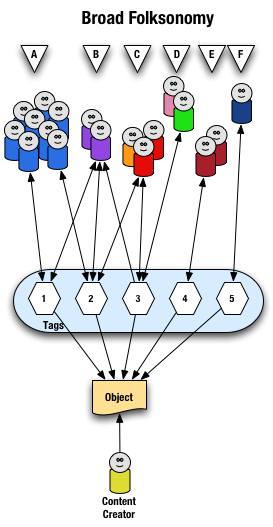
The broad folksonomy is illustrated as follows.
visualization of the text on broad folksonomies that follows
From a high level we see a person creates the object (content) and makes it accessible to others. Other people (groups of people with the same vocabulary represented people blobs and noted with alphabet letters) tag the object (lines with arrows pointing away from the people) with their own terms (represented by numbers). The people also find the information (arrows on lines pointing from the numeric tags back to the people blobs) based on the tags.

Digging a little deeper we see quite a few people (8 people) in group "A" and they have tagged the object with a "1" and a "2" and they use this term to find the object again. Group "B" (2 people) have applied tag "1" and "2" to the object and they use tag terms "1", "2", and "3" to find the information. Group "C" (3 people) have tagged the object with "2" and "3" so that they can find the object. Group "D" has also tagged the object with tag "3" so that they may refind the information this group may have benefitted from the tagging that group "C" provided to help them find the information in the first place. Group "E" (2 people) uses a different term, "4", to tag the object than others before it and uses only this term to find the object. Lastly, group "F" (1 person) uses tag "5" on the object so that they may find it.

Broad Folksonomy and the Power Curve

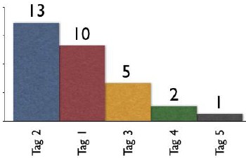
The broad folksonomy provides a means to see trends in how a broad range are tagging one object. This is an opportunity to see the power law curve at work and show the long-tail.
Shows tag 2 with 13 people tagging, tag 1 with 10 people, tag 3 with 5 people, tag 4 with 2 people, and tag 5 with 1 person
The tags spike with tag "2" getting the largest portion of the tags with 13 entries and tag "1" receiving 10 identical tags. From this point the trends for popular tags are easy to see with the spikes on the left that there are some trends, based on only those that have tagged this object, that could be used extract a controlled vocabulary or at least know what to call the object to have a broad spectrum of people (similar to those that tagged the object, and keep in mind those that tag may not be representative of the whole). We also see those tags out at the right end of the curve, known as the long tail. This is where there is a small minority of people who call the object by a term, but those people tagging this object would allow others with a similar vocabulary mindset to find the object, even if they do not use the terms used by the masses over at the left end of the curve. If we take this example and spread it out over 400 or 1,000 people tagging the same object we will se a similar distribution with even more pronounced spikes and drop-off and a longer tail.

This long tail and power curve are benefits of the broad folksonomy. As we will see the narrow folksonomy does not have the same properties, but it will have benefits. These benefits are non-existent for those just simply tagging items, most often done by the content creator for their own content, as is the means Technorati has done, even with their following tag links to destinations other than Technorati (as they initially had laid out). The benefits of the long tail and power curve come from the richness provided by many people openly tagging the same object.

Narrow Folksonomy

The narrow folksonomy, which a tool like Flickr represents, provides benefit in tagging objects that are not easily searchable or have no other means of using text to describe or find the object. The narrow folksonomy is done by one or a few people providing tags that the person uses to get back to that information. The tags, unlike in the broad folksonomy, are singular in nature (only one tag with the term is used as compared to 13 people in the broad folksonomy using the same tag). Often in the narrow folksonomy the person creating the object is providing one or more of the tags to get things started. The goals and uses of the narrow folksonomy are different than the broad, but still very helpful as more than one person can describe the one object. In the narrow the tags are directly associated with the object. Also with the narrow there is little way of really knowing how the tags are consumed or what portion of the people using the object would call it what, therefore it is not quite as helpful as finding emerging vocabulary or emergent descriptions. We do find that tags used to describe are also used for grouping, which is particularly visible and relevant in Flickr (this is also done in broad folksonomies, but currently not to the degree of visibility that it is done on Flickr, which may be part of the killer interactive environment Ludicorp has created for Flickr).

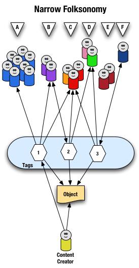
The narrow folksonomy is illustrated as follows.
vizualization of the text on narrow folksonomies that follows
From a high level we see a person creates the object and applies a tag ("1") that represents what they call the object or believe describes the object. There are fewer tags provided than in a broad folksonomy and there is only one of each tag applied to the object. The consumers of the object also can apply tags that help them find the object or describe what they believe are the terms used to describe this object.

A closer look at the interaction between people and the object and tags in a narrow folksonomy shows us that group "A" uses tag "1" to find and come back to the object (did the creator do this on purpose? or did she just tag it with what was helpful to her). We see group "B" also using tag "1" to find the object, but they have tagged the object with tag "2" to also use as a means to find the object. Group "C" uses tag "1","2", and "3" to find the object and we also note this group did not apply any of its own tags to the object as so is only a consumer of the existing folksonomy. We see group "D" uses tags "2" and "3" to find the objects and it too does not add any tags. Group "E" is not able to find the object by using tags as the vocabulary it is using does not match any of the tags currently provided. Lastly, group "F" has their own tag for the object that they alone use to get back to the object. Group "F" did not find the object through existing tags, but may have found the object through other means, like a friend e-mailed them a link or the object was included in a group they subscribe to in their feed aggregator.

We see that the richness of the broad folksonomy is not quite there in a narrow folksonomy, but the folksonomy does add quite a bit of value. The value, as in the case of Flickr, is in text tags being applied to objects that were not findable using search or other text related tools that comprise much of how we find things on the internet today. The narrow folksonomy does provide various audiences the means to add tags in their own vocabulary that will help them and those like them to find the objects at a later time. We are much better off with folksonomies than we were with out them, even if it is a narrow folksonomy being used.

Conclusion

We benefit from folksonomies as the both the personal vocabulary and the social aspects help people to find and retain a tether to objects on the web that are an interest to them. Who is doing the tagging is important to understand and how the tags are consumed is an important factor. This also helps us see that not all tagging is a folksonomy, but is just tagging. Tagging in and of its self is a helpful step up from no tagging, but is no where near as beneficial as opening the tagging to all. Folksonomy tagging can provide connections across cultures and disciplines (an knowledge management consultant can find valuable information from an information architect because one object is tagged by both communities using their own differing terms of practice). Folksonomy tagging also makes up for missing terms in a site's own categorization system/taxonomy. This hopefully has made things a little clearer for all in our understanding the types of folksonomies and tagging and the benefits that can be derived.

This entry first appeared at Personal InfoCloud and comments are open for your use there.


20 February 2005

The Future of Newspapers

A state of the newspaper industry article in today's Washington Post tries to define what people want from newspapers and what people are doing to get information.

Me? I find that newspapers provide decent to great content. Newspapers are losing readers of their print versions, but most people I know are new reading more than one paper, but online. The solutions I see from my vantage are as follows.

Ads

The articles rarely have ads that relate to the stories, foolishly missing ad revenues. The ads that are available are distracting and make for an extremely poor experience for the reader. News sites should ban the improperly targeted inducements that rely on distracting from reading the article, which is the reason the person is on that web page. The person has an interest in the topic. There are monetary opportunities to be had if the news outlets were smart and advertisers were smart.

How? If I am reading an article on the San Francisco Giants I would follow and may pay a little something for an ad targeted to this interest of mine. I like to buying Giants tickets, paraphernalia, a downloadable video of the week's highlights, etc. If I am reading about an airline strike a link to train tickets would be a smart option. A news article about problems in the Middle East could have links to books by the journalist on the subject, other background books or papers, links to charitable organizations that provide support in the region. The reader has shown an interest, why not offer something that will also be of interest?

We know that advertisers want placement in what they consider prime territory, the highly trafficked areas of the site. Often this is when the non-targeted ads appear. This is an opportunity to have non-targeted ads pay a premium, say five to 20 times that of targeted ads. The non-targeted ads have to follow the same non-disruptive guidelines that targeted ads follow. This is about keeping the readers around, without readers selling ads does not make any sense.

Archives

One area the news site are driving me crazy is access to the archives. The news sites that require payment to view articles in the archives are shooting themselves in the foot with this payment method and amount required to cough up to see an article that may or may not be what the person interested is seeking. The archives have the same opportunity to sell related ads, which in my non-professional view, would seem like they would have more value as the person consuming the information has even more of an interest as they are more than a casual reader. Any payment by the person consuming the information should never be more than the price for the whole print version. The articles cost next to nothing to store and the lower the price the more people will be coming across the associated advertising.

Blogging and personal sites often point to news articles. Many of us choose whom we are going to point to based on our reader's access to that information at any point in the future. We may choose a less well written article, but knowing it will be around with out having to pay extortionist rates to see it is what many of us choose. Yes, we are that smart and we are not as dumb as your advertisers are telling you. We, the personal site writers are driving potential ad revenues to you for free, if you open your articles for consumption.

Loyalty

Loyalty to one paper is dead, particularly when there are many options to choose to get our news from. We can choose any news source anywhere in the world. Why would we choose yours? Easy access, good writing, point of view, segment coverage (special interests - local, niche industries, etc), etc. are what drive our decisions.

I often choose to make my news selections to include sources from outside my region and even outside my country. Why? I like the educated writing style that British sources offer. I like other viewpoints that are not too close to the source to be tainted. I like well researched articles. I like non-pandering viewpoints. This is why I shell out the bucks for the Economist, as it is far better writing than any other news weekly in the U.S. and it pays attention to what is happening around the world, which eventually will have an impact to me personally at some point in the future. I don't have patience for mediocrity in journalism and the standards for many news sources have really slipped over the past few years.

News sources should offer diversity of writing style and opinion of one source will attract attention. The dumbing down of writing in the news has actually driven away many of those that are willing to pay to read the print versions. Under educated readers are not going to pay to read, even if it is dumbed down. Yes, the USA Today succeeded in that, but did you really want those readers at the loss of your loyal revenue streams?

Loyalty also requires making the content available easily across devices. Time and information consumption has changed. We may start reading an article in the print edition (even over somebody's shoulder and want to follow-up with it. We should be able to easily find that article online at our desk or from our mobile device. Integration of access across devices is a need not a nicety and it is not that difficult to provide, if some preparation is done with the systems. Many of us will pull RSS feeds from our favorite news sources and flag things for later consumption, but the news sites have not caught on how to best enable that. We may pull feeds at one location, but may have the time and focus to read them at another location, but we may not have the feeds there. Help those of us that are loyal consume your information in a pan-medium and pan-device world that we live in.


16 February 2005

All the Blog that is Fit To...

From the blog realm. Elise Bauer provides an excellent overview of available blog tools. This is a very good article on the business of weblog tool development and what the tools offer.

The fine folks at Six Apart launched their redesign today. Not only is there a new look, but the navigation is improved and is now consistent. All of the Six Apart properties are now united, which is also very helpful. Their site is looking less like a blog and more like a professional software company, but the secret it is their sites are run by their blogging tools. Great job 6A and Mule who did much of the work!


31 December 2004

Books Read in 2004

I bought and read one standout book this year, Malcolm McCullough's Digital Ground mixed in with many more that I enjoyed. Digital Ground stood out as it combined a lot of things I had been thinking about, but had not quite pulled together. It brought interaction design front and center in the ubiquitous computing and mobile computing spectrum. I have been working on the Personal InfoCloud for a few years now and this really moved my thinking forward in a great leap. I considering better questions and realizing there are many next step, but few of these next steps the design community (in the broad user experience design sense) seems ready for at this time. One of the key components that is not was thought through is interaction design and the difference place makes in interaction design. It was one book that got my highlighter out and marking up, which few books have done in the past couple years.

I greatly enjoyed the troika of books on the mind that came out in 2004. The first was Mind Wide Open by Stephen Berlin Johnson, which was a relatively easy read and brought to mind much of how we use are minds in our daily lives, but also how we must think of the coginitive processes in our design work. Mind Wide Open focussed on improving one's attention, which is helpful in many situations, but I have had a running question ever since reading the book regarding focus of attention and creative problem resolution (I do not see focus of attention good for creative problem resolution).

The second book was On Intelligence by Jeff Hawkins. On Intelligence is similar to Mind Wide Open, but with a different frame of reference. Hawkins tries to understand intelligence through refocussing on predictive qualities and not so much on results based evaluation (Turing Test). I really like the Hawkins book, which throws in some guesses in with scientifically proven (unfortunately these guesses are not easily flagged), but the predictive qualities and the need for computing to handle some of the predictive qualities to improve people's ability to handle the flood of information.

Lastly, for in the mind book troika I picked up and have been reading Mind Hacks by Tom Stafford and Matt Webb. This is one of the O'Reilly Hack series of books, but rather than focussing on software, programming, or hardware solutions these to gents focus on the mind. Mind tricks, games, and wonderful explainations really bring to life the perceptions and capabilites of the grey lump in our head. I have been really enjoying this as bedtime reading.

Others in related genres that I have read this year, Me++: The Cyborg Self in the Networked City by William Mitchell, which was not a soaring book for me, mostly because Ihad just read Digital Ground and it should have been read in the opposite order, if I had cared to. Linked: How Everything is Connected to Everything Else and What it Meands by Albert-Laszlo Barabasi was a wonderful read, once I got through the first 20 pages or so. I had purched the book in hardback when it first came out and I was not taken by the book in the first 20 pages. This time I got past those pages and loved every page that followed. Barabasi does a wonderful job explaining and illustrating the network effect and the power curve. This has been incorporated into my regular understanding of how things work on the internet. I have learned not to see the power curve as a bad thing, but as something that has opportunities all through out the curve, even in the long tail. On the way back from Amsterdam I finally read Invisible Cities by Italo Calvino, which was quite a wonderful end to that trip.

I picked up a few reference books that I enjoyed this year and have bought this year and have proven to be quite helpful. 250 HTML and Web Design Secrets by Molly Holzschlag. CSS Cookbook by Chris Schmitt. More Eric Meyer on CSS by Eric Meyer.

On the Apple/Mac front the following reference books have been good finds this year. Mac OS X Unwired by Tom Negrino and Dori Smith. Mac OS X Power Hound by Rob Griffths.

Two very god books for those just starting out with web design (Molly's book above would be a good choice also). Web Design on a Shoestring by Carrie Bickner. Creating a Web Page with HTML : Visual QuickProject Guide by Elizabeth Castro.

The year started and ended with two wonderful Science Fiction romps. Eastern Standard Tribe by Cory Doctorow. Jennifer Government by Max Barry.

Update: I knew I would miss one or more books. I am very happy that 37signals published their Defensive Design for the Web: How To Improve Error Messages, Help, Forms, and Other Crisis Points, as it is one of the best books for applications and web development on how to get the little things right. The tips in the book are essential for getting things right for the people using the site, if these essentials are missed the site or application is bordering on poor. Professionally built sites and applications should work toward meeting everything in this book, as it is not rocket science and it makes a huge difference. Every application developer should have this book and read it.


28 December 2004

Information Waste is Rampant

Fast Company published costs facing business. The top four relate to poor design and information use: Poor knowledge harnessing ($1.4 Trillion); Digital publishing inefficiencies ($750 billion); Data quality problems ($600 billion); and Paper-based trade processes ($400 billion). That is 3.15 Trillion U.S. dollars down the tubes with no benefit.

The solutions are not that difficult, but everybody seems happy to use the rear view mirror to view the future.

Christina stated, "What me worry" about design and business. The whole CIO is a sham as the CIO is a technology driven person, which is tangentially related to information and technology still hinders information flow if not planned for properly (more on this is coming in the near future here on this site). There needs to be a chief level position that cares about the information, the people using it, and the people who create the information. To Christina's post I responded with the following on her site (posted here so I can better keep track of it):

It seems like the 80s all over again. The focus on design in the to late 80s, mostly with unified branding and creative practices formally brought in-house. There was a lot of push around design, mostly labelled branding (nearly the exact same discussions, but slightly different terms). Much of this was around the brandhouses like Landor. The business community embraced the results and tried to incorporate the creative culture as part of their own.
What happened? The innovators were bought by large advertising or public relation firms and the firms changed their industry term to communication companies. Companies created corporate communication divisions (comprised of adversising, PR, branding, and other creative endevors) and had high level management visability.
By the early 90s the corporate environment had largely subsumed the communication into marketing and business schools that has embraced the creative mindset followed suit. Today marketing is often what trumps design and there is no creative in marketing. The creative departments by the late 90s had been gutted by the web craze. This left business types with little creative craft understanding as those driving what was once good.
It is not suprising that currently named "design" is taking off, as what was good about the creative was gutted and most companies lack central design plans. There is tremendous waste in cross medium design, as few sites are built with an understanding of the digital medium, let alone cross platform design or true cross media design. Part of the problem is far too few designers actually understand cross-platform and/or cross-media design. There is millions wasted in bandwidth on poor web design that is using best practices from the late 90s not those from today. There is no integration of mobile, with a few exceptions in the travel industry. There is still heavy focus on print, but very little smart integration of design in the digital medium. This even applies to AIGA, which is a great offender of applying print design techniques on the web. How can we expect business design to get better if one of the pillars of the design profession has not seemed to catch on?

There are large problems today and we need to break some of our solutions were have been trying to get to solutions that work. Not only do today's solutions not work today, they will not work tomorrow as they are only stop gaps. Cross-platform, cross-device, and cross-medium design solutions are needed, but technology is not here to deliver and few that I have run across in the design world are ready for that change as they have not made the change to today's world.

Today's designer focusses on getting the information in front of the user and stops there. They do not consider how this person or machine may reuse the information. There is so much yet to improve and yet the world is progressing much faster than people can or want to change to keep up. There are designers and developers who will not build for mobile (it is not that hard to do) because they do not see them in the user logs. They fail to see the correlation that their sites suck for mobile and mobile users may test once and go somewhere else for their information. The people that are seeing mobile users in their logs are the ones that have figured out how to design and develop for them properly (most have found that it is relatively inexpensive to do this). This is not rocket science, it is using something other than the rear view mirror to design for now and the future.


26 December 2004

Flickr and the Future of the Internet

Peter's post on Flickr Wondering triggers some thoughts that have been gelling for a while, not only about what is good about Flickr, but what is missing on the internet as we try to move forward to mobile use, building for the Personal InfoCloud (allowing the user to better keep information the like attracted to them and find related information), and embracing Ubicomp. What follows is my response to Peter's posting, which I posted here so I could keep better track of it. E-mail feedback is welcome. Enjoy...

You seemed to have hit on the right blend of ideas to bring together. It is Lane's picture component and it is Nadav's integration of play. Flickr is a wonderfully written interactive tool that adds to photo managing and photo sharing in ways that are very easy and seemingly intuitive. The navigations is wonderful (although there are a few tweak that could put it over the top) and the integration of presentational elements (HTML and Flash) is probably the best on the web as they really seem to be the first to understand how to use which tools for what each does best. This leads to an interface that seems quick and responsive and works wonderfully in the hands of many. It does not function perfectly across platforms, yet, but using the open API it is completely possible that it can and will be done in short order. Imagine pulling your favorites or your own gallery onto your mobile device to show to others or just entertain yourself.

Flickr not only has done this phenomenally well, but may have tipped the scales in a couple of areas that are important for the web to move forward. One area is an easy tool to extract a person's vocabulary for what they call things. The other is a social network that makes sense.

First, the easy tool for people to add metadata in their own vocabulary for objects. One of the hinderances of digital environments is the lack of tools to find objects that do not contain words the people seeking them need to make the connection to that object they are desiring. Photos, movies, and audio files have no or limited inherent properties for text searching nor associated metadata. Flickr provides a tool that does this easily, but more importantly shows the importance of the addition of metadata as part of the benefit of the product, which seems to provide incentive to add metadata. Flickr is not the first to go down this path, but it does it in a manner that is light years ahead of nearly all that came before it. The only tools that have come close is HTML and Hyperlinks pointing to these objects, which is not as easy nor intuitive for normal folks as is Flickr. The web moving forward needs to leverage metadata tools that add text addressable means of finding objects.

Second, is the social network. This is a secondary draw to Flickr for many, but it is one that really seems to keep people coming back. It has a high level of attraction for people. Part of this is Flickr actually has a stated reason for being (web-based photo sharing and photo organizing tool), which few of the other social network tools really have (other than Amazon's shared Wish Lists and Linkedin). Flickr has modern life need solved with the ability to store, manage, access, and selectively share ones digital assets (there are many life needs and very few products aim to provide a solution for these life needs or aims to provide such ease of use). The social network component is extremely valuable. I am not sure that Flickr is the best, nor are they the first, but they have made it an easy added value.

Why is social network important? Helping to reduct the coming stench of information that is resultant of the over abundance of information in our digital flow. Sifting through the voluminous seas of bytes needs tools that provide some sorting using predictive methods. Amazon's ratings and that matching to other's similar patterns as well as those we claim as our friends, family, mentors, etc. will be very important in helping tools predict which information gets our initial attention.

As physical space gets annotated with digital layers we will need some means of quickly sorting through the pile of bytes at the location to get a handful that we can skim through. What better tool than one that leverages our social networks. These networks much get much better than they are currently, possibly using broader categories or tags for our personal relationships as well as means of better ranking extended relationships of others as with some people we consider friends we do not have to go far in their group of friends before we run into those who we really do not want to consider relevant in our life structures.

Flickr is showing itself to be a popular tool that has the right elements in place and the right elements done well (or at least well enough) to begin to show the way through the next steps of the web. Flickr is well designed on many levels and hopefully will not only reap the rewards, but also provide inspiration to guide more web-based tools to start getting things right.


This work is licensed under the Creative Commons Attribution-NonCommercial-ShareAlike License.