Off the Top: User Experience Entries
Showing posts: 1-15 of 194 total posts
The Blue Ant Trilogy and The Near Future and Everynow
This may need another edit, but it is still a bit time-foldy, but what I’m focusing on is very time-foldy.
When I read the Blue Ant Trilogy from William Gibson (Pattern Recognition, Spook Country, and Zero History) as they came out in 2003, 2007, and 2010 I wondered then how they would hold up, as they were near future scifi. Each was sat in the now and /or the just about to become. If, at the time, you were paying attention to culture (particularly around a technology focused world) all of the elements in the book were familiar to nearly familiar. Most of the roles, technology, and ways of thinking were already at the edges of society, but very very niche and not yet made it into the main consciousness. How does near future look in the future?
I regularly pull Pattern Recognition off the shelf and read snippets and it takes me back to that time in 2003. I’m a big fan of that book on many levels. But, to me it still holds up, yet I’m looking at it from the living through this at the front edge of emergent culture and technology. I still wonder how someone would read this today who was less than, say, 10 years old would read and perceive this today.
In the past week or two I’ve run into a handful of YouTube videos and blog posts / articles by people who have recently read one of the books, most often Pattern Recognition. I find interesting in that some see things in the books from 15 to 20 years ago are still coming in the near future (this really intrigues me) and others things seem quite foreign and more futuristic. Yet for some of us they have happened and became normal outside of the far edges of culture, but were far from mainstream. I was expecting reviews, at least some, to talk about how these books seemed set in the past. But, yet no, not one. They focused on, what to me is, an odd perspective continuum.
This surfacing of ideas and perceptions in a society and culture hit two scenarios and situations: 1) Common, but at the edges; 2) Things from the past that still seem futuristic as they haven’t happened in someone’s (or mainstream’s) perception lens. Yes, William Gibson’s famous, “The future is already here — it’s just not very evenly distributed” applies readily. But, there is more to this where things happen in pockets and spread more widely, but not too widely and don’t take hold broadly, nor are they known of more widely.
This phenomena isn’t just related to scifi and technology, but global understandings around mental models, and the language structures around broad cultural mental models (that are mainstream in another culture in an other part of the globe that people in another culture don’t have curiosity about and are more settled in their parochialism and pedestrian thinking to look up and notice). The scales of this and the complex mappings around it from edge cultures, out to large global cultures are more than a lifetimes of effort. But, the key piece is a response of curiosity or defending one’s own currently limited understanding. The common responses are often, “Wait, what? Tell me more.” Or, “That is wrong.” My common phrase when people discover something new that changes how they see and understand things, and they feel like they were doing things wrong, or didn’t know of other helpful possibilities, is, “You can’t know until you know.”
But, with in those interested in exploring at the edges and particularly around the fluidity of time and understandings and seeing something from the past (20 plus years in the past) that was then just happening at the edges and moved more into some cultures mainstreams and faded, as still in that same state of temporal now or about to happen. Now is different for everybody.
In 2004 I started using the term Everynow and included it in a lot of presentations and writing and ended up writing about it explicitly in the linked post in 2013. I was focussing on technology and ideas that set in play the now. But, for some reason concept of having people read a piece that is around 20 years old about the early edges of something and it being still near future, is really surprising to me. The concept of near future from 20 plus years in the past and for many (yet still a small few in the whole of it all) today becoming again (or still) the near future is wild.
The near future idea, has a sense of anticipation in it that something is coming. But, for those who went through that near future and lived it as it was happening, and to the past transition cycle, it seems odd that a near future for something in the past doesn’t just jump straight to the now stage as they experience it. Having a near future anticipatory stage for something that happened for many in the past feels odd, but it is just another reflection of experiencing the now of others viewed throw and really wide and elastic everynow.
The Poetry of Time
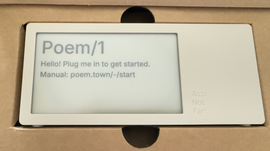
Today a package arrived that I’ve been deeply looking forward to. Part of the anticipation is the pure utter whimsy of it, part is it was a Kickstarter project that involved hardware (read hardware is hard when manufacturing is involved), and knowing the creator and watching all the steps along the way I was happy to see it and touch it. This is the Poem/1.
Most of all, this device is giving me a lot of enjoyment and, well, glee.
The Poem/1 Arrived
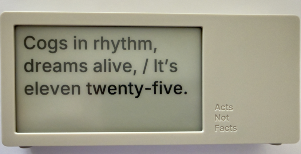
This poetry clock in the few hours I have had it running, with its e-ink display that updates every minute with a new poem for the time, which is / was generated by AI. Some of the poems are, well unique, and others are wonderful, but they can be favorited with the one button on the device.
The one button does a lot of work. It can be used to favorite a poem. There is a site with a dashboard for your device where you can push it notes you write to display, but to clear the note and get back to the clock you use the one button. There is a sleep mode with a screen saver and to clear that, you use the one button.
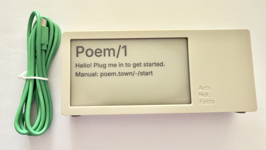
The Poem/1 also has one USB-C cable. There is no manual in the box. Everything you need is the new Poem/1 device, the USB-C cable, and the e-ink screen tells you the rest.
After plugging it in you get a screen with some technical details and a QR code and using your phone with the QR code it then walks you through everything from easily connecting it to your WiFi (if printers could do this…), then make a selection or two and you have poetry time. There is also a dashboard website and the setup to your device is incredibly easy as is the setting up the account on that site.
The Journey of Poem/1
About 3 years ago Matt Webb blogged about an idea he had about an AI poetry clock, My new job is AI sommelier and I detect the bouquet of progress (Interconnected). This soon got connected to an e-ink device and Matt was on his way.
Matt setup a Kickstarter, which I happily backed. It wasn’t that I was overly keen with the AI bits (I’ve been working with AI/ML going back to 2008 and stayed current and it is a thing that I treated, like most everything else, as a tool). But I enjoyed the process of little printer – BERG and its outcome from afar. Having watched Little Printer’s journey of toil to come to life from Berg London (Matt and the amazing folks there), I wanted to support Matt (who mostly did this Poem/1 project alone). This provided insite into his long journey of quickly getting to a working prototype, then the slog of finding viable parts, a manufacturer, various regulatory approvals, and iterations when due to various things there were changes made late mid-stream to add to the delays.
Matt has done a good job logging his slog and journey. There were times where I’d realized I’d forgotten about Poem/1 and not heard of any progress in a while. About that time Matt would have an update in Kickstarter or on his blog.
Then there was US Customs, which stalled things for a while (not the tariffs, which became a hurdle earlier), but there there was more paperwork needed around “what is this clock”, oddly I (the customer) was sent the forms and I knew there wasn’t a winding mechanism nor jewels in it (well I haven’t checked inside, but pretty sure there are no jewels). Matt did a great job documenting the US Customs documentation hurdle in his post, How global logistics got me over my fear of personal agents (Interconnected) (my having worked at a Custom’s Brokerage for a few years I know the many reasons brokerages are needed).
What Time Is It?
I love the ability to favorite a time. (What is your favorite time?) In a few hours I have a couple favorites that I quite like:
Puddles reflect lost skies, / At two forty-five, heart sighs.
At twelve fifty, shadows creep, / Secrets held within silence deep.
Willow branches gently sway, / It’s twelve twenty-five today.
Thank you Matt I now have favorite times and a wonderful product.
Updated Categories with Sparklines and Search is Now in Production
I made a couple of updates I have long wanted to make to this site. I’ve been wanting to see frequency of categories used on my blog for more than 15 years (or pretty much since I’ve had category list pages). I have also wanted to have blog search and the utter mess that Google Search has become in recent years, where my site isn’t showing at all at times has driven this. These additions will likely iterate and adapt a bit going forward.
Updates to Category Lists with Sparklines
I have basically had two category list pages for years: Category List (which is alphabetical sort) and Category List by Use. I have kept these two and added sparklines to them (Sparkline - Wikipedia). Each line now has a small line chart that covers the 25+ years and what periods had used the category and some sense of the volume of use over time. One category list view I wanted and was missing was one to show a view with the focus of most recently used categories, so there is now a Category Recently Used List that not only groups by most recently used (and in the same entry keeps the alphabetical sort) but also shows the date of the last use in the list. Personally, I have been finding this recently used list view the most helpful and interesting. Skimming through the list I know I have more recent posts that have covered or touched on a subject, but it didn’t include the category, and that becomes a quick task to fix that gap.
Sparklines?
I have been a big fan of sparklines to give quick understanding of data’s distributions at a glance, which I learned about in “recommended reading” of Edward Tufte’s book The Visual Display of Quantitative Information | Edward Tufte in grad school in social / policy quant classes. (There are are many Tufte essays and book annotations on sparklines at Edward Tufte Notebooks & Sketches | Art, Science and Sculpture).
Creating the Sparklines
In creating the sparklines for my category lists I looked initially (and have long looked at them) creating static images from the data and bringing the images in (this would mean updating the images and replacing the old with the new ones, which is relatively straight forward programmatically and something I’ve done in the past, but not optimal) and I also looked at JavaScript but it was a bit slow. I poked at using creating SVGs (which work well when printing or zooming in) and often are much quicker and less strain on a browser than JavaScript. I’ve had a few goes at SVG in the past and I get get my mind around simple shapes, but I would need a little help with sparklines. A couple years back on a sparkline spelunking I found Easy SVG sparklines | Alex Plescan which showed the how. But, I have SVGs somewhat in the same category as regex, which is I do it rarely and I’ll just use Claude Code | Anthropic’s agentic coding system \ Anthropic to assist with the creation.
Chunking the Data for a Sparkline
The other part of sparklines is they are intended to be small glimpses and I have 25+ years of posts and a monthly temporal segmentation would make for a long graphic. I played around with breaking things down to quarters, but in the end I went with two segments per year and roughly 50 data points to map out on a line chart. Running a test with the two data points a year was a reasonable enough glimpse to sort out if the category was used recently or what the variation of use was over time.
One of the interesting discoveries with the first lab run of the categories of sparklines was the rather “U shaped” distribution of the use of categories, which pretty much calls out the lull I had in blogging. This softening of blog post rhythm is something I call, “when Twitter ate my blog” (where the interesting things I would discover and want to share and interact around ended up on Twitter rather than my blog(s)). Other patterns that surfaced were limited use a category in a period when I was rather sure I had posted on the subject, some of this was I was not using the term in that way or I didn’t have the category in my system yet. One of the things that helped sort this out was using my blog search.
Search is Now Out of the Lab
One of the things I have been working on and using my my Lab at vanderwal.net is blog search. But, the modifications I made to the Category pages I found I was leaning on my blog search a fair amount to investigate things. But, the categories and blog search are both in the blog section of this site, so making the change from the lab to the production side made sense. One of the things holding back moving search over, was I had an SVG of a magnifying class in the menu bar with “Blog Search”, but no matter how small I made the image it still was messing with the vertical layout of the menubar. In removing the magnifying glass and just using text things kept to the same layout.
Bringing in Search
The search in the menu in the pages in the blog section with “Off the Top” or “random” in the URL which is where there are currently menubar links to Blog Search. I have the menu bar link to a search page to search from rather than a JavaScript drop down or other menu bar convention (again layout of the menu bar was part of the considerations).
When I was working on search in the Lab section I found I needed to make some modifications to the database to have quicker search and I needed to modify the database engine so I could have search include 3 letter terms as a minimum rather than 4 letter words. In working on search I found many of my early posts didn’t (and still don’t) have titles and I was using the title as the link. I initially thought I would just add titles, but there are around 300 posts that don’t have titles (I’m adding some as I touch the posts for other clean-up issues), but I ended up coding the search results to have the results just fill in “Blog Post #…” as a proxy for a proper title.
The initial 170 or so posts are not in the database and are therefore not in the search.
Bringing Search and Categories In
As I went to move the category list pages out of the lab and into the production side I needed to modify a few other templates and pages to add the updated links. In doing this I realized I could also easily update the menu bar to include “Blog Search”. So, I took a little bit of time and made both changes at the same time.
Not all of the links are in yet. If you see something a little off with category lists or missing blog search links let me know.
Swan Song's AR Design and Creation
I have a serious soft spot for the movie Swan Song (which stars Mahershala Ali and Glenn Close that is set in the near future in the Pacific Northwest. I was a fan of its soft and deep thought invoking exploration of life and replication, but also its near future view of technology. While others have been excited by the Minority Report’s manic augmented reality (AR) interface, the design and use of near future AR as part of work and personal life was really good. To say I was fascinated, may be putting it lightly. Swan Song (2021 Benjamin Cleary film) - Wikipedia was released in 2021 and Apple had yet to have announce Apple Vision Pro with its visionOS and really good graphics and workable interface. The visual and interaction design of what the main character (Cameron) worked in was incredibly good. Once Apple Vision Pro was out it felt like Cameron’s interfaces and interactions were part of the future road map.
The Design Studio Behind the Digital Interfaces and Interaction Design
Being that Swan Song movie was part of Apple Studios - Wikipedia I was believing Apple had a part in the creation of the user interfaces and interaction design of the AR in the movie. But, poking around in Vimeo I stumbled on the design reel for Swan Song - Territory Studio, so I finally found the studio that created the AR and digital design elements in the film.
Territory Studio’s Design Overview
Territory Studio’s page for the high level design overview of what they created for Swan Song is really good. I had been feeling like Swan Song’s design and AR team were more closely tied to Apple as their AR interaction design is very much like Apple’s sensibilities, with a more muted palette from a calm future. A lot of things that are in Apple Vision Pro’s user interface and interaction design patterns seem to have been hinted at, if not felt like they were previewed in Swan Song. But, I’m not so sure of the connection or how specious it may be.
The Territory Studio page has highlights of their visual / virtual design language, personal UIs, home office AR, AR home gaming, speculative hardware, smart watch UIs, and virtual mimoji. I really would love an even deeper dive, as this is much of the virtual interactive world I’ve been waiting for, and been hoping to see come to life for years prior to the film.
There is a whole lot in Swan Song that I loved from the time it was released, which was a couple years or so ahead of Apple Vision Pro being released. The headset-less AR and interaction design is one piece. But, I also was deeply taken by the whole story, cinematography, and feelings the film evoked, but also the keep thinking and consideration it evoked.
Swan Song Demo Video from Territory Studio
The show real from Territory’s work on Swan Song is in Vimeo: Swan Song Breakdown Reel - Vimeo
Strong Opinion About Slide Over on iPadOS
I should say up front, I’m deeply appreciative of Apple and all the products, OSes, services, and applications they make, as most everything is done with care and craft with and eye and understanding of detail. Having interactions with develop support and internal developers now and over the years, I’ve always been impressed in their focus on getting things right and doing thing better. Nearly every interaction with Apple from customer support, sales support, Apple’s developers, and people inside Apple has been fantastic and from people who aim to do their best and look to make really solid products and services for their customers.
Apple Announces the New ipadOS
At this month’s Apple WWDC 2025 they made the announcements about the new ipadOS 26, which seems like it may be a good step forward with the new windowed interface, that moves it into looking and acting much like a Mac. There are many other updates and improvements.
Subtraction of Productivity is Far from an Improvement
But… subtraction of one prime productivity advancement that the iPad has had for many of its iterations is that of Slide Over, which if you aren’t familiar (it seems Apple isn’t), is the ability to have an app that will slide in from the side of the screen and hover in a narrow mode, while the other app (or apps, as two apps on screen has been around for a while as well) is still in view.
This meant, with one flick and (in Steve Jobs’ parlance) boom! you have a note app (my strong preference has been for Drafts) that allows me to capture ideas in markdown quickly and then (or later) push the note out elsewhere - Twitter, Mastodon, note directories that Obsidian sits over, Messages, etc.) then flick it back out of the way. It is simple, quick, efficient, and productive, which is what Apple always seemed to put as a priority.
I often have Drafts and PCalc sitting one flick (two for PCalc for the second flick), which is ONE STEP to get a productivity app of my choice in place to divert my focus from a video I’m learning from, reading I’m wanting to capture a note or to do from, a quick calculation, or whatever I want to need at the ready and then get back to focussing. This is a super power that iPad has enabled. It is what separates an iPad apart from Mac and other devices in a big way.
The New ipadOS 26 is Four Large Steps Backward for One Element of Productivity
This new window model on ipadOS 26 is nice and could be helpful, but trying to do the same quick productivity action is at minimum four steps. That isn’t a productivity gain or enhancement. That is four large steps backward Apple. Four anti-productivity steps backward. If I wanted to lose productivity like that, I would switch to Windows.
The corner quick swipe from the corner of the iPad isn’t available unless I’m using the full window interface for finger use and only getting access to Apple Notes (a really nice product, but for various reasons isn’t my first choice, nor second choice). In the new interface the quick corner access is available with Pencil swipes. The full window interface you can add a finger swipe.
But, going from a window I’m working or learning in and want to get a Drafts up and ready, if I have it in my dock it is a tap to open, get it out of the way (often two moves for placement and then narrowing it, if not also adjusting the window I’m also using, and then typing in Drafts) and that is the quickest way. Spotlight is the other option, which adds a step.
It Is an iPad not A Mac
Apple, this device is the iPad it isn’t a Mac, it has special super powers, which include the ability to help focus and be productive. With this new ipadOS 26 new functionality and capabilities are added that are helpful, but don’t take away the iPad’s strength as well. It may be those leading iPad don’t live with it as a core device and don’t care about its strengths and super powers, or they don’t understand productivity so they slipped up.
The windowed world of ipadOS 26 could easily have Slide Over and keep the super power of one flick for productivity. I’m hoping the fall release of ipadOS 26 still includes the productivity super power that sets the iPad apart and allows its users to have super productivity powers that help set them apart with the partnership of Apple’s products helping them be their best.
Delicious Library Shut Down
Will Shipley who created Delicious Library, a personal book collection tracking app for Apple’s Macs (It started there and then moved to iPhone / iPad as well), announced on Mastodon, Delicious Library Removed from App Store - Will Shipley. Shipley also took down the site for Delicious Library. The unsentimental background for Delicious Library can be found at Wikipedia - Delicious Library - Wikipedia.
You Don’t Know Delicious Library?
Delicious Library was an utter gem of an app. It was wonderfully designed and looked like one’s bookcases, with the book covers facing out. The metadata for the book, which it could support an abundance of, was easy to use and it could pull some of the metadata from Amazon through its API. The rest was up to the user of the app. If you enjoyed books and well crafted apps,
Delicious Library was the gem that people raved about and love to tell their friends about. The product was one of those apps in the mid–2000s that stood out, not as an Apple related app, but a great one across all platforms (others were Skitch and Apple’s own Keynote). Delicious Library when it was open and others were around, people would ask what it was and to show them how it worked. Great apps excel at not only filling a need, but also bringing delight, as well as showcasing a platform.
Wired has a great review and overview of the app and the people behind it and the response from users in a 2005 article - Monster Fueled by Caffeine.
I still was feeding my Delicious Library app, but in the last few years with my use of Obsidian and the book search plug-in (it pulls its metadata from Google’s Books API) I log all my new books in there. But, the ease of data entry and fun and legacy collection of books I have in it I still feed Delicious Library. The ease of use the last, maybe, 10 years or so was just holding up the book’s barcode on the cover or dust jacket so Delicious Library’s use of the Mac’s camera could read it and pull in the data from the Amazon API. That was so simple.
The End Came Quickly, Then Slowly
The end of Delicious Library came when Amazon pulled access to their API without warning nor discussion (very much in Amazon’s usual form). This broke the core ease of functionality and Shipley (who has been an Apple employee for a while now) who doesn’t have the time to rework Delicious Monster to use another source (like the excellent Google Books API, but Google is also wildly erratic with what is continues to offer as services and products).
You can still manually add data to your Delicious Library and it still functions rather well. But, it is a slow movement into the sunset for a wonderfully delightful product.
Weeknote - 15 November 2020
Happy 260th day of March in the Year of Covid.
The wonders of smell. Not from the lack of smell from Covid–19, but the muted smells from wearing a mask. Losing a sense seems like a great tragedy, be it hearing or sight. But the senses don’t stop there, as we have touch - which seems like it would be detrimental to lose yet that is what happens when someone becomes paralyzed. Taste, I’m realizing is an odd one, as it is so heavily intertwingled with smell that it isn’t fully clear what would be lost.
It is the muted smells and the temporary loss of smells that has me in awe from wearing masks (other than it is God’s way of reminding you that you didn’t brush your teeth). Taking off one’s mask when outside is something magical. The muted sense of smell from wearing a mask, becomes magical when taking it down or taking it off getting a solid direct nose full of the wonderful world around. The background scents that go un-fully noticed on walks of trees, freshly wet pavement, a car engine cooling, all the different flowers and plants, the creek that has filled or when it is drier than usual, fires in fireplaces, and wafts of food being prepared. Taking off one’s mask when nobody is around, or just lowering it is like a firework show finale with all the scents hitting full saturation at once. It is a bit magical. Yet, within a few minutes the smells fade into the background and seem difficult to pull out of the air unless masked again, which does happen. The one scent I don’t find all that magical is vehicle exhaust, which I’m finding is one smell that really lasts. I’ve never noticed it before Covid times, but it is sure present now.
Thanks to Covid–19 and one of its traits of infection can be the loss of scent, one of the first things I do each day after waking is smell things. I smell the back of my hands, fingers, and wrist and then wash my face and hands and smell. Every morning I am relieved that I can smell.
Related, I restumbled upon Monocle’s “The secret to putting on perfume” video that focusses on scent and the use of it as a personal layer of attire, as in scenting for the occasion or work role or environment.
Watched
I finished up Season 3 of The Crown on Netflix so I’m good to start Season 4. I’m utterly impressed with the story telling and film work. The stories don’t seem to fully hew to what I remember reading and hearing retold, but I’m fine with that. I’ve really liked the crafting and developing of characters.
This week I also have been watching some recent and older Monocle Videos, which some seem to be fully Monocle productions and some are Gestalten produced with Monocle. What strikes me is how well they are made as the color grading, edits, cuts, transitions, and tempo are all well done, but they also all are similar going back years to older Monocle videos.
I was good to watch a Netherlands win today over BIH, as they have been a bit lifeless scoring under the new coach. There may be hope.
Listened
I found the 1998 Grace Jones album Private Life: The Compass Point Sessions, which has an 8 minute version of “Slave to the Rhythm”, which is a Hot Blooded Version mix. This song brings back a lot of memories of college, nights out in San Francisco, living in England, and wandering Paris. The odd thing is I didn’t own Island Life the album the original version was on, nor have it on mix tapes. It was ambient life sound track. I have some music that I owned and had on tape and I can tell you the shoes, socks, coat, and places quite vividly when I hear that music. Slave to the Rhythm always seemed to be background soundtrack to some wonderful times and this 8 minute version, which is largely instrumental fills to get to 8 minutes is the perfect background for running errands after the sun has gone down.
Food
This weekend’s grocery errands had a bit of focus on Thanksgiving, as far as sorting out what is stocked and where. With my county back down to Level 1 Covid reopening stores are down to 25% capacity and counting the number of customers in the store and lines starting again.
The weather turned a little bit cooler so made a pot of chili (beef and black bean) that was quite dense, but also really good. My son went through two bowls and it was gone in 3.5 bowls.
Play
A couple days after work I took some time to play through a bit more of Ghosts of Tsushima. I am still amazed withe the scenery and I’m looking forward to being done and just wandering the open map.
Productivity
I’ve been reworking how I’m going to handle blogfodder in Obsidian notes, which start as a link to a piece from someone or some other source. I have been keeping a list in notes, but that was one of the things that I had reworked and been keeping it in an outline, just a tag one note files, and a link on the source in Pinboard. I started a blog fodder note file that links to the source, person, and a note page for what could follow. These may turn into mid-week posts as the notes seems to be turning into 50% to 75% done responses.
Mac Touchpad Dragging
I bought a Mac laptop for myself in 2001 and largely have been using the same version of the same set-up since then across 5 or 6 Macs since them (with one or two full nuke and repaves in there, but with those I pulled in my the applications and modification / customizations from preferences). In the past few months, I’ve been using a brand new Mac that is supplied by work / project and not only does it lack my outboard brain, but it doesn’t work like my heavily modified Mac.
The one thing that has been driving me crazy is I haven’t been able to sort out how I have a three finger drag on my personal MacBook Pro so I can have it on my one for work. It is frustrating as I go to click on an object to then drag it with three fingers to where I want it, or I go to the top bar of an app and place the cursor over it and use three fingers to drag the window to where I want. I do similar things to resize windows. I have looked in Better Touch Tool, thinking I had set it up there. I looked in Preference Settings for the touchpad, but no. Today I opened a lot of customization apps I have on my personal Mac and nothing.
I was looking in the Preference Settings in the Accessibility settings and found what I was looking for, the three finger drag. I would have never thought it would be in Accessibility. Given that my current personal MBP has a touchpad that the left half needs a lot of force to click on something and do usual tasks it does make sense that having a light touch manner of dragging things would be in Accessibility. Now I know how to fix one more thing on a work Mac to get it to my own personal Mac set-up so it gets closer to being an extension of me and less a tool I have to think about how to interact with rather than thinking about the work I am doing.
The Writing Ache
It has been a while since I’ve written here, or over at Personal InfoCloud. I have an even larger stack of things in my writing queue and it is getting to the point that I am aching to write.
Shift Happened
I have a few things I really want to and need to get out. One is to take the Shift Happened series I started and made it through 4 of 16 I have outlined and I am finding the shifts myself and others saw and were living and advising through, happened to far more and they are really lost and acting as if these shifts never happened. Still.
Complexity / Social Lenses
The other thing is my Complexity / Social Lenses are now numbering in the 70s and I need to write to frame the core 12 or so I often use as half-day or full-day workshops to help others see through the fog of complexity with social and other complex environments they work and live within. I have been hoping to get these into a book, but the timing either wasn’t right or the environment (publishing company) shifted.
Information Strata
The last of these is around information depth, which I started relabelling Information Strata, that I have been including in client work and as one of the lenses related to social objects / socially mediated objects (depending if it was Jyri Engstrom or Karin Knor Cetina as one’s entry point). Information strata gets back to the core point and realization in the early 2000s that having a discussion with the subject in clear sight drastically improves the depth of the conversation, reduces errors from lack of clarity or misunderstanding, and improve conversational (information sharing) efficiency. Somehow today that basic concept is really lost and people accept the poor communication patterns as a given or don’t think to investigate a better way.
Over the last 10 years or so I started using a point system around the layers inhibiting a person from having a clear view of what is being discussed. This concept of having a clear understanding and isn’t new, it was something I learned as a communication major in many dog years ago as an undergrad. I need to do a decent write-up of this to have something to point to when helping others. I’m also realizing Info Strata leads right back to the “Come to Me Web” and related matters where the importance of bringing things related near has prime importance when building a service and system for someone to live and work with.
Now what I need is time and stability at the same time to get these going. Oh, and to get the ever bumped side project moving forward again.
Animoji Trains Future Interaction Interface
In the September 2017 Apple iPhone 8 and iPhone X announcement Keynote they demonstrated the Apple ARKit driven face emoji, Amimoji. This is similar to other platform’s and service’s offerings.
But, there is something I think a little different about what Apple is doing. One piece is the face identification system that Apple has in the iPhone X and the 30,000 dots it uses on people faces to ascertain an identity, which makes it difficult for someone to use a photo or mask of a person to gain access. The other piece is people interacting with their screens and the live face scans of muscles and facial features moving.
It is this second piece, the live interaction where I have a strong hunch Apple is seeding things for the future. People are learning to interact with a facial scan interface for fun and learning the capabilities so to be comfortable with it. This seems very similar to Microsoft’s using the Solitaire game in early Windows to provide a fun interaction as a means to train people how to use a mouse and get comfortable with it.
Look out a few years and start to see not Animoji, but people talking to Siri to bring up an app on their wrist, car heads-up display, or (rather banal) iPhone and use facial interactions to swipe, scroll, sort, etc. feature options and light contextual information options for simple / calm interfaces. A raise of the eyebrow could scroll up options, a side smile left moves to preferred options and side smile right moves to next screen.
I know nothing other than a hunch, but playing around with this idea for years, I’m seeing the potential could be around the corner. Finally. Maybe. Come on Apple, lets take that step.
Breaking Radio Silence Again
It has been a while since I’ve posted here. I’m thinking I may go back to a daily update for a stretch to keep the blogging muscle limber and trained.
Personal InfoCloud Backlog too
Over on other blog, [http://www.personalinfocloud.com](Personal InfoCloud) I have had a few more recent posts, but I have a very long backlog of content for that space as well. I need to rewrite the intro to the latest post there, Team Roles Needed for Social Software Projects.
I also have a series there called Shift Happened that I have at least 12 most posts that need to get written (edited, or more likely rewritten). The next two in the Shift Happened series are related to UX in enterprise software and services and the subject of Adaption. Both of these subjects could likely have more than one post each. The UX in enterprise needs a grounding / framing piece as many still think of UX as visual design and not things being designed for use (nor all the various roles and domains that make up successful UX design). The Adaption pieces need the framing of complexity and complex adaptive systems to get set as a footing, but also needs to frame how adaption works and enables being comfortable in an ever changing environment that we live in today. As well a focus on Adaptive Road Maps is needed as how one plans in an ever shifting and complex environment is needed when today’s road maps for the next 2 to 5 years are shot to pieces after a quarter or two. Having and maintaining a long focus on where a company or product is headed is really helpful, particularly when needing to understand foundation priorities needed for a long haul in a world were agile practices drive the day-to-day, but those agile practices are incredibly nearsighted and often discourage the long view (I’ve had a lot of work related discussions about this in the last 6 months or so as it is a common deep pain point for many).
Health
A common question is about health after the eColi issue in 2014 to early 2015. My health seems to be good. Getting through last winter’s holiday season had me on edge as I was partially expecting to fall ill again. Thankfully, I stayed healthy.
Inviewed on Shift Podcast
On Friday I had the pleasure of spending about an hour with two of my favorite people, Euan Semple and Megan Murray on the wonderful podcast, Shift. We covered tagging, taxonomies, meaning, power, and the future that we are all hurtling towards.
I am a big fan of their interviews (as their conversations between them are familiar from past conversations between us) with other. I still have a few to get to.
Mobile Apps and Enabling Content Use and Reuse
This morning I read Dave Winer’s “When will the 140-char wall come down” that aside from the focus of the piece is the secondary focus on mobile. The part that caught my attention is the section that mentions Facebook’s discussions with content publishers.
David Carr ran an article in the NY Times last October that previewed the pitch we'll likely hear. They want publishers to post full content to Facebook. In return they are willing to share ad revenue with the publishers.
The reason this is so important? In a mobile environment, clicking on a link to read a story is a very big price. We all know that mobile is where Facebook’s growth is coming from. News reading on mobile can become much more fluid. That's what Facebook wants to do.
This pulling content into large commercial social platform’s mobile apps is also problematic. While I really understand the value of not having the users click out of the service and keeping ad revenues pegged to a higher level, it is this lock-in that creates problems. For those of us who value content and being able to refind content and easily quote it and pull it together in links (as is done in this post) these walled gardens of social platforms have rather overbearing walls that make ease of personal information management a giant chore. Many of the social platforms offer some connection to bookmark, send to a full browser, and / or to other apps on the mobile device. Each service is different, most offer some means of getting the content out to functional tools or providing them within their app, but some (like LinkedIn offer nothing, which is really painful and horribly thought through).
The Value to Publishers of Connecting Content
Why should publishers care about their content in a commercial social platform like Facebook? As Dave Winer points out it is about mobile access and what apps and services to people spend time in. A common adage and mindset is to place your content were people are and can see your content. This makes sense to be in the commercial social platforms. Also people share in these social platforms things they find of interest. But, the downside is the lack of ease for people to share out into other social platforms and hold on to content for greater value add outside one platform.
The ability and ease of getting content out of the social platform’s mobile app and into a browser has value, as the browser often have user’s bookmarklets to tuck things into services to read things later (like Instapaper), bookmark it in services (like Pinboard) or a work service (like KnowledgePlaza), or grab an interesting snippet for later (in something like Evernote). All of these not only add personal value to the reader using these services, but most often this content is easily shared to others who follow the link and go read the publisher’s content. If the content is not linked to the publisher’s site and to the social platform, that often hinders people from going.
As publishers consider going this route they need to understand the referral value from power readers and how social platforms currently add friction to that model of value generation.
Design and Business Leadership Snippets
There have been quite a few pieces lately on the importance of design and design leadership. The importance of design is getting to the true understanding of what the problems are and thinking about solving out from there without preconceptions of solutions, but letting solutions evolve form the need. Different and well fitting solutions often result from this approach, which is real innovtion and not copying someone else’s solutions for your use as innovation approach.
Matt Milan’s “It’s never been more important for design firms to think differently” is the cornerstone for this thinking differently approach and its deep value. I’d add to this is knowing not only the current state of where the various mediums, systems, and devices are sitting, but where they are headed in the next year or two, so to openly plan for adaption and keep the potential integrations as open possibilities.
Brian Zmijewski’s The Design Leadership Gap and Lead by Design are two really good pieces that take a look at the need for strong design leadership.
Kai Brunner’s Is DevOps Driving the Future of UX Design? is a great look at how to mix and have success with design and DevOps. The two prodominant models don’t really work well and how to work to get to a more optimal model.
24 Ways: A Web Holiday Favorite
Nothing makes me happier than to see the winter holiday begin and 24 Ways start its annual release of web development and design goodness. Drew McLellan and the 24 Ways crew have done another great job and I look forward eagerly for every day’s gem that is released.
To make all of this better, 24 Ways is in its 10th year. Congratulations for all the great content and work, from the very first to the current offering of the day.